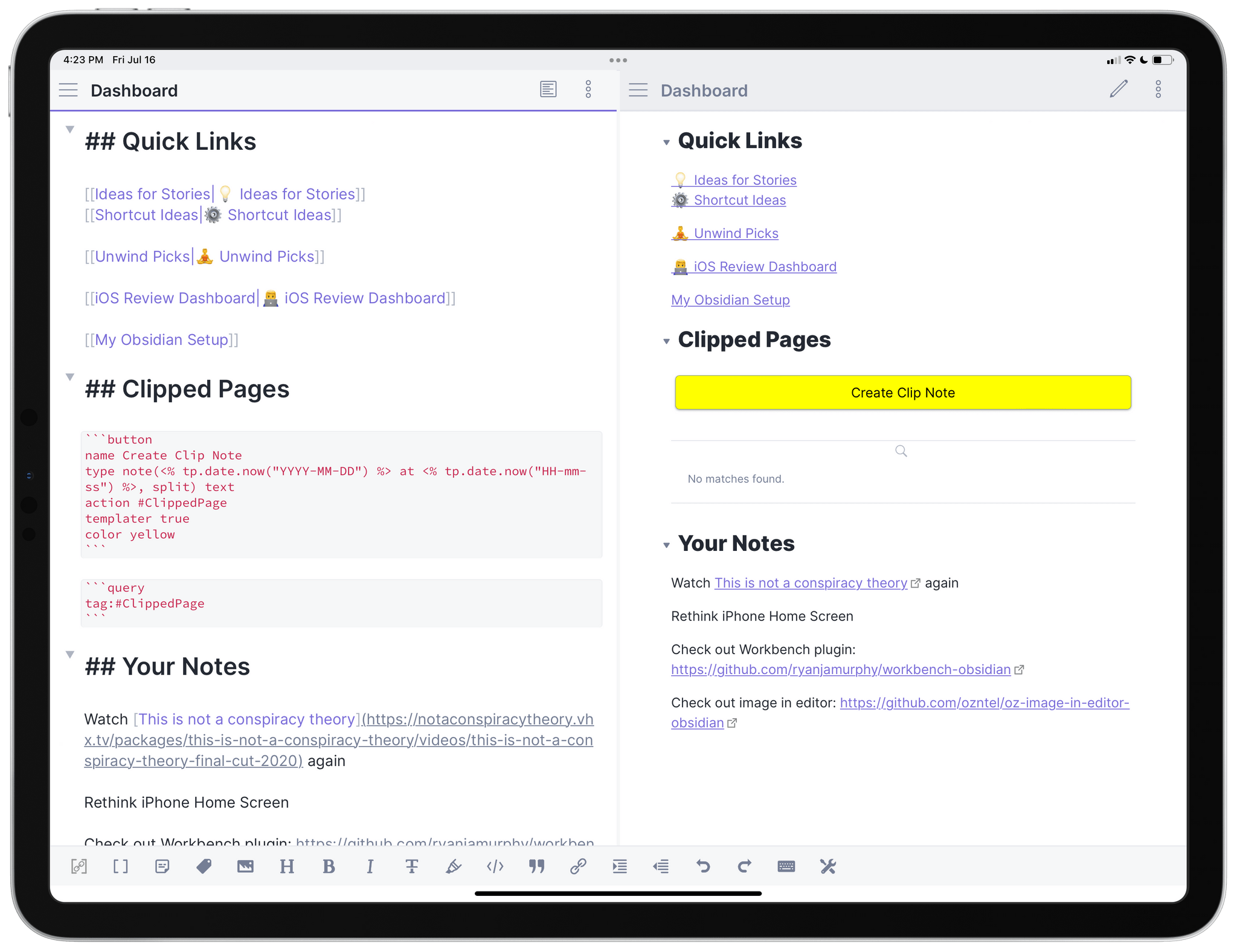
My Dashboard workspace in Obsidian for iPad.
Earlier this week, after a long beta period I’ve participated in for the past few months, the official Obsidian app for iPhone and iPad launched on the App Store. I’ve covered Obsidian and my approach to writing my annual iOS review in it on both AppStories and Connected; because I’m busy with that massive project and an upcoming major relaunch of the Club (hint hint), I don’t have time right now to work on a proper standalone, in-depth review of Obsidian for MacStories. So, given my time constraints, I thought it’d be fun to do a multi-part series for Club members on how I’ve set up and have been using Obsidian as my Markdown text editor and note-taking app of choice.
Obsidian has a steep learning curve on all platforms: there are a lot of settings to choose from, and there’s an incredible third-party developer community responsible for hundreds of plugins that can fundamentally alter the functionality of the app. The recently-launched iOS and iPadOS also matches all the core functionalities of the desktop app, including the ability to install custom plugins, themes, and CSS snippets to customize the app’s behavior and look. As a result, it can be quite challenging to get started with Obsidian and know what to tweak in the app’s preferences.
I don’t know how long this series will take me to complete, but my hope is that by sharing practical examples of how I set up the app on my end, I can make it easier for Club members to get started with Obsidian and personalize it to their needs. What I do know is that Obsidian already is one of the most impressive app launches of 2021, and I have high hopes for this product as an extensible, completely customizable Markdown text editor based on plain text files. I haven’t felt this way about a text editor since Editorial’s first beta in 2012, and I’m going to have a lot of fun sharing my techniques, custom plugins, and tips for Obsidian.
Let’s dive in.
The basic truth you should know about Obsidian is the following: it’s a front-end for a folder full of plain text files, which can be stored anywhere on your filesystem, including any location of the Files app for iPhone and iPad. Obsidian creates a ‘vault’ (a database) that is a folder containing your plain text files. At a basic level, Obsidian doesn’t require you to customize anything; you can get started by pointing it to a folder of Markdown files, which the app will index and let you edit in-place. This is an important piece of knowledge to keep in mind since, for data portability purposes, Obsidian lets you export your documents by simply copying and pasting them from the Finder of Files app. There’s no hidden database format and no proprietary sharing features to worry about: ultimately, the vault is just a folder you can freely access at any point via your computer’s file manager.
When you create a vault in Obsidian for iPhone and iPad, you can choose to create it in iCloud Drive or your device’s local storage – the ‘On My iPhone’ or ‘On My iPad’ default file provider of the Files app. Now, I know plenty of people who have decided to store their Obsidian vaults in iCloud Drive and use Apple’s service for sync between devices, which has the advantage of seamless integration with the Files app and background sync privileges. I did that too initially, but, personally, I prefer using Obsidian’s custom Sync service, a $4/month (when billed annually) paid add-on that is enabled via one of the app’s built-in ‘core’ plugins. There are a few reasons why I like Obsidian Sync as an alternative to iCloud Drive or other syncing solutions on iOS:
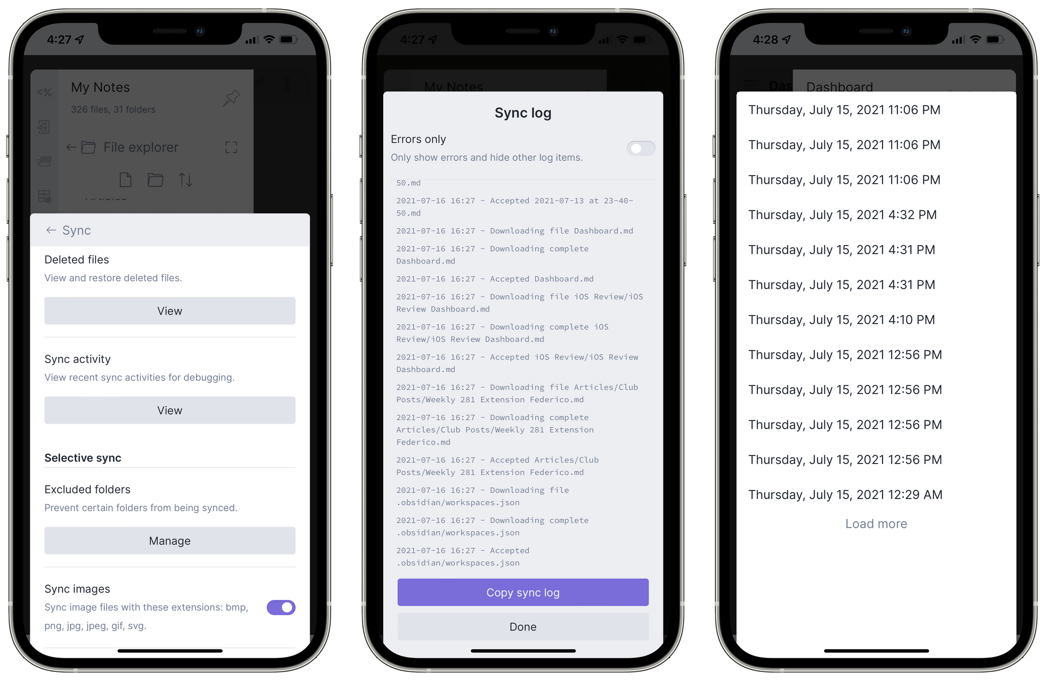
Obsidian Sync and per-document version history.
In my experience over the past few months, Obsidian Sync has been rock-solid and, more importantly, blazing fast. Plain text files have the benefit of being extremely lightweight, so the combination of speedy sync and being able to view a raw sync log has given me the peace of mind I never really had with iCloud Drive. It’s similar to Dropbox in this regard, but it’s end-to-end encrypted, and it can work as a layer on top of local storage on both iPhone and iPad. I highly recommend signing up for this additional service if you’re interested in these sync features.
As I’ll explore in a future installment of this series, choosing to go with the local storage + Obsidian Sync route creates additional complications for accessing Obsidian’s hidden metadata and configuration files. I’ve come up with a Shortcuts-based solution for this as well, which I’m going to explain later on.
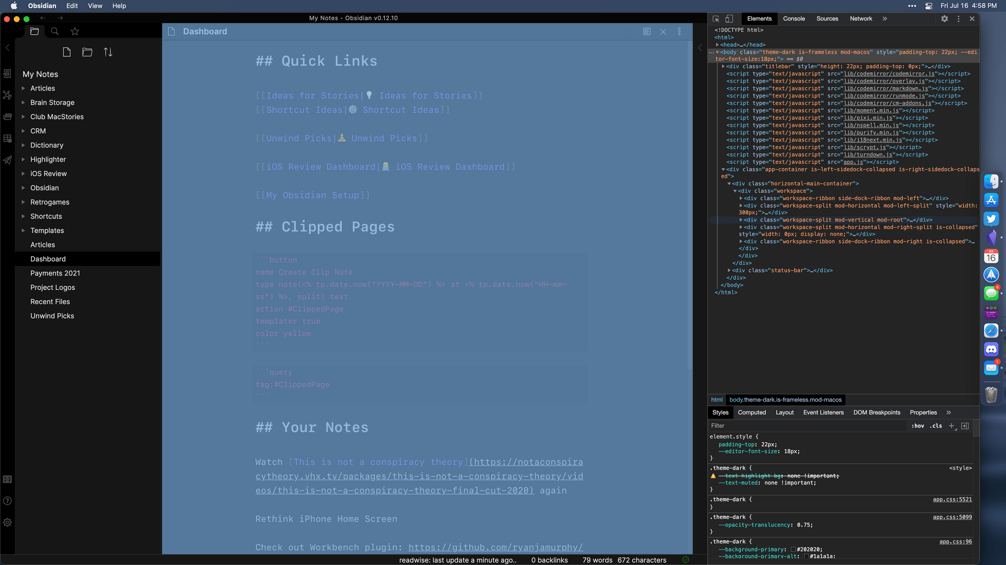
Obsidian can be best described as a modular note-taking app and text editor based on an extensible plugin architecture. There’s an open API for developers of plugins, which are based on web technologies (HTML, JS, and CSS) and tap into Obsidian’s hybrid nature as an Electron app. The app’s web-based nature is obvious enough: the UI is odd and non-standard in a lot of places; in the Mac version, you can inspect the app’s whole interface with a web inspector reminiscent of developer tools found in Safari and Chrome:
Yeah, it’s essentially a web app.
This is, I believe, the most important trade-off to understand right away about Obsidian: what it lacks in native, HIG-compliant interactions and design conventions, it makes up for with a fully customizable editing environment that lets anyone make plugins, themes, and even CSS snippets to modify the app’s appearance and functionalities. If Obsidian doesn’t have something you want, you can make it yourself – or found someone else’s plugin that does the job for you. From this standpoint, it’s reminiscent of Sublime Text, which never came to iOS and iPadOS.
Cleverly enough, the Obsidian creators themselves based key functionalities of the app on this plugin architecture and made certain features ‘core plugins’ you can enable in the app’s settings. Core plugins are different from third-party plugins, which are called ‘community plugins’ and are the ones you can browse inside the built-in gallery in Obsidian (for those that have been vetted by the Obsidian community) or manually install as files. You’d be surprised to see how many “obvious” features of Obsidian are actually core plugins you can optionally disable. Here’s a list of the highlights:
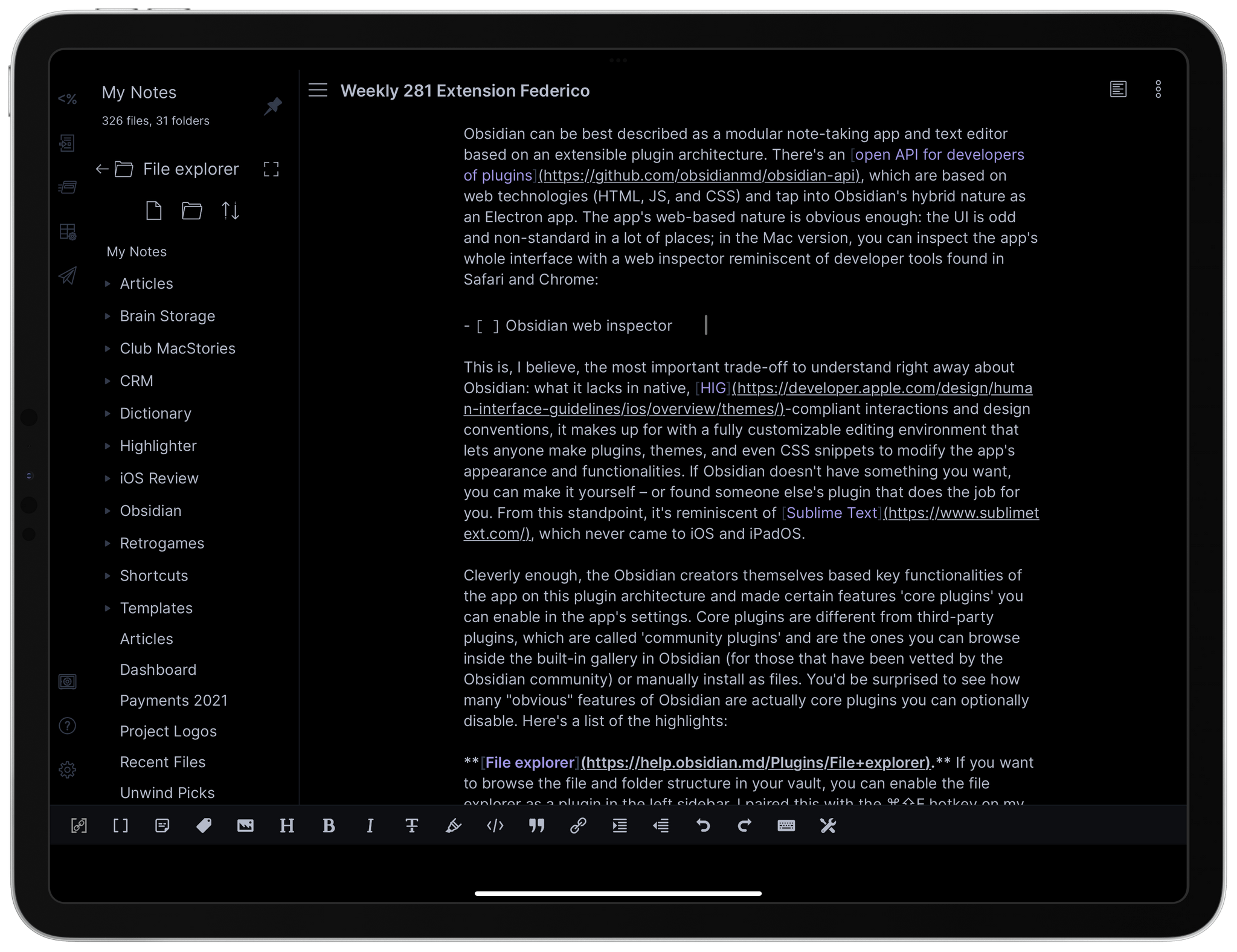
File explorer. If you want to browse the file and folder structure in your vault, you can enable the file explorer as a plugin in the left sidebar. I paired this with the ⌘⇧E hotkey on my iPad.
Obsidian’s file explorer plugin as a pinned sidebar.
Search. The ability to search for text across all text files in your vault is also a core plugin that adds a new item to the left sidebar. I gave this the ⌘⇧F hotkey.
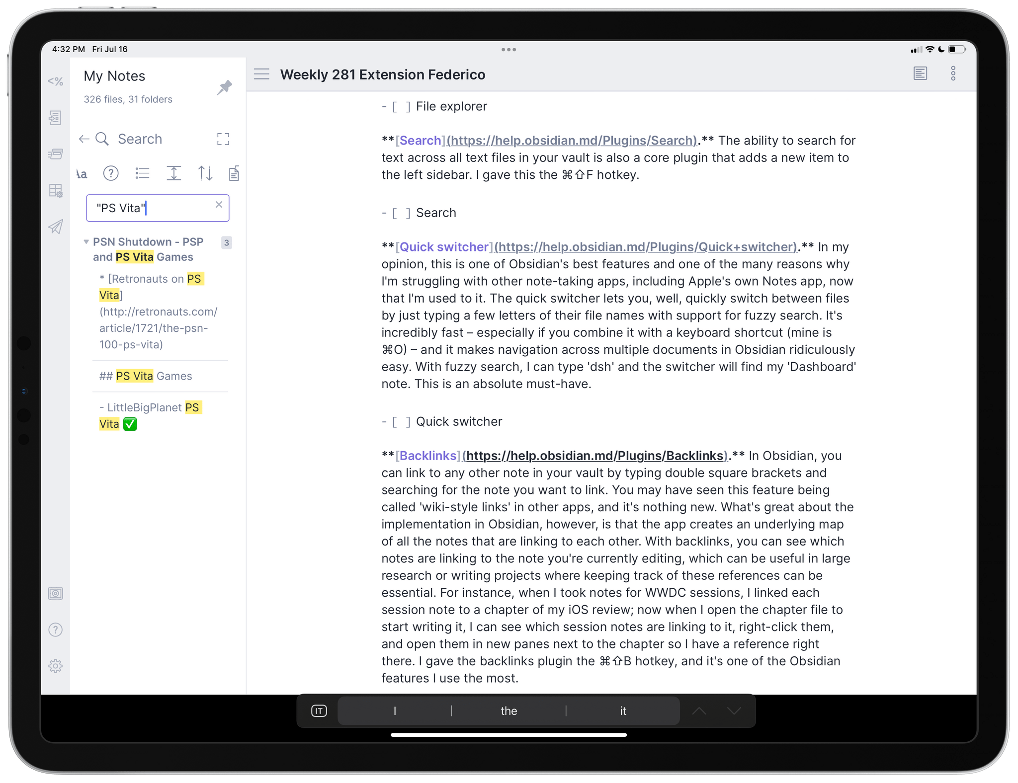
Full-text search in Obsidian.
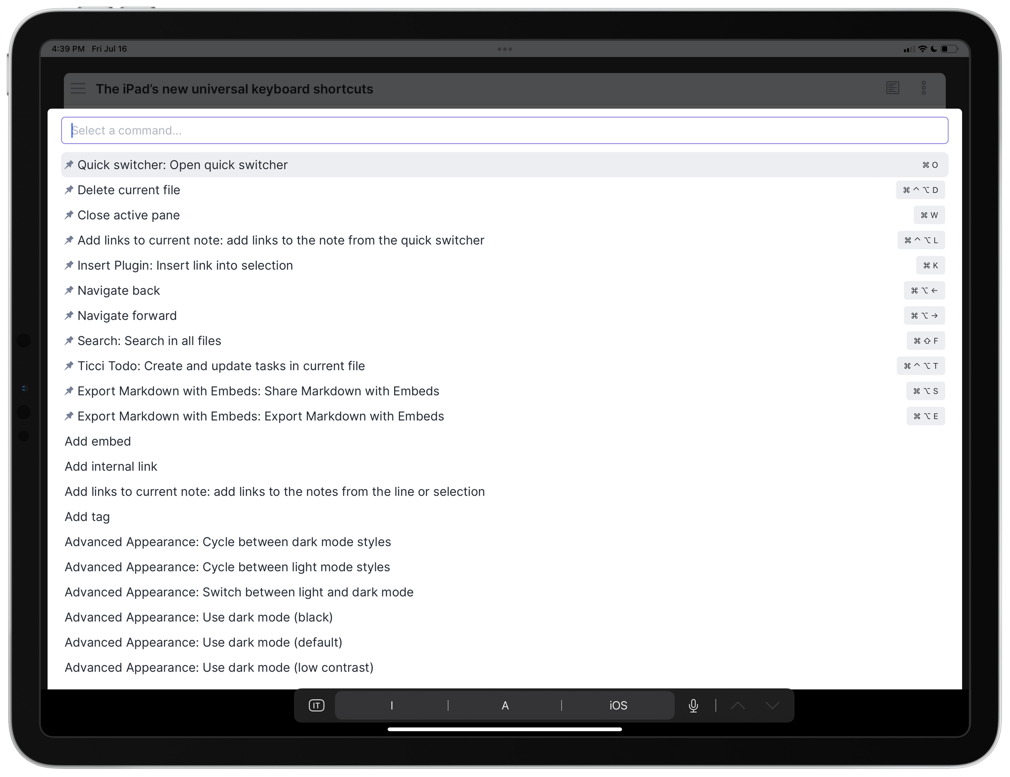
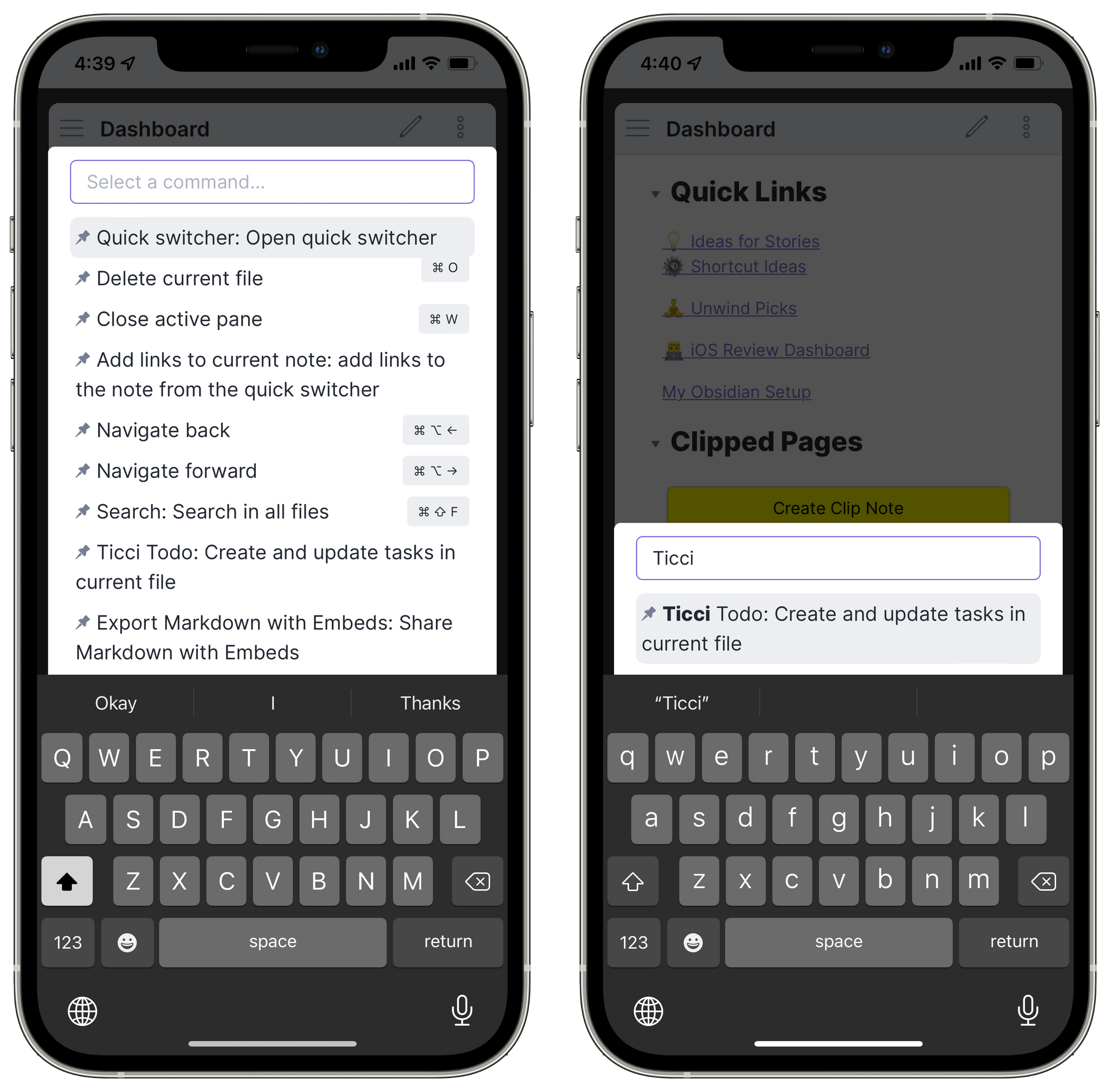
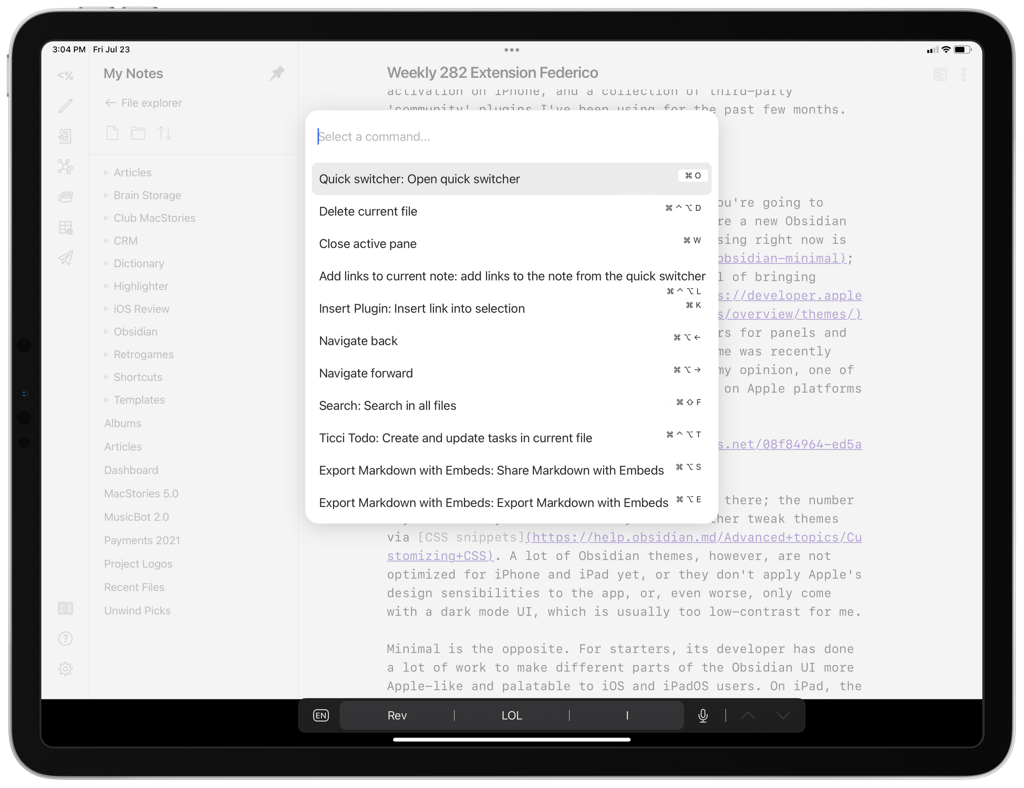
Quick switcher. In my opinion, this is one of Obsidian’s best features and one of the many reasons why I’m struggling with other note-taking apps, including Apple’s own Notes app, now that I’m used to it. The quick switcher lets you, well, quickly switch between files by just typing a few letters of their file names with support for fuzzy search. It’s incredibly fast – especially if you combine it with a keyboard shortcut (mine is ⌘O) – and it makes navigation across multiple documents in Obsidian ridiculously easy. With fuzzy search, I can type ‘dsh’ and the switcher will find my ‘Dashboard’ note. This is an absolute must-have.
Opening documents with the quick switcher.
Backlinks. In Obsidian, you can link to any other note in your vault by typing double square brackets and searching for the note you want to link. You may have seen this feature being called ‘wiki-style links’ in other apps, and it’s nothing new. What’s great about the implementation in Obsidian, however, is that the app creates an underlying map of all the notes that are linking to each other. With backlinks, you can see which notes are linking to the note you’re currently editing, which can be useful in large research or writing projects where keeping track of these references can be essential. For instance, when I took notes for WWDC sessions, I linked each session note to a chapter of my iOS review; now when I open the chapter file to start writing it, I can see which session notes are linking to it, right-click them, and open them in new panes next to the chapter so I have a reference right there. I gave the backlinks plugin the ⌘⇧B hotkey, and it’s one of the Obsidian features I use the most.
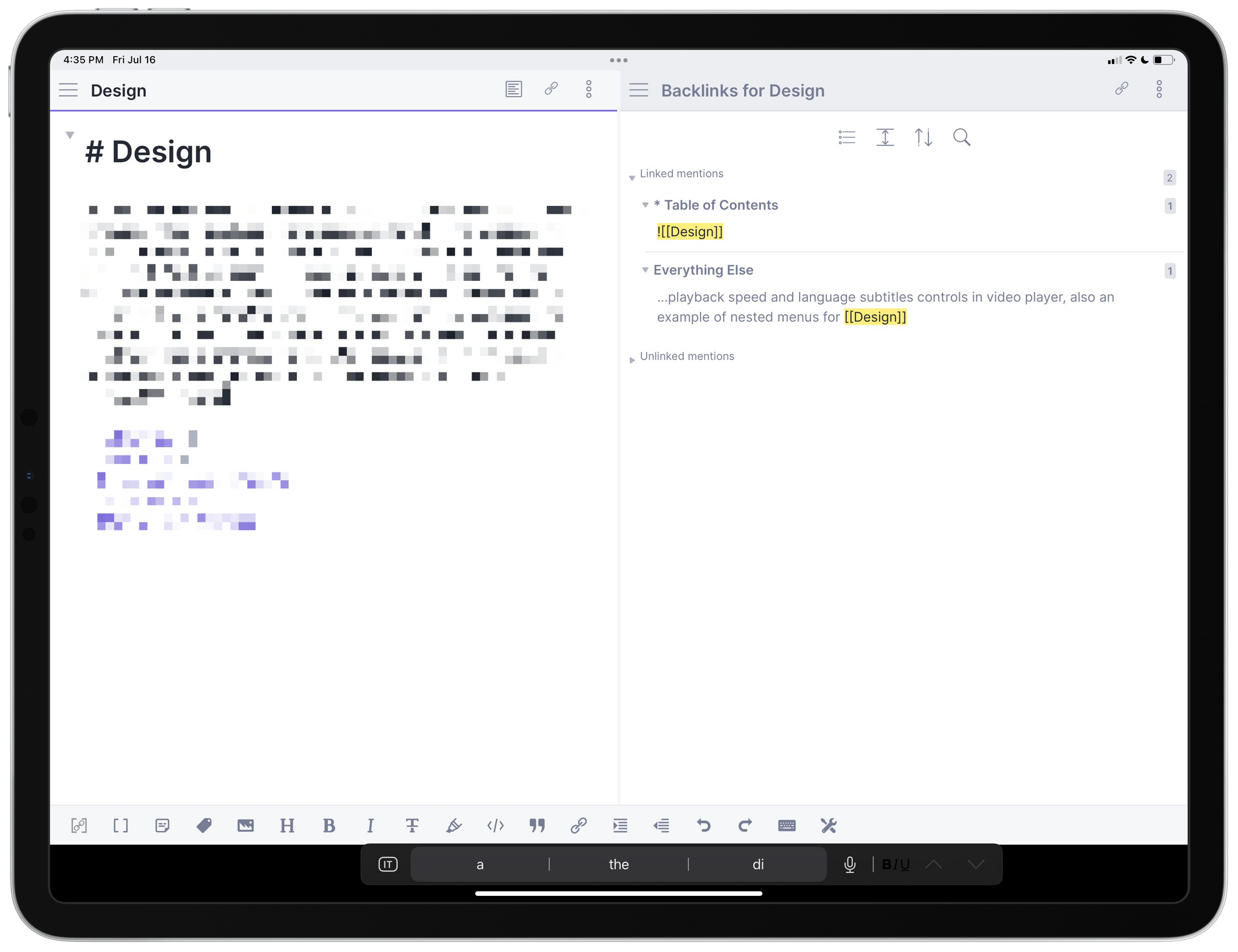
The backlinks pane for a chapter of the iOS review.
Page preview. You may have seen this feature in Craft before: with the page preview plugin, when you hover with the pointer over a [[Linked Note]] and hold the ⌘ key, you’ll see a floating popup with a preview of the linked item. I find this a great addition for those times when I don’t fully remember what a linked note is about.
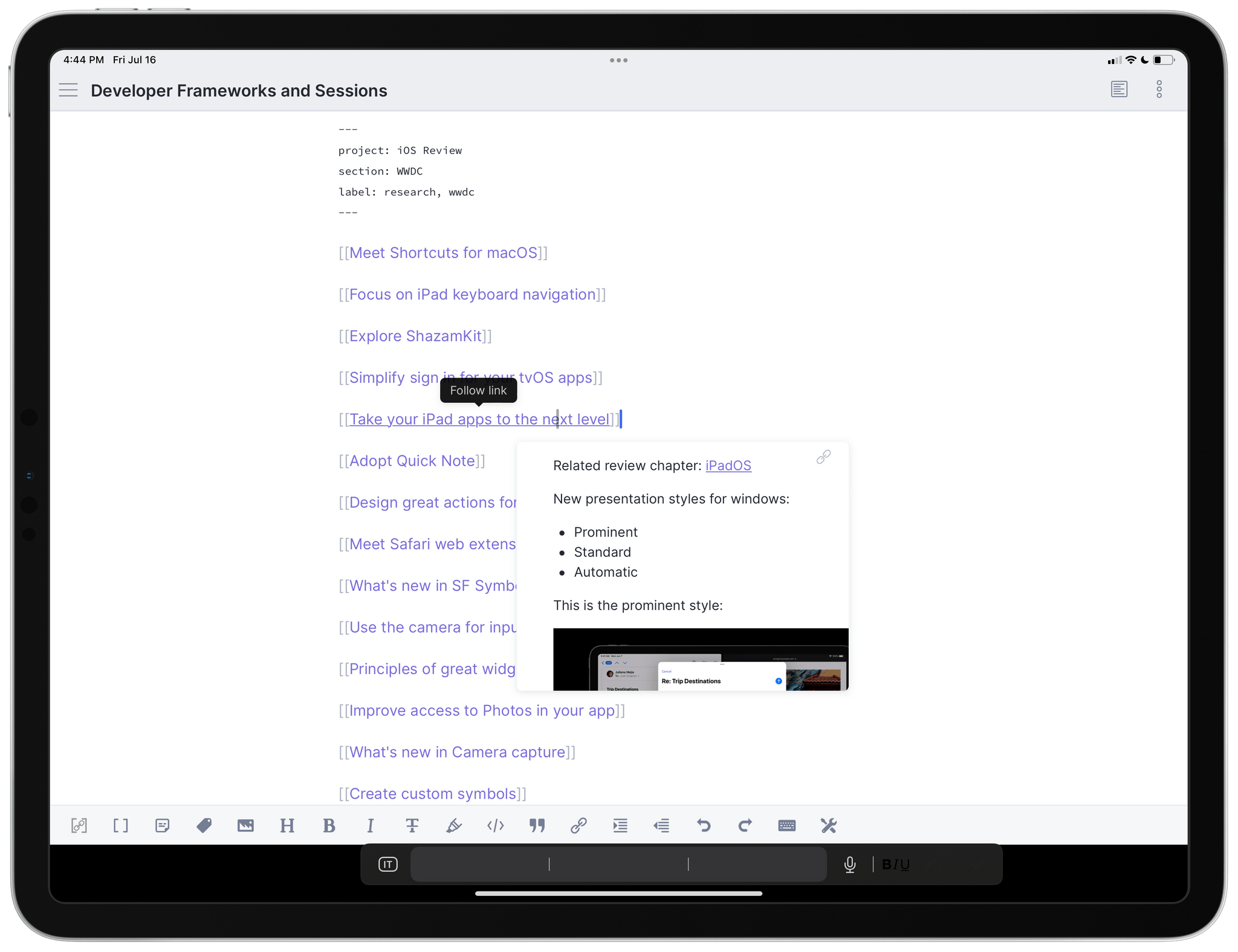
Page previews are shown when you hover over an internal link and hold the ⌘ key.
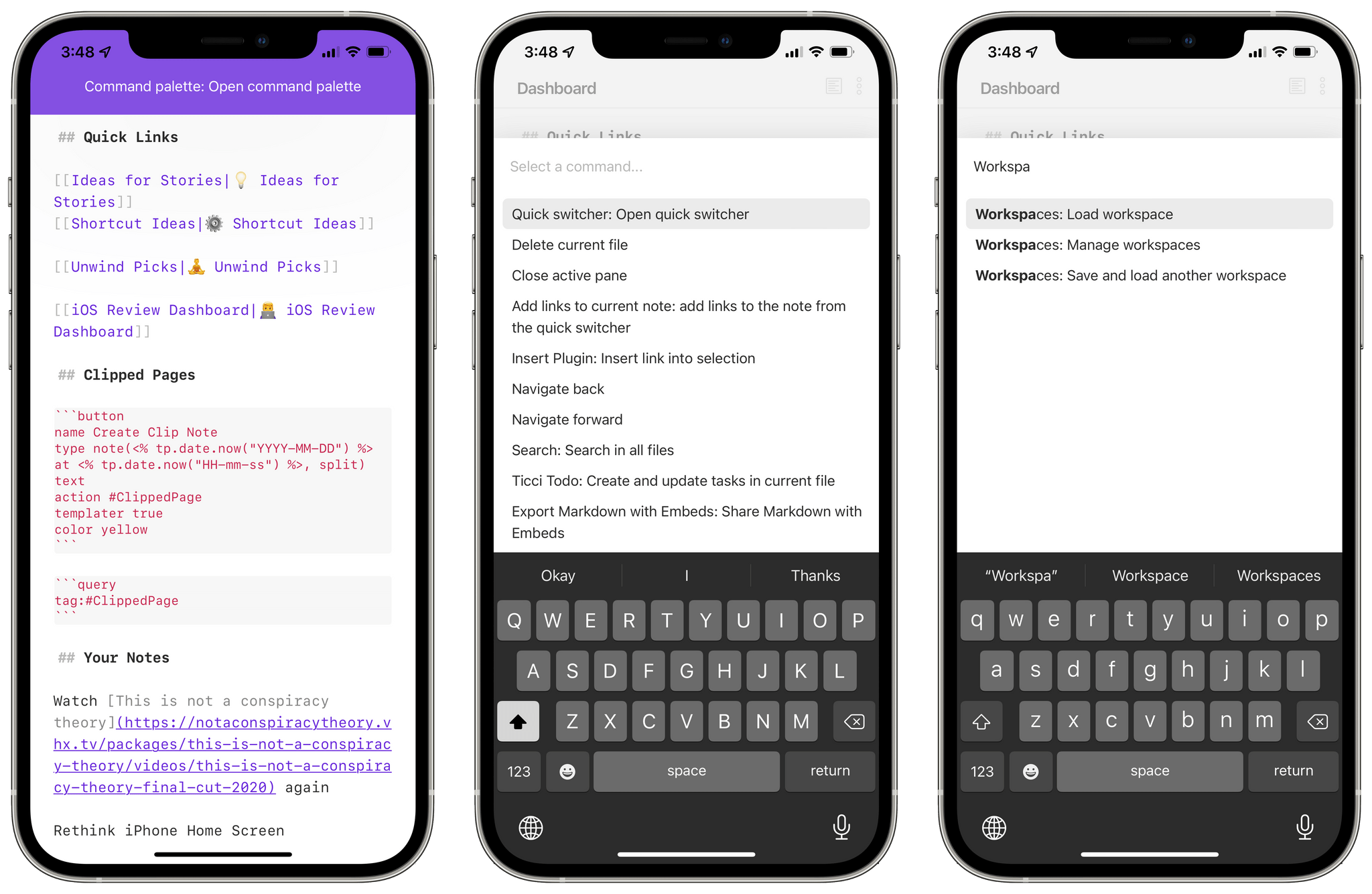
Command palette. One of the (many) unique features of Obsidian is the fact that each plugin, in addition to visual modifications, can also install one or multiple commands you can search and trigger with the keyboard. For instance, the backlinks core plugin I covered above installs two commands – ‘Show backlinks pane’ and ‘Open backlinks for the current file’. When you hear people like me say that they’ve assigned keyboard shortcuts to features in Obsidian, it’s because those features are commands you can find in two places: under Options ⇾ Hotkeys in settings, and in the command palette.
Pinned commands and hotkeys in the command palette.
The command palette lets you search for commands by name.
The command palette is the quick switcher, but for commands: it lets you search for any available command by name with fuzzy search, and when you’ve found the one you’re looking for, you can press Enter to trigger it. I assigned ⌘P to the palette, which I use dozens of times each day to activate different features of Obsidian. The command palette shows you hotkeys you’ve assigned to commands, and, even better, lets you pin frequently used commands to the top of the list for fast access. You can pin any command by visiting Options ⇾ Command palette and searching for any command available in the app. I think pinned commands are especially handy on iPhone, where the lack of a hardware keyboard makes searching for commands by name slower.
Open in default app. The ability to share the current document via the share sheet in Obsidian is itself a core plugin called ‘Open in default app’. Once triggered (my hotkey for it is ⌘D), the plugin will share the current note as a Markdown file with any compatible extension in the share sheet, including contact suggestions for iMessage and other communication apps.
As I mentioned above, these are just highlights from the list of core plugins; there are many more core features of the app that can be optionally enabled/disabled such as a tag pane, daily notes and Zettelkasten prefixes, a word count, an outline sidebar, and more. I don’t use all of them, and there are others I plan to cover more in depth in future installments of the series. Overall, however, I find this modular approach (unsurprisingly) fascinating since it allows different users to build deeply different setups in the same app, which is something I’ve never seen done before in any other Markdown text editor for iPhone and iPad.
There’s one core plugin in particular I want to cover today since it has had a profound impact on how I navigate Obsidian and switch between different modes in the app: workspaces. With the workspaces core plugin, you can save the current layout in Obsidian – the files, panes, and sidebars you have open – and reload it at any point, restoring it exactly as you left it. This is not the “bookmarking” functionality you may have seen in other text editors that let you reopen frequently used files with a single keystroke: what I mean is that you can create a workspace displaying four different notes at once, each set to editor or preview mode, save it, then instantly recreate it whenever you want.
A workspace showing the same note in editor and preview mode side by side.
The same idea, but with two notes and four panes.
The ability to create workspaces for specific layouts and combinations of notes has changed how I take notes, organize research material, and write in Obsidian because I can now quickly switch between ‘templates’ without manually opening new panes and sidebars every time. The workspaces plugin installs a command called ‘Manage workspaces’ that lets you save the current layout of the app as a named workspace as well as delete existing workspaces; then, you can use the ‘Load workspace’ command to switch to a previously-created workspace, which will be instantly recreated in the UI.
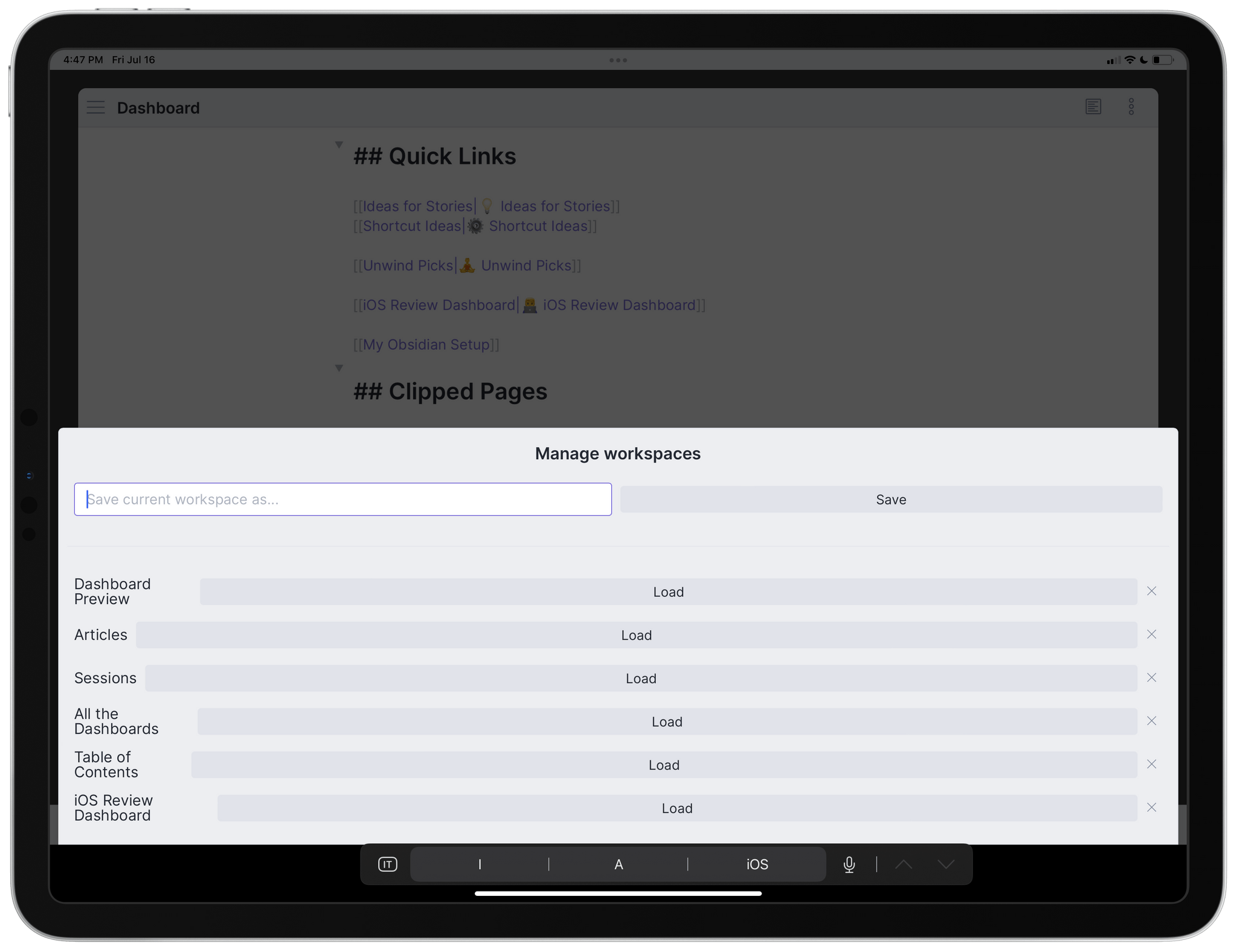
Managing workspaces in Obsidian.
I assigned the ‘Load workspace’ command to the ⌘⌥L shortcut, and it’s become second nature for me at this point to jump between different “modules” of note-taking and writing in Obsidian via this system.
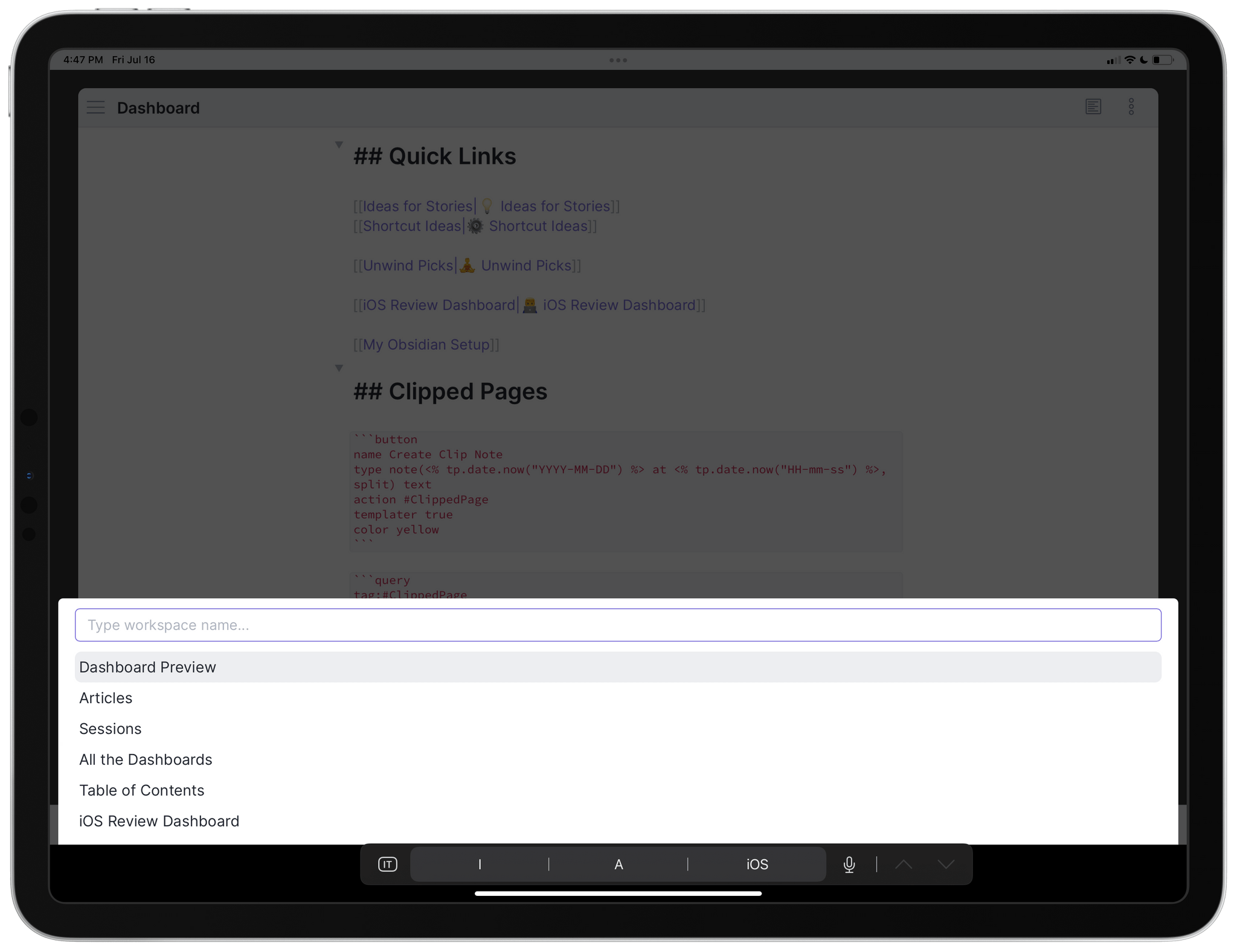
Loading saved workspaces.
A good example of the flexibility of workspaces is my Table of Contents note for the iOS review. When I open this document, it’s because I want to write one of the chapters of the review; as I noted above, when I do that, I want to see backlinks for the chapter I’m working on so I don’t miss notes that mention it. To make this process easier, I created a workspace that shows the Table of Contents note in editor mode and the backlinks pane as a pinned sidebar, which is something you can do in Obsidian for iPad and Mac by clicking the pushpin icon at the top of any sidebar. This way, when I open the Table of Contents note, I can select the chapter I want, follow the link to navigate to it, and the pinned backlinks pane will update automatically to show me notes that reference the chapter I just opened. It’s research bliss, and I love it.
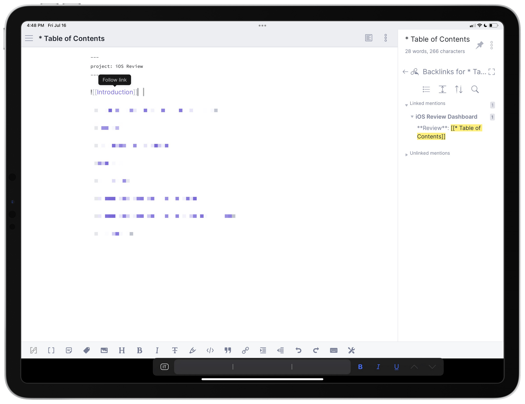
My Table of Contents workspace showing a pinned backlinks pane.
There are so many settings in Obsidian, many of them specific to plugins (each plugin comes with its own preference pane for additional options), it’s impossible to cover them all in a single story. There are some features of the ‘Options’ screen I want to focus on more in depth in the next installment (such as the mobile quick action), but here’s a list with my recommendations for key settings you should consider right away:
Well, I think that’s enough material to get started with Obsidian for this first installment of the series. I have a long list of topics, writing workflows, plugins, and custom shortcuts I want to cover, and I believe this is going to be a fun journey for Club MacStories members.
In the meantime, if you have questions, doubts, and tips about Obsidian and the kind of content I should cover, I’d love to hear from you: clubfeedback@macstories.net
In the first installment of my new Obsidian series I published last week, I covered the basics of the app to get started with its (many) settings, built-in core plugins, and different types of sync. This week, we’re taking a look at the Obsidian theme I’m using right now, options for customizing command activation on iPhone, and a collection of third-party ‘community’ plugins I’ve been using for the past few months. Let’s jump back in.
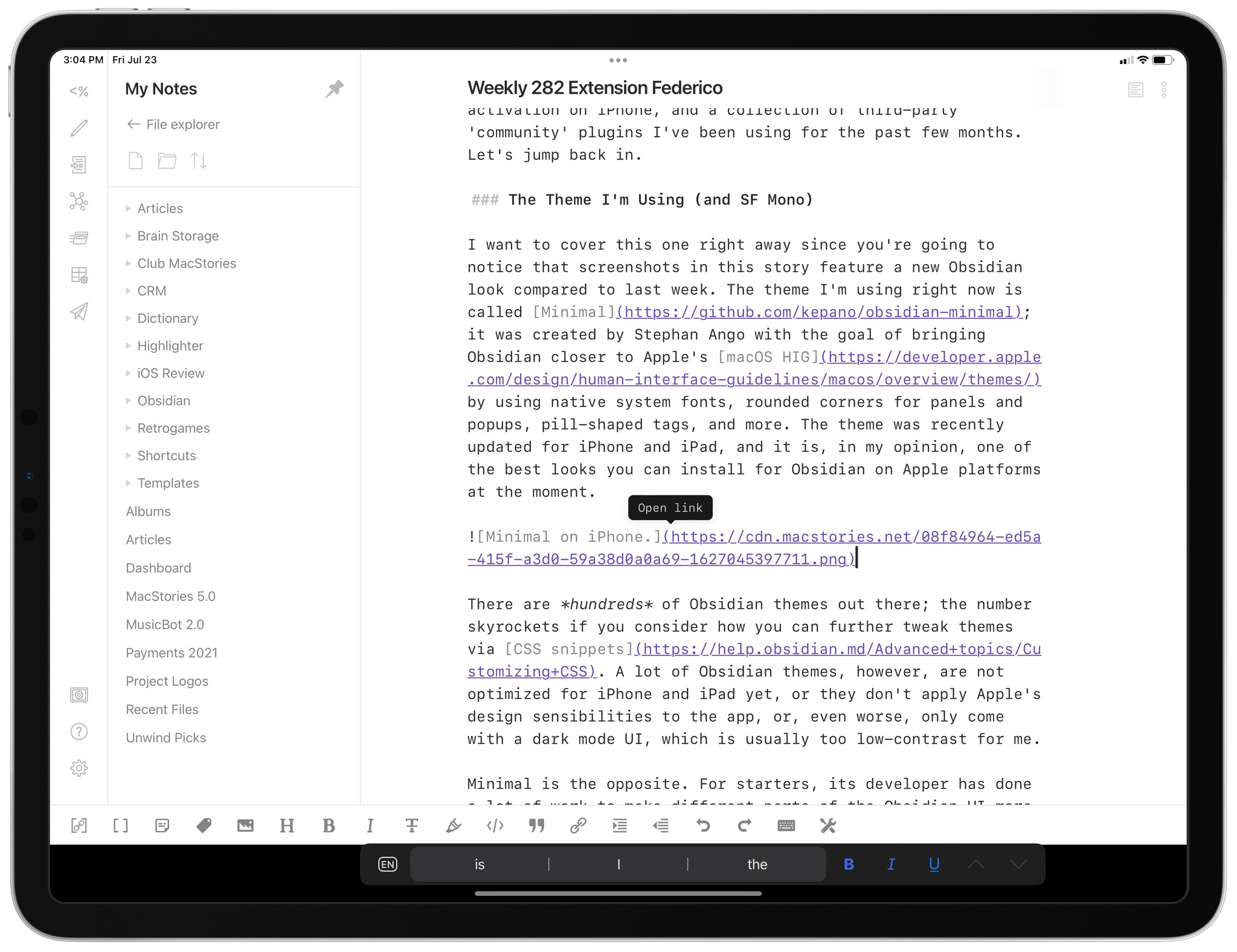
I want to cover this one right away since you’re going to notice that screenshots in this story feature a new Obsidian look compared to last week. The theme I’m using right now is called Minimal; it was created by Stephan Ango with the goal of bringing Obsidian closer to Apple’s macOS HIG by using native system fonts, rounded corners for panels and popups, pill-shaped tags, and more. The theme was recently updated for iPhone and iPad, and it is, in my opinion, one of the best looks you can install for Obsidian on Apple platforms at the moment.
Minimal on iPhone.
Minimal on iPad.
There are hundreds of Obsidian themes out there; the number skyrockets if you consider how you can further tweak themes via CSS snippets. A lot of Obsidian themes, however, are not optimized for iPhone and iPad yet, or they don’t apply Apple’s design sensibilities to the app, or, even worse, only come with a dark mode UI, which is usually too low-contrast for me.
Minimal is the opposite. For starters, its developer has done a lot of work to make different parts of the Obsidian UI more Apple-like and palatable to iOS and iPadOS users. On iPad, the command palette is a floating popup reminiscent of the quick switchers seen in Craft and Agenda; the preference pane is displayed as a large card raising from the bottom of the screen; sidebars (such as the file explorer or backlinks pane) have a nice floating appearance and support hover effects when moving the pointer over buttons and documents.
Floating sidebars in Minimal.
The floating command palette in Minimal.
I particularly appreciate the design of context menus on iPad, such as this popup you get by right-clicking a document in the file explorer sidebar:
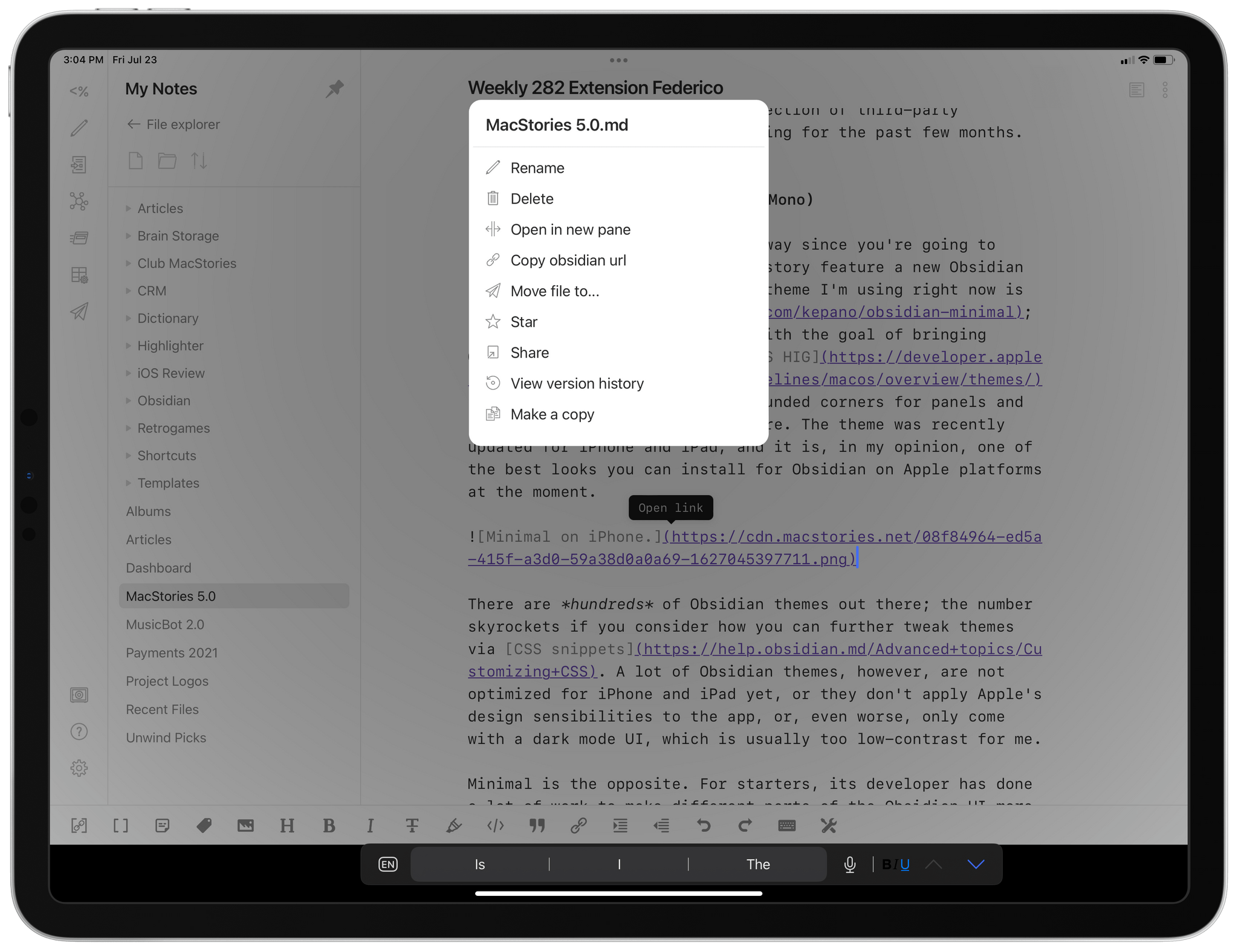
Minimal’s context menus.
What also makes Minimal stand out is the availability of a companion Minimal Theme Settings plugin created by the developer to customize the theme to fit your needs and tastes better. This is where it gets interesting since most themes don’t offer this kind of personalization. Once you’ve installed Minimal and Minimal Theme Settings, head over to the plugin’s preference page and you’ll notice you can change the theme’s accent color hue and saturation. Minimal is, well, a very minimal theme, but it uses accent colors for elements such as hyperlinks, text selection, note links, and buttons in settings. If you want to give Obsidian a green or blue accent color, just move the two sliders until you’ve gotten the color you like. In the future, it’d be nice to be able to input a single HEX value rather than having to use manual sliders.
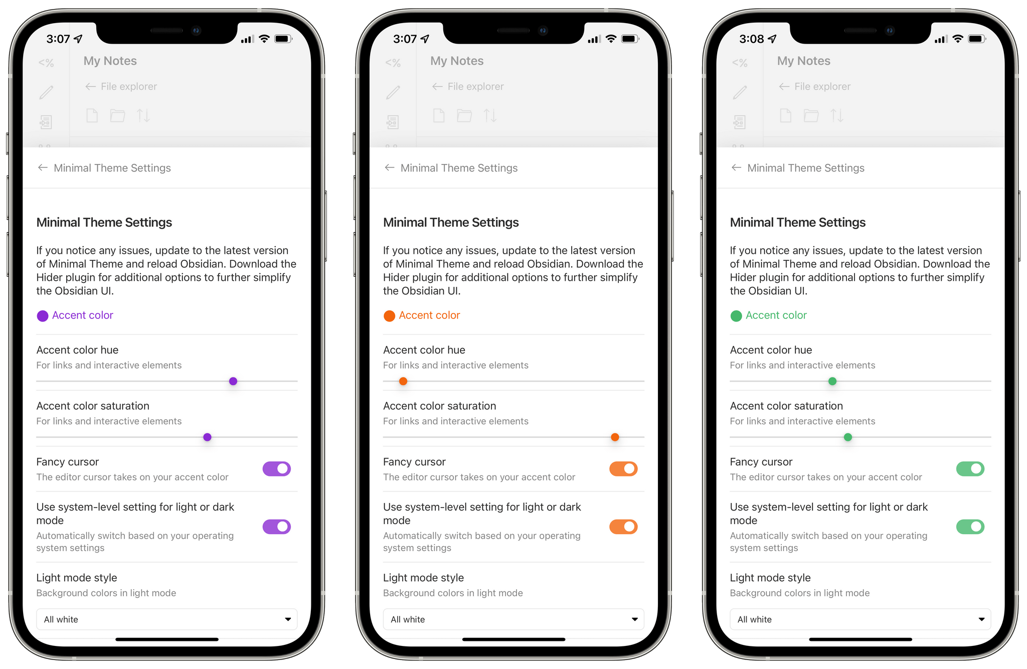
Different accent colors in Obsidian.
Minimal also comes with separate appearance modes for light and dark mode, which can be configured to follow the system’s appearance setting or not. (Personally, I prefer Obsidian to switch to dark mode when I enable dark mode in Control Center.) I’ve decided to go with all white for light mode and true black for dark mode; if the all white option is too low contrast for you, there are low and high contrast modes you can enable for the light theme setting. Unsurprisingly, true black mode looks fantastic on OLED iPhones and the M1 iPad Pro with mini-LED display:
And then we have fonts. For a few years now, I’ve been writing all my articles and newsletters using a monospaced font. I used to have iA Mono back when I was an iA Writer user; in other text editors, whenever possible, I prefer to fall back to Apple’s own SF Mono font. Other Obsidian themes I’ve tested make it surprisingly difficult to switch to a different font for the text editor, and I’ve spent way too much time trying to force this change using CSS snippets found online. The Minimal theme and its associated plugin make this process incredibly easy thanks to built-in menus to switch the fonts used in the app’s UI and preview mode, the text editor, and code blocks. All you have to do is open the Minimal Theme Settings page, scroll to the font section, and pick from a list of prepackaged font selections. Assuming you have those fonts installed on your device, just reload Obsidian, and changes will take effect.
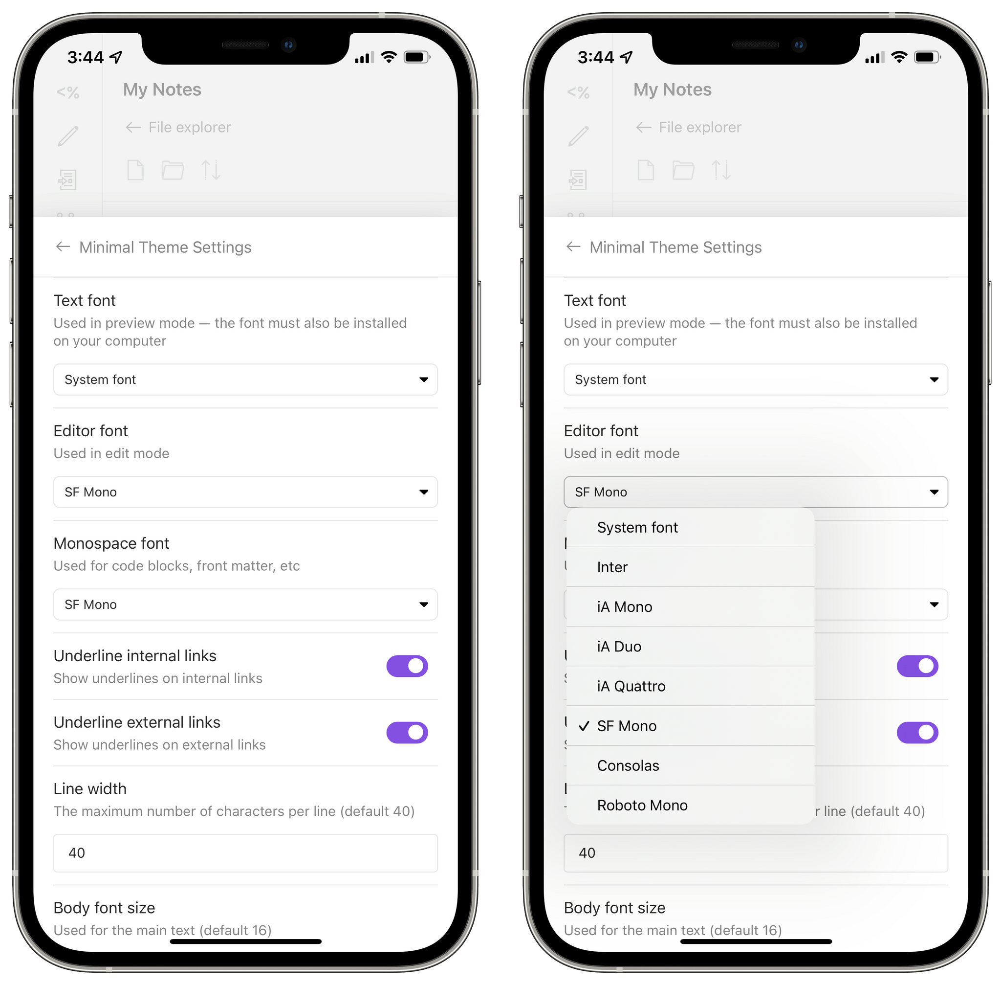
Changing fonts in Minimal Theme Settings.
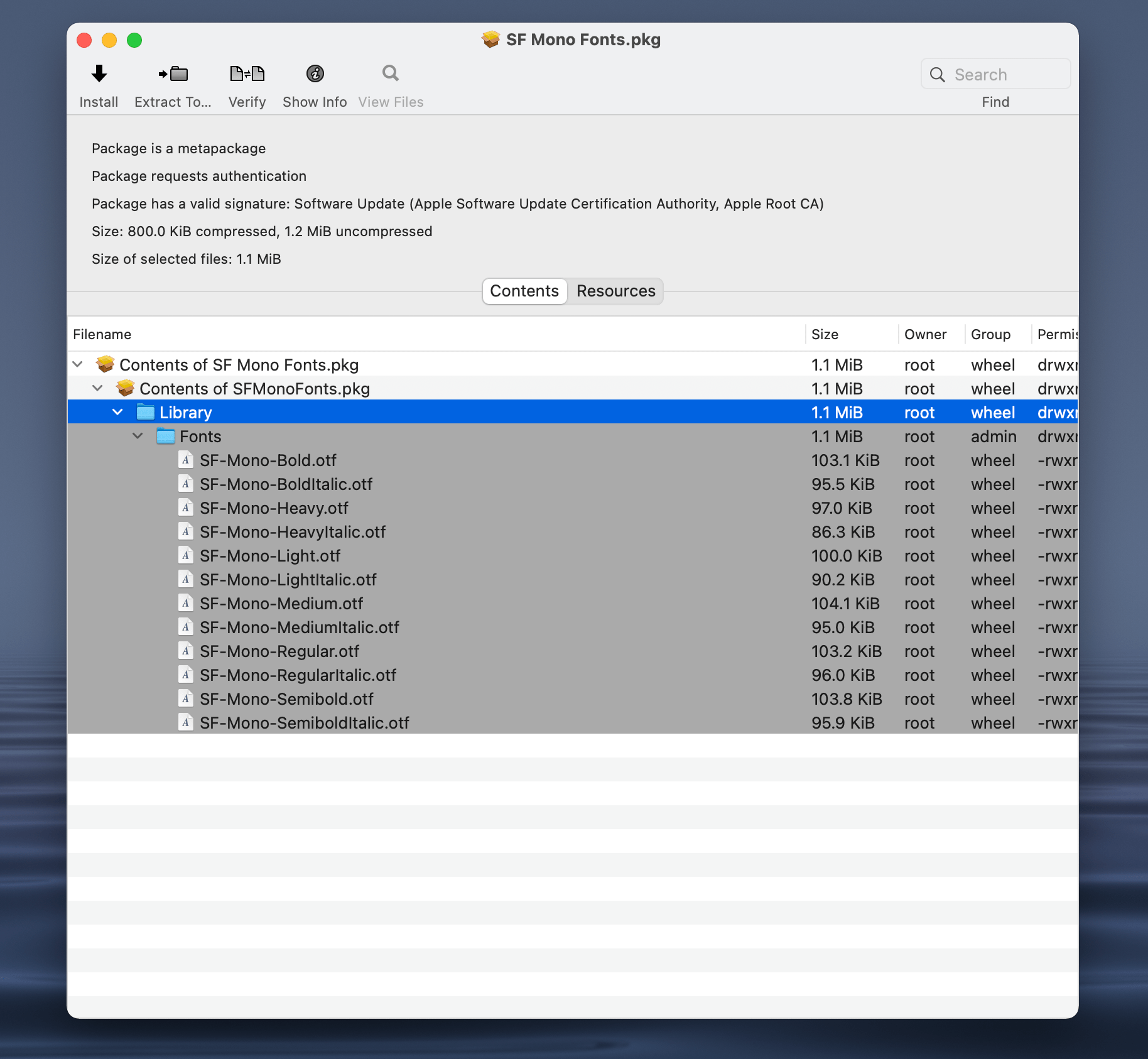
The only issue is – you have to install those fonts manually on your device beforehand using apps such as AnyFont or Fontcase (I prefer the latter since it lets me easily import multiple font files at once from the Files app). And because Apple’s SF Mono font is not pre-installed on iOS or iPadOS by default, there are some additional steps to follow. First, download the .dmg file for the SF Mono font from Apple’s Fonts webpage on your Mac. The disk image contains an installer file that saves SF Mono’s font files somewhere on your computer, and you need to extract those .otf files (avoid the .ttf ones if you want to bring them over to iOS or iPadOS).
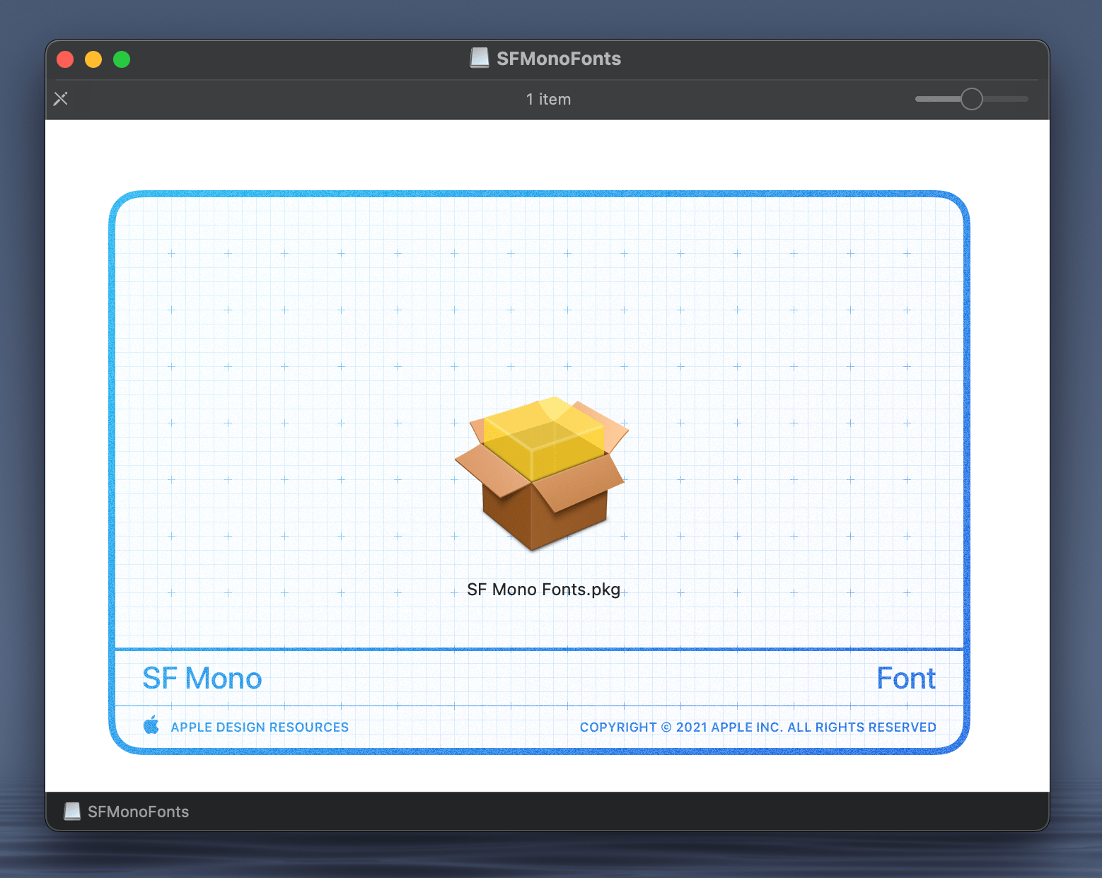
The installer package for SF Mono.
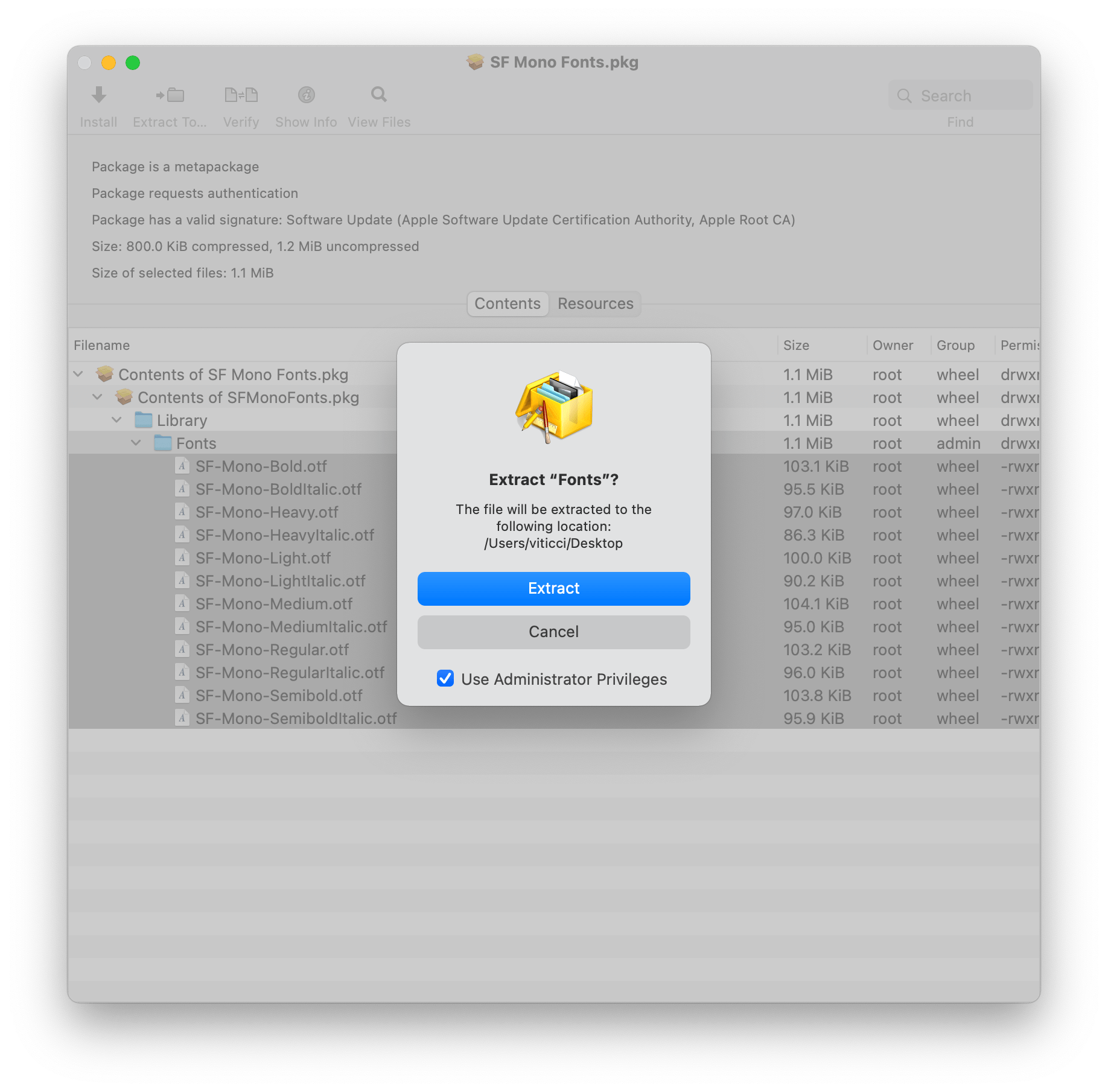
Thankfully, there’s a relatively easy solution to this as well. For the past few years, I’ve been using the excellent Pacifist app for macOS to inspect the contents of installer packages and extract them to the Finder. For SF Mono, all I had to was drag the installer to my desktop, open it with Pacifist, expand its directory until I found the Fonts folder stored within it, and extract it to a folder in Finder. You’ll have to use an additional desktop app for this, which isn’t ideal, but I purchased Pacifist years ago and have used it dozens of times to extract all kinds of files from installer packages, so the investment paid off. I can’t recommend this app enough.
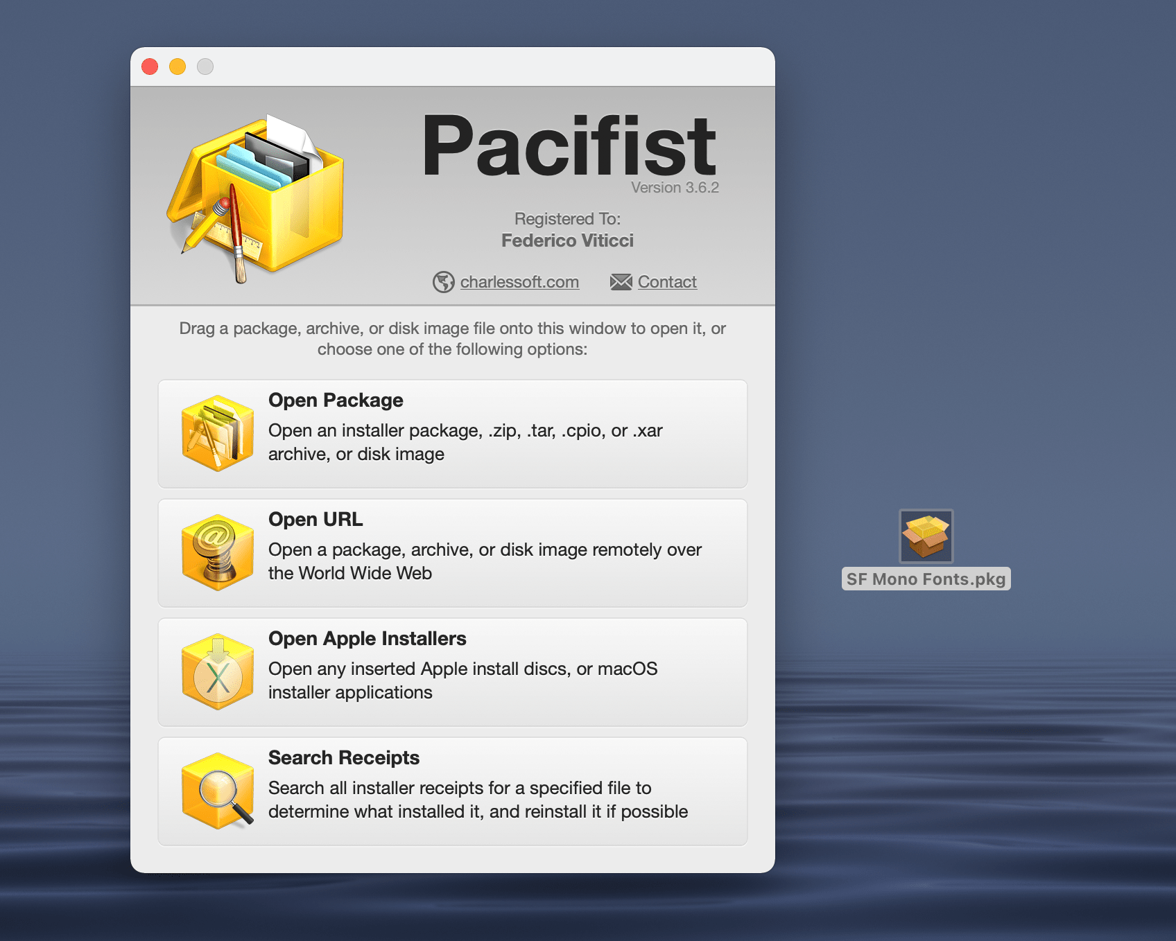
Select ‘Open’ to open an installer package with Pacifist…
…find the folder containing the font files you need…
…and extract them to Finder.
Once I had a folder containing SF Mono’s .otf files, I synced it to my devices using iCloud Drive, manually installed them via the profile-based method supported by Fontcase, force-quit Obsidian, and the app’s text editor started correctly using SF Mono as the monospaced font for the editor.
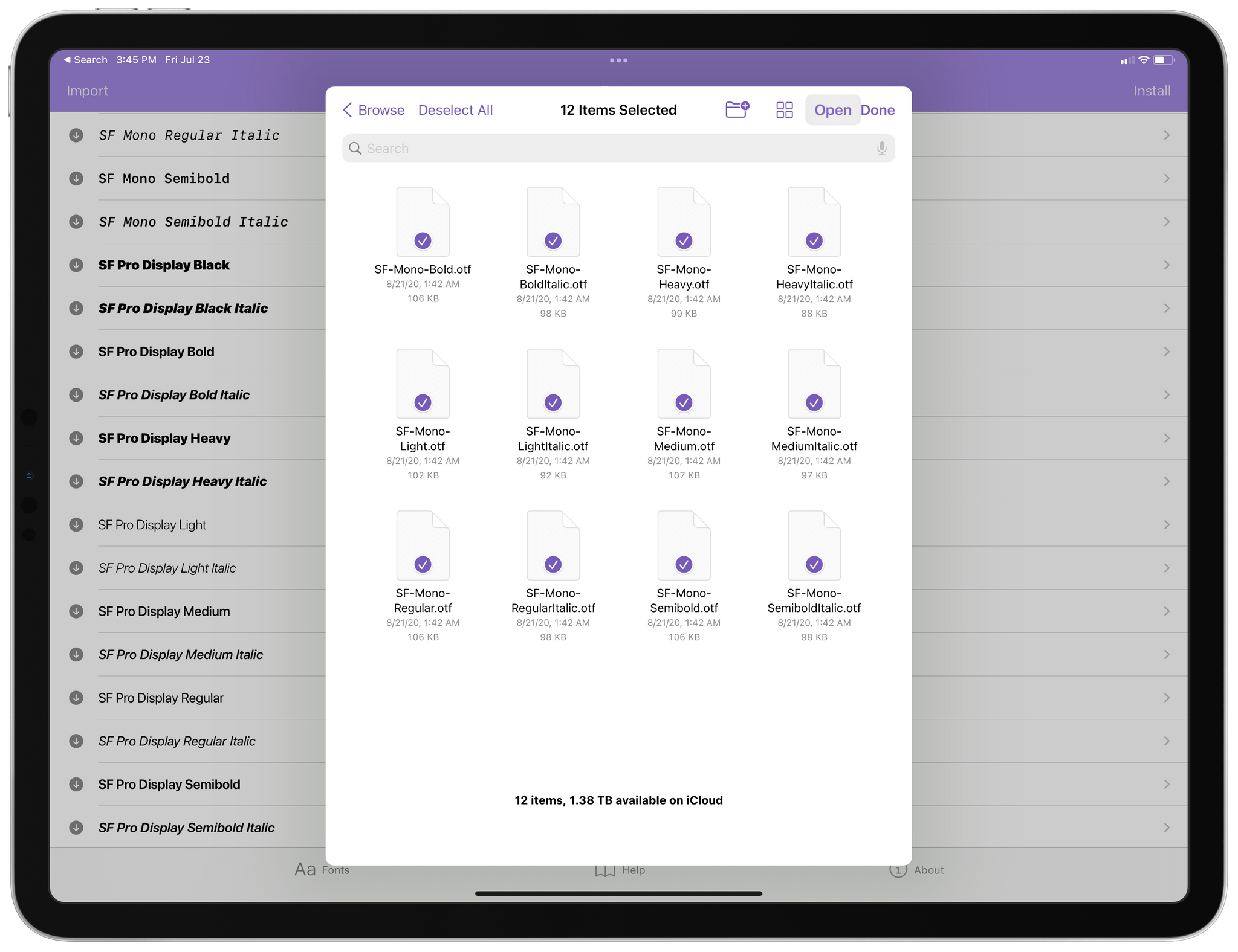
Installing multiple font files at once with Fontcase.
SF Mono and SF Pro in Obsidian.
Thanks to Minimal, I now have a beautiful theme for Obsidian that works well in the iOS and iPadOS app and which lets me use my favorite Apple typeface for the editor. If you’re looking for a different appearance for the Obsidian app, I highly recommend Minimal and its Minimal Theme Settings plugin.
One of my favorite details of Obsidian for iPhone is the mobile quick action – a handy pull-down gesture that lets you execute any command by swiping down anywhere in the app. The iPhone version of Obsidian is (unsurprisingly) harder to navigate than the Mac and iPad apps due to the lack of an external keyboard (unless you use a Bluetooth keyboard with your iPhone; in that case, I salute you), so the quick action can come in handy to trigger commands that would otherwise require multiple taps on the iPhone’s smaller screen.
Triggering the quick action on iPhone.
My recommendation for the iPhone quick action is to assign it to trigger the command palette. This way, you can quickly swipe down anywhere in the app and you’ll be instantly presented with a list of commands you can activate with one tap. The keyboard comes up as soon as the command palette is shown (so you can look for a command by name with fuzzy search, as I explained last week), and you can also pin specific commands to the top of the palette for even faster access.
The command palette should be assigned to the mobile quick action by default. If it isn’t, or if you prefer to pair any other command with the quick action, you can customize it in Options ⇾ Mobile ⇾ Configure Mobile Quick Action.
There’s more to customizing how commands are triggered in Obsidian for iPhone and iPad than the quick action: you can also configure the row of controls displayed above the keyboard, and, as I mentioned above, you can pin commands to the top of the command palette.
Let’s start from the command palette. Open Obsidian’s Options screen, open the Command Palette’s core plugin settings page, and you’ll be presented with a list of pinned commands. This list will likely be empty the first time you open this screen, so tap into the search bar next to ‘New Pinned Command’ and you can search for any command available in the app to make it a pinned one. All commands – both built-in commands and the ones exposed by plugins – will show up here, and you’re free to pin whatever you want. Once you’ve selected some, you can rearrange their order in the list of pinned commands.
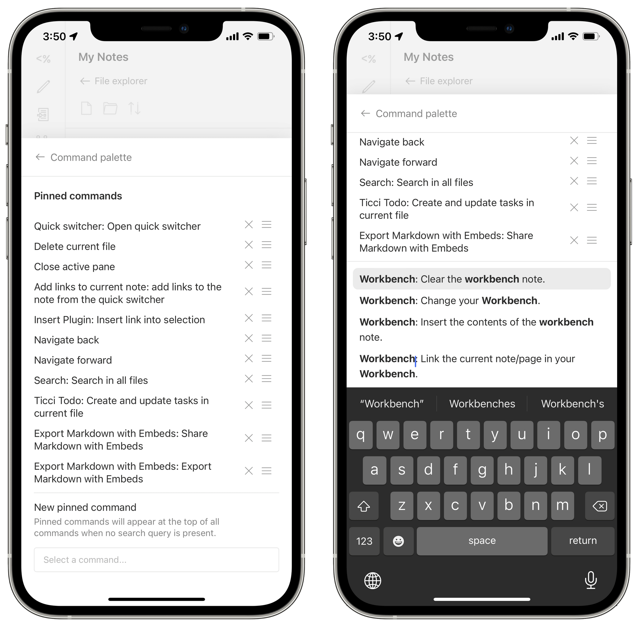
Creating pinned commands for the command palette.
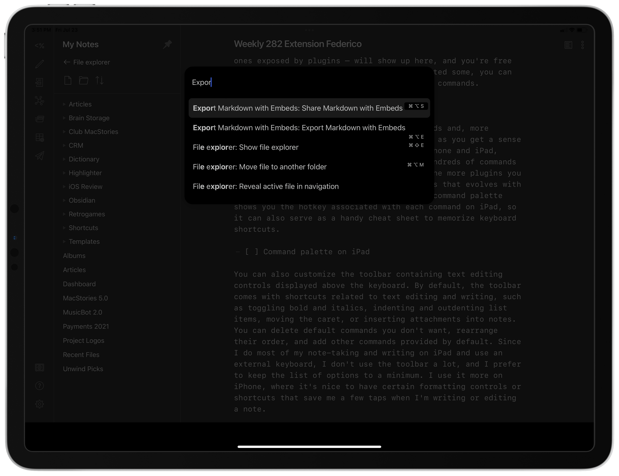
I highly encourage the use of pinned commands and, more importantly, to revisit this page over time as you get a sense of the commands you use the most on your iPhone and iPad, tweaking the list accordingly. There are hundreds of commands available in Obsidian, and the list grows the more plugins you install, so it’s good to have a list of pins that evolves with your needs over time. In a nice touch, the command palette shows you the hotkey associated with each command on iPad, so it can also serve as a handy cheat sheet to memorize keyboard shortcuts.
You can also customize the toolbar containing text editing controls displayed above the keyboard. By default, the toolbar comes with shortcuts related to text editing and writing, such as toggling bold and italics, indenting and outdenting list items, moving the caret, or inserting attachments into notes. You can delete default commands you don’t want, rearrange their order, and add other commands provided by default. Since I do most of my note-taking and writing on iPad and use an external keyboard, I don’t use the toolbar a lot, and I prefer to keep the list of options to a minimum. I use it more on iPhone, where it’s nice to have certain formatting controls or shortcuts that save me a few taps when I’m writing or editing a note.
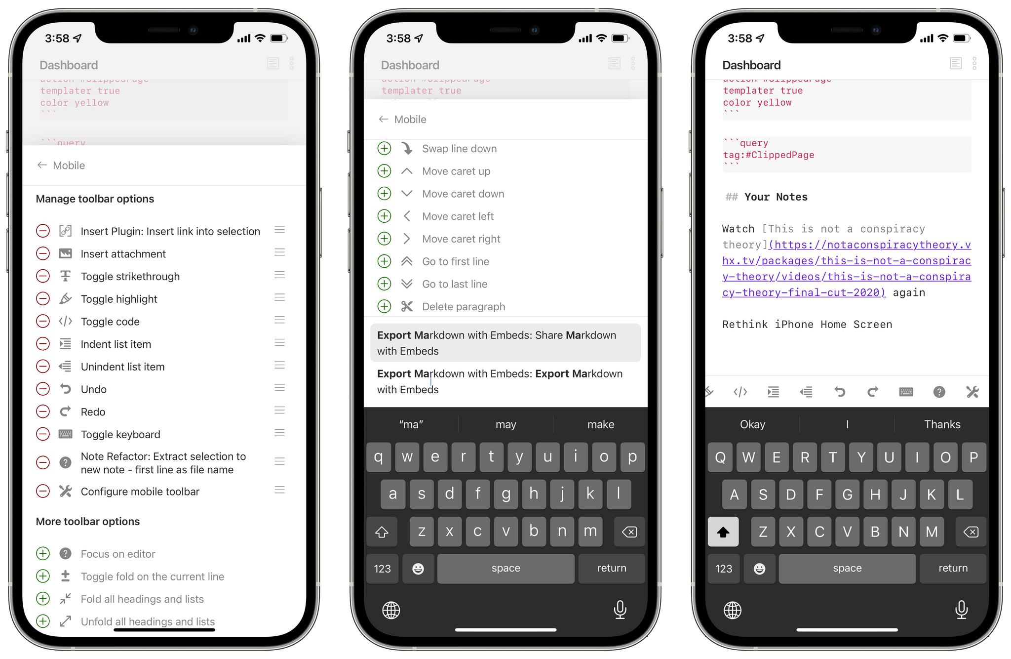
Customizing the mobile toolbar with global commands.
However, what I really like about the toolbar is the ability to pin any global command as a custom accessory displayed above the keyboard. This option is consistent with Obsidian’s command palette, and it allows you to add any other command from the app and show it as a button above the keyboard. To do this, open Options ⇾ Mobile, scroll to the bottom of the page, and tap into the search bar next to ‘Add Global Command’. From here, you can search for any global command you want and add it to the toolbar for fast access.
A word of caution for global commands: because not all of them are necessarily optimized for toolbar usage, you may not see dedicated icons for them above the keyboard. If that’s the case, a global command will be displayed with a generic ‘?’ icon, which can be confusing if you add a bunch of global commands that don’t have toolbar icons and can’t tell them apart. I’ve only added a couple to my iPhone, so I can remember which one is which, but I hope more plugins will start adding support for toolbar icons soon.
In case it’s not clear by now, there are hundreds of third-party plugins for Obsidian – some of which can do things you’d never expect from a text editor (how about a Kanban board? What about mind maps?). Therefore, this is by no means an exhaustive list of all the plugins I’m playing around with. However, I wanted to call out some of the community plugins I’ve been using for a while now, since I believe they’re a good place to start when it comes to exploring the many possibilities offered by Obsidian.
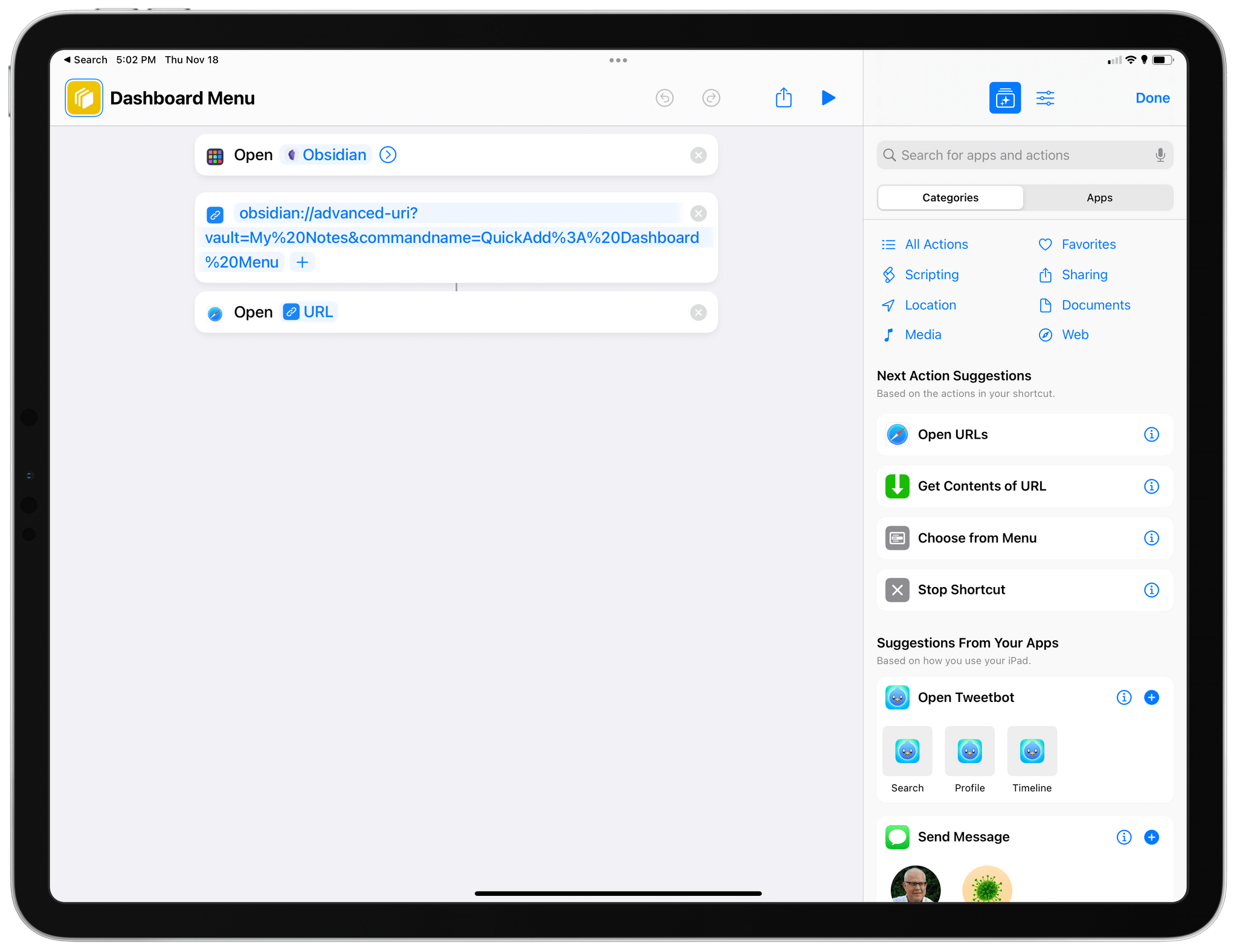
Advanced Obsidian URI. Here’s a wild one: what if I told you that third-party Obsidian plugins can register URL schemes otherwise not supported by default in Obsidian? That’s what Advanced Obsidian URI does: it exposes additional commands via the Obsidian URL scheme, such as loading workspaces, appending text to files, or opening your daily notes. I mostly use this plugin to load my favorite workspaces via shortcuts on the iPhone and iPad, which can be done by opening a URL like this one:
obsidian://advanced-uri?vault=My%20Notes&workspace=Dashboard%20Preview
As you can see, this plugin uses the Obsidian URL scheme, but it adds an ‘advanced-uri’ command that can be set to open the ‘Dashboard Preview’ workspace in the vault called ‘My Notes’.
Cycle Through Panes. This is one of those features that should be built into Obsidian by default: with this plugin, as the name implies, you can cycle through multiple open panes via ⌃Tab. This command is so ingrained in my muscle memory now, I often forget it’s actually provided by a plugin.
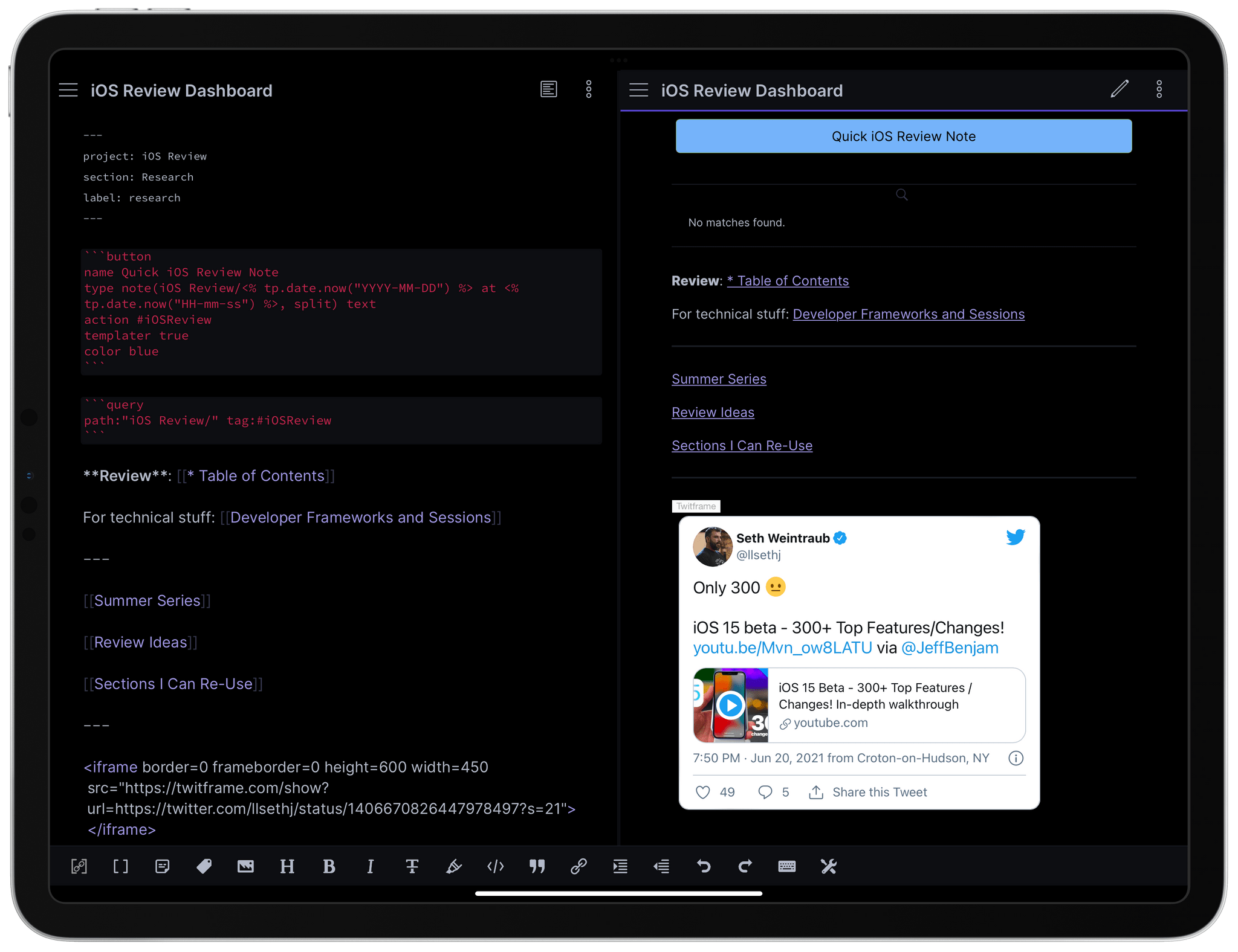
Buttons. This is one of the third-party plugins that will require a standalone, deeper dive in the future. With Buttons, you can, well, create buttons that perform specific features while in preview mode. In editing mode, all you see is a special code block with a proprietary syntax; as soon as you enter preview mode, the syntax becomes a colored button you can click to do something. There are several different kinds of button types: you can create buttons that run commands, open links, perform calculations, create new notes from templates, append or prepend text to notes, and more. In the screenshot below, you can see how I’ve been using this plugin to put together a button that lets me create a note with a timestamp and tag; I plan to write about this more in depth in future installments.
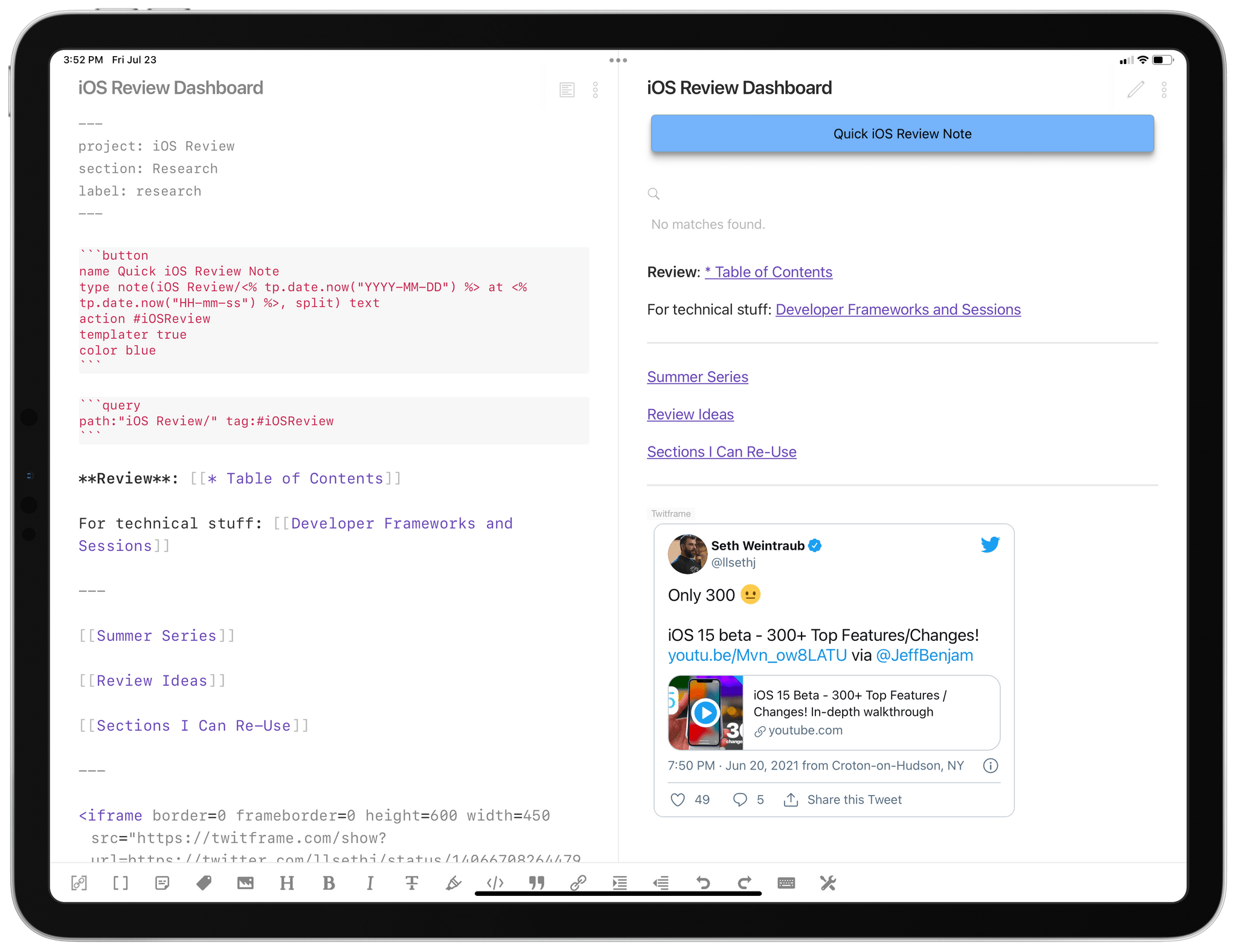
A button’s syntax (left, first red code block) and the final result (right, blue button).
Dataview. Dataview is, quite possibly, the most complex and incredible third-party plugin at the moment. Effectively, Dataview lets you use your Obsidian vault as a database, and there’s a special syntax to create code blocks that query from that database. Like Buttons, when you hit preview mode, that special code block becomes something else; in this case, Dataview code blocks become tables that show you the result of your query.
It can be hard to wrap your head around Dataview, which is why this plugin will also require a deeper exploration in the future. In the meantime, I suggest you check out the full documentation here to get a sense of the dynamic views you can create with Dataview. To give you a first example of how I’m using Dataview, I’ve put together a table that pulls in article highlights I save into Obsidian when I’m catching up on stories in Safari Reading List. These notes are saved with a specific syntax, which Dataview can query, and they’re then presented in a table which is sorted by date. Stay tuned for a future installment in which I will describe my workflow for this.
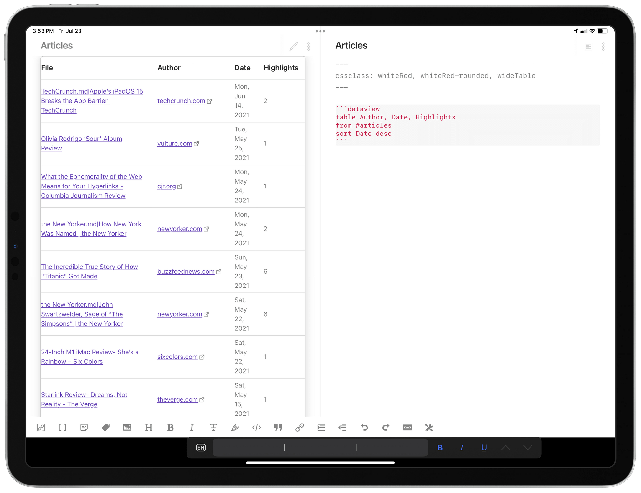
The Dataview syntax (right) and the resulting table with queried results (left).
Note Refactor. If you’ve ever found yourself working on a long document and realizing it could be split into multiple, shorter notes, allow me to introduce you to Note Refactor. This plugin lets you extract a selection from the text editor into a new note and (optionally) use the first line of text from the selection as the new note’s filename. This has been perfect for me for all those times when I’m working on a story, create a few headings for sections and start writing, then realize I’d prefer to split those sections into their own separate notes. The plugin comes with two settings I recommend enabling: you can choose to split new notes into the same folder as the current file (so you can keep files from the same project in the same folder) and you can embed a newly split note into the original one by default.
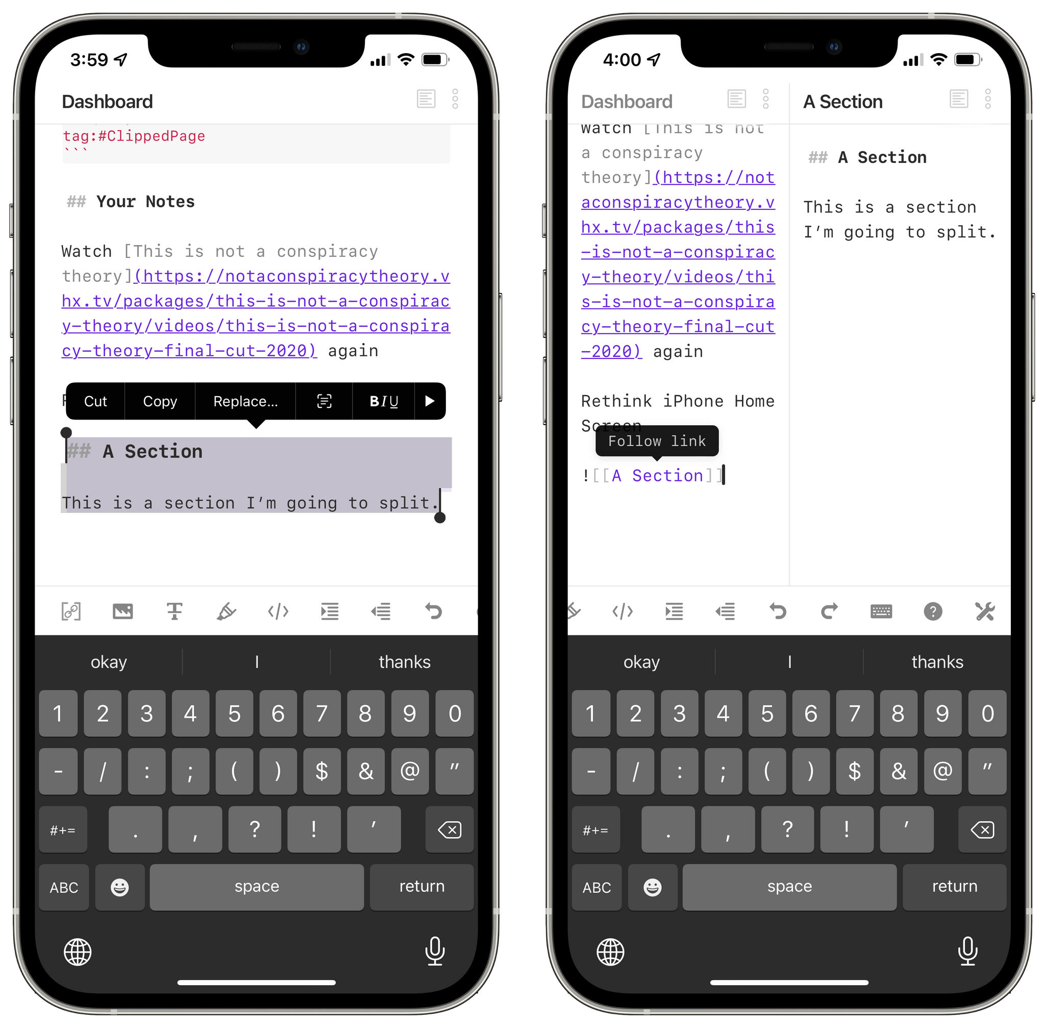
Refactoring a section of a note into a separate, standalone note.
Workbench. Developed by Obsidian user extraordinaire Ryan J.A. Murphy, Workbench lets you collect working materials by appending links to specific notes or sections of notes at the bottom of a general ‘workbench’ that serves as an inbox of sorts. For me, this is the ‘Dashboard’ note I’m going to describe in the next installment of this series, which is a note where I keep all kinds of links and temporary notes for things that are on my mind at the moment. Amazingly, Workbench lets you immediately append any internal link by ⌥-clicking it, and you can also save any line of text at the bottom of your workbench by ⌘⌥-clicking it. Alternatively, you can use the ‘Link the current note in your Workbench’ command, which I’ve pinned to the top of the palette on iPhone and trigger with ⌘⌥W on my iPad Pro.
That’s it for this week. There’s still a lot to cover in Obsidian, but I feel like I’ve explained the basics of the app, and it’s time to start digging into advanced workflows, plugins, and my approach to note-taking and writing. In the meantime, if you have an interesting setup in Obsidian or have plugin suggestions for me, I’d love to hear from you.
When Mark Gurman reported for Bloomberg that Apple might launch an iPhone with an always-on display, my ears perked up. That’s because I’ve been running an iPhone and iPad with the Auto-Lock feature turned off for months. If Apple goes with such a display, I expect it will be coupled with new iOS 15 features, but even without that, there’s a lot to like about leaving your screen on all the time.
I didn’t set out to test what having an always-on screen would be like. It started with my review of the Twelve South HoverBar Duo, which is my current favorite iPad stand. I love the stand’s range of motion and ability to hold everything from my iPhone 12 Pro Max to the 12.9" iPad. Before the HoverBar Duo, I’d used iPad stands with a keyboard and trackpad for writing. What made Twelve South’s stand a little different is that its adjustability allows an iPhone or iPad to function exceptionally well as a second screen.
I set the HoverBar Duo up on my desk next to the external display I use with my 2018 Mac mini, and the two made a great pair. Sometimes I’d use Sidecar, so my iPad served as a true second display, but more often, I ran native iPadOS versions of apps like Discord, Messages, and Spark on it.
However, I quickly realized that the iPad’s maximum auto-lock timer is too short at five minutes for this kind of setup. That time period is fine if I’m actively using apps on the iPad, but when I’m just monitoring conversations and keeping an eye out for notifications, having to unlock the iPad repeatedly gets old fast.
Having your device’s screen auto-lock is a valuable security feature, but I was testing the HoverBar Duo in the dead of winter during a pandemic. I wasn’t going out much, so locking my devices wasn’t a big concern. Access to power to charge the iPad or run it connected to a power adapter wasn’t an issue either. So, I turned auto-lock off to see how it would go.
I was pleasantly surprised. My experience with the iPad was so good, in fact, that I decided to add my iPhone to the mix. My iPhone usually sits to one side of my desk on a Belkin 3-in-1 MagSafe charger, which holds it up at the perfect angle to see the screen. Keeping the screen on for stretches of the day proved useful there too. I’d run a quick shortcut, adjust lights and other HomeKit accessories from Home, monitor video cameras, and AirPlay music to my HomePods. I can do most of that on my Mac too, but for some apps, quickly dipping in and out of them on an iPhone feel more lightweight than launching an app on the Mac to do the same thing.
To my surprise, even when the iPhone 12 Pro Max wasn’t sitting on its charger, keeping the display on at all times didn’t drain the battery as fast as I expected. Over the years, Apple has fine-tuned the battery consumption of its devices, and although powering the screen is a big draw on the battery, an idle iPhone draws less power than you might expect.
Also, it’s worth noting that it’s not like I keep my iPhone and iPad on 24/7. If I don’t need either one, I turned the screen off with the side button. That helps minimize battery drain, too, although I am sure my battery calculus will continue to shift as I spend more time away from home again. Still, I’ve been pleased with how well the batteries of my devices have held up to the experiment.
The entire experience has made me wonder how Apple might pair an always-on display with the iOS 15 update. Earlier this year, Federico and I speculated that the Today page might be removed from iOS and replaced with the App Library. That got me wondering if a version of the Today page might move to the Lock Screen. That would be the perfect spot for a weather, battery, Fitness rings, and other widgets and notifications. Widgets have already been designed to use minimal resources, so putting them on the Lock Screen and allowing users to tap them to launch directly into the corresponding app would be handy.
The always-on route seems inevitable, though I’m not sure if it will be this year or not. The battery life of Apple’s larger iPhones feels ready for the transition, but it’s hard to imagine the feature being a good fit for an iPhone mini or SE. One option that I think is likely is that Apple would allow an always-on display to be turned off when you wanted to maximize the device’s longevity. Still, having lived with the screens of my iPhone and iPad on for long stretches for the past 4-5 months, I’m excited by the prospects of what the transition could mean for the way we use our iPhones.
My Dashboard note.
In previous installments of my series about Obsidian, I covered the basics of the app, its core plugins and options offered by third-party developers, plus advanced settings and my approach to sync and hotkeys. Today, I want to get into the juicy part of this series and explain in detail one of my favorite aspects of my Obsidian setup: my Dashboard note, which is rapidly becoming my second brain for everything that’s on my mind and has to be archived somewhere more reliable.
While I take plenty of notes in Obsidian and am also writing my iOS and iPadOS 15 review in it, the Dashboard is the single note I keep going back to the most; over the past few months, I’ve modified it to my needs and preferences, and now I think I have something that could potentially be useful to other people too.
Let’s dig in.
I don’t think I’m alone in this problem: I forget things on a daily basis. By this I don’t mean that I forget to check my task manager, or that I don’t feed my dogs or ignore the article drafts I’m writing in Obsidian. It’s the little things that get lost in the gray area in between tasks and longform notes I’m working on. I’ve talked about this problem before on AppStories and Connected: I tend to forget about that link John sent me over iMessage that I meant to check out in 30 minutes after I was done with an article; or perhaps it’s an idea I just had that is neither a task nor a proper “note” yet; maybe it’s a reminder for myself to investigate something that may or may not be interesting for, say, Shortcuts or Obsidian. I understand that some people like to turn these kinds of items into tasks, but personally, when I don’t consider something actionable just yet, I prefer to keep it in my brain. The only issue is that, over time, I’ve stopped trusting it as a reliable repository for these transient thoughts and ideas.
I’m also the kind of person who needs structure in his daily life. This doesn’t mean routine: I very often change my plans at the very last minute (John can confirm this) and upend my working schedule without much warning. I like that flexibility about my life, and it’s part of the reason why I wouldn’t be able to work for anyone else at this point. What I need, however, is a tool that lets me see, at a glance, all the things I’m currently working on and stuff that’s on my mind, allowing me to quickly jump to those things and start processing them.
What I need is, effectively, a dashboard that allows me to easily see what’s on my mind and save ideas or random things as they come in, without having to decide where to put them in a task manager or turn them into full notes. A place where I can see a reflection of my thoughts, save new ones, and jump into work projects. And that’s exactly what I’ve been building and refining in Obsidian for the past few months.
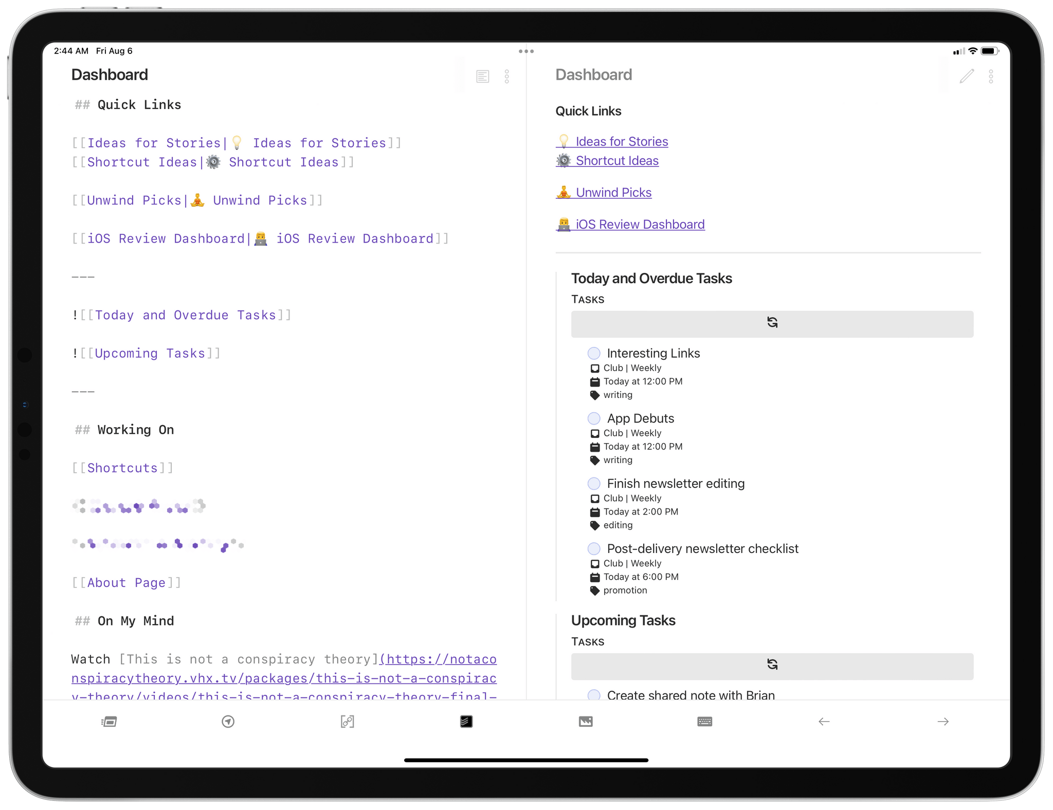
At a high level, my Dashboard note is split into two distinct areas: at the top, there’s a variety of sections that preview or link to different things in Obsidian; at the bottom, there’s a more creation-focused area that lets me save quick notes.
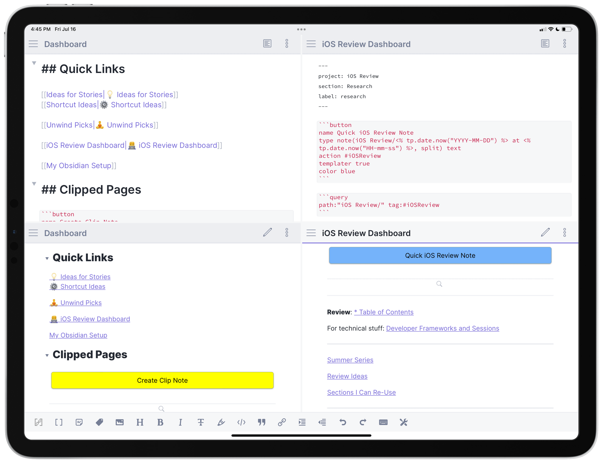
Let’s start from the top. The first item is a section called ‘Quick Links’, which I filled with internal links to notes I find myself frequently opening in Obsidian. For instance, in this section I can find links to reopen my ‘Ideas for Stories’ or ‘Unwind Picks’ note; rather than manually searching for those notes, I can tap the links at the top of my dashboard, which in this case serves as a table of contents for my professional life.
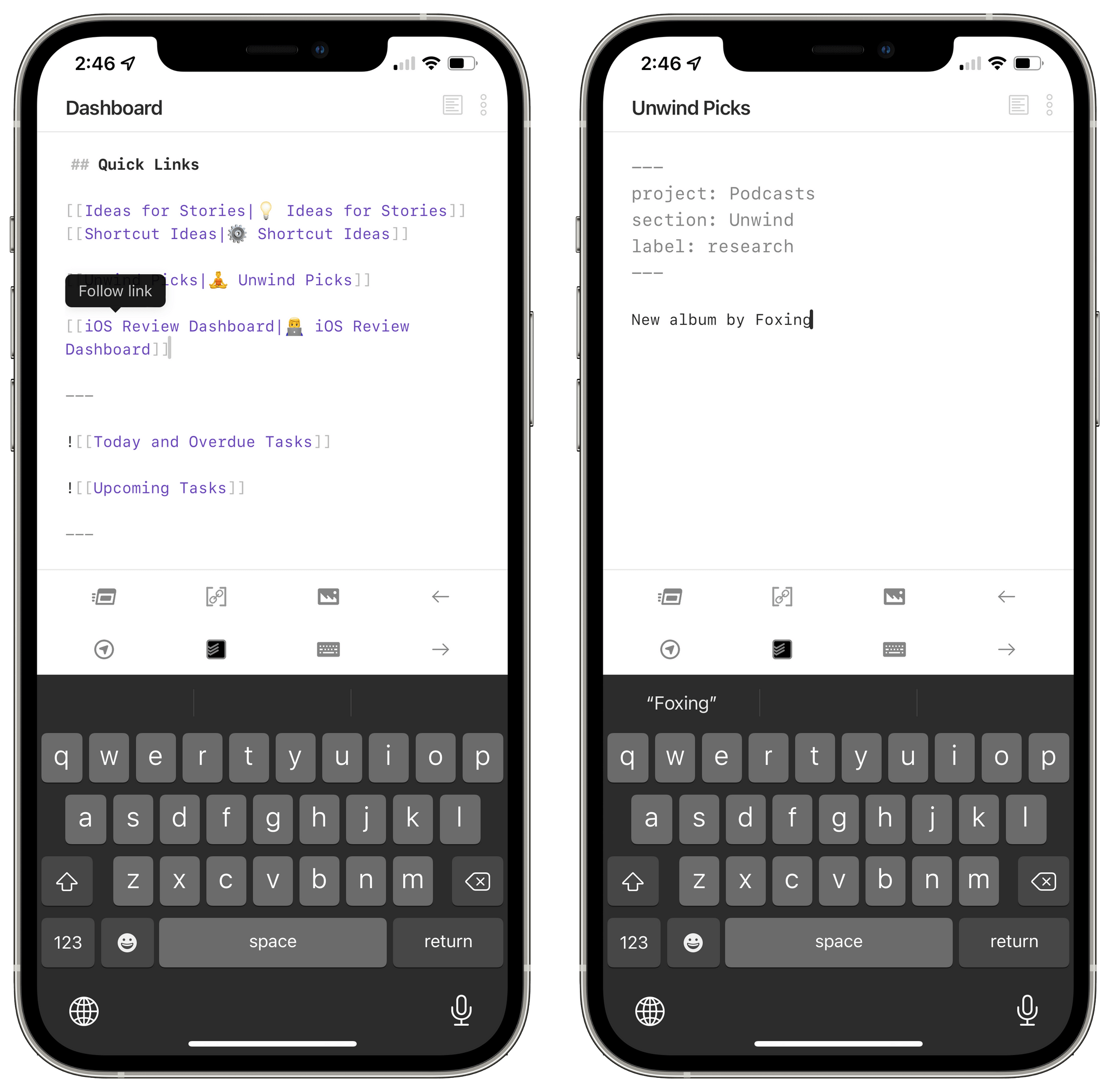
Quick Links at the top of my dashboard.
You’ll notice that those internal links have emoji associated with them. The actual note titles don’t have emoji; what I leveraged here is the ability to assign ‘alt text’ to links in Obsidian by separating the linked item’s title and alternative title with a pipe (‘|’) character. This way, when I open the dashboard in preview mode, those links are prettier.
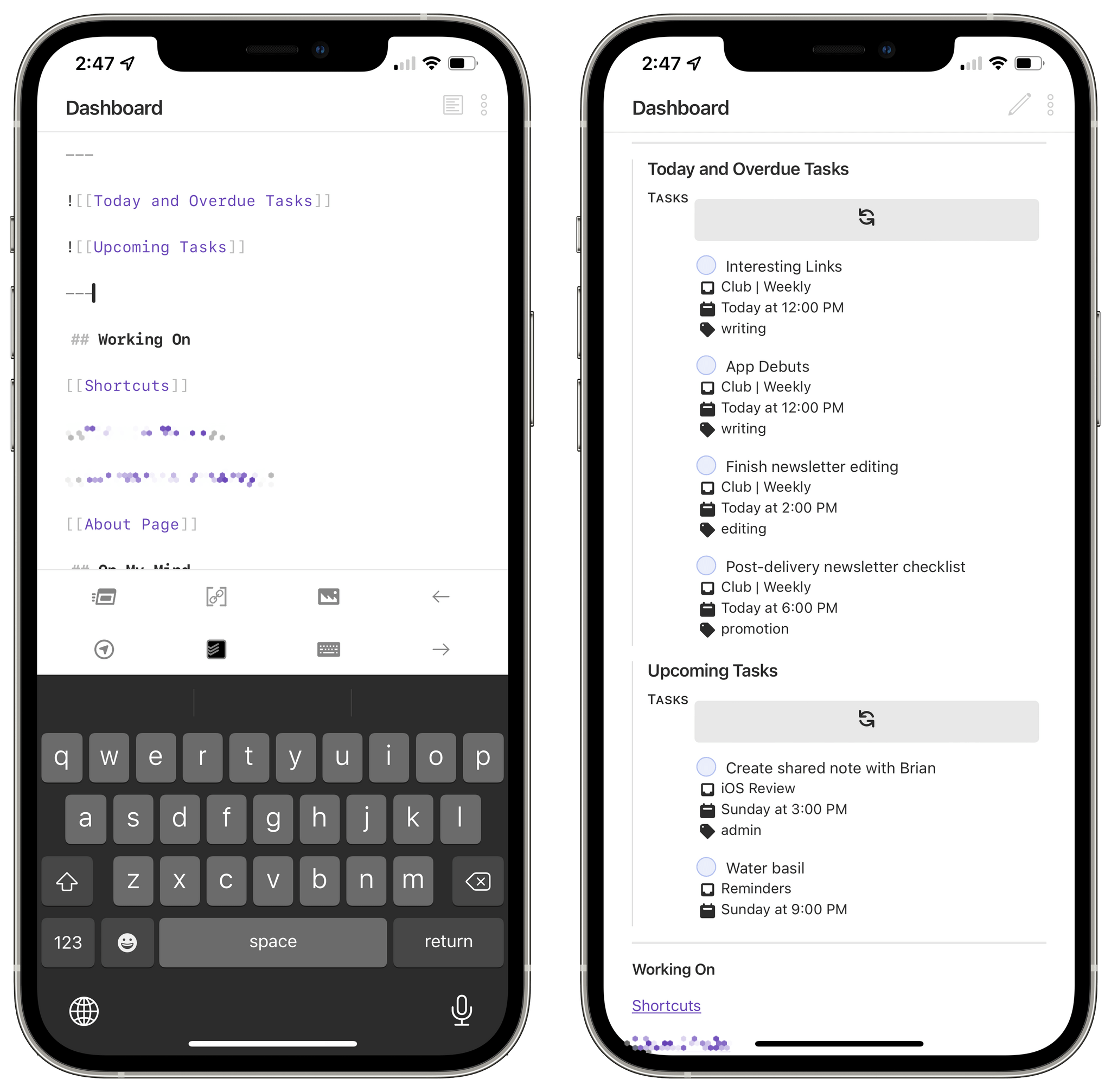
The second item in the upper section of my Dashboard note is a visualization of my tasks from Todoist. In edit mode, it looks like I have two embedded notes based on internal links; when I hit the preview button, those notes turn into interactive Todoist widgets that show me the tasks I want to see based on Todoist’s native filters:
Todoist embeds in Obsidian.
This amazing Todoist embed functionality is based on the Obsidian x Todoist plugin created by Jamie Brynes. The idea is genius: after providing your Todoist API token in the plugin’s settings, you can drop a special code block in a note and edit it to display a subset of tasks from your Todoist account inside Obsidian’s preview mode. As detailed in the plugin’s documentation, there is a syntax you can use to configure these code blocks; the most important part, however, is that you can use any valid Todoist filter to display specific tasks.
This plugin opens up some incredible opportunities to bring your task manager into your note-taking app and create a direct link between the two of them. What’s even more remarkable about this plugin is the fact that checkboxes for tasks are clickable: you can check things off from Obsidian as you get work done, and changes will be instantly reflected in Todoist. (This is also the advantage of web apps with open APIs, but I digress.) Furthermore, you can choose to display task metadata such as dates and projects, and you can set an auto-refresh time to automatically reload these widgets while in preview mode.
Here’s what I’ve done for my dashboard: I’ve created two blocks to display tasks due today or overdue, as well as tasks due over the next three days. In both cases, these code blocks are based on a Todoist filter that excludes a specific project from view.
Here’s the filter that shows tasks due today or overdue except those from my Calliope project:
{
"name": "Tasks",
"filter": "(today | overdue) & !#Calliope",
"sorting": ["date"]
}
And here’s the one that shows me upcoming tasks for the next three days, excluding today and the Calliope project:
{
"name": "My Tasks",
"filter": "3 days & !#Calliope & !today",
"sorting": ["date"]
}
I could have dropped these code snippets directly into the Dashboard note, but it would have looked ugly. So instead I pasted the code into separate notes and embedded both in the dashboard with Obsidian’s ![[embed syntax]]. This way, the note stays compact but I retain the plugin’s functionality.
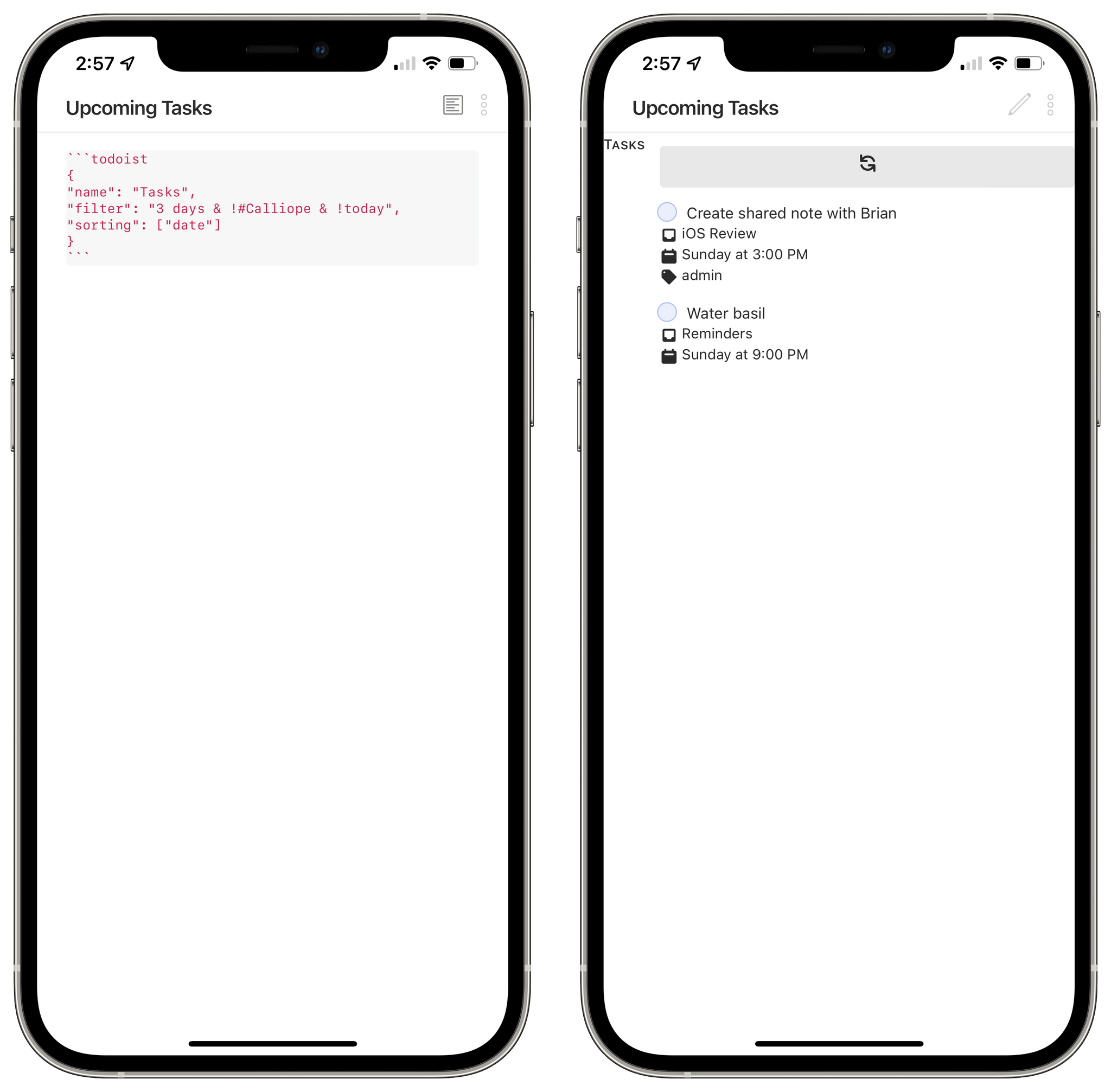
Special code blocks turn into Todoist embeds.
If you’re a desktop user, you can go ahead and install the plugin in Obsidian from the list of community plugins in the app. If you’re an iPhone and iPad user though, the plugin will give you an error and tell you it’s not compatible with Obsidian’s mobile app yet.
To fix this, I’ve teamed up with Finn Voorhees, who forked the plugin and released a version that can be manually installed on iPhone and iPad. You can find Finn’s version of Todoist x Obsidian here. In addition to enabling mobile compatibility, this version also includes some stylistic updates to Todoist’s embedded widgets to make them prettier.
Now you may be wondering: how do you manually install plugins as folders on iOS and iPadOS? Manual installation of plugin files in Obsidian requires opening a hidden folder and, unfortunately, hidden folders cannot be enabled in the Files app.
Well, fear not, because I created a solution to this as well. As I discovered a while back, it is possible to save files into hidden folders on iOS by leveraging the folder bookmarks feature of Toolbox Pro. First, create a folder bookmark in Toolbox Pro by picking the root folder of your Obsidian vault. For me, that’s the ‘My Notes’ folder stored in On My iPad ⇾ Obsidian. Then, download the plugin from GitHub, uncompress it, and save the folder named ‘obsidian-todoist-plugin’ somewhere in Files. Last, install my shortcut to manually save plugins on iOS.
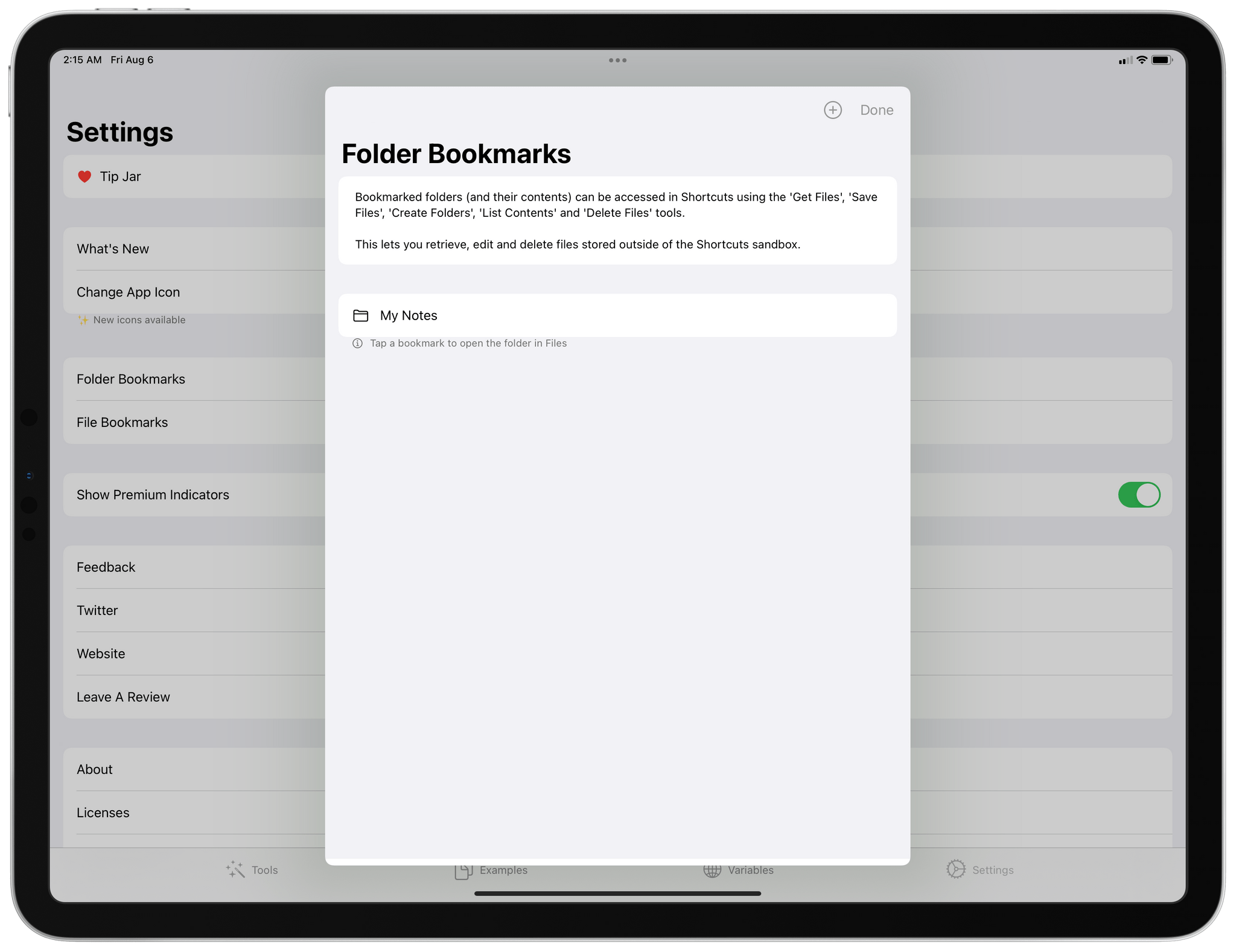
Create a folder bookmark for your Obsidian vault in Toolbox Pro.
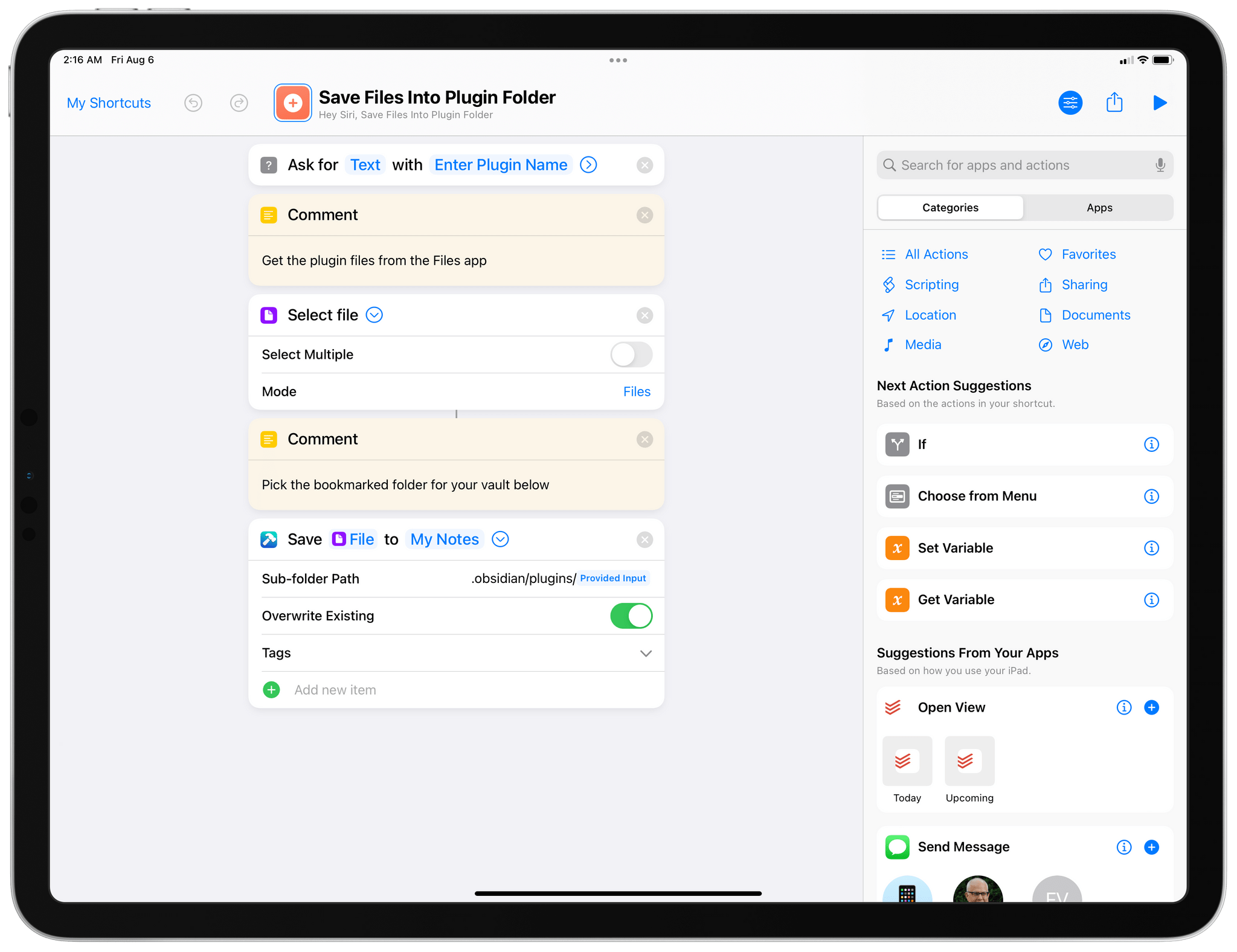
My shortcut to save plugin files manually.
Before running the shortcut, copy the name of the plugin’s folder to your clipboard. This way, the shortcut will auto-fill the plugin’s name in its first input prompt, so you can just continue by picking, one by one, the plugin files you want to install in the newly created folder. Repeat this process for all the files contained in the plugin folder, then switch to Obsidian, reload Community Plugins, enable the Todoist plugin, and you’re done.
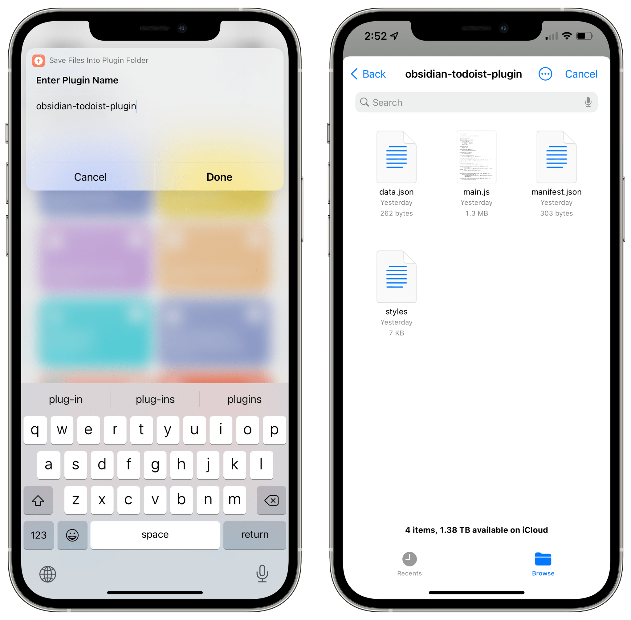
Running the shortcut to save plugin files.
At this point, you can visit the plugin’s settings page in Obsidian to configure your Todoist credentials, then head over to the plugin’s documentation to learn about the code blocks you can drop in Obsidian. Hopefully, the plugin’s original developer will release an official update for mobile compatibility soon; in the meantime, you can use Finn’s version.
The best part about this plugin is, unsurprisingly, its customization options. Because it’s entirely based on Todoist’s filters, I can choose to create embeds that focus on specific projects I’m prioritizing at the moment or, conversely, hide others I don’t want to see. This functionality is perfect for my Dashboard note, and I appreciate the closed loop this plugin creates between Obsidian and Todoist.
Things are quite different in the second half of the note, which features separate sections titled ‘Working On’ and ‘On My Mind’. The names are fairly self-explanatory: the Working On section contains links to notes or articles I’m actively working on at the moment; the On My Mind section has ideas and links that are, well, currently on my mind at, at least for me, unfit for a task manager at this stage. What isn’t obvious is how I’ve been able to remove friction from appending text to these sections in a way that was never possible for me in other text editors or note-taking apps.
This is where we have to talk about QuickAdd, an incredible third-party plugin for Obsidian developed by Christian Bager Bach Houmann. QuickAdd is packed with features – including some esoteric ones such as JavaScript and calling the Obsidian API I haven’t played with – but it’s best to think about it this way: it’s the ultimate plugin to add text to existing notes, create new notes based on templates, or run macros inside Obsidian to execute multiple commands in a row via a single hotkey or command.
It’s easy to go deep down the QuickAdd rabbit hole if you don’t know where to start or if you spend too much time looking at those fascinating, complex setups shared in the Obsidian Discord community. So I’m going to give you a very practical rundown of how I use QuickAdd as a complement to my dashboard setup, which you can hopefully reuse for your Obsidian workflow.
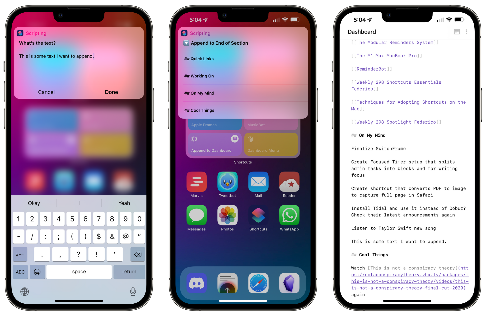
The first thing I wanted to create was a command that instantly appends a link to the document I’m working on to the ‘Working On’ section of my Dashboard note. For example, if I’m working on the Shortcuts chapter of my iOS 15 review, I want to be able to capture a link to that document for future reference. QuickAdd is the only plugin I’ve found that has this knowledge of appending text to the bottom of a specific section of another note. This is a very specific functionality that I’m sure other writers or serious note-takers like me will appreciate.
Here’s how you can put this together: in QuickAdd’s settings, create a ‘choice’ with a unique name and select the ‘capture’ type from the menu. Add the ‘choice,’ then click the cog icon to configure it.
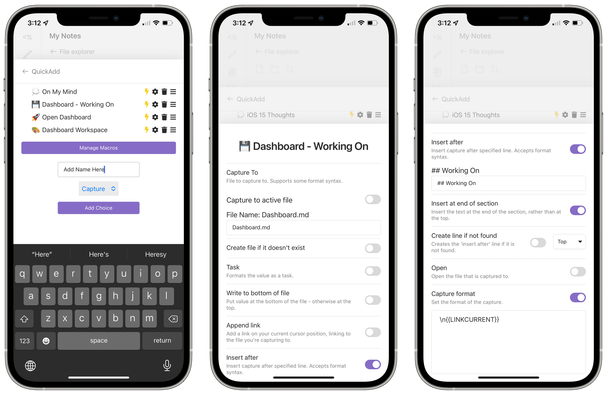
How to create a command to save what I’m working on.
In the choice’s configuration menu, you’ll have to modify these fields if you want to grab the link of the current document and append it to a section of another note:
LINKCURRENT, which is the variable to generate a link to the note you’re currently focusing on.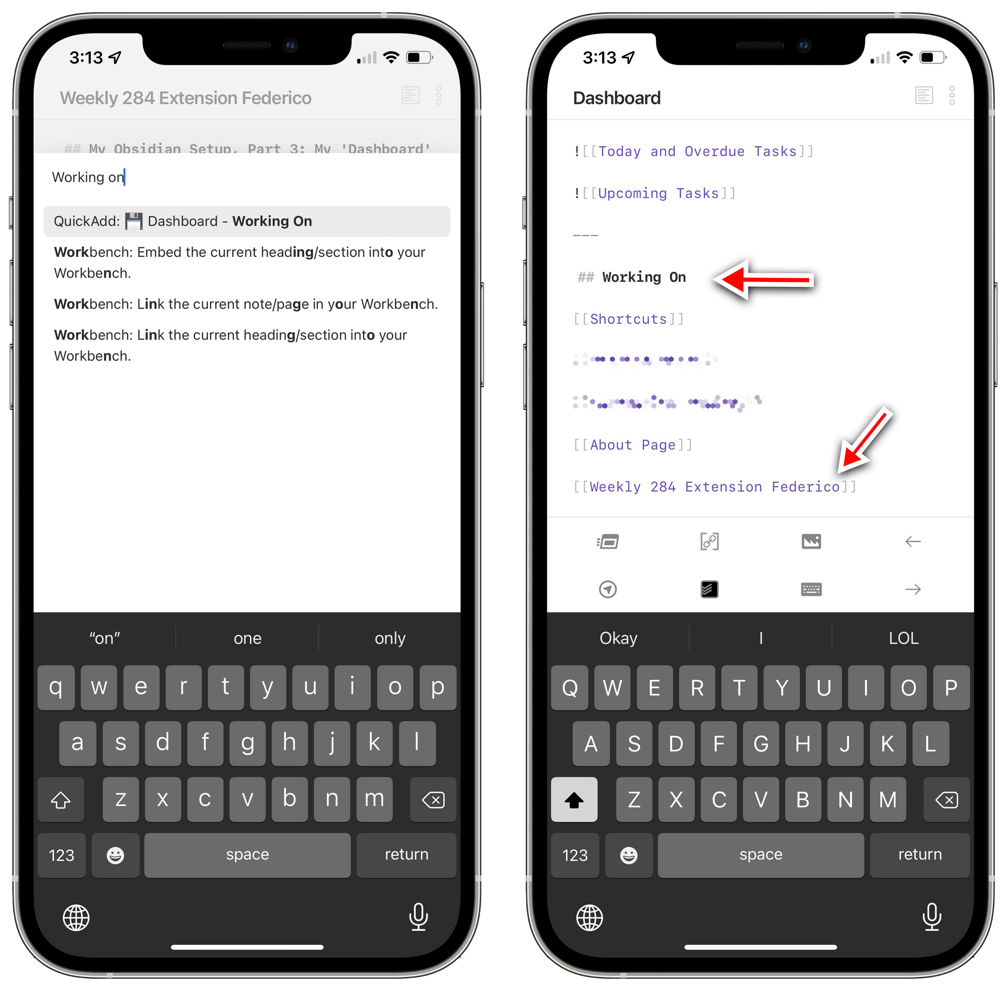
How links to other notes get appended to the dashboard.
With this command setup, all I have to do when I’m working on a document I want to save in my Dashboard is hit ⌘P to show the command palette, type ‘Working’ to find the command, and run it so that a link to the note is appended to the dashboard immediately. Better yet, I can assign a hotkey to this command so I don’t even have to search for it.
I love this command since it provides me with a one-click solution to the problem of remembering all the things I’m working on and seeing them in one place. But as I kept looking into QuickAdd, I realized I could take the same append-to-section-of-a-note approach a step further with manual text input at runtime.
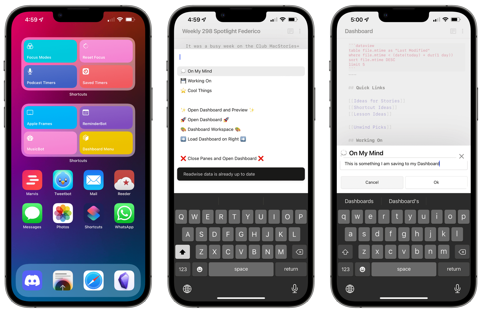
QuickAdd’s syntaxsupports a VALUE placeholder that, when a command runs, shows a native input prompt in Obsidian to type some text. I think you can see where this is going. I created another capture ‘choice’ in QuickAdd and replicated the same settings of the one above, but I swapped the section for ‘## On My Mind’ and used the ‘value’ placeholder instead. Now when I run the ‘On My Mind’ command, an input prompt comes up, I can type some text for an idea I have, and it gets saved immediately to the bottom of the ‘On My Mind’ section of the Dashboard note.
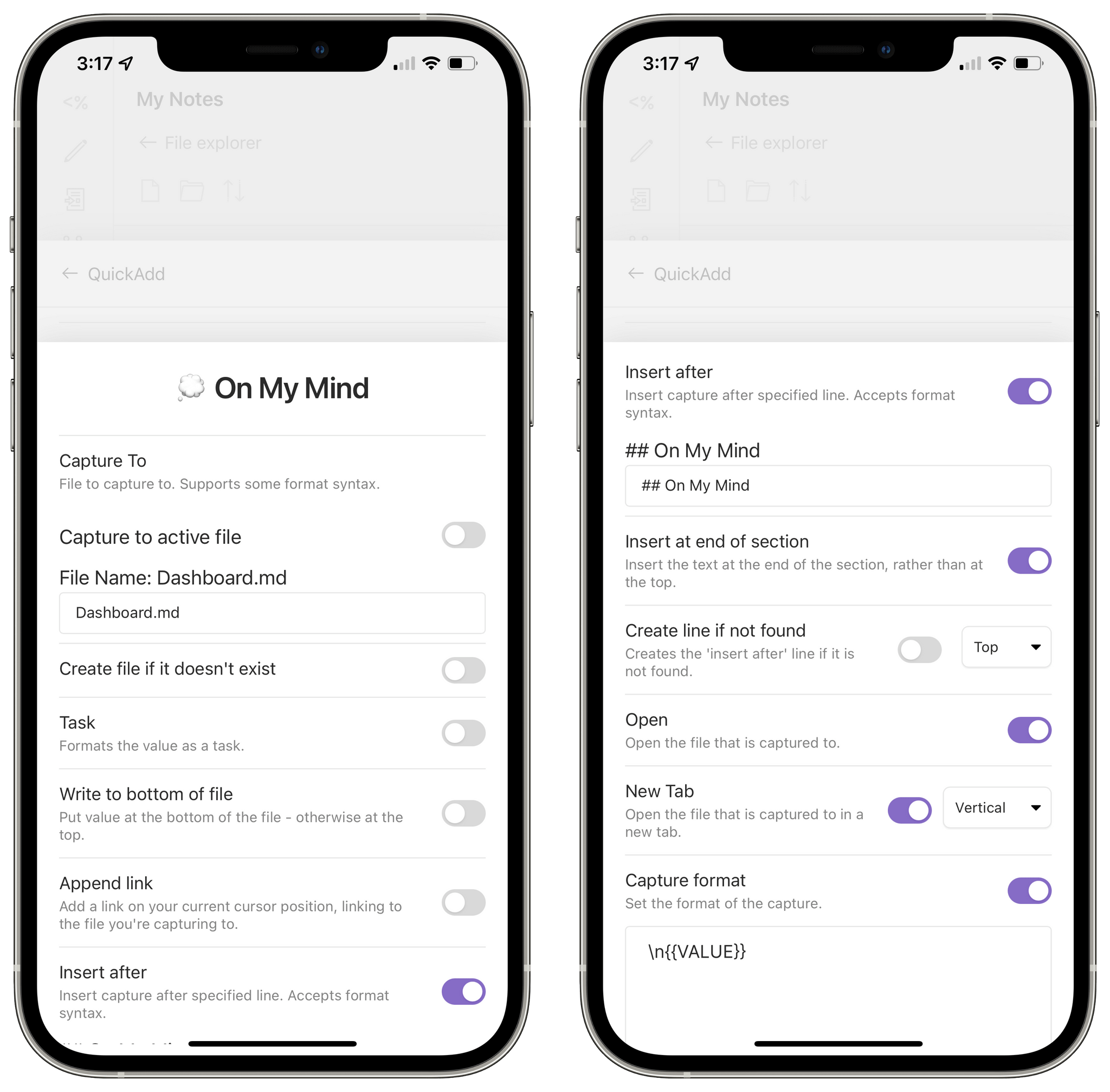
Configuring the On My Mind command.
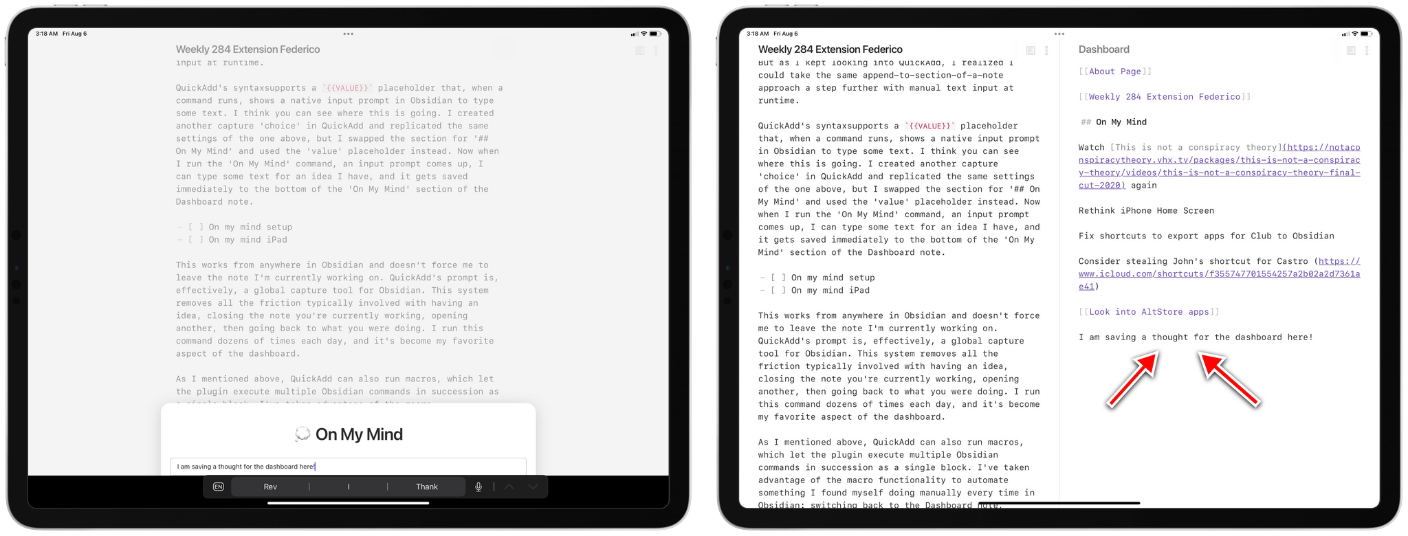
Capturing thoughts in Obsidian.
This works from anywhere in Obsidian and doesn’t force me to leave the note I’m currently working on. QuickAdd’s prompt is, effectively, a global capture tool for Obsidian. This system removes all the friction typically involved with having an idea, closing the note you’re currently working, opening another, then going back to what you were doing. I run this command dozens of times each day, and it’s become my favorite aspect of the dashboard.
As I mentioned above, QuickAdd can also run macros, which let the plugin execute multiple Obsidian commands in succession as a single block. I’ve taken advantage of the macro functionality to automate something I found myself doing manually every time in Obsidian: switching back to the Dashboard note, splitting the UI vertically to open a second pane on the right, and toggling preview mode on that pane. The end result is the workspace at the top of this story.
This is another great thing about Obsidian: I could load this workspace via the Workspaces plugin, but I’ve also figured out how to open it as a macro, with additional control, using QuickAdd. Obsidian gives me the option to choose the solution that works best for me rather than forcing an “opinionated” design upon me that cannot be customized to fit my needs.
To create a QuickAdd macro, open QuickAdd’s settings, then hit ‘Manage Macros’ and create a new one. Press ‘Configure’ next to the newly created macro and you can start setting it up. In my case, all I needed to do was chain all the necessary commands together in a string of actions executed from top to bottom, kind of like Shortcuts. Here are the commands I used to create a Dashboard workspace with two panes using QuickAdd:
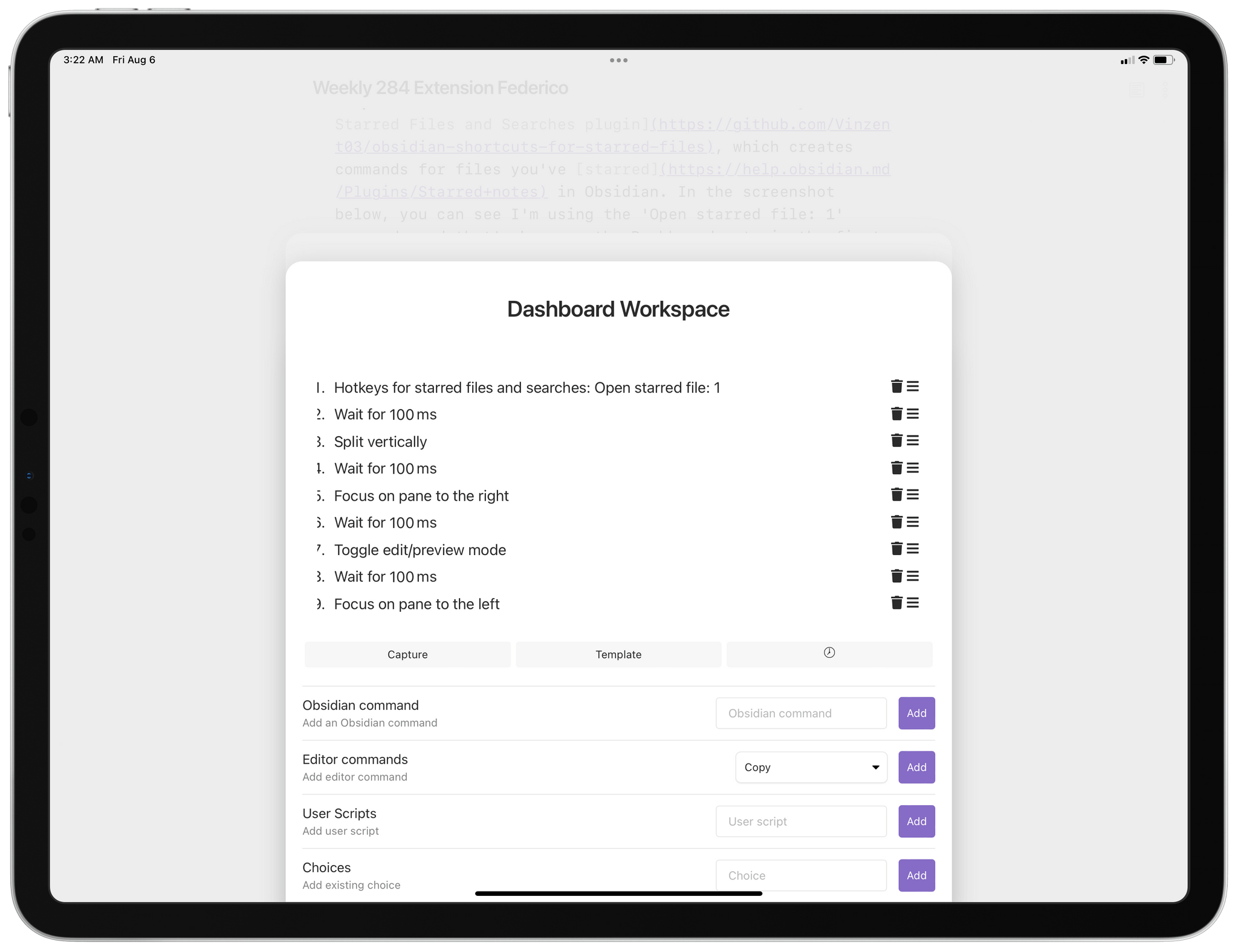
Recreating my Dashboard workspace with a macro.
Similarly, I also created another version of this macro that only loads the Dashboard note on the right side, leaving the document I’m currently working on in the left pane. Here’s what the macro looks like:
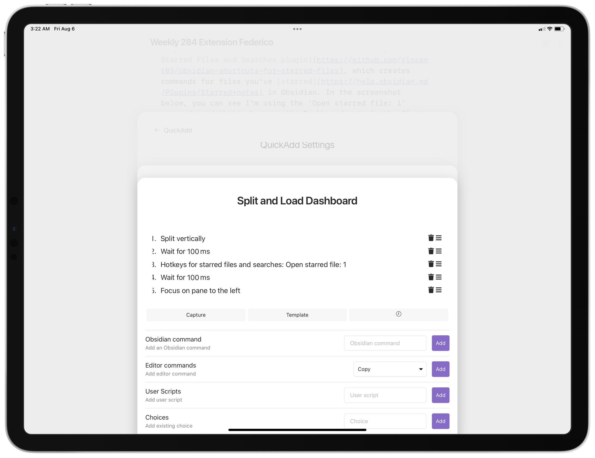
My macro to split the UI and open the Dashboard note on the right.
One important note about chaining actions in QuickAdd macros: make sure to always put ‘Wait’ actions in between steps, otherwise QuickAdd won’t be able to execute them all fast enough. You can add these actions by tapping the clock icon in the macro editing UI.
Thanks to QuickAdd, I’ve been able to put together commands that speed up the act of capturing links to notes I’m working on, saving ideas, and opening my dashboard. All of these commands can be triggered individually with hotkeys or via the command palette, but for my convenience, I also grouped them together in a menu in QuickAdd. I did this by adding a ‘Multi’ choice in QuickAdd and dragging each command under it until they were all contained in the menu.
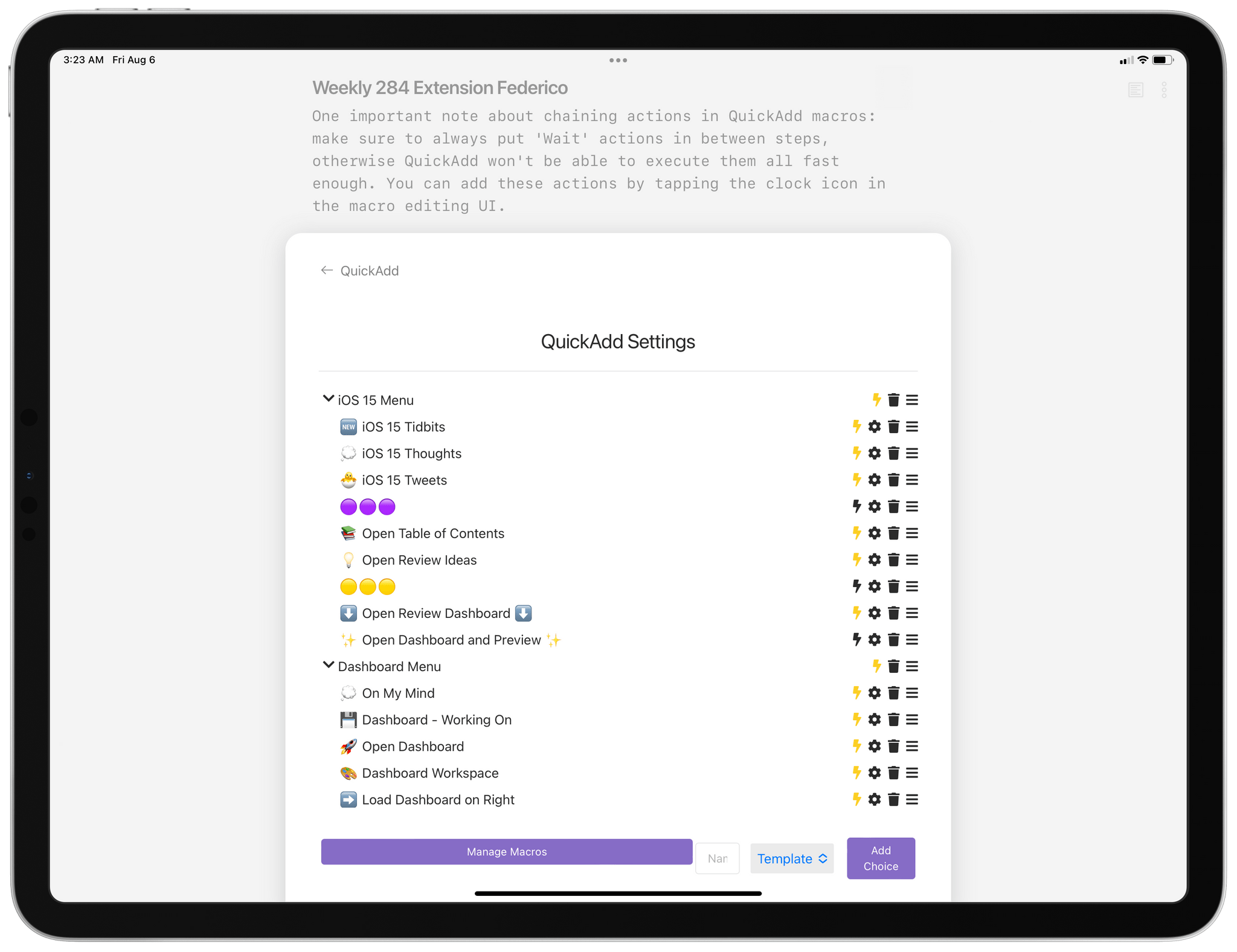
Menus in QuickAdd.
Now, when I hit ⌘P, type ‘dash,’ and press Enter, this is what I see:
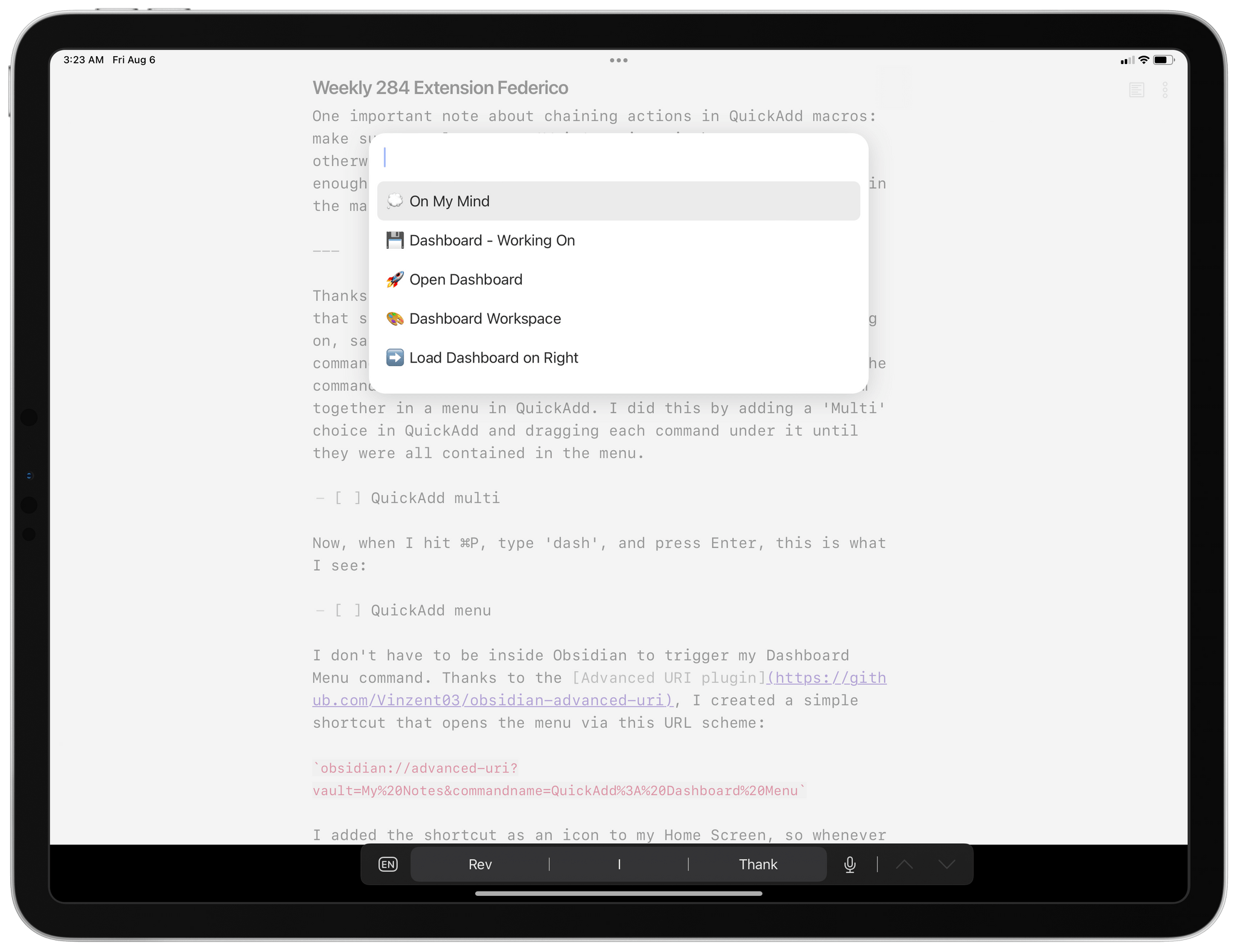
My Dashboard Menu in QuickAdd.
I don’t have to be inside Obsidian to trigger my Dashboard Menu command. Thanks to the Advanced URI plugin, I created a simple shortcut that opens the menu via this URL scheme:
obsidian://advanced-uri?vault=My%20Notes&commandname=QuickAdd%3A%20Dashboard%20Menu
I added the shortcut as an icon to my Home Screen, so whenever I want to open my Dashboard workspace or save a thought, I can press the icon to launch Obsidian and run the command.
Speaking of Obsidian and Advanced URI, I also created another shortcut that opens my dashboard in different modes whether the shortcut is running on iPad or iPhone. This is a direct launcher that goes straight to the Dashboard note without showing a QuickAdd menu in the middle, and it’s one of the icons in my iPhone dock since I use it a lot.
When the shortcut runs on iPhone, I likely don’t want to split the UI in Obsidian in multiple panes due to the smaller screen, so the shortcut simply opens the note in full-screen; if the shortcut is being executed on iPad, however, it loads my Dashboard Preview workspace, which has two panes open side-by-side. You can see how this platform-based shortcut can be created in the screenshot below:
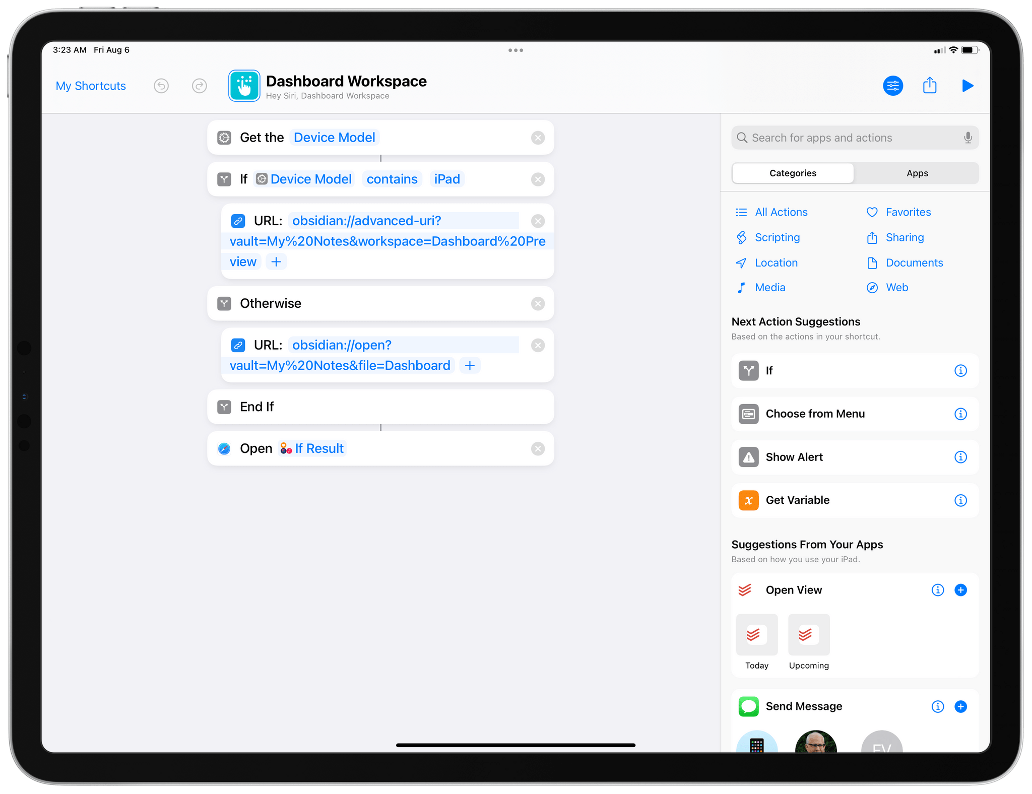
My shortcut to reopen the Dashboard workspace.
It’s not an exaggeration to say that my Dashboard setup has tangibly improved my life over the past few months. I forget fewer things, have a better sense of all the different things I’m working on (and, believe me, they are many), and I can more easily keep up with all my hobbies because saving ideas and links with QuickAdd’s prompts is a breeze. Obsidian’s native linking capabilities lend themselves well to this kind of workflow where I can reference documents I’m working on, turn text from the dashboard into standalone notes (thanks to Note Refactor), and jump to frequently-used notes.
For me, the Dashboard is where all work starts now, and Obsidian is the only app that gives me the tools to make all this happen.
This column is a sort of sequel to my Monthly Log story last week about why you should delete more of your notes and not feel bad about not having a ‘system’ for taking them. I love an efficient system no matter what the workflow is, which is why I tweak mine a lot. Once you have a good system in place, though, the trick is to not go overboard.
I’ve framed today’s topic in terms of automation, but it holds true for any system really. Automation just happens to be on my mind because I’ve been taking the time to reassess a lot of the ways I work and the automations I use. Some of the ways I’ve been automating tasks are outdated, and I’m working on new projects that could benefit from changing how I work. To that end, I’ve been experimenting with Obsidian plugins, creating new shortcuts, and setting up a Loupedeck Live, a device I’ll be reviewing soon.
The process of thinking through my workflows has been rewarding. It’s not something I’d suggest doing often, but as the work you do and the apps you use evolve, understanding how and why you do things the way you do can be enlightening. I can’t say that any one insight I’ve had rethinking my workflows has led to monumental productivity gains, but together, several smaller things have made my latest efforts worthwhile.
My workflow reevaluation reminded me of a couple of areas that would be trivial to automate that I don’t. It’s not that I haven’t taken the time to automate these tasks. No, the decision was very intentional, and I suspect it will surprise some of you.
I don’t automate responses to email. If someone sends me a message, I’d rather not respond to it until I have the time than to send a canned response. I can always tell when I get a canned response, masquerading as a personal message, and I don’t want to be that guy. If someone’s message is worth responding to, the response should be tailored to the context of the message and not feel like an FAQ.
That’s why I don’t use a dedicated text expansion app on any platform. I’m a fast typist, so I feel like the time I’d save isn’t worth the cost. That’s not to say I don’t use text templates, but those are a little different. I have checklists of materials I’ll need from advertisers, for example. However, when I send those, it’s always with a note that explains that I’m pasting a checklist at the bottom of the message for reference. The main body of the message is often similar for similar situations, but it’s always unique because I feel like it’s the least I can do when someone gets in touch.
Because I get a lot of email, the system has its limits. It means I don’t respond to everyone, which I’m sure disappoints some people. However, I’d rather connect with as many people as I can and disappoint a few than send robo-responses.
Instead of using text expansion, I rely on a growing list of templates like the checklists I mentioned, which are simple text files for collecting and organizing information for things like the show notes for an AppStories episode or ensuring format and content consistency among posts that appear regularly on MacStories. Obsidian is excellent for this, but before I used it, I copied one week’s template to the next week in iA Writer.
The other thing I’ve never automated is publishing articles or podcast episodes. It’s easy to schedule articles and episodes for publication. The functionality is built right into WordPress. The value of doing it manually, though, is having one last chance to catch a typo or other error and being somewhere where even if I don’t catch a problem, I can correct it quickly.
Despite my best efforts, I make mistakes in articles I publish. I’ve gotten better over time, but some errors are inevitable. Fortunately, it’s simple to edit a published post, assuming you’re aware of the problem. If I’ve just published an article with a typo manually, I’ll hear from someone on Twitter within a matter of minutes. Being in front of whatever device I used to publish the story means I can fix it quickly before many people ever see it.
Whenever I see an error on someone’s homepage that’s been there for hours, I wonder if it was a scheduled post. Whether it is or isn’t, I don’t want to ever be in the position of not knowing about an issue or being unable to correct it quickly.
The point of both of these examples isn’t to suggest that no one should automate these things. Different people have different priorities. However, I do think it pays to think before you automate. Just because something can be automated doesn’t mean it should be even if it’s easy to do so. Putting in a little time and effort into thinking about why something should or shouldn’t be automated is the difference between a nifty demo and a meaningful change in the way you get things done, which is what productivity should be all about after all.
In the last installment of My Obsidian Setup series from August, I described my Dashboard note that served as a centralized hub for saving ideas and quick links, navigating to different projects, and embedding Todoist tasks. That article predated the launch of Club MacStories+ and my annual iOS review; I was in the middle of finalizing both, so I was clearly prioritizing those massive, one-off projects over regular, day-to-day writing and note-taking tasks. Now that both have launched (successfully, thanks to all of you), I’ve adjusted to a “normal” usage of Obsidian again that doesn’t involve huge projects with a looming deadline that consume and take over my life.
In this week’s installment of the series, I’ll be taking a look at how I manage templates for MacStories Weekly posts in Obsidian and explain my approach to the mobile toolbar with pinned commands on iPhone and iPad. Let’s dive in.
As Club MacStories members know, our MacStories Weekly newsletter is comprised of regular sections we produce as a team on a weekly basis such as App Debuts, Interesting Links, Spotlight, and more. Both John and I work on our assigned parts of these sections in our own text editors and save drafts to a private GitHub repository where they are named with the upcoming issue of MacStories Weekly, the title of the section, and the author name. For instance, my App Debuts portion of this week’s newsletter was saved as a file called ‘Weekly 295 App Debuts Federico.md’ in GitHub. Each week, we merge every section into Calliope, assemble the newsletter version in Mailchimp, and publish everything. At the end of the process, these files are moved into an ‘Archive’ sub-folder of the repo and the process starts anew on Monday.
We’ve been doing this for six years now, and I recently realized that I can speed up my end of the process thanks to Obsidian by taking advantage of the amazing QuickAdd plugin (which I covered in August) and its support for templates based on the Templater engine. Specifically, I figured I could create templates that have pre-filled boilerplate for some sections, a consistent naming structure (to avoid typos), and a default destination folder in my Obsidian vault.
It was the most recent addition to MacStories Weekly, the new Spotlight section, that pushed me down this path of investigating templates. The section contains some default text at the beginning and end of the post, and I wanted to make sure I could easily generate a new one each week without forgetting to include the intro text and footer or, worse, having typos in them. This was very easy to build with QuickAdd, and if you also find yourself constantly generating similar documents on a regular basis, it’s a strategy you can apply to your Obsidian workflow as well.
First, I created a document called ‘Spotlight Template.md’ and saved it into a ‘Templates’ folder in my Obsidian vault. The template document is, essentially, a shell version of MacStories Weekly’s Spotlight section with an introduction and footer already filled in.
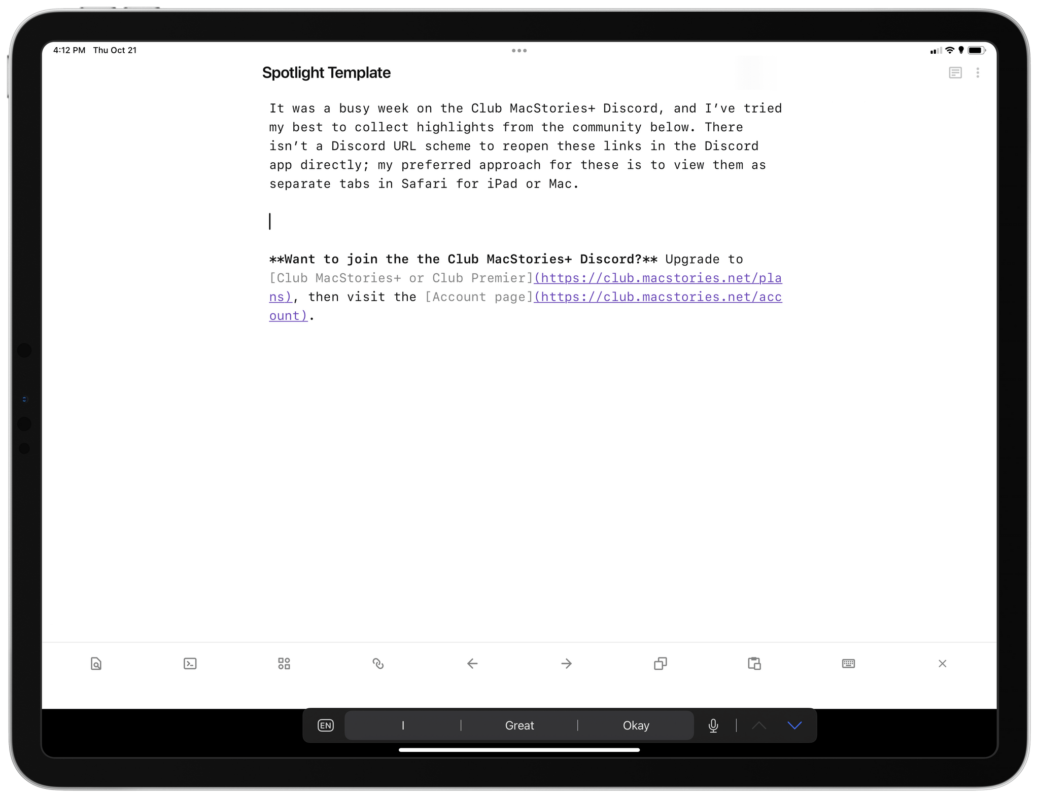
My template document for the Spotlight section.
Then, I opened QuickAdd’s settings, pressed ‘Manage Macros’, created a new macro called ‘Create Spotlight Template’, and hit the ‘Configure’ button next to it. From the macro management screen, I chose the ‘Template’ option, which added a template action to the macro.
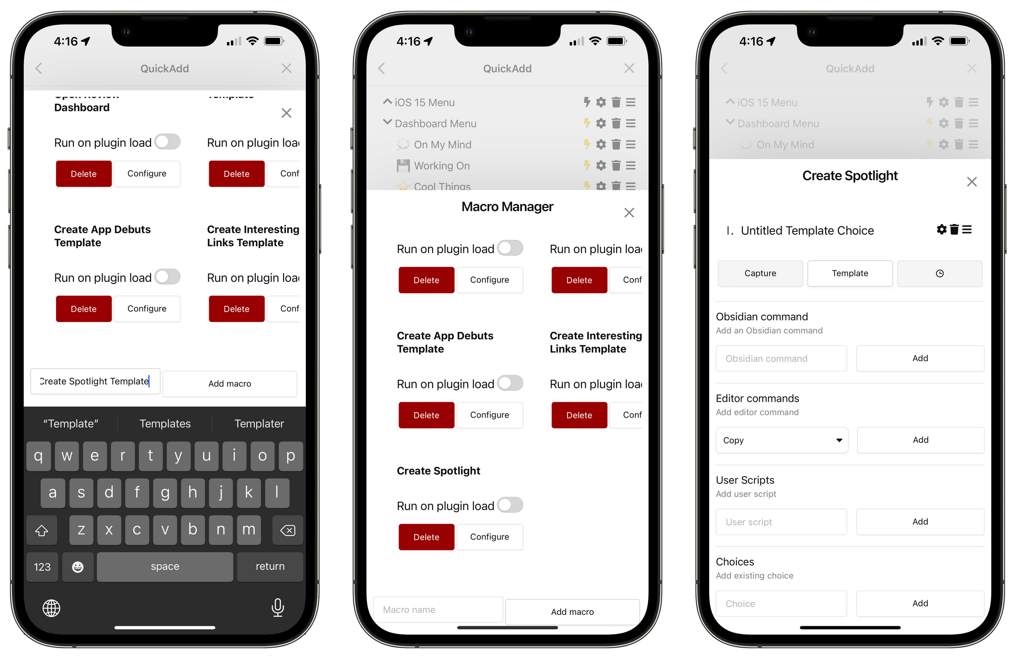
Creating a new macro for a template in QuickAdd’s settings.
At this point, I had a new macro in QuickAdd based on a template action, which is what I needed, but I had to configure the template too. So I tapped the gear icon next to ‘Untitled Template Choice’ and I was taken into a secondary template configuration page for the macro, which is where the magic happens. If you want to configure macros that create notes based on templates in Obsidian, you’ll have to follow the steps listed below, so be careful now.
The first field that needs to be tweaked is the ‘Template Path’ one. This field tells QuickAdd where to find the template file that will be used to create a new note, and it needs to be an absolute file path that points to the document I mentioned above. In my case, I inserted ‘Templates/Spotlight Template.md’ without a leading forward slash (I don’t know why, but QuickAdd doesn’t like those).
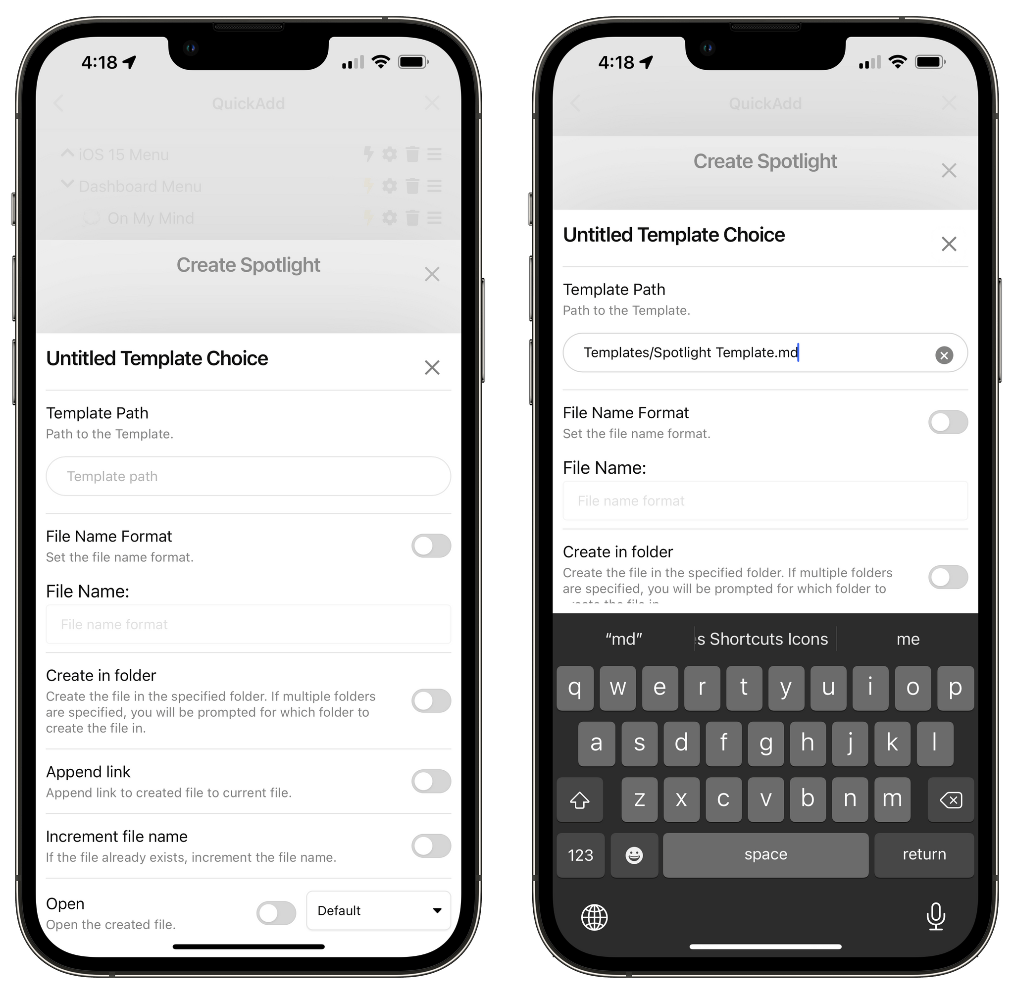
Configuring the template path for the macro.
With the template set, I then needed to ensure QuickAdd would name the document with a fixed structure except for the issue number of MacStories Weekly. That was the tricky part to figure out: I can name a document ‘Weekly Spotlight Federico’ just fine, but how can Obsidian know that the next issue of MacStories Weekly is, say, ‘295’?
The beauty of QuickAdd and its macro system is that you can freely mix and match static content and user interaction within the same text field. Put simply: QuickAdd lets you define values that are filled in with manual user input when the macro runs. Think of this ability as the QuickAdd equivalent of Shortcuts’ ‘Ask When Run’ variable: when the macro executes, you can put in a special variable that is only “resolved” by typing something in yourself at runtime.
If you remember, I also covered this back in August when I explained how QuickAdd allowed me to quickly append text to my Dashboard note by bringing up a text input field. Well, the same system can be used to define a portion of the name of a new document that is created from a template. In my case, I included a VALUE variable in between the words ‘Weekly’ and ‘Spotlight’ in the File Name Format text field. When the macro runs and hits this step, it sees the variable, knows that it needs to resolve it with my manual input, and displays an input field where I can manually type in the issue number of the next MacStories Weekly.
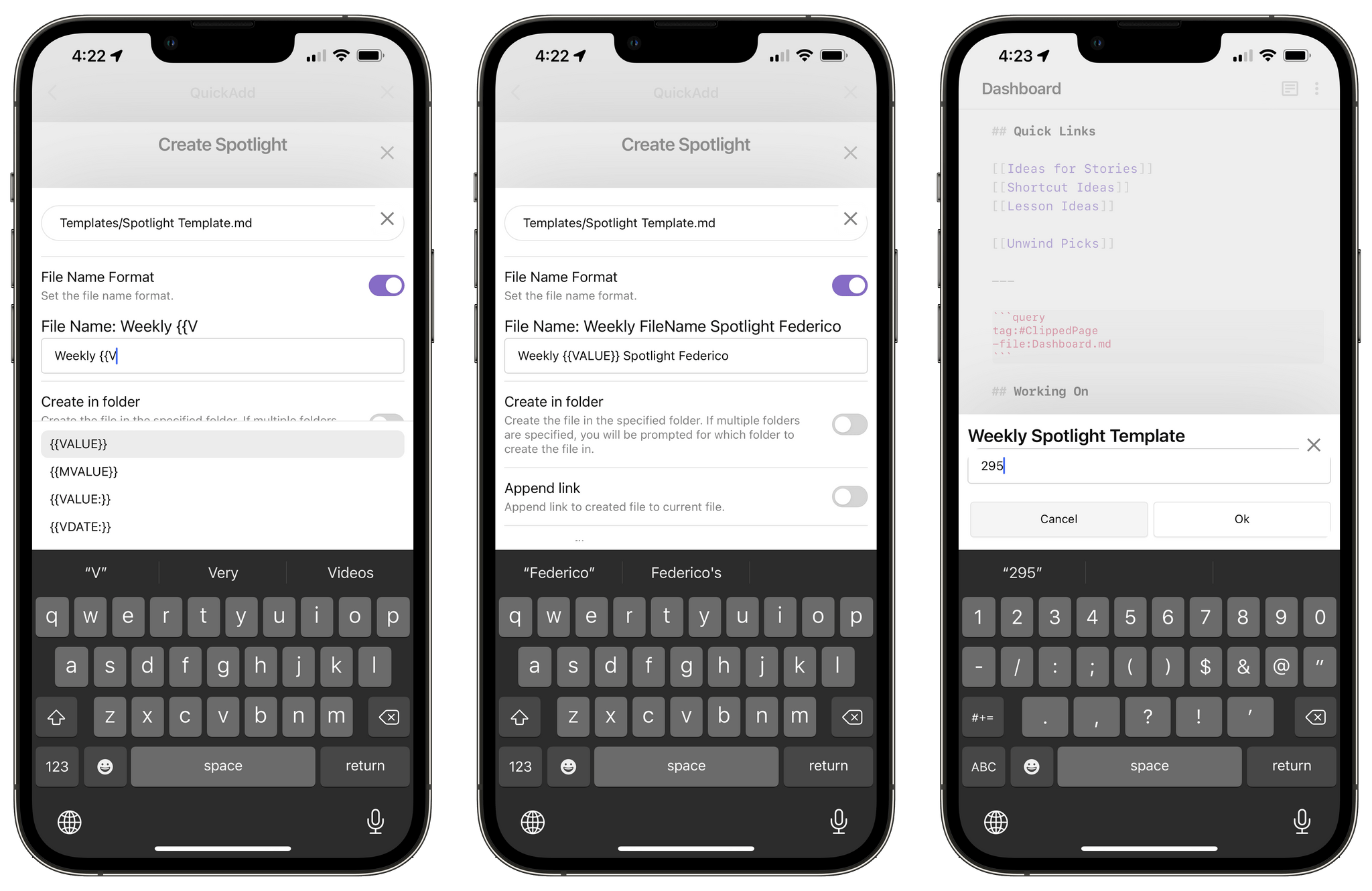
You can display text input fields when a macro runs thanks to QuickAdd.
If you’re interested in exploring QuickAdd variables, you can read the official documentation here. There’s a lot you could potentially do with dates, linking current documents (which I also covered in Part 3), or even writing LaTeX formulas. I plan to cover other implementations of this format syntax in the future.
But back to my template. The next aspect I wanted to control was the destination folder for the new document. So I enabled the ‘Create in folder’ toggle, typed in the path of the specific sub-folder I wanted (in this case, without leading and trailing forward slashes), and hit the ‘Add’ button. This way, when the macro runs, the document is automatically saved inside ‘Articles/Club Posts’ in my vault.
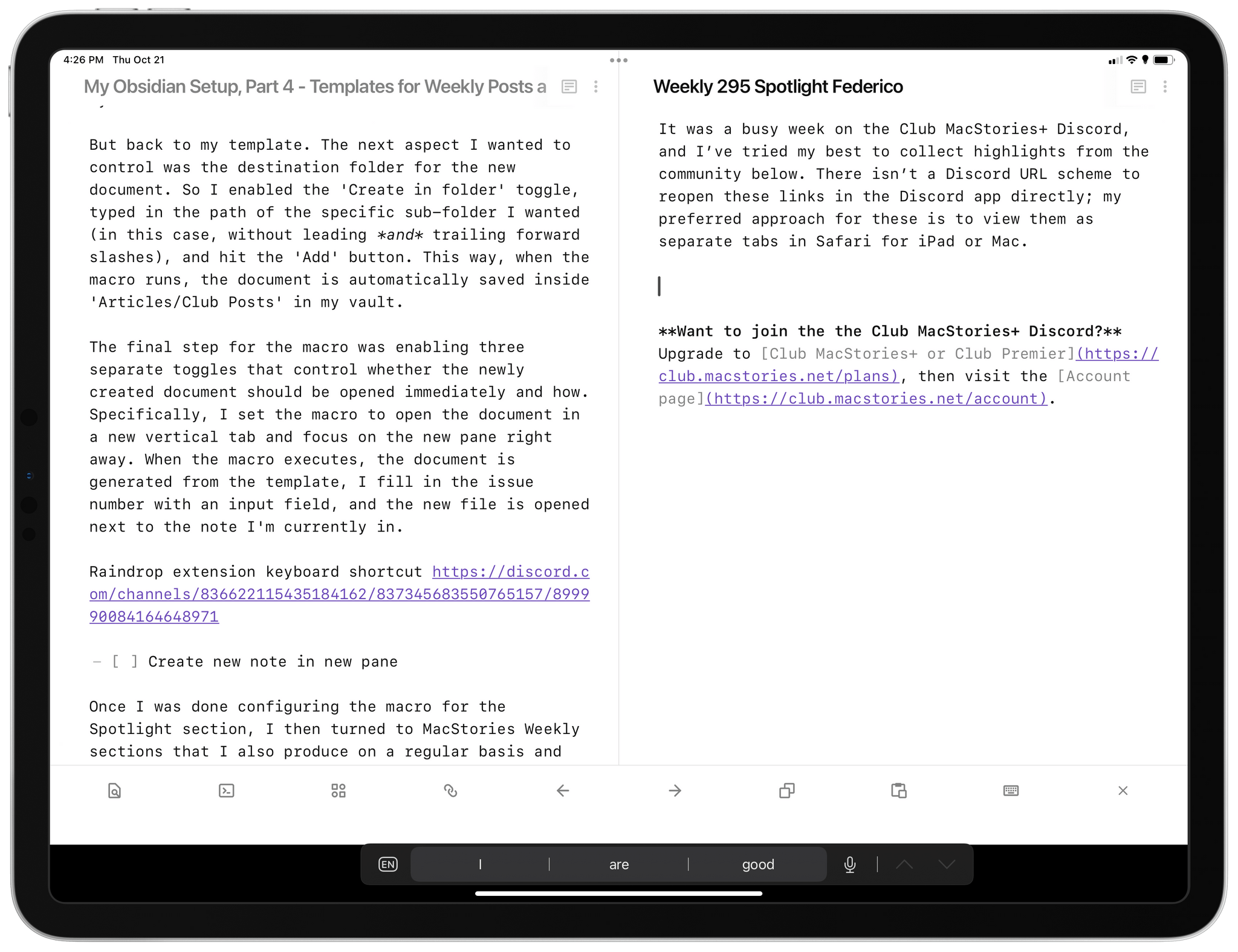
The final step for the macro was enabling three separate toggles that control whether the newly created document should be opened immediately and how. Specifically, I set the macro to open the document in a new vertical tab and focus on the new pane right away. When the macro executes, the document is generated from the template, I fill in the issue number with an input field, and the new file is opened next to the note I’m currently in.
Once I was done configuring the macro for the Spotlight section, I then turned to MacStories Weekly sections that I also produce on a regular basis and that need to have a consistent naming structure: App Debuts and Interesting Links. In this case, however, templates for these sections don’t need to have any boilerplate – just a static filename with a “dynamic” issue number. So I replicated the same setup as Spotlight with empty templates and a VALUE variable that lets me fill in the issue number manually.
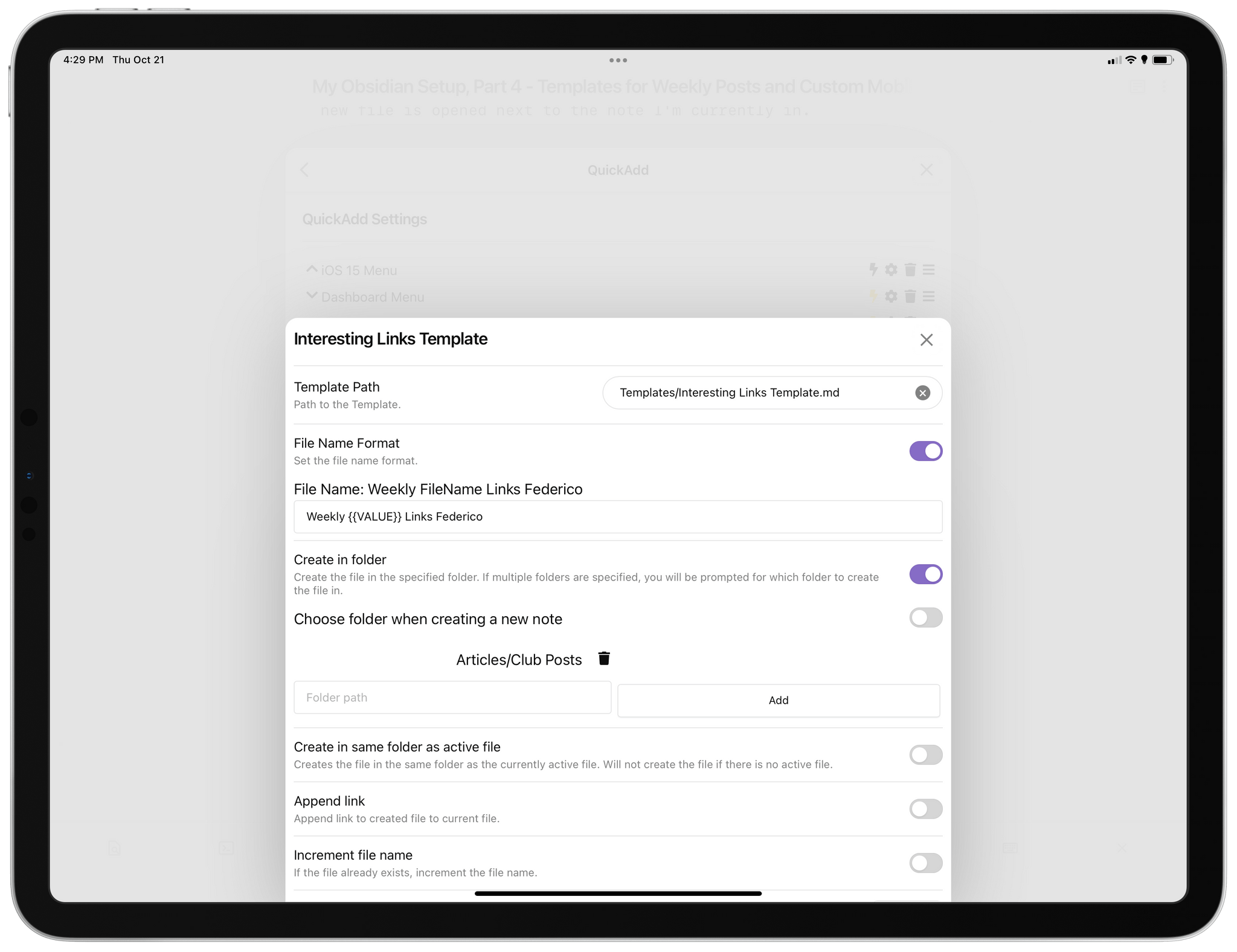
My template macro for the Interesting Links section of MacStories Weekly.
You may be wondering now: how do I remember how to trigger these individual macros? As I explained in Part 3 of the series, I like to take advantage of QuickAdd’s ability to group multiple macros together in a visual menu. Rather than remember multiple names and hotkeys for each individual macro, I can put them all inside a single ‘command palette’ and memorize just one name and hotkey. I can then select items in the palette with the pointer, arrow keys, or by typing a few letters of their name and pressing Enter.
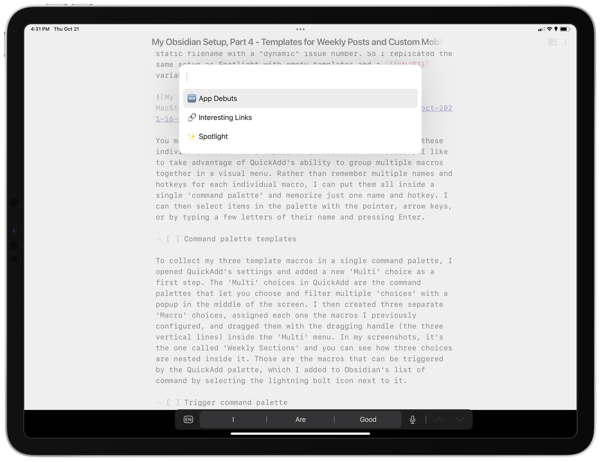
My command palette for MacStories Weekly templates.
To collect my three template macros in a single command palette, I opened QuickAdd’s settings and added a new ‘Multi’ choice as a first step. The ‘Multi’ choices in QuickAdd are the command palettes that let you choose and filter multiple macro ‘choices’ with a popup in the middle of the screen. I then created three separate ‘Macro’ choices, assigned each one the macros I previously configured, and dragged them with the dragging handle (the three vertical lines) inside the ‘Multi’ menu. In my screenshots, it’s the one called ‘Weekly Sections’ and you can see how three choices are nested inside it. Those are the macros that can be triggered by the QuickAdd palette, which I added to Obsidian’s list of command by selecting the lightning bolt icon next to it.
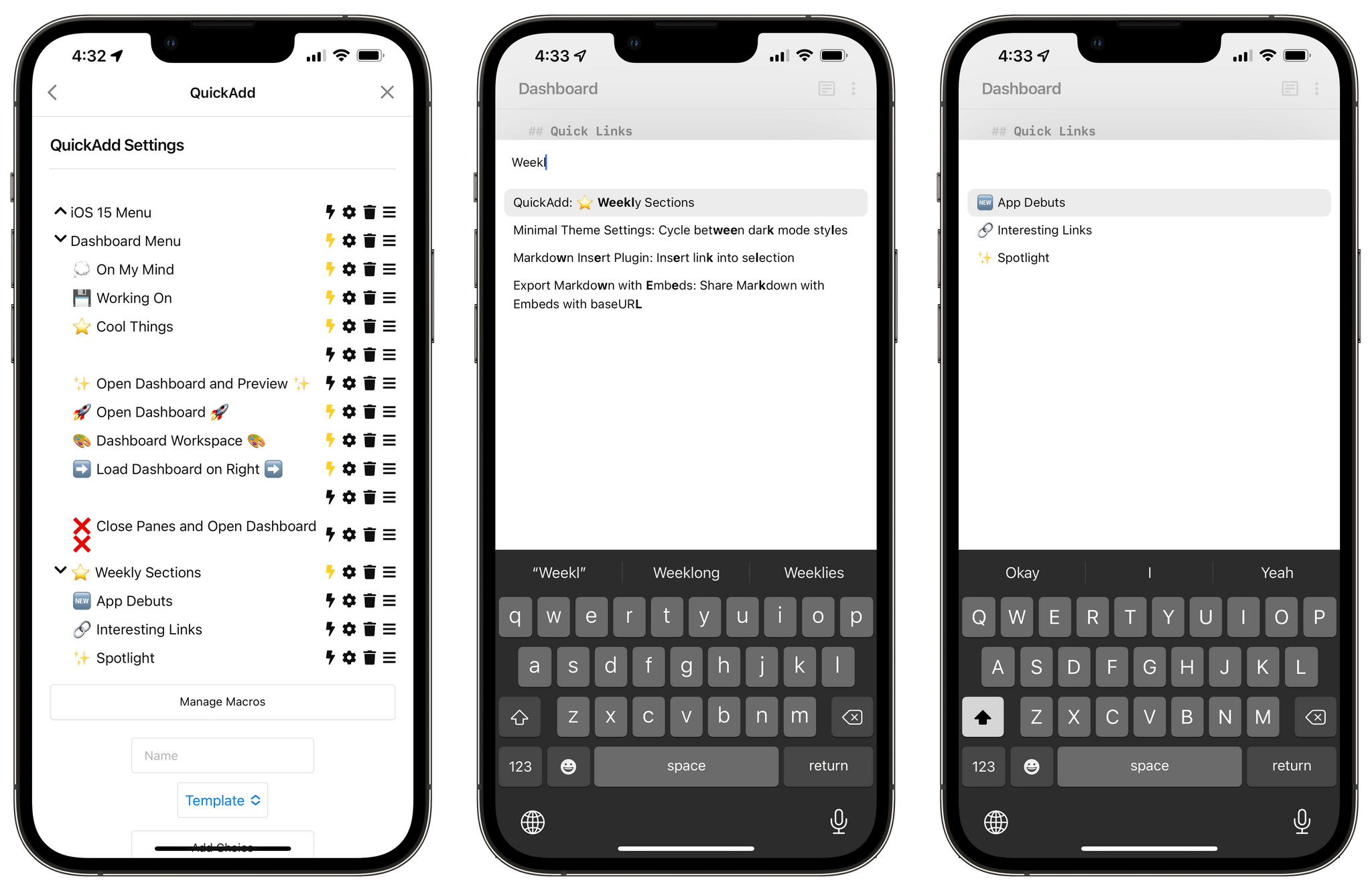
A ‘Multi’ choice in QuickAdd can present multiple macros to choose from.
Now, whenever I sit down to work on a section of MacStories Weekly I want to recreate with a template, all I have to do is press a hotkey I assigned to this command (⌃⌥⌘S), pick a section, enter an issue number, and a new note gets created from a template in a specific folder in a second.
I recognize that I’ve barely scratched the surface of what QuickAdd and Obsidian can do together when it comes to templates and the Templater engine. However, I’m also a big believer in the idea that automations don’t have to be complex and esoteric to be powerful and useful. My template-based system for MacStories Weekly may not be as fancy as some of the ones you can find on the Obsidian forums, but it’s saving me time every week and it’s producing a consistent output free of typos. That’s a win in my book, and I love how I can trigger all this so easily from the keyboard.
Now, while my most used method for triggering commands on iPad is, by far, the keyboard (either via hotkeys or command name search), I’ve always preferred the ability to activate specific Obsidian features via the mobile toolbar on iPhone.
I previously covered the mobile toolbar in Part 2 of the series, so I won’t rehash that section again. As I covered in July, I like how you can fully customize the toolbar and pin any command from Obsidian as a button you can instantly trigger from above the keyboard. In fact, I soon realized I liked the toolbar so much, I wanted to do even more with it.
Enter Obsidian Advanced Toolbar, a community plugin that lets you extend the default mobile toolbar with multiple rows and the ability to customize icons for any command. Thanks to this plugin, I’ve been able to go from 5 buttons in the mobile toolbar to 10; the number works out nicely on iPhone, where the toolbar automatically reflows to place icons on two rows above the system keyboard. The plugin picks up all the default options you’ve already configured in Obsidian under Settings ⇾ Mobile for the app’s toolbar, and it also works perfectly with Minimal, my favorite theme for Obsidian on Apple platforms.
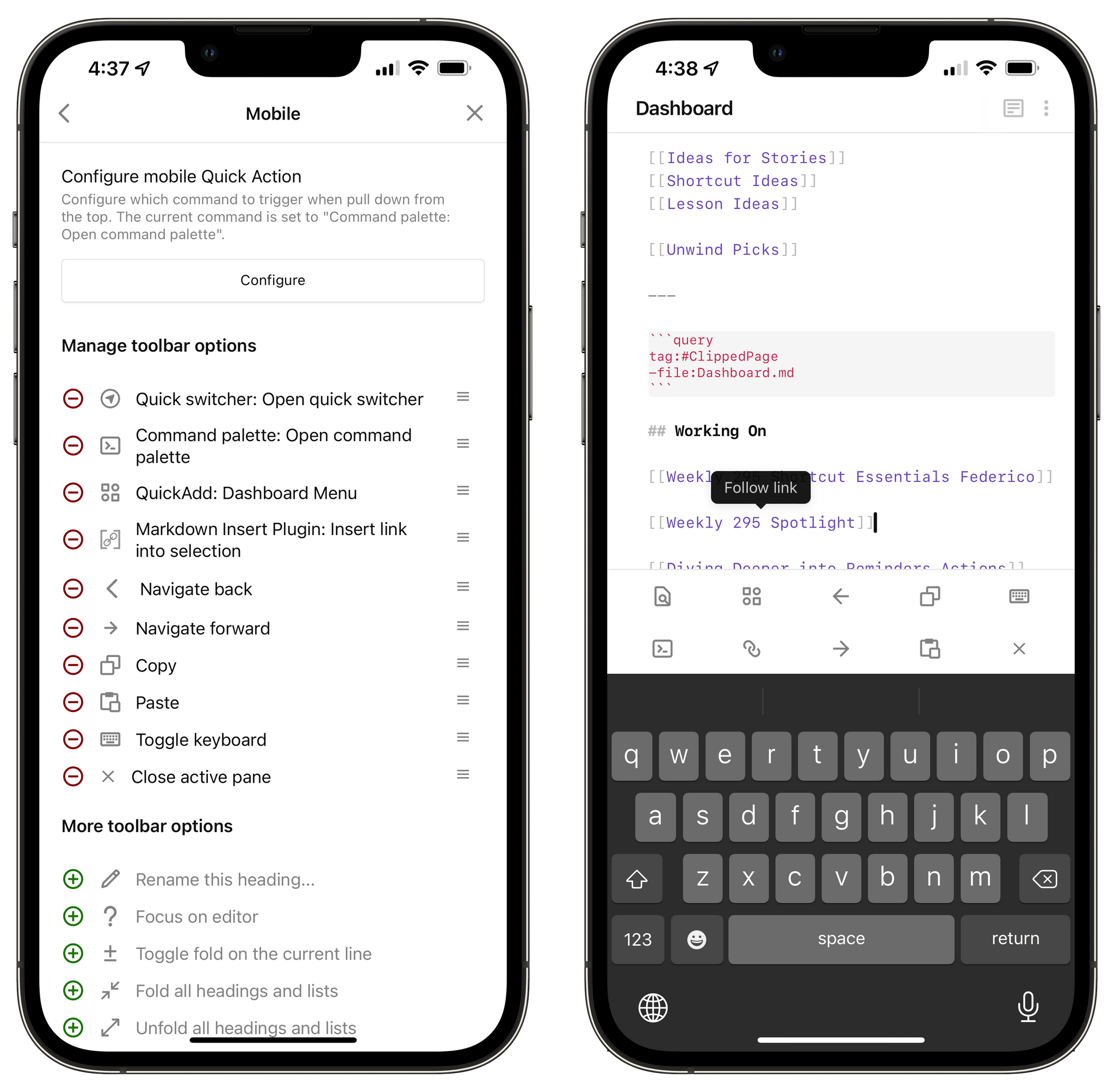
My custom mobile toolbar in Obsidian.
There are some nice touches in the plugin’s settings worth covering, too. For starters, you can define how many rows you want and the size of buttons. I like to keep a maximum of two rows on iPhone and the default button size; on iPad Pro, as you can see from my screenshots in this story, 10 buttons fill a single row above the keyboard.
Additionally, I recommend enabling the ‘Allow Styling of all Quick Actions’ option. With this enabled, you’ll unlock the ability to customize toolbar icons for all commands in the toolbar, not just the ones that don’t have a built-in icon. This means you can change toolbar icons for all commands and plugins – even those created by the Obsidian team. It couldn’t be easier: just click the icon you want to change and search for an alternative option from the list of built-in icons supported by the plugin.
Changing icons from Advanced Toolbar’s preference pane.
Lastly, I also recommend considering the ‘Always Show Toolbar’ option. With this setting, you can force the toolbar to be always shown onscreen, even if the software keyboard has been dismissed. Otherwise, the mobile toolbar’s visibility is always controlled by whether the keyboard is shown or not.
That’s it for this week. Now that we’ve reached Part 4 of the series, I feel like I’ve covered all the basics of my Obsidian setup so far, and it’s time for me to dive deeper into more specific use cases I’ve devised to manage my read-later archive, tasks, and integration between Shortcuts and Obsidian. Stay tuned: it’s going to be a fun ride.
Get help and suggestions for your iOS shortcuts and productivity apps.
In Part 4 of my Obsidian setup series, I described how I’ve been using a single ‘Dashboard’ note to quickly capture all kinds of links, ideas, and bits of text to process at a later stage – sort of like an inbox for my thoughts. In the story, I also detailed how I configured the incredibly powerful QuickAdd plugin with a menu that lets me easily append text or internal note links at the end of specific sections of my Dashboard note. I’ve been using this system for the past four months; being able to see at a glance what I’m working on or what’s on my mind for later has greatly improved how I can make sense of all the ideas I have.
The menu system I created in QuickAdd, of course, can only be triggered inside the Obsidian app. However, I wanted to remove as much friction as possible from the act of capturing an idea, so months ago I created a shortcut that launches Obsidian and instantly triggers my Dashboard Menu macro inside the app.
The shortcut that triggers a QuickAdd macro.
I installed this shortcut on the Home Screen of my iPhone and iPad, and I also enabled it as a menu bar shortcut on my MacBook Pro. With a single click, Obsidian launches and displays my custom QuickAdd menu, ready for me to save an idea or reopen the Dashboard note.
Triggering my QuickAdd macro in Obsidian from the Home Screen.
This has been great for me, but earlier this week I realized I could potentially make the entire process even more seamless and integrated with the Shortcuts app. With the QuickAdd plugin, the actual typing of text occurs inside Obsidian, which means there is no integration with the share sheet or, on macOS, text passed by other apps. If I could create a shortcut based on Apple’s new Files actions that appended text at the end of a specific section, I could potentially type text directly from the Home Screen and append it to my Dashboard note without using QuickAdd at all. Such a shortcut could even accept text input from the share sheet when used as an extension, or from Mac apps when triggered via the shell or AppleScript.
The only problem: by default, Shortcuts can only append text to the very end of a document. It has no idea what “appending to the bottom of a specific section” means. So if I wanted to replicate QuickAdd’s functionality in Shortcuts, I knew I had to do it all manually with regular expressions and conditional blocks.
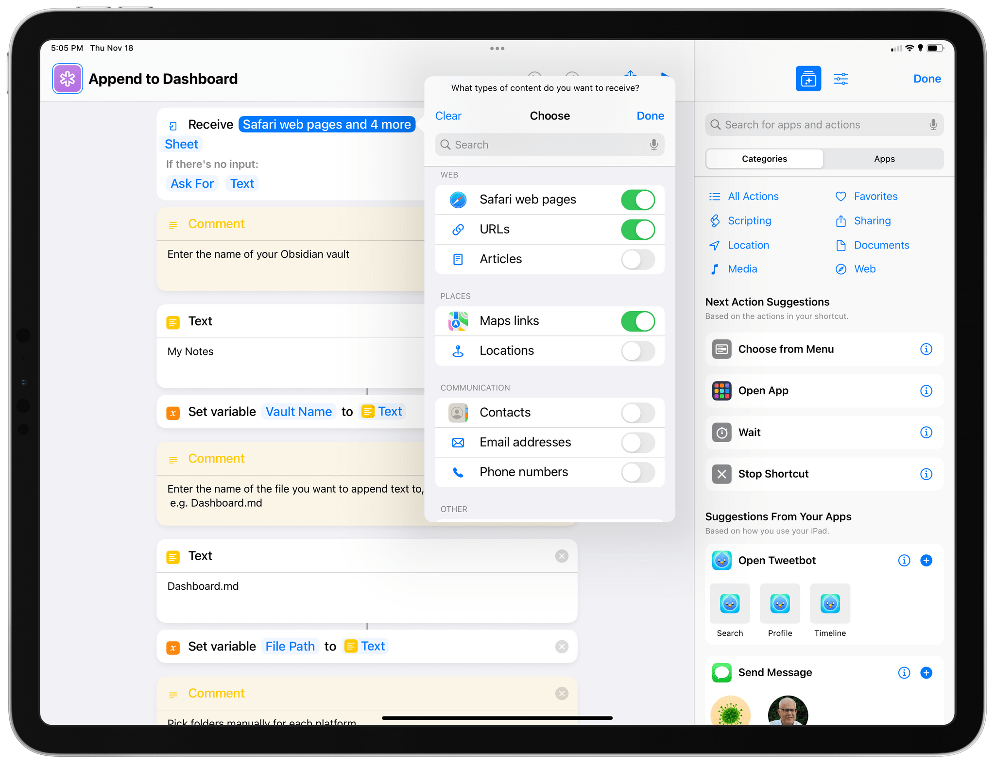
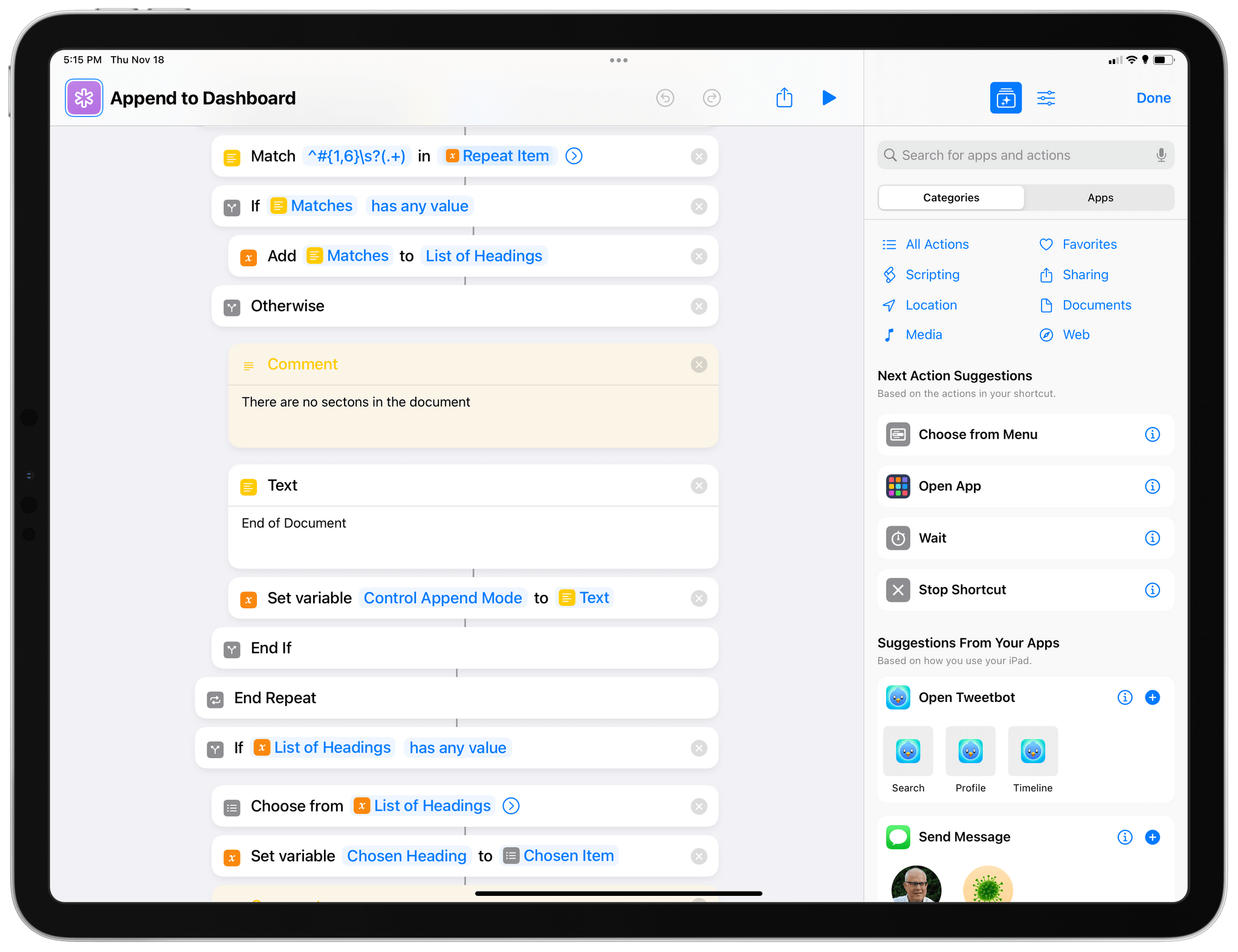
The result is a shortcut called Append to Dashboard, which I’ve designed in a way that can scale for different kinds of users and Markdown notes. Once pointed to a specific note, the shortcut can check whether it contains sections (formatted as Markdown headings) and gives you the ability to append text at the end of a section. If the note doesn’t have any sections, text will be appended at the end of the file instead. Append to Dashboard takes advantage of a new feature in iOS and iPadOS 15 to use text passed as input or ask you to manually type some text; furthermore, the shortcut is fully optimized for macOS Monterey and I’ve created PopClip extensions to quickly append text selected anywhere on a Mac. Plus, I’ve created a companion shortcut to clip webpages from Safari as new notes in Obsidian and append their internal links to the Dashboard note as well. There’s a lot going on here, so let’s dig in.
This is the star of the show and the shortcut I pinned to my Home Screen for fast access. At a high level, Append to Dashboard is quite simple to explain: when you run it, you see an empty text field where you can type; then you can pick a section of a note where you want to append that text; finally, Obsidian launches and your text is appended at the end of the section you selected.
Running Append to Dashboard from the Home Screen. Text gets appended at the end of a specific section.
There’s more going on behind the scenes, of course. For starters, the shortcut uses iOS 15’s new input system to check whether it received any input from the share sheet or other techniques that can pass input text to a shortcut (such as URL schemes, the shell, or AppleScript). If no input text is found, the shortcut will automatically ask for text with a manual input field, which is one of my favorite additions to the Shortcuts app this year. No matter how you trigger this shortcut, you’ll always end up with text stored in the default ‘Shortcut Input’ variable.
Configuring input types for the shortcut.
At the top of the shortcut, you’ll also find two Text actions to define your Obsidian vault name and the file name of the note you want to append text to. These variables are import questions you can configure upon installing the shortcut; if you don’t set them up correctly, the shortcut won’t work.
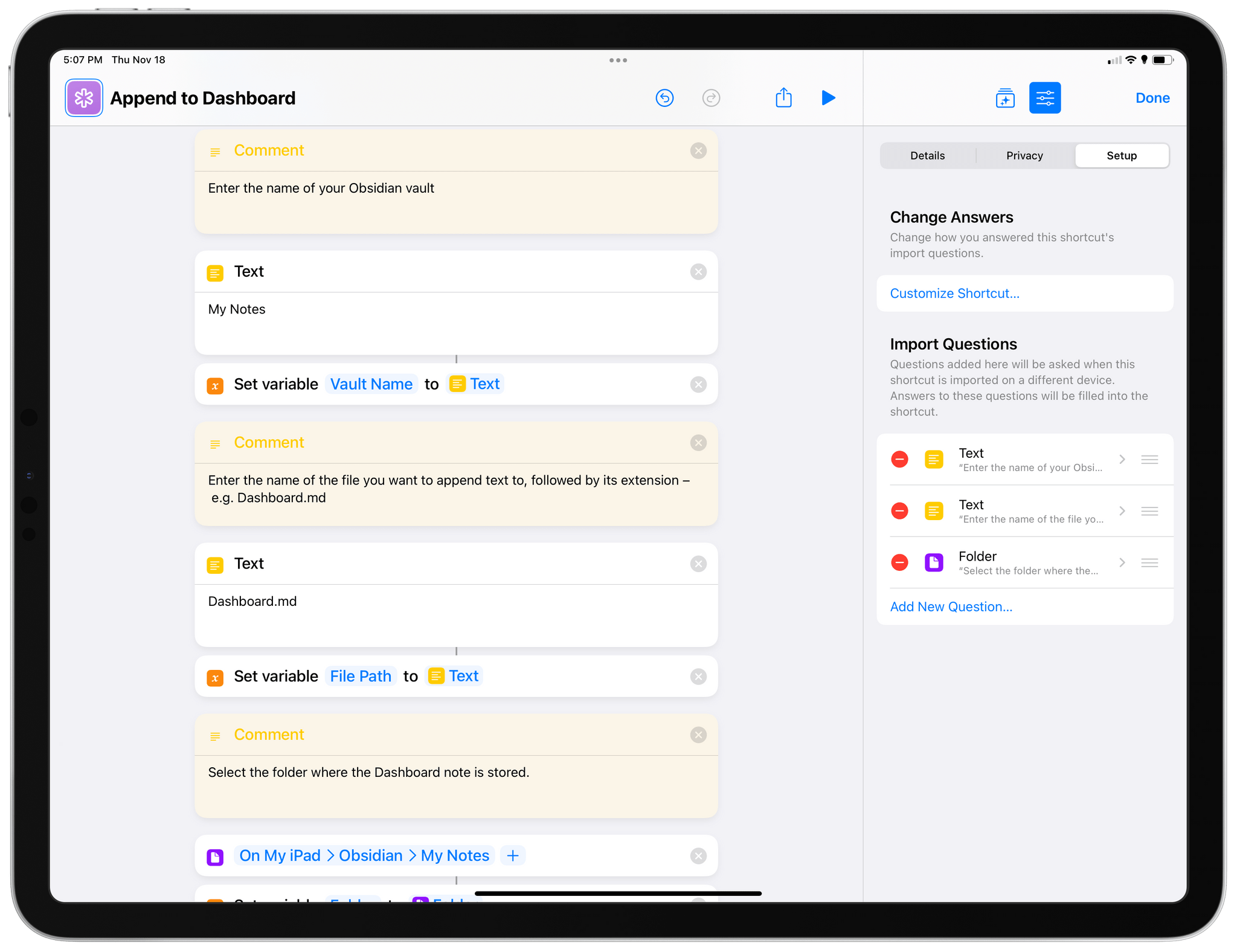
You’ll have to configure these actions for your Obsidian’s vault name, note, and folder.
Another variable you have to configure only once is the folder where the note you want to modify is stored. As of the latest iOS, iPadOS, and macOS betas, these ‘Folder’ actions work for local storage paths, too: if you set up a folder stored in ‘On My iPad’ on your iPad Pro, the same action will automatically point to the same folder in ‘On My iPhone’ or the ‘Documents’ folder on your Mac. This is ideal for Obsidian users who, like me, keep their vault in local storage and sync it across devices using the Obsidian Sync service. Thanks to this fix, we no longer have to put in conditional checks for separate folders on different devices – one of the drawbacks of Files actions I explained in this Automation Academy lesson.
And that’s it for configuration. The rest of the shortcut is all about reading the contents of the note, scanning it for headings, and letting you append text to the bottom of a section, before the next section begins. In my case, here’s what the Dashboard.md note looks like:
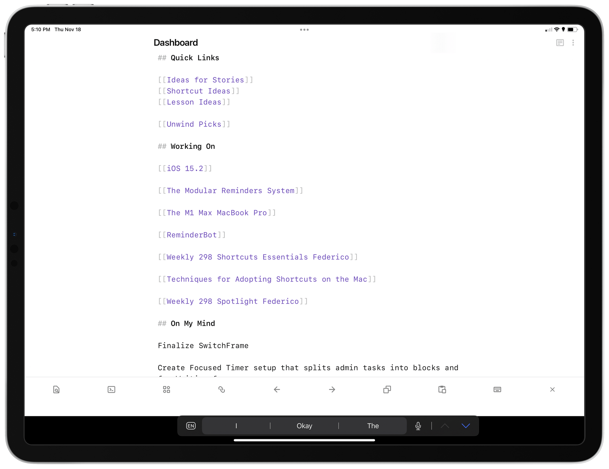
And here’s what Append to Dashboard sees in terms of sections contained in the note:
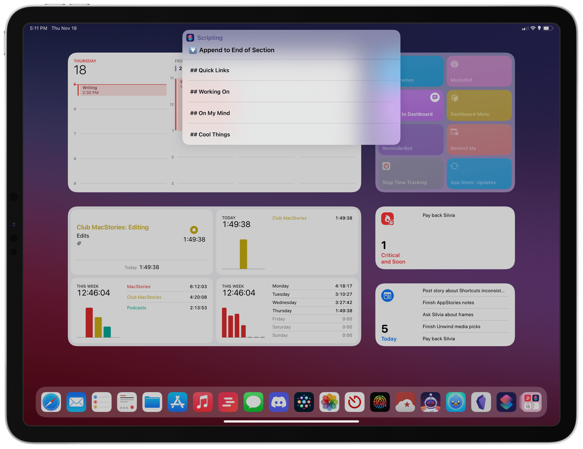
Sections found in the Dashboard note.
Under the hood, the shortcut’s logic is powered by a regular expression, which checks for new lines that begin with one hashtag and which may contain up to six of them, followed by an optional space, followed by some text. Basically, the typical formatting of a ## Markdown Section. The regex is:
^#{1,6}\s?(.+)
There are some fascinating implementation details worth explaining here. To know whether the shortcut should append text at the end of a section or the end of a document, I use a ‘control variable’ that literally says “End of Document” or “Next Section”.
The control variable for Append to Dashboard.
Additionally, the actual appending of text at the end of a section isn’t done with the ‘Append Text’ action: it’s powered by the ‘Replace Text’ action. The way I set it up is quite clever: rather than figuring out where the chosen section ends, the shortcut finds where the next section begins, and it inserts the new line of text right before that Markdown section heading. To do this, the shortcut relies on the ‘Get Item from List’ action to retrieve the section after the one you selected; I built it using a simple ‘Chosen Heading + 1’ operation.
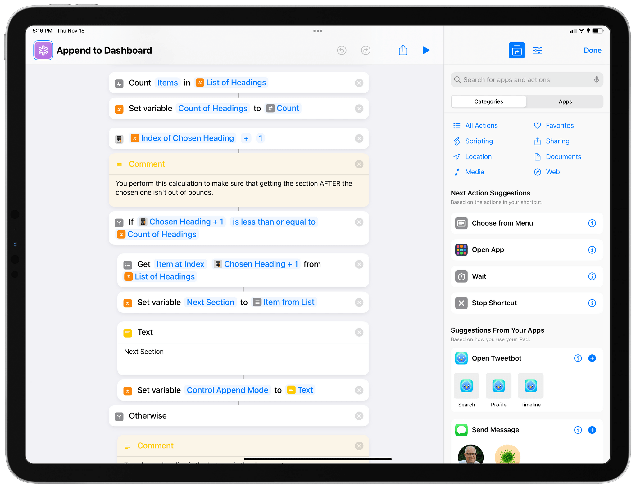
The math that finds the next section after the one you picked.
At the end of the shortcut, the modified note is saved directly to the Files app or Finder. At this point, the shortcut is, in theory, done, and I could have ended it here. However, because I’m using local storage paired with Obsidian Sync, I also wanted to open Obsidian to make sure it’d trigger a sync for the modified note. You’ll notice that I added an Open App action, followed by an Open URL one, followed by another Open App action to do so.
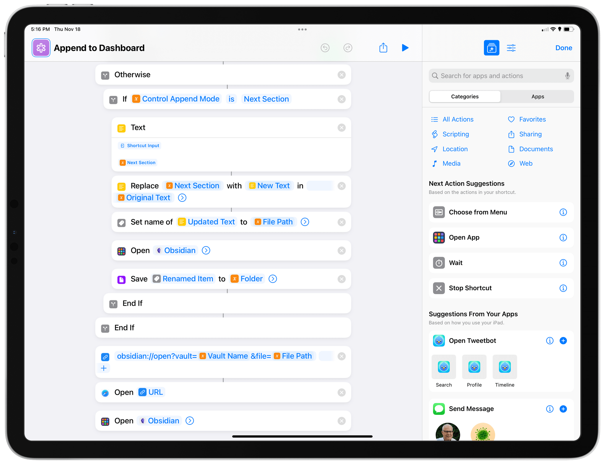
Why the repetition? In my experience, Obsidian may display a cached version of the note after launching the app, and the double Open App action seems to do the trick when it comes to forcing Obsidian to reload the contents of its vault and display the latest version of a note from the Files app.
I’ve been using the Append to Dashboard shortcut extensively on all my devices. It’s on the Home Screen of my iPhone, it’s in my iPad’s dock, and I can also trigger it from the Mac’s menu bar. On macOS, I can invoke the shortcut with the ⌃⌥⌘P hotkey too. Because I found Shortcuts’ built-in keyboard shortcut feature unreliable, I set up a simple BetterTouchTool trigger that runs my Append to Dashboard shortcut, which has worked consistently for me.
Triggering Append to Dashboard on macOS.
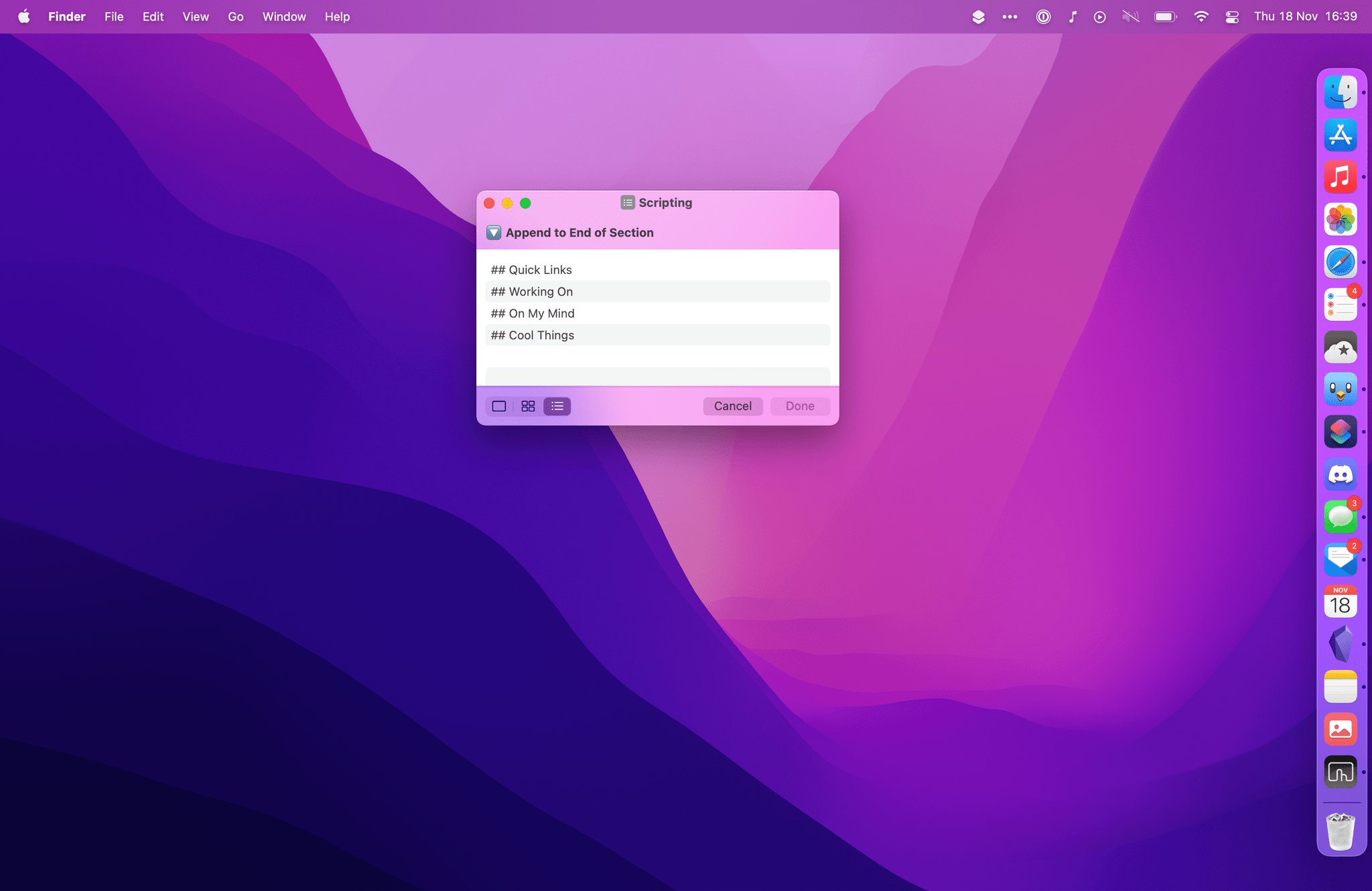
Sections from the Dashboard note as seen on Mac.
You can download my Append to Dashboard shortcut here.
As John covered in his review of macOS Monterey, share sheet integration is suspiciously absent from Shortcuts on the Mac. That was a problem for my Append to Dashboard shortcut as it meant its Mac version couldn’t easily accept text input shared from other apps. Fortunately, macOS lets me work around these limitations by installing all kinds of system enhancements and utilities, and in this case I turned to an obvious candidate: PopClip.
PopClip and MacStories go way back. I first wrote about the app in 2011 and followed up in 2012, before my switch to iPad as my primary computer. After a few years, John covered PopClip in MacStories Weekly, and later shared his favorite PopClip extensions. In case you’re not familiar with it, PopClip is an incredible tool that displays custom actions in a toolbar floating above selected text. PopClip works anywhere you can select text on macOS, and it can be enhanced with extensions that anyone can create and share. Imagine the iOS copy and paste menu, but if it was infused with the power of automation and was available system-wide in any text field with custom actions. PopClip is one of the greatest examples of what Mac software can do compared to iPadOS apps.
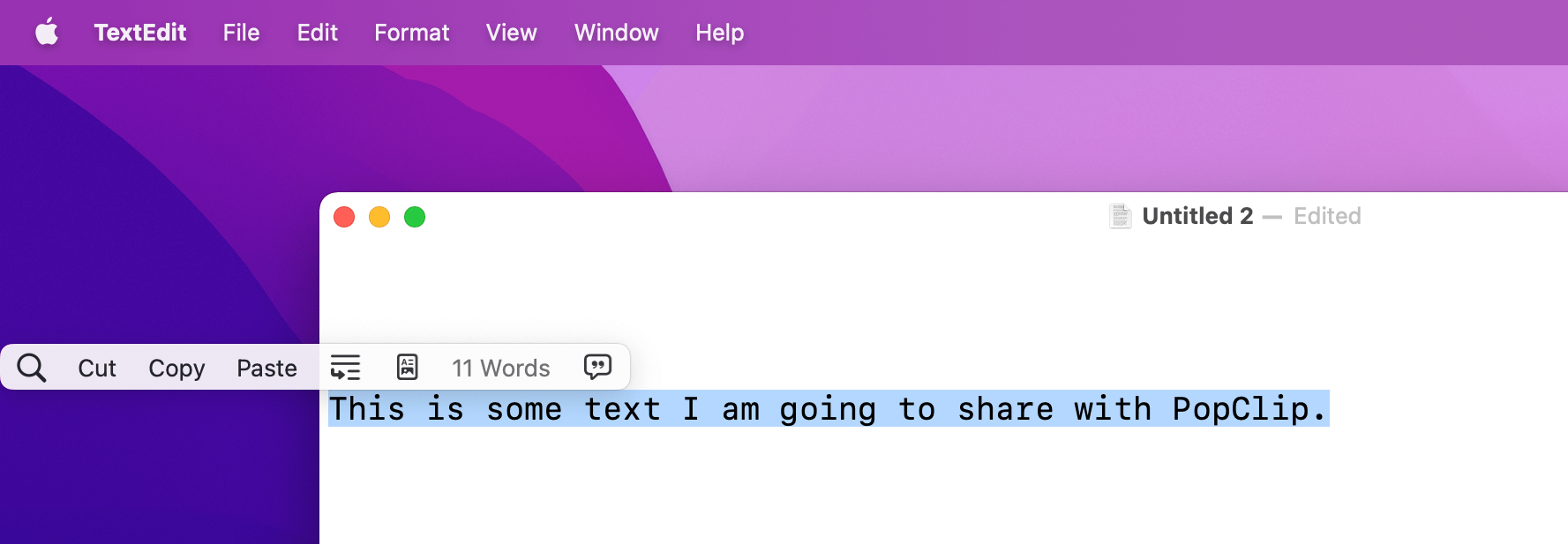
PopClip for Mac.
Anyway, the PopClip developer recently announced the ability to create extensions for the app by simply writing a special plain text syntax, which you can then select – with PopClip itself – and add to the app as a new extension. It’s all very meta, and these are called snippets, which are based on PopClip’s existing syntax to define actions, icons, and more. You can read more about this in John’s column in this very issue.
So, I wanted to make a PopClip button that would let me capture any selected text and pass it to my Append to Dashboard shortcut. Here’s what the PopClip snippet syntax looks like:
#popclip
name: Append to Dashboard
icon: symbol:text.append
shortcut name: Append to Dashboard
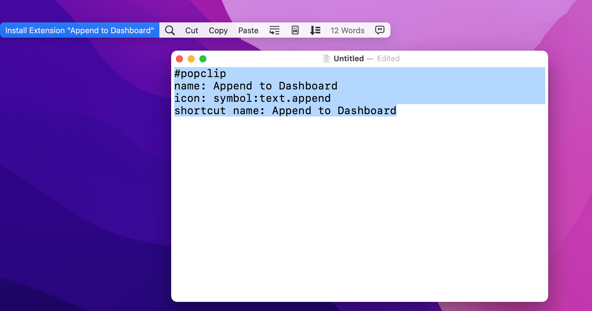
Installing PopClip’s extension snippets.
If you want to use this snippet, make sure you have the latest version of PopClip installed, then select the text above, and add it as a new extension with PopClip. Once added, you’ll be able to select any text and fire off the Append to Dashboard shortcut with PopClip using the selected text as input.
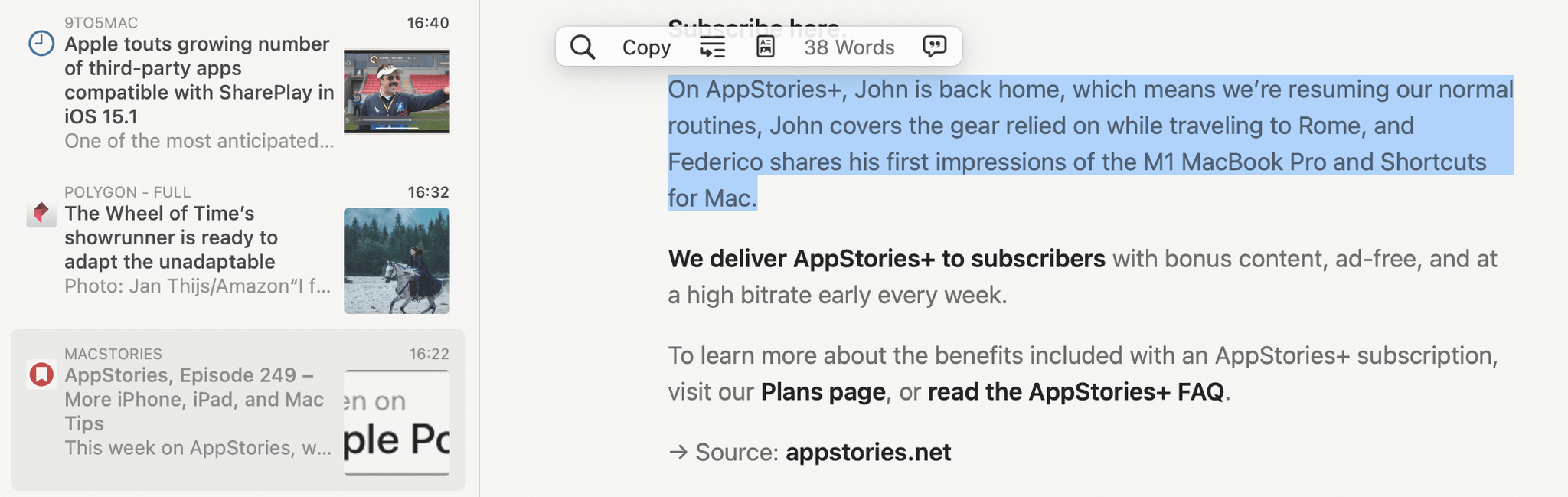
Triggering Append to Dashboard for selected text from PopClip.
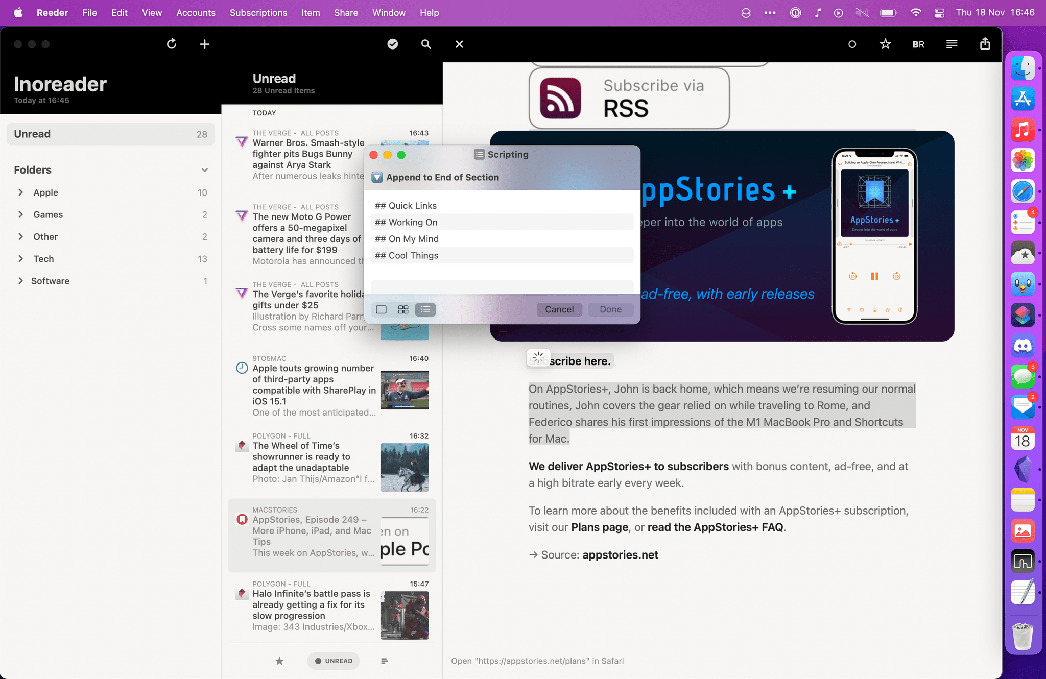
Append to Dashboard triggered by PopClip inside Reeder for Mac.
I also made a separate version of this PopClip extension that is optimized for Safari and lets you quickly append text selected on a webpage as Markdown to your Dashboard note in Obsidian. This extension takes advantage of PopClip’s ability to trigger shortcuts via AppleScript and pass along some input text. In this case, I’m using PopClip’s built-in {popclip markdown} variable, which takes text selected on a webpage and formats it as Markdown, preserving its links and styles. This way, if I find something on a webpage I want to append to my Dashboard note while keeping its formatting and links, I can run this extension from PopClip and save the Markdown selection in a few seconds.
#popclip
name: Append HTML
icon: symbol:doc.richtext
capture html: true
applescript: |
  tell application "Shortcuts Events"
    run the shortcut named "Append to Dashboard" with input "{popclip markdown}"
  end tell
As I mentioned before, you can save this extension by highlighting its text and adding it directly to PopClip.
Saving a webpage selection as Markdown from Safari via PopClip and Shortcuts.
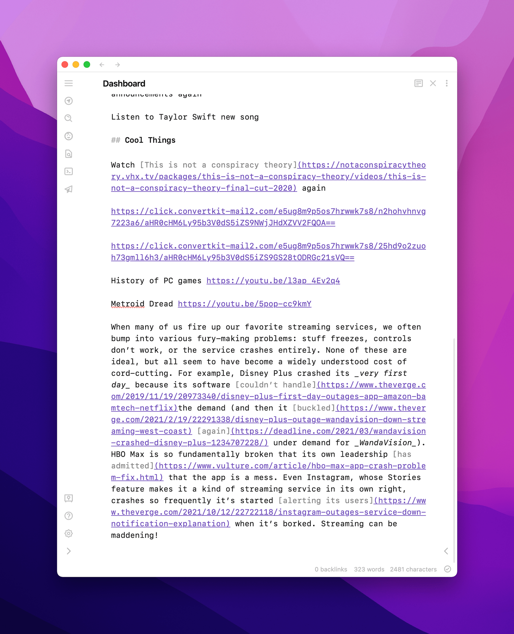
The selection appended as Markdown in Obsidian.
There’s more I’ve done with Obsidian and Shortcuts this week, so keep on reading to find out.
Sometimes, what I want to capture in my Dashboard note isn’t some plain text, but a link to a webpage. So for this week’s column, I dusted off a shortcut I created months ago and never shared, optimized it for macOS Monterey, and integrated it with the Append to Dashboard shortcut.
This shortcut is called Clip Webpage, and it lets you capture any webpage from Safari as a new note in Obsidian that contains YAML-formatted metadata such as the title and URL of the page, plus the date when you saved it. Additionally, if you have selected something on the page before running the shortcut, your selection will be saved in the note as Markdown; and, you can optionally add your own comment to save alongside everything else.
Clipping a webpage from Safari.
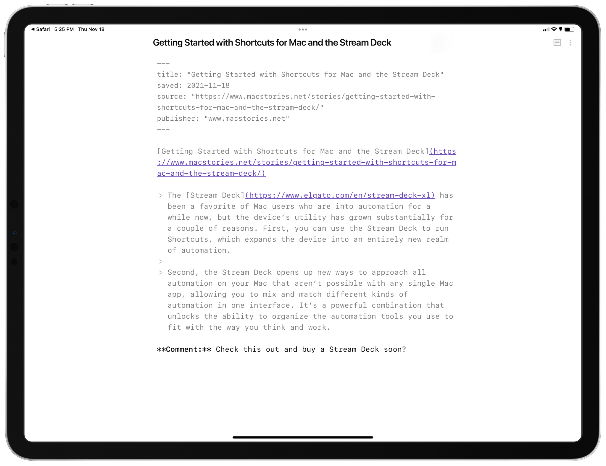
The clipped link and webpage selection in Obsidian.
I created this shortcut during the week of WWDC, when I realized I wanted a way to save webpages in Obsidian as notes containing their link and selection. The shortcut is pretty basic in how it works: like Append to Dashboard, you have to pick a folder where you want new notes to be saved, and details such as page URL, selection, and title are all generated via built-in Safari variables in Shortcuts. It’s all a matter of formatting the note with Text actions and using the ‘Save File’ action to save the newly assembled note in a folder.
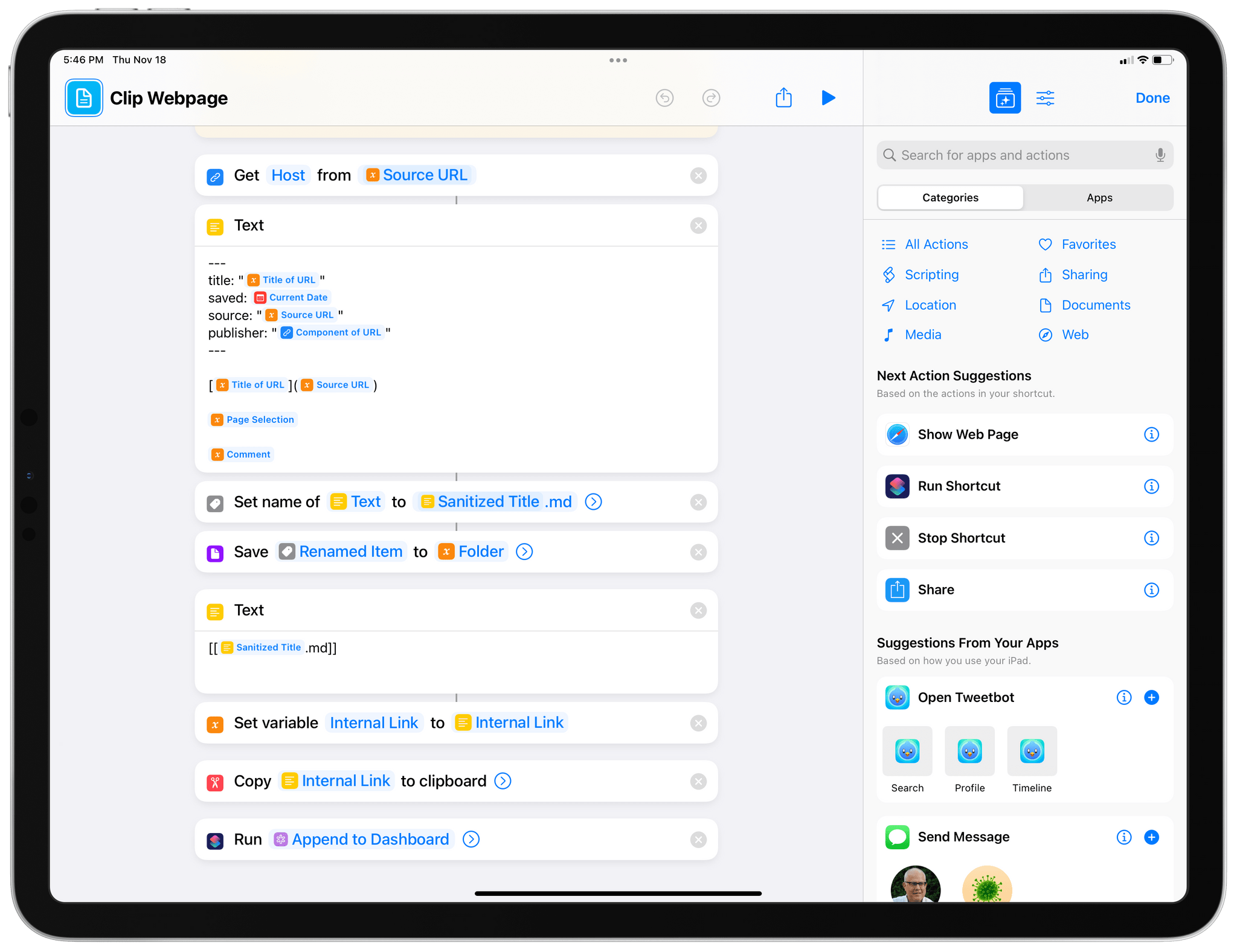
Assembling the note template in Shortcuts.
What did require some work was figuring out how to handle capturing information from Safari on the Mac, where, for some reason, there’s no share sheet integration for Shortcuts and most Safari actions from iOS and iPadOS don’t work.
I had to get creative about how to get the URL of the current webpage, its title, and selected text. By default, the shortcut tries to find a URL passed from the share sheet and, if that’s empty, tries to get one from the clipboard. If no URL is found in the clipboard either, the shortcut checks whether you’re running it on a Mac and, if you are, uses the Mac-only ‘Get Current URL from Safari’ action to retrieve the URL of the current tab.
Then, for both webpage title and selection, I had to use two different ‘Run AppleScript’ actions. The one that deals with selection uses the do JavaScript AppleScript command for Safari, which is a topic I will explore more in depth in the future.
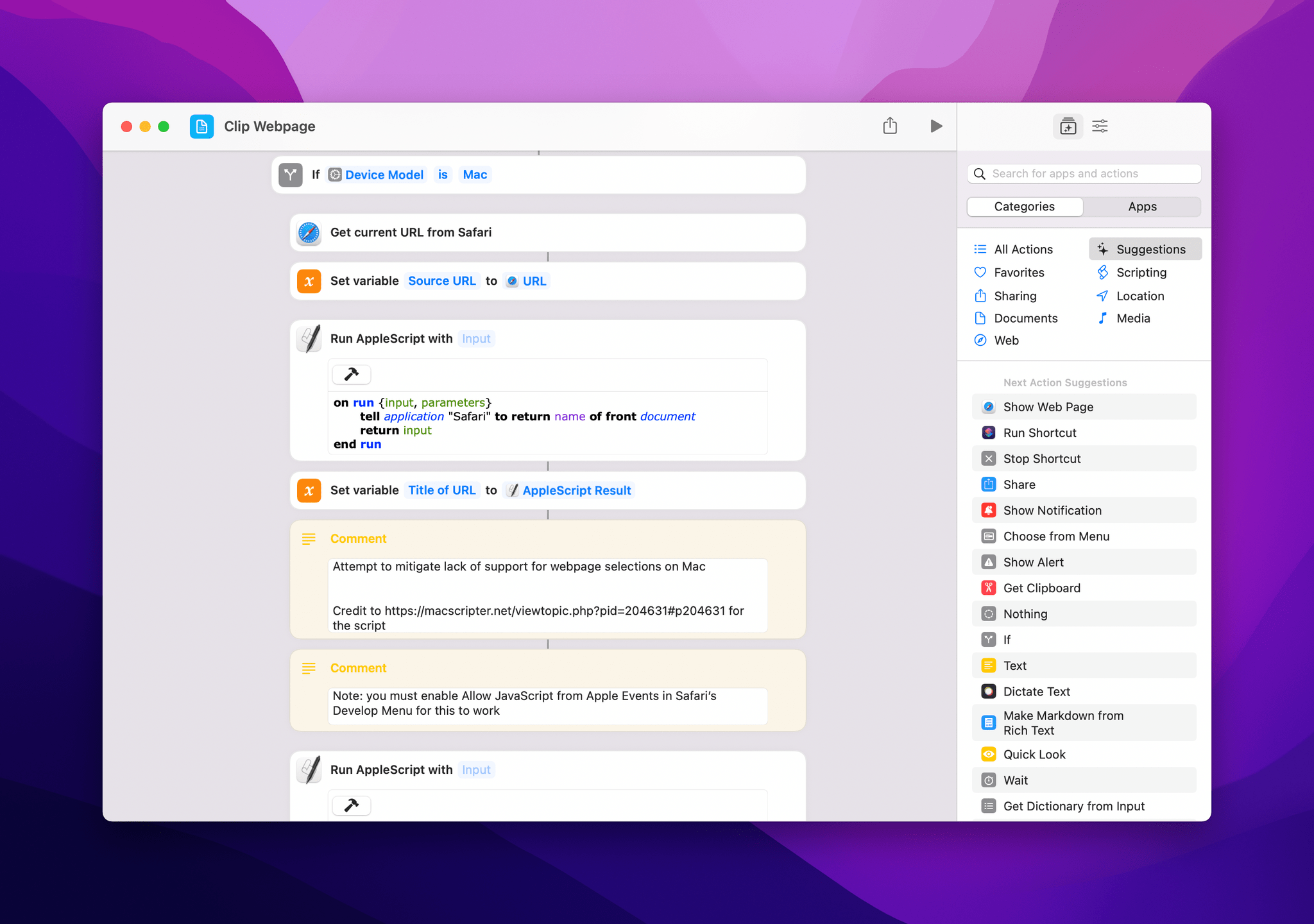
Getting the URL and title from Safari for Mac.
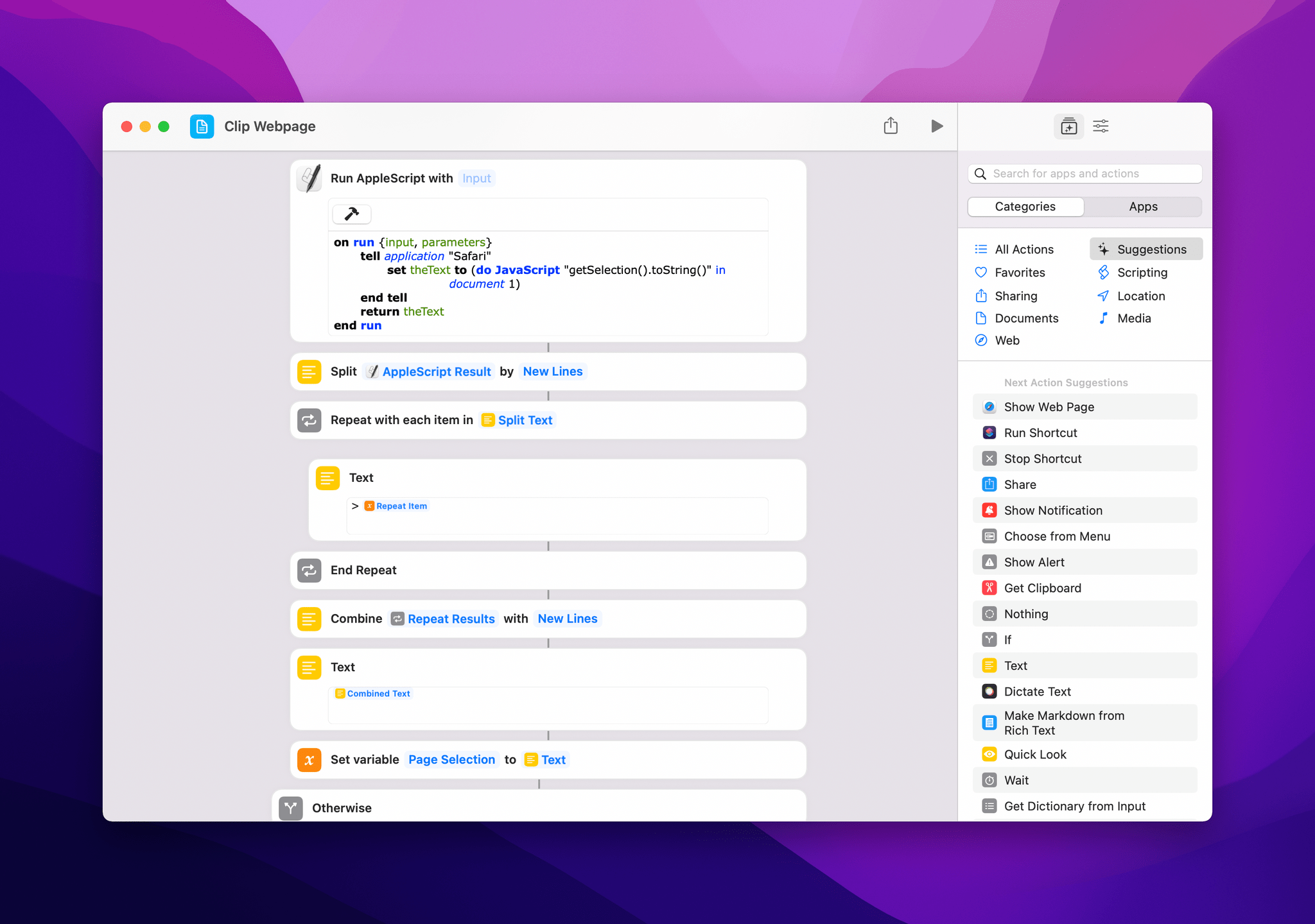
Getting selected text from Safari for Mac in Shortcuts.
One word of caution for running AppleScript with JavaScript in Shortcuts: for these actions to work, you’ll have to enable the ‘Allow JavaScript from Apple Events’ option in Safari’s Develop menu. If you don’t see the Develop item in the menu bar in Safari for Mac, open its preferences, select the Advanced page, and enable ‘Show Develop menu in menu bar’ first. Furthermore, make sure you have enabled ‘Allow Running Scripts’ in Shortcuts for Mac’s settings, also under the Advanced section.
Allowing JavaScript for Apple Events in Safari is required for this shortcut to work properly.
Once the note has been created and saved in your Obsidian vault in the background via Files actions, the shortcut outputs its filename formatted as an [[internal link]], copies it to the clipboard, and passes it to the Append to Dashboard shortcut. This way, you can either open Obsidian and manually paste this internal link for the new note somewhere, or you can use Append to Dashboard to instantly append it to a section of your Dashboard note (or whatever you like to call your version of my Dashboard note).
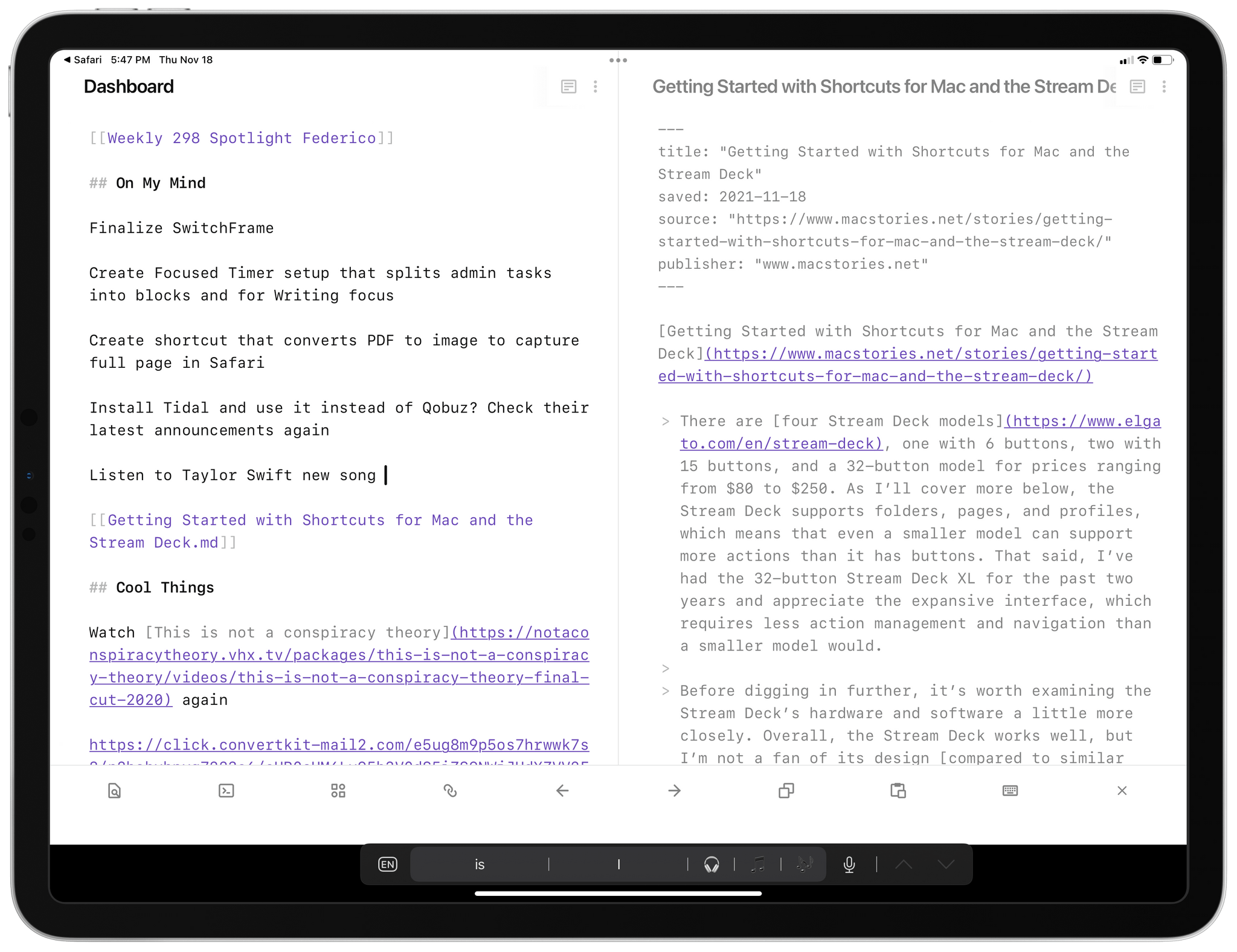
A clipped link appended to my Dashboard.
(Note: If the Clip Webpage shortcut isn’t properly running Append to Dashboard for you, this appears to be a bug in Shortcuts where shortcuts invoked via the ‘Run Shortcut’ action cannot access the contents documents from the Files app.)
I’ve been using Clip Webpage and Append to Dashboard together a lot, and they’re a great example of the kind of integration you can achieve between different apps, the filesystem, and Obsidian if you use Shortcuts as the glue between all of them. I do wish optimizing these shortcuts for Mac was easier and that I didn’t have to rely on AppleScript, but I’m also glad I was able to use this (temporary?) workaround. This is not the last time you’ll hear from me about shortcuts I’ve updated for macOS here on MacStories Weekly, so stay tuned for more.
You can download my Clip Webpage shortcut here.
I’ve spent a good portion of my holiday break studying and playing around with Dataview. If you’re into Obsidian and its plugin ecosystem, you’ve probably heard of Dataview already and seen the examples of people who use this plugin to create all sorts of custom views in the app. But in case you’re not aware of it, here’s how I would describe it: Dataview lets you visualize notes from your Obsidian vault with tables and lists that support advanced filtering and sorting criteria. These tables are generated by Dataview snippets, which are code blocks that you drop into a note and that turn into a table when you switch to Preview mode in the Obsidian editor. Here’s what’s even more special about Dataview though: it’s based on an incredibly fast query engine that lets you find hundreds of notes with a syntax that supports all sorts of note metadata, whether they are implicit to a note or explicitly declared by you.
What I just typed above is a lot to take in, right? I totally understand, which is why I’ve put off learning about Dataview for a long time, until I had a couple of weeks to tinker and experiment with it. It’s tricky not to get too conceptual and high-level when covering Dataview, so for the next few installments of this series on MacStories Weekly, I’m going to try my best to give you practical examples and guidance on what you can achieve with this plugin.
For starters – and I know this sounds obvious, but stay with me – I recommend checking out the detailed documentation provided by the Dataview developer here. I don’t want to rehash a description of Dataview in this column, but I want to highlight the two key concepts behind it: data annotation and data querying.
Annotation refers to Dataview’s ability to read a specific bit of information from a note (or collection of multiple notes) in Obsidian using its own proprietary syntax. I’m referring, of course, to metadata. Broadly speaking, there are two kinds of metadata: those that are implicit to a note (they just “exist”), and those that you manually define using YAML or inline Dataview fields. For instance, the creation date of a note is an implicit metadata item since it’s just something that a note carries by default; same with a note’s file name, tags, modified date, and other built-in properties. Dataview can query all those values. At the same time, Dataview can also query metadata that you manually define in a note using its frontmatter (formatted as YAML) or a Dataview-specific inline syntax. You can read more about the different types of metadata annotation here, and you can learn more about Dataview’s query syntax here.
There are plenty of pre-made Dataview examples you can check out here and on the Obsidian forums, but allow me to share a few as well and, more importantly, detail how I’ve made my Dashboard note smarter and more powerful thanks to Dataview.
One of the first things I set out to build with Dataview was a visualization of my most recently modified notes from across the entire Obsidian vault. This is very easy to accomplish with Dataview. All it takes is to drop a code block like this one anywhere in a note:
```dataview table file.mtime as "Last Modified" where file.mtime < (date(today) + dur(1 day)) sort file.mtime DESC limit 6 ```
This Dataview snippet, when rendered in Preview mode, will generate a table that looks something like this:
A Dataview table for recently edited files.
If you take a look at the syntax above, I think you can understand how this all works under the hood. The code block tells Dataview to render a table for files where their modified date (the file.mtime metadata) is in the past day and sort them with descending order of modified date, which means from latest to oldest. The code block adds a limit of 6 notes found by Dataview, which should also display a Last Modified column showing the date of each parsed note. When the code runs, Dataview finds all notes matching these criteria in your vault and instantly renders them as a table.
That’s Dataview in a nutshell, and once you learn this basic syntax and approach, a world of note-filtering possibilities opens up to you in Obsidian. For example, take the following snippet:
```dataview list FROM #quickLink sort file.name ASC limit 6 ```
This code tells Dataview to render a bulleted list with 6 notes that have been tagged with #quickLink and sort them alphabetically by file name. When rendered, here’s the result we get:
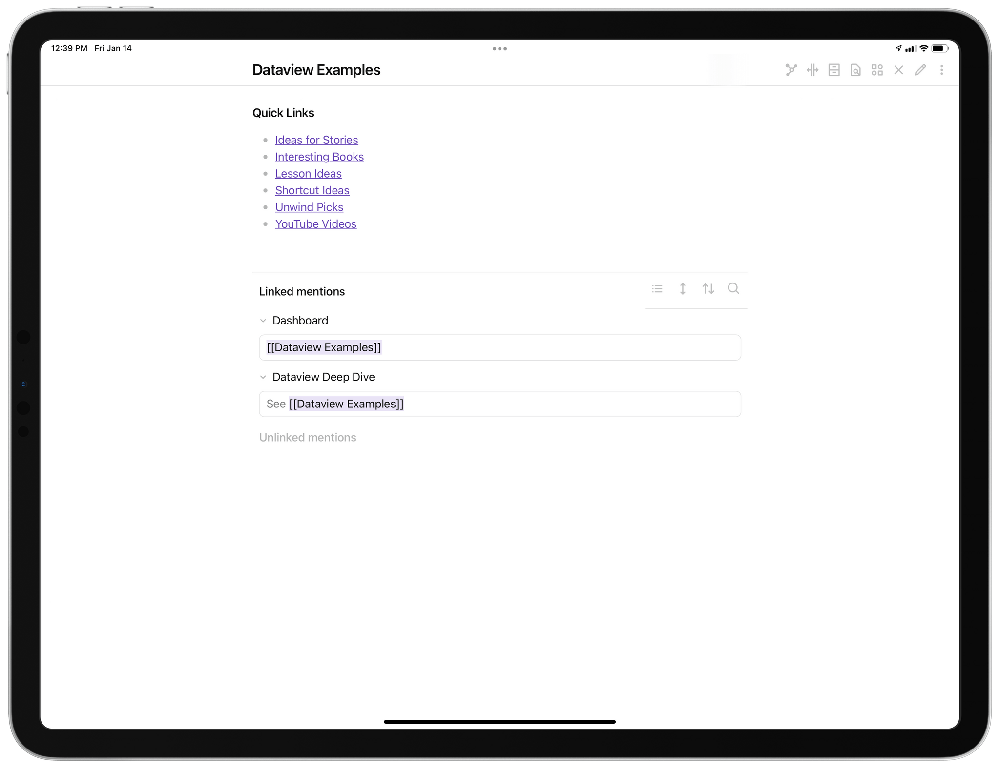
You get the idea by now. These are the basics of Dataview, and like I mentioned above, I recommend playing around with some of these common snippets to understand how it all works behind the scenes and how Dataview could be useful for your Obsidian setup. As always with any kind of automation, do not be afraid to tinker, throw away things, and start over: it’s all part of the learning process.
Now let’s take things up a notch. One of the most exciting developments in the Obsidian-Dataview space lately has been the release of version 4.4 of Minimal Theme. I previously covered Minimal here, and I believe it is, by far, the best alternative look you can install in Obsidian. Version 4.4 of Minimal has introduced Cards, which is a custom appearance mode that renders Dataview snippets as a grid of cards rather than a table. You can read more about Minimal and Cards here and watch a demo video here. Essentially, if you want to visualize Dataview snippets in a note as cards, install Minimal Theme and just drop the following YAML syntax at the top of a note:
Once you do that, a Dataview table will be displayed by Minimal Theme as a grid of “note cards” instead, which looks fantastic in my opinion.
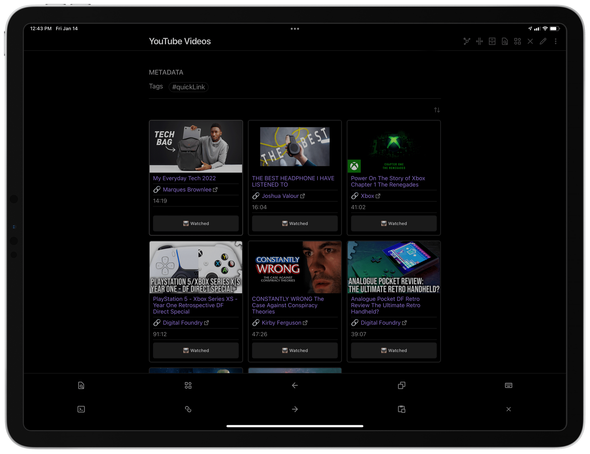
Cards in Obsidian.
Here, for instance, is the aforementioned table of recently modified notes displayed as cards instead:
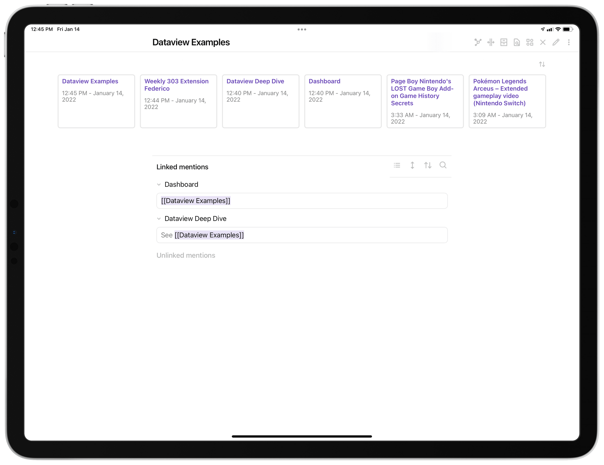
The same table rendered as a grid of cards.
I love how cards are rendered by Minimal and I especially appreciate the hover effects – supported on iPad too – that you see when you place the cursor on top of a note. If you have the Page Preview plugin enabled in Obsidian, you can hover with the cursor over a linked file name and you’ll get a popup with a preview of the page without even having to open it.
The design of Minimal cards and the integration with Dataview got me thinking: what else could I display as cards in Obsidian featuring multiple fields and perhaps even inline images? And another question followed immediately: what if I could figure out a way to save URLs in Obsidian as “rich links” with thumbnail previews, similarly to how you can save links in Craft or Apple Notes?
This took me a few days of work and fine-tuning, but here’s the result:
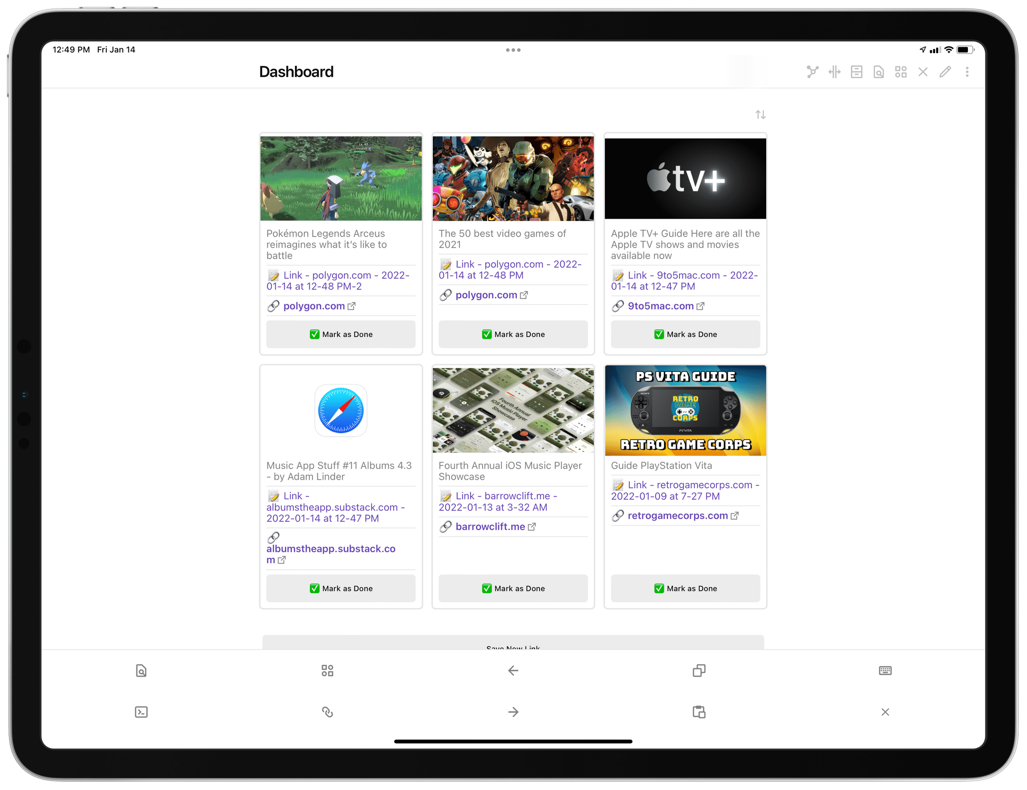
Rich links in my Dashboard note.
Now, you’re probably thinking that my screenshot looks nothing like Obsidian. And yet, the grid of links displayed as cards with metadata and the interactive ‘Mark as Done’ button is entirely powered by Dataview and based on a code block that is rendered as a grid of cards thanks to Minimal Theme.
Let me explain all the steps involved in this system and share all the pieces you’re going to need if you want to start using it yourself. First, make sure you install Dataview, Minimal Theme, and the Buttons plugin. I’m going to talk about Buttons more in depth in the future, but it’s basically a plugin that lets you create interactive buttons (again, based on custom code snippets) that execute specific commands when they’re clicked in preview mode. Also, install the MetaEdit plugin, which will allow Buttons to modify properties of the rich links we’re going to save in Obsidian, and Sortable, which adds dropdown menus with sorting options to Dataview tables.
Next up, create a ‘Links’ folder in the root of your Obsidian vault. While in the past I would save links in Obsidian by, well, just pasting raw URLs in my Dashboard note, this new system is based on Dataview, which means all the links we’re saving are standalone notes stored in a folder. Here’s what one of these notes looks like:
A standalone note for a link.
As you can see, the note features a frontmatter with YAML-based metadata. These individual pieces of metadata are the values that Dataview will query and process to put together a table, which will then be rendered as a grid of cards by Minimal Theme. Which begs the question: how can you actually save links from Safari or any other app with this kind of formatting?
This is where Shortcuts comes in. To turn a webpage I want to save for later in Obsidian (usually because it’s something I want to check out / buy / link on MacStories; articles I want to read go in Matter), I’ve put together a shortcut called Save Link that extracts metadata directly from a webpage’s source. Specifically, the shortcut can parse a webpage’s HTML and find its Open Graph tag for the cover image, which will then be rendered by Dataview and Minimal Theme as an inline image for the “rich link” we’ve saved in Obsidian. Whenever you see a note-taking app that supports saving URLs as rich links (such as Notes or Craft), they’re always checking the same og:image meta property in HTML to see which image should be presented as the thumbnail preview of the URL. I made a shortcut that extracts the same information and saves it as part of a note’s YAML frontmatter in Obsidian.
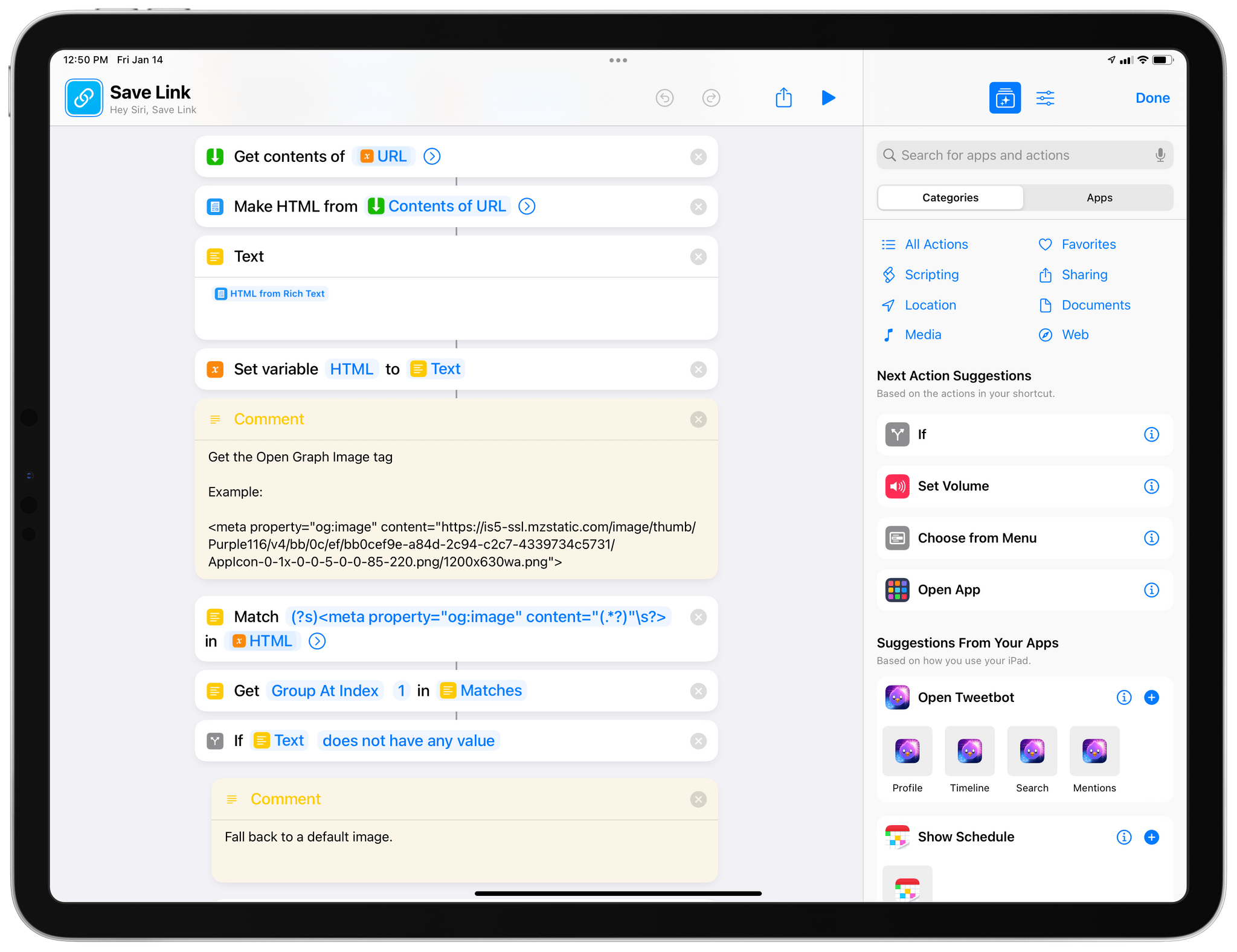
The shortcut extracts Open Graph tags via regular expressions.
You can run Save Link from the share sheet on iPhone and iPad in Safari and Safari View Controller; alternatively, you can run the shortcut manually from the Home Screen or the Shortcuts app, and you’ll be prompted to paste the URL you want to save in Obsidian.
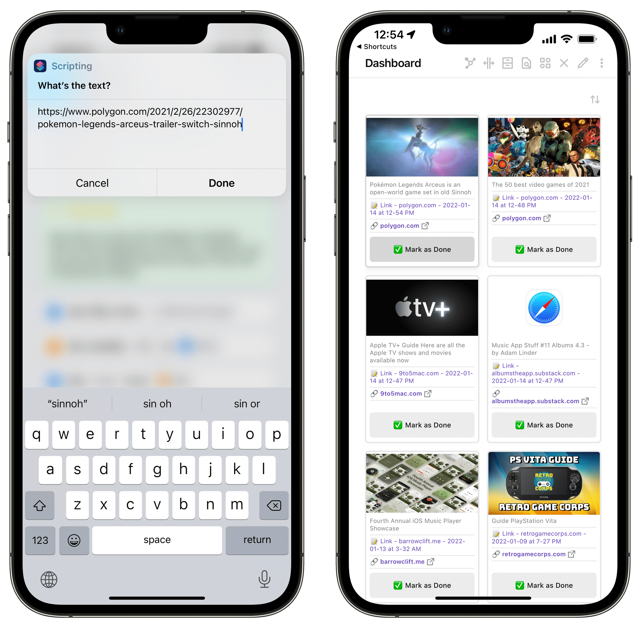
There are some details worth noting about the shortcut: tracking parameters are automatically removed from URLs thanks to a regex that Robb Knight put together; the link is saved alongside a timestamp so you can see when you first saved a webpage in Obsidian; and, you can configure the folder where links should be saved as notes in the ‘Save File’ action at the end of the shortcut as well as modify the default text for the note and any YAML metadata tags.
You can download my Save Link shortcut here.
With a system in place to save links from Safari as standalone notes in Obsidian, I needed to figure out a way to query them all and visualize them as a table in Obsidian with Dataview. My idea was relatively simple: I wanted to query all notes saved in the ‘Links’ folder, but only display the ones that had a status metadata value of new, meaning that Dataview would only show me new links I recently saved in the app. But that meant I also had to come up with a way to mark a link as “not new” anymore when I was done with it.
To make this work, I used DataviewJS and modified a script shared by the creator of the MetaEdit plugin here. DataviewJS is a JavaScript API for Dataview that lets you combine arbitrary JS code with regular Dataview queries, tables, and access to the Obsidian plugin API. Basically, it means you can put together more advanced Dataview code blocks that do all the things non-JS Dataview snippets can do, but you have greater freedom since you can run any code you want in them. This is a topic I’ll revisit in the next installment of this series for another script I created in DataviewJS.
In the case of rich links, I liked the idea of a button I could click in the table to change a note’s status from new to done. DataviewJS can do this because it has access to the API for the Buttons and MetaEdit plugins, which can create buttons and change frontmatter values in notes, respectively. So, after a bit of trial and error, here’s how I modified the DataviewJS snippet I found online to parse and visualize my rich links:
```dataviewjs const {update} = this.app.plugins.plugins["metaedit"].api const {createButton} = app.plugins.plugins["buttons"] dv.table(["Image", "Title", "Note", "Link", ""], dv.pages('"Links"') .where(p => p.status == 'new') .sort(p => p.timestamp, 'desc') .map(p=> ["", p.title, "📝 " + p.file.link, "**[" + "🔗 " + p.domain + "](" + p.link + ")**", createButton({app, el: this.container, args: {name: "✅ Mark as Done"}, clickOverride: {click: update, params: ['status', 'done', p.file.path]}})]) ) ```
When you switch to preview mode in Obsidian, this is table you get:
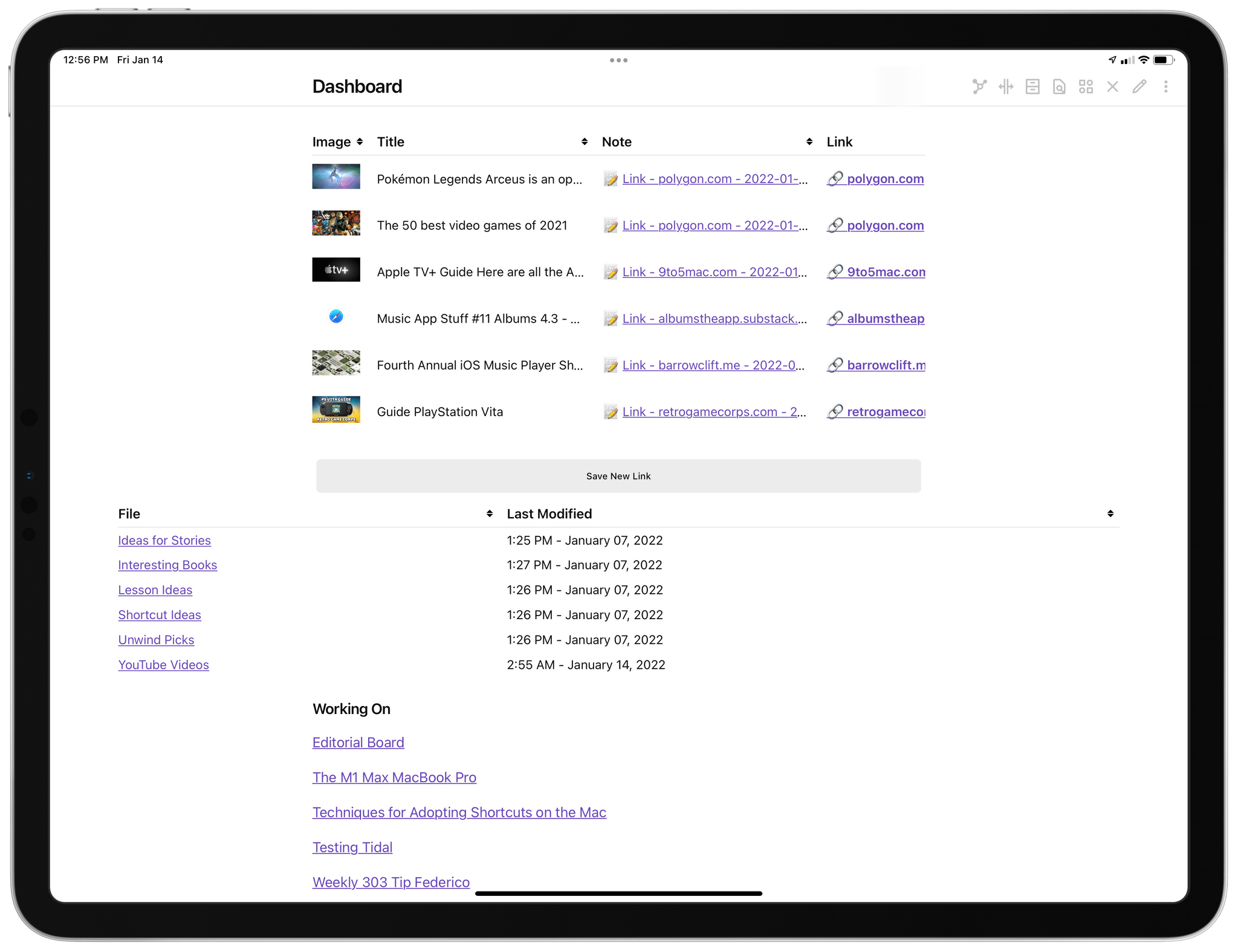
Dataview’s default table mode.
As you can see, the script queries Obsidian for notes in the Links folder that have a status set to new, creates columns for Image, Title, Note, and Link, then maps metadata values for each note to the respective column. The Markdown image syntax is used in the JavaScript code to render native images in the table. The final step was to adopt Minimal Theme’s CSS classes to turn this table into a grid of cards for each link, which would also display a ‘Mark as Done’ button at the bottom of each link card. So I added this frontmatter code to my Dashboard note:
And the result is what I always wanted to have in Obsidian:
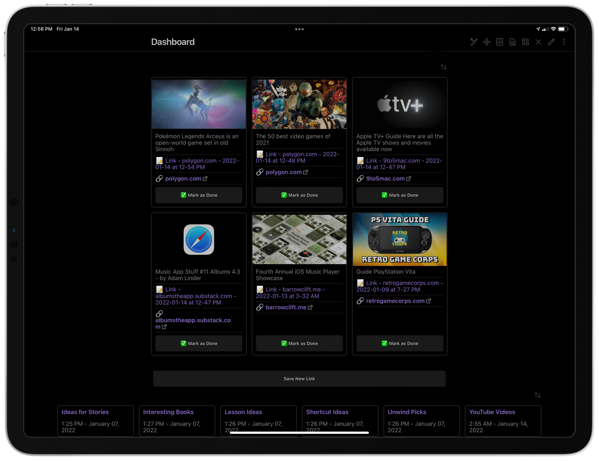
The same table as cards.
Each card lets me do three things: I can open the URL in Safari by tapping the link; I can open the standalone note associated with each link if I want to add some comments to it; or I can click the ‘Mark as Done’ button in the card, which will instantly change the note’s status and remove it from my Dataview visualization (but the note itself will remain in Obsidian). I genuinely love the workflow I’ve built here: it lets me save links in Obsidian just as quickly as before, but it adds more context around each link with titles and image previews, which I didn’t have before when I was just pasting raw URLs in plain text. I hope you’ll find it useful, too.
The freedom granted by this dual Obsidian-Shortcuts system is unprecedented for note-taking apps on Apple platforms. It does require some understanding of how Dataview works and a bit of preparation upfront, which is exactly why I’m writing about this stuff – so other people can use the same system. As I noted above, this is just my first story on what I’ve built with Dataview in Obsidian: stay tuned, it’s going to be a fun journey.
In last week’s issue of MacStories Weekly, I explained how I turned my Dashboard note into a richer, more interactive hub thanks to Dataview snippets displayed as cards, which show me a grid of links I’ve recently saved, plus a collection of recently modified notes. As I covered last week, the cards displayed in my Dashboard are an alternative look for a Dataview table made possible by Minimal Theme; those cards feature an interactive ‘Mark as Done’ button that takes advantage of the Buttons and MetaEdit plugins to change each linked note’s status from new to done.
It’s been fun watching members of our Discord as well as the Obsidian forums tweak and adapt my setup to their needs, so this week I want to share something else I’ve built with the same system that has fundamentally changed my Obsidian workflow: a watch-later system for YouTube videos powered by Shortcuts, Markdown files, and, of course, Dataview.
Let’s actually start from the end result, so you can immediately have some context as to what I’m referring to:
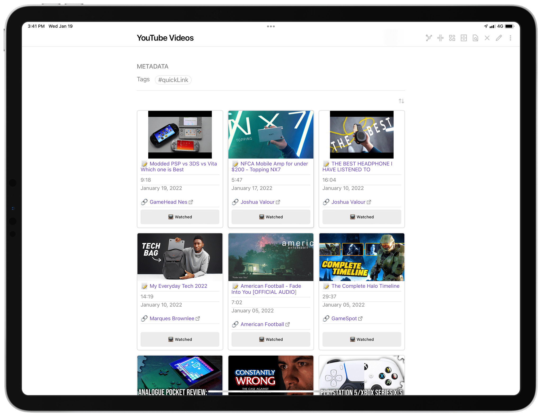
My watch-later system in Obsidian.
As you can see, the look of my ‘YouTube Videos’ note is fairly similar to the rich link section of the Dashboard note I covered last week. This is a note that contains a Dataview snippet, which aggregates notes from a specific folder that are rendered as a table. In plain text, this is what the entire note looks like:
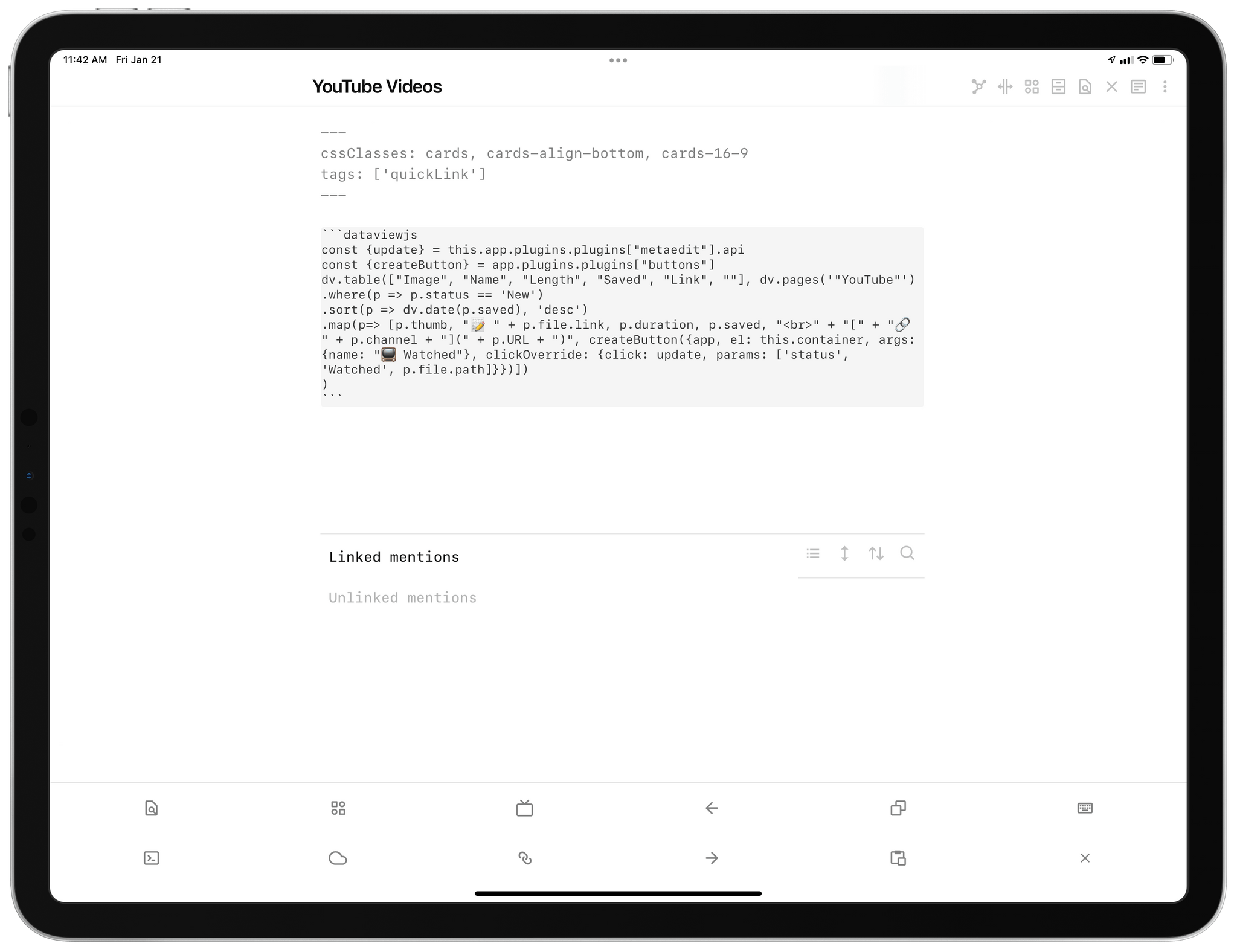
My YouTube Videos note before being rendered in preview mode.
You’ll notice the cssClasses for Minimal Theme, which I also covered last week. That’s the special syntax that makes it possible to render a standard Dataview table as a grid of cards. In fact, if I remove the YAML syntax for cards, here’s what the same Dataview snippet is rendered as:
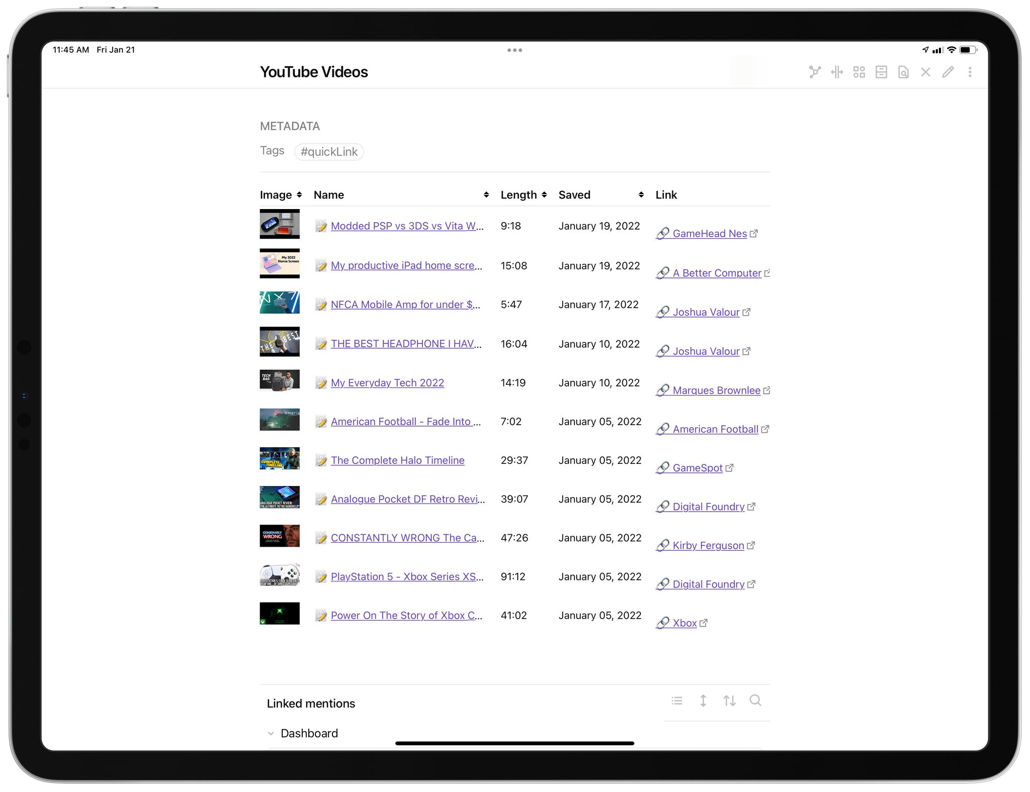
The same Dataview snippet, rendered without the extra CSS for cards.
So far, this is all pretty standard and in line with my explanation from last week. For this system, however, I had to put quite some time into the shortcut that makes it possible to save YouTube links as standalone Markdown notes with the proper metadata necessary for this Dataview snippet to work.
Let’s back up a little. Like many others these days, I enjoy watching a lot of YouTube videos from my favorite channels, and I don’t think I’m alone in feeling like there’s always more content than time I have for it in a regular day. So, I want to save links to these videos somewhere and make sure I can find them again later and catch up with them at my own pace. For a while I tried to use YouTube’s built-in Watch Later playlist, but I don’t like how many taps are required in the YouTube UI to open the playlist. I also tried to save links to YouTube videos in read-later systems like Reading List, Raindrop, GoodLinks, and Matter; the problem with those services is that they’re always optimized for articles first and foremost, and they never offer video-specific filters or details such a displaying the duration or channel names of saved videos. Therefore, once I had a good foundation in place for saving rich links and displaying them with Dataview, I realized I wanted to build the same system, but specifically optimize it for YouTube content.
The trickiest part about turning a YouTube URL into a note that contains information about the video is extracting metadata about the video from the YouTube website. YouTube has an API, but it requires a lot of configuration for OAuth-based authentication in Shortcuts, and I didn’t have the time, nor patience, to go down that road. So as is often the case for web services that do not want to cooperate with Shortcuts through native actions or an easily accessible API, I turned to a tried and proven method:
Scraping webpages with regex.
The shortcut I put together is called Save YouTube Link and, like last week’s Save Link shortcut, it turns a link (passed from the YouTube app, the share sheet, or manually pasted into Shortcuts) into a Markdown note in Obsidian with YAML metadata. These bits of metadata include the original video URL, channel name, video title, thumbnail URL, and duration of the video. Here’s what a note created by Save YouTube Link looks like:
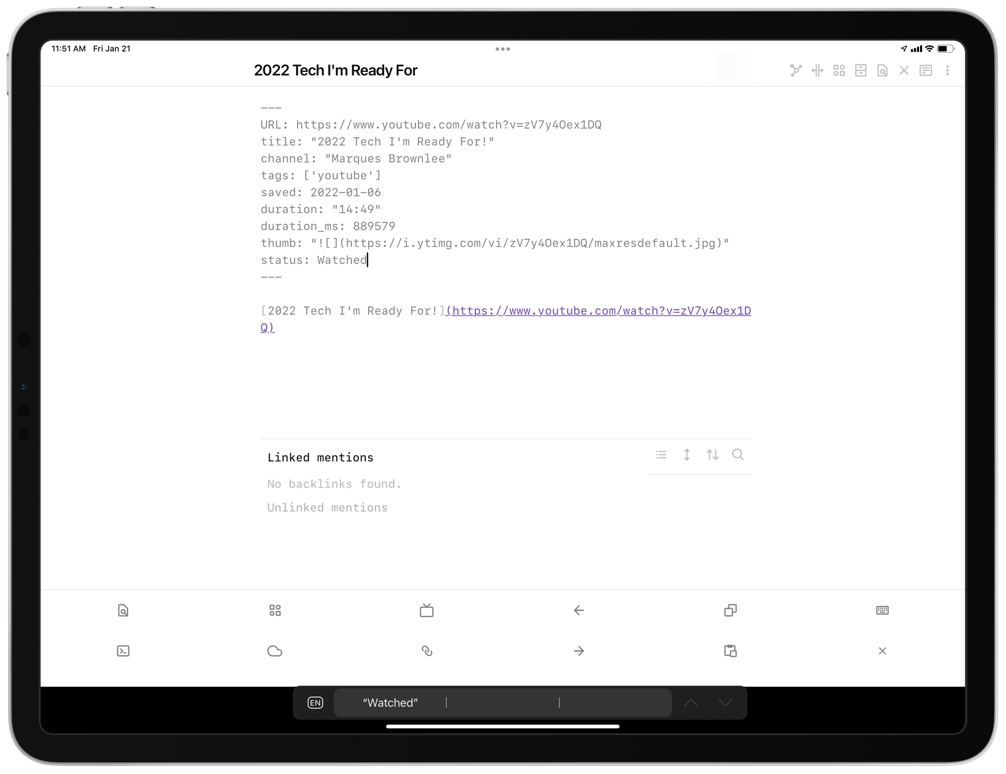
A YouTube link saved as a note with metadata.
As you can imagine, all these metadata values are then parsed by Dataview and used to assemble a table that presents notes as rich links with thumbnails, links, duration, and a button to mark videos as “watched” in Obsidian. Once again, here’s what the final table looks like in Cards mode:
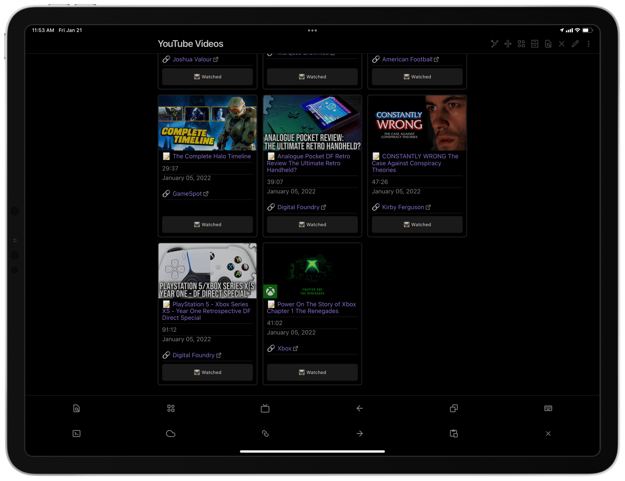
And here is the Dataview snippet that powers it all:
```dataviewjs
const {update} = this.app.plugins.plugins["metaedit"].api
const {createButton} = app.plugins.plugins["buttons"]
dv.table(["Image", "Name", "Length", "Saved", "Link", ""], dv.pages('"YouTube"')
.where(p => p.status == 'New')
.sort(p => dv.date(p.saved), 'desc')
.map(p=> [p.thumb, "📝 " + p.file.link, p.duration, p.saved, "
" + "[" + "🔗 " + p.channel + "](" + p.URL + ")", createButton({app, el: this.container, args: {name: "📺 Watched"}, clickOverride: {click: update, params: ['status', 'Watched', p.file.path]}})])
)
```
It is, effectively, the same setup as my Dashboard featuring rich links, but it uses another folder as source for notes that are formatted differently. Which brings it all back to the shortcut required to save YouTube links as Markdown notes with a YAML frontmatter.
The shortcut takes a very crude, yet effective approach to scraping YouTube webpages for information: it downloads YouTube links as webpages using the ‘Get Contents of URL’ action, converts the result to an HTML variable, then uses multiple regular expressions hard-coded to match specific strings of text that contain the information we need. When I say “crude”, this is what I mean:
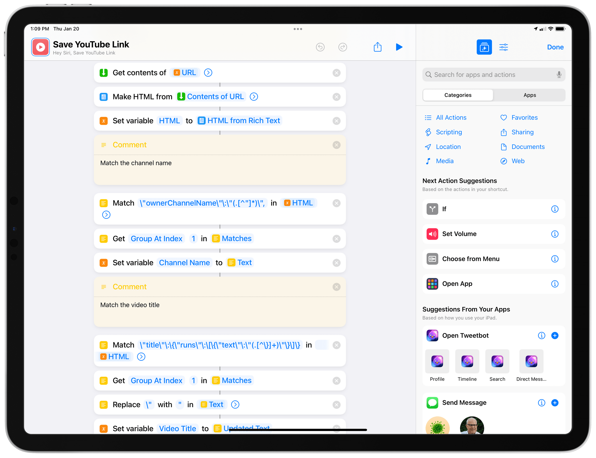
Hard-coded regular expressions to scrape YouTube for video metadata. In this case, channel names and video titles.
Scraping is never a reliable technique to get the information you want out of a webpage. Websites are redesigned, how source code is presented to web browsers (or the ‘Get Contents of URL’ action) changes over time, and your hard-coded scraping script may stop working and require an update. But sometimes scraping is the only or most effective way, and this was the case for me and this YouTube shortcut. I know that it may break and require a fix eventually, but on balance, I’d still prefer that occasional bug fix over spending days trying to figure out Google authentication flows and the YouTube API in Shortcuts.
I’ve been using this scraping-based YouTube shortcut for nearly two months, and it has always worked reliably, so I’m very happy with it for now. That said, be aware that it is based on some ridiculous regular expressions that have been hard-coded into the shortcut to make some sense out of the complicated HTML that YouTube returns. My favorite example is this wild series of actions I had to put together to extract video duration as milliseconds from YouTube and convert it to a readable duration string formatted with minutes and seconds.
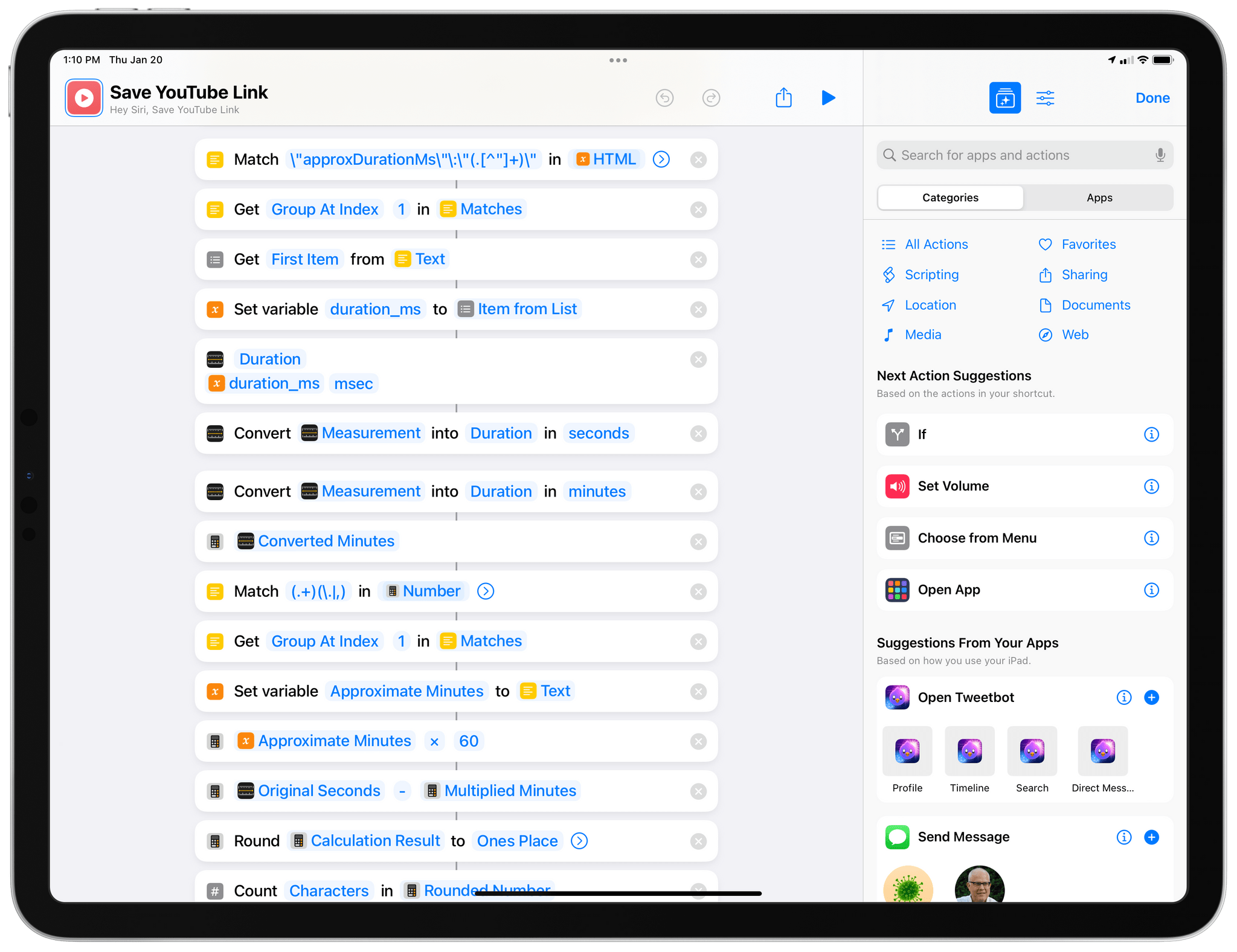
Scraping video duration from YouTube.
Once all the scraping is done and variables are ready at the end of the shortcut, a ‘Text’ action prepares all the YAML syntax we need for Dataview to work in Obsidian:
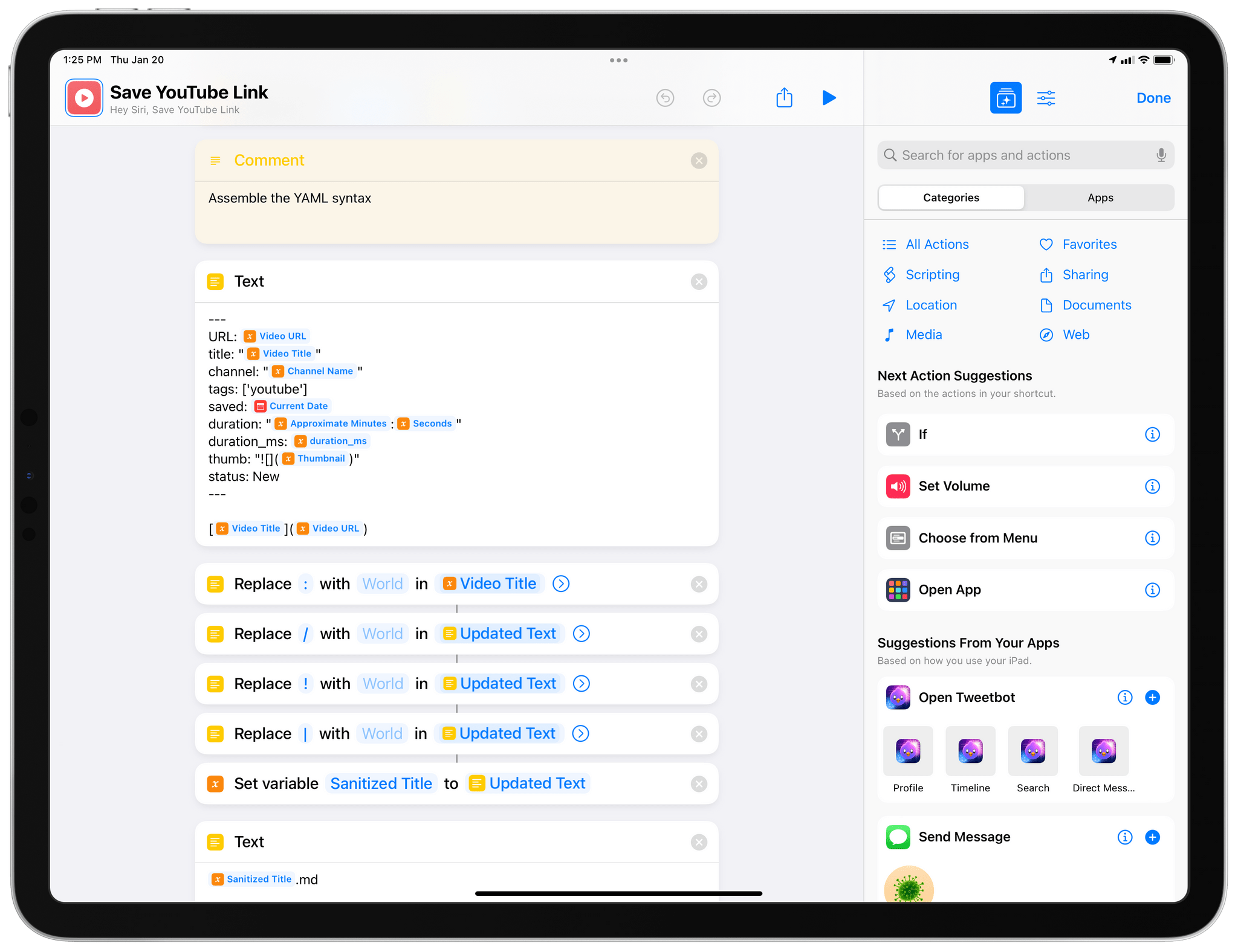
The newly-generated Markdown note featuring YouTube metadata for the selected video is then saved to a folder in Obsidian, and the video will show up in the note that contains the Dataview snippet as a new card:
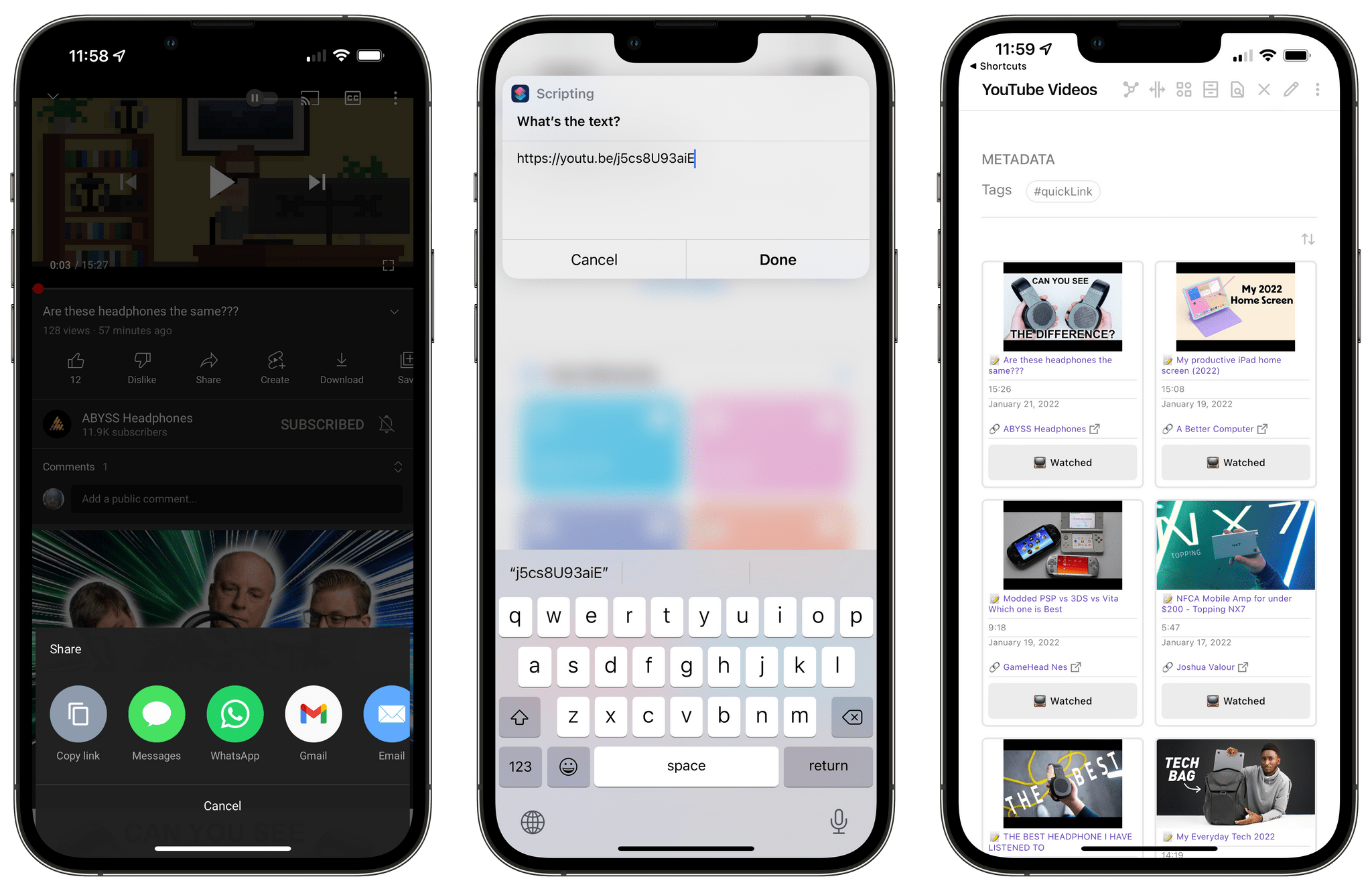
Saving YouTube links on iPhone.
There is one important detail I should note here: my Dataview snippet assumes that all YouTube links are saved as notes in a folder in the root of your vault called ‘YouTube’. If you want to save notes in a different folder, make sure you modify this part of the Dataview snippet to include the path of the folder you want to use:
dv.pages('"YouTube"')
So that’s the system I’ve built. Now whenever I find a YouTube video I want to watch later, I can save it with the Save YouTube Link shortcut in Obsidian, load my YouTube Videos workspace, and Dataview will show me a grid with cards for all the videos I’ve saved. I can tap links in the grid to reopen videos in the YouTube app for iPhone or iPad (or the website on Mac), and click the ‘Watched’ button when I’m done with them to remove them from the grid. Thanks to the Sortable plugin, the Dataview table/grid can be sorted by any of the properties available for videos; by default, the grid is sorted by date saved from latest to oldest, but you can also sort videos by title, channel name, or duration.
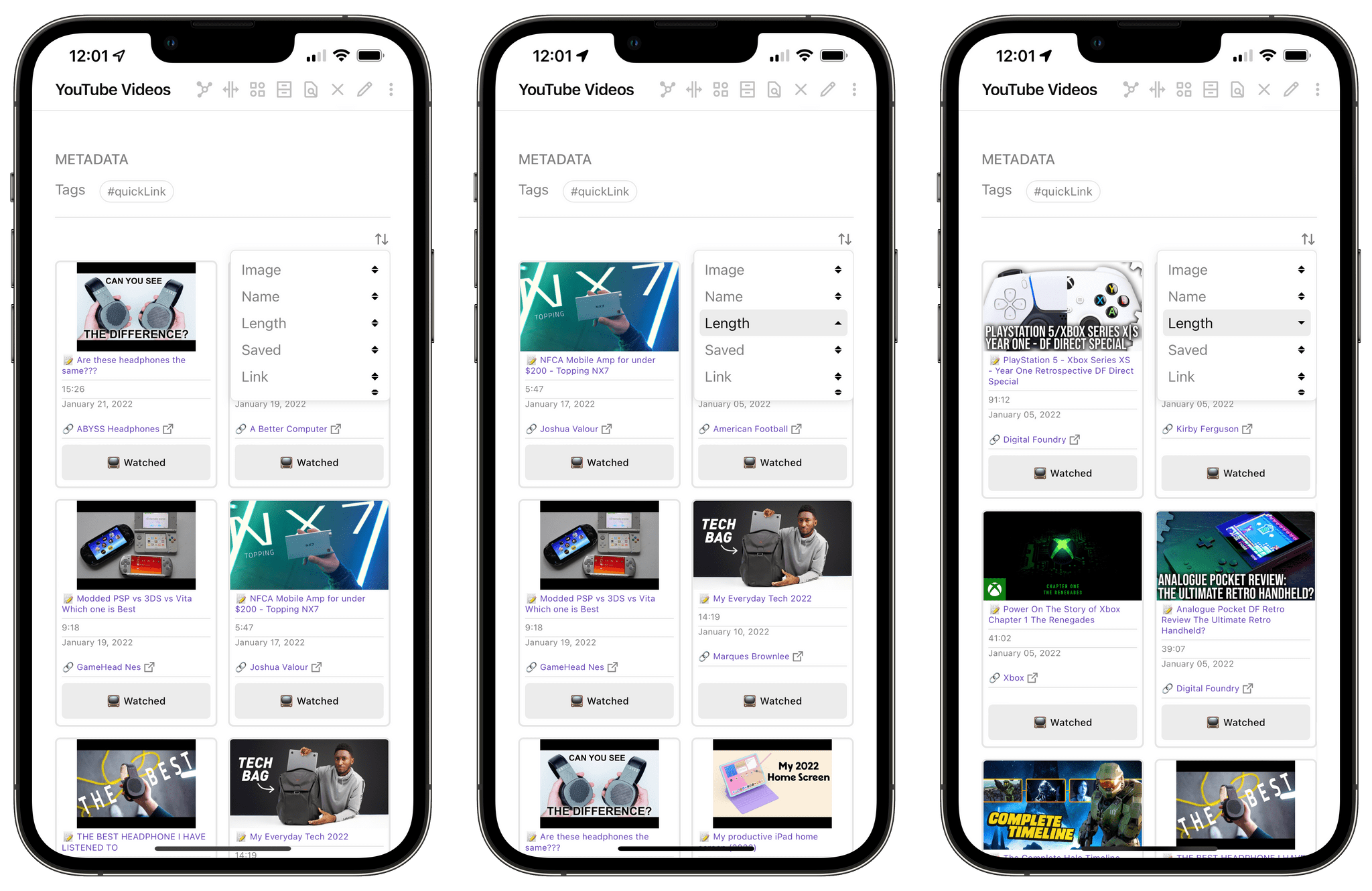
Sorting videos thanks to the Sortable plugin.
I love what Obsidian, Dataview, and Shortcuts have allowed me to create here. This is the happiest I’ve ever been with a watch-later solution for YouTube videos, and I hope you’ll find it useful too.
You can find my Dataview snippet as a private gist here, and you can download my Save YouTube Link shortcut here.
---
cssClasses: cards, cards-align-bottom, cards-16-9
---
const {update} = this.app.plugins.plugins["metaedit"].api
const {createButton} = app.plugins.plugins["buttons"]
dv.table(["Image", "Name", "Length", "Saved", "Link", ""], dv.pages('"YouTube"')
.where(p => p.status == 'New')
.sort(p => dv.date(p.saved), 'desc')
.map(p=> [p.thumb, "📝 " + p.file.link, p.duration, p.saved, "<br>" + "[" + "🔗 " + p.channel + "](" + p.URL + ")", createButton({app, el: this.container, args: {name: "📺 Watched"}, clickOverride: {click: update, params: ['status', 'Watched', p.file.path]}})])
)
The last time I wrote about appending text to my Dashboard note in Obsidian in November 2021, I shared two distinct methods to do so, both based on shortcuts. The first one relied on the QuickAdd plugin and its ability to insert text into specific sections of notes in Obsidian; QuickAdd doesn’t support passing text to its input field from Shortcuts via, say, a URL scheme, so my shortcut worked by asking you to type some text first, which it then copied to the clipboard so you could paste it into QuickAdd’s UI. An ingenious workaround, but not an elegant one.
The second method was based on Shortcuts’ native Files actions in iOS 15, and it worked by directly inserting text into the Dashboard.md document stored in the Files app (I keep my Obsidian vault in local storage and use the Obsidian Sync service). Over time, I’ve grown to prefer this method of appending text to my Dashboard: it’s faster, I don’t see the QuickAdd interface when Obsidian launches, and, more importantly, I don’t have to tap ‘Paste’ in the QuickAdd input UI.
Over the past few months, however, I’ve also realized that I wanted to simplify my workflow for capturing ideas and make it more flexible. So today, I’m sharing a spin-off of my original Append to Dashboard shortcut called On My Mind, which is based on the same technique but specifically optimized for fast idea capture on multiple Apple devices. The shortcut is largely similar to the one I shared last year, but there are some key differences regarding user interaction and text-entering methods I’m going to describe below.
First, the simplification occurred because I realized I don’t need multiple sections in my Dashboard note to save thoughts. I found that I was always dropping thoughts and ideas into the ‘On My Mind’ section of the note, but the original Append to Dashboard shortcut would always prompt me to pick a specific section from the note every time. I wanted to drop that extra section-picking step and default to always prepending new thoughts at the top of the On My Mind section. Prepending instead of appending is a new thing for me, but I’ve discovered that it works better for my brain since it means most recent ideas are also the most recent lines of text at the top of the section.
So, for On My Mind to work, you’ll have to enter the Markdown syntax of the specific section of your Dashboard note where you always want to save your thoughts. You’ll be asked to complete this step at setup, but you can also tweak this in the ‘Text’ action near the beginning of the shortcut, as pictured below:
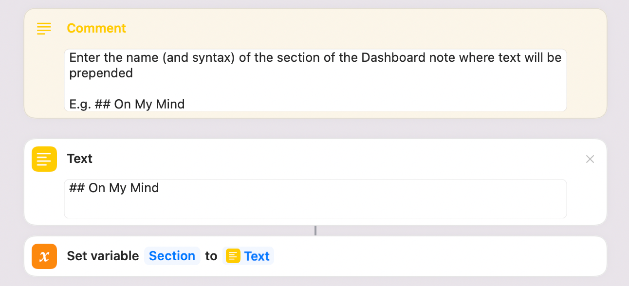
You can define a specific section of the Dashboard where you want to prepend text.
Prepending text at the top of a section is also much easier to do in Shortcuts than appending, which required regular expressions to determine where a section ended and another began. When we’re prepending text, all we need to do is replace the Markdown heading of the section with the heading plus the text we’re appending. This is what it looks like in the shortcut:
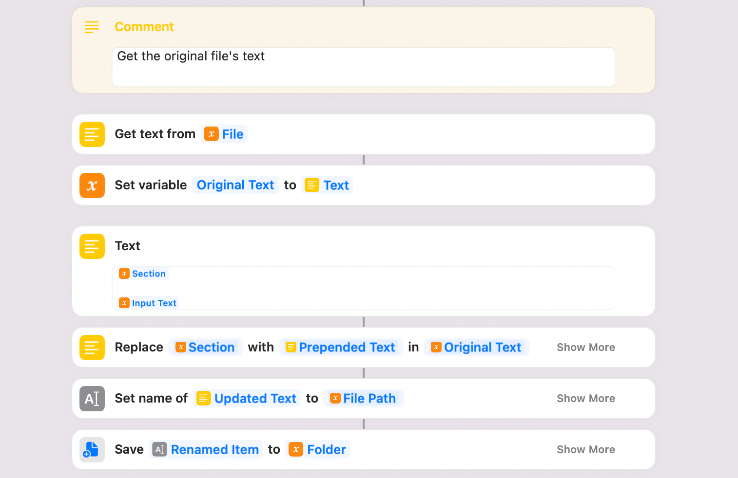
Prepending text to a section of a note in Obsidian. You can see how the original text is modified and re-saved as the same document in the same folder.
With this new system, saving random ideas and thoughts in my Dashboard note in Obsidian couldn’t be easier. From the Home Screen widget on my iPhone and iPad, I can type some text and it gets immediately inserted at the top of the On My Mind section:
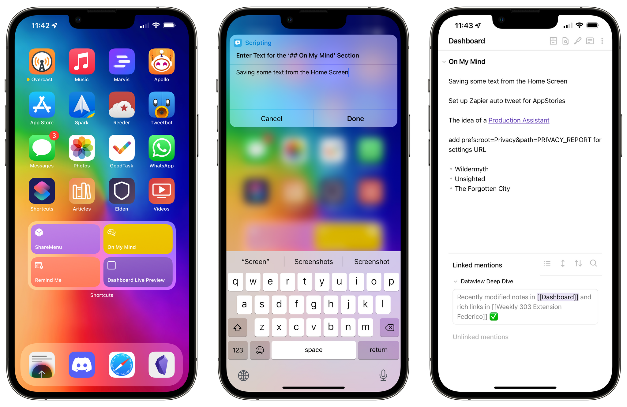
Saving thoughts from the Home Screen via On My Mind.
The process is even faster on the Mac, where I can trigger the shortcut with a system-wide hotkey (⌘⌥⌃O for me) and capture ideas from anywhere on my computer. I’ve been doing this with Raycast, and I love it.
On macOS, I can trigger On My Mind’s manual text input from anywhere.
All this has been great for me, but there was a missing piece: dictation. I often find myself in two similar, but different, scenarios in which I’d prefer to save ideas by dictating them without any manual interaction whatsoever: when I’m in the car, and when I’m wearing AirPods and doing things around the house. How could I extend On My Mind so it would fall back to dictation input only in those scenarios?
As it turns out, Apple doesn’t provide users with a way to check the audio playback destination of the device where a shortcut is running. Fortunately, third-party developers have thought about this problem and there are a couple of options to add audio-checking capabilities to Shortcuts. My favorite, and the one I’m now using in On My Mind, is the ‘Get Audio Playback Destination’ action offered by the free Actions app, a MacStories team favorite. This action works on iPhone and iPad only, and it does not detect AirPlay devices, but it can correctly identify whether audio is playing through your device’s speakers, AirPods, or a connected Bluetooth device. Thanks to the Actions app, my shortcut can now quickly check where audio is playing; the action runs in a fraction of a second and works entirely in the background; the only requirement is that you download the Actions app from the App Store before trying dictation with On My Mind.
When the action from Actions (I know, I know) runs, it first checks if the Audio Playback Destination variable contains the word ‘AirPods’. If it does, the shortcut will bring up the native dictation UI instead of keyboard input so you can dictate your text. Dictation parameters (language, pause, etc.) can be configured as always in the Shortcuts editor, and text is immediately transcribed as-you-speak thanks to Apple’s fast on-device processing. The dictated text is turned into actual text and prepended to a section of a note in Obsidian, just like I described above.
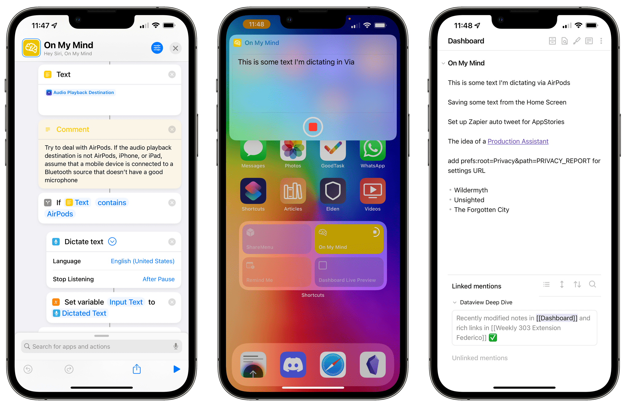
Dictating text when AirPods are connected.
I took a slightly different approach for connected devices that are not AirPods. I did this because of an issue that is very specific to me; if you also have this problem, this is likely going to apply to you as well; if it doesn’t, feel free to delete the entire block of actions I’m going to describe below.
I don’t have a CarPlay-enabled car, which means my iPhone automatically connects to it using a standard Bluetooth connection. That has been mostly okay for music playback (although I don’t see album artwork for music on the car’s display), but the system has been absolutely horrible for Siri and any kind of voice input. There are multiple issues here: if I try to activate Siri, dictate a message, or send an audio message via WhatsApp, there’s a 5-second delay between pressing the button and voice input actually activating; second, I don’t know why, but the voice quality of Siri in this mode is terrible, making it sound like a robot stuck in a tin can; third, and perhaps worst of all, if I do decide to dictate messages this way, the car’s microphone also makes me sound like that robot. And it’s very strange, because this only applies to voice input for Siri and dictation; people say that I sound crystal-clear on phone calls I take from the car.
I have no idea why this is the case, and I can’t wait to get a CarPlay-enabled car, but I wanted to find a solution to this problem for my On My Mind shortcut in the meantime. The solution I came up with may be a little unconventional, but it works: if the shortcut detects that it’s connected to a Bluetooth output device that isn’t AirPods, Bluetooth is temporarily turned off, text can be dictated via the iPhone’s built-in microphone, then Bluetooth is immediately re-activated so my iPhone can reconnect to my car’s Bluetooth system. Here’s what this flow of actions looks like in the shortcut:
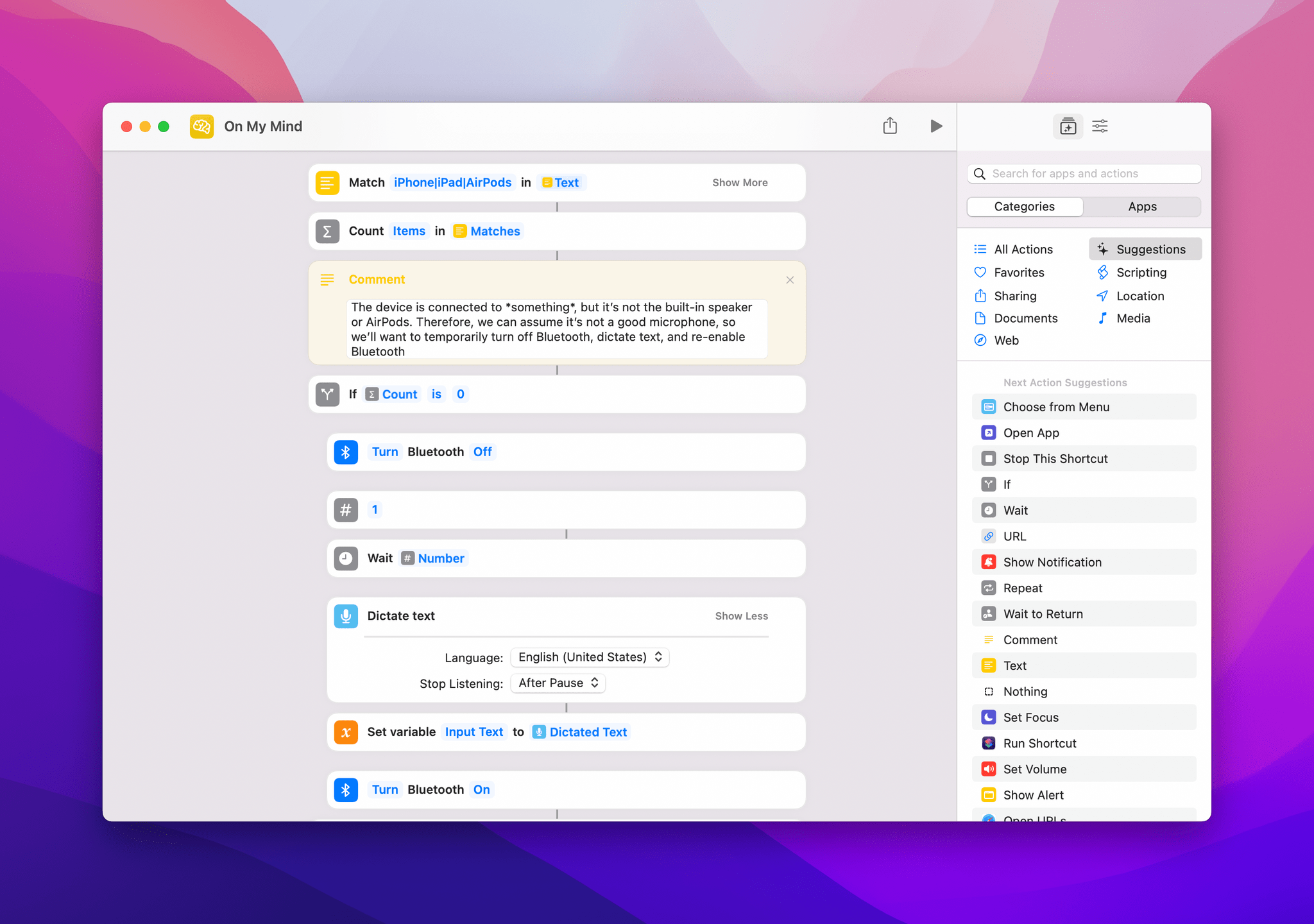
How the shortcut turns off Bluetooth and instantly re-enables it.
With this method, I’ve been able to save the occasional idea I have while driving without a) distractions and b) having to deal with whatever is going on between my iPhone and the car’s terrible Bluetooth voice input.
The result of this optimization process is the fastest, most versatile idea-capturing workflow I’ve ever had with Obsidian or with any note-taking app, really. Now, no matter the device I’m using and no matter how I’m triggering the shortcut, I know I can invoke On My Mind and I’ll be able to quickly capture a thought in seconds and send it to a section of my Obsidian dashboard right away, with no further interactions. This shortcut has genuinely helped me forget fewer things and use Obsidian even more, and I hope you’ll find it useful as well.
You can download On My Mind here.
Get help and suggestions for your iOS shortcuts and productivity apps.
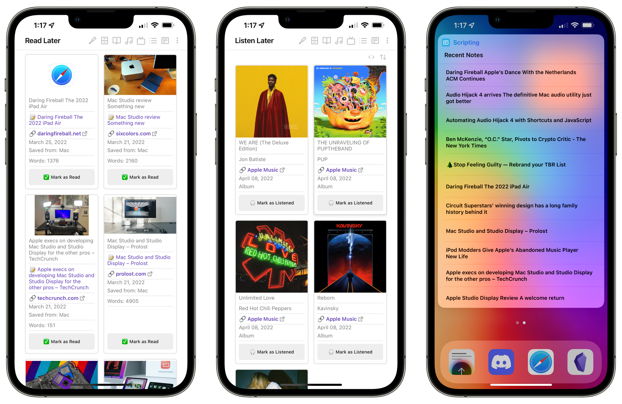
In Parts 6 and 7 of my Obsidian Setup series, I explained how I created a system to save Safari webpages and YouTube videos as ‘rich links’ in Obsidian thanks to a combination of Dataview and Shortcuts. For this first week of Automation April, I thought I’d add two more examples of content I’ve been tracking in Obsidian via cards in a grid powered by Dataview with interactive buttons: articles and Apple Music albums saved for later.
Both flavors of this workflow are largely based on the same techniques and structure I first shared in January; however, the shortcuts that make the creation of these ‘cards’ (i.e. notes in Obsidian) have some unique aspects to them, and I’ve also created additional helper shortcuts to retrieve these items from the Home Screen, so let’s take a look.
The fact that I’ve been struggling to find the ideal read-later app for me should come as no surprise to Club MacStories members, just like it shouldn’t surprise anyone that my latest experiment in this field is trying to track everything I read in Obsidian. I’ve tried everything over the years – from Pocket and Reading List to converting articles into ‘books’ for a Kindle device to the latest crop of read-later apps such as Matter and Readwise. Perhaps the reason I can’t stick to a single read-later service right now is that I don’t want to: this market of apps is effectively living its own renaissance right now, and I want to dip my toes into many different waters. I want to try everything because I’m curious. So, obviously, I was also curious to see whether I could build my own, private, self-hosted read-later system in Obsidian.
As it turns out, not only was this all possible to create in Obsidian based on techniques I already explored months ago, but it’s also one of the more fun and flexible systems I’ve tried for tracking read-later material in a while.
At a high level, my Obsidian read-later workflow revolves around the same dual Shortcuts+Obsidian setup I wrote about for saving rich links in my Dashboard in January. When I find an article I want to save for later, I can run my Obsidian Read Later shortcut in Safari; doing so creates a new note in a ‘Read Later’ folder in Obsidian that contains YAML metadata for the article. Here’s what these notes look like:
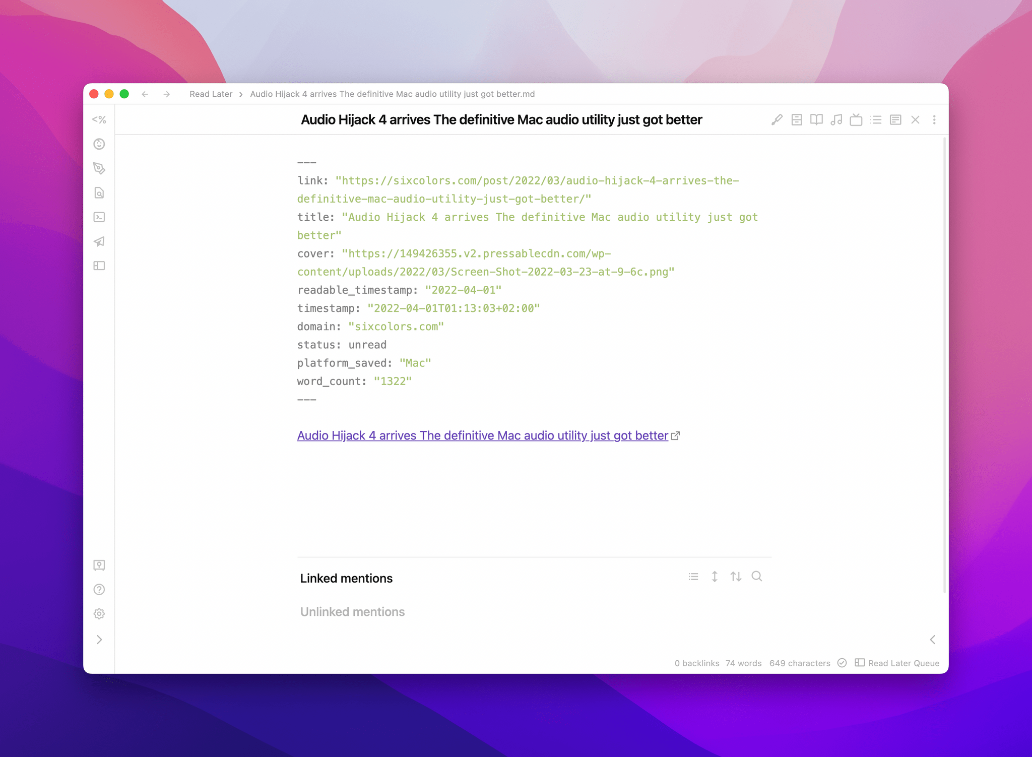
A note for an article saved for later.
As you can see, each article becomes a Markdown note with a frontmatter that contains additional metadata for the story: the original URL and title are included, of course, but there’s also a field for the article’s hero image, a timestamp for when it was saved, and the domain name. You’ll also notice that for this read-later-optimized version of this shortcut, I added new metadata fields for information that makes sense to have when you’re browsing a read-later queue.
First, I added a field to see from which device you saved an article into your queue. Sometimes I find it convenient to know whether I’m looking for a story I saved from my iPad or iPhone, but most read-later apps don’t care about this kind of context; from Shortcuts, I just added an additional block of actions to save the current device’s model name to a variable, and that was it.
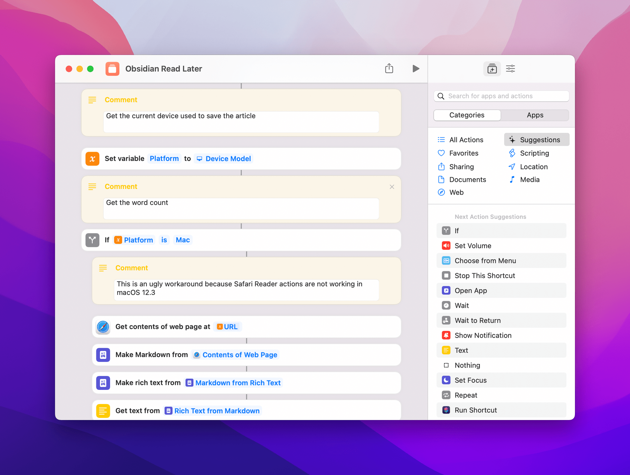
Saving device details in Shortcuts.
I also wanted to save the word count of the article so that I could later sort my queue by word count – a useful option to have if you’re looking for a shorter story to read in a few minutes. This turned out to be more of a challenge than I anticipated since Shortcuts for Mac cannot run actions based on Safari Reader, which is what the iPhone and iPad versions of Shortcuts use to get a word count from the article you’re saving.
Don’t just take my word for it though – let’s take a look at the shortcut in action. Here’s how easy it is to turn a URL into an article and get its word count in Shortcuts for iPhone and iPad:
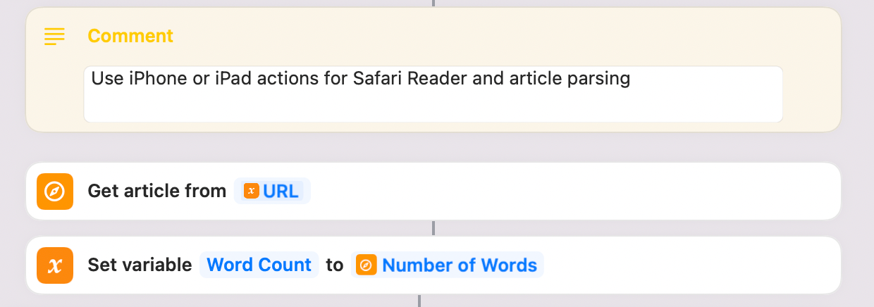
Two actions, and that’s it.
And because, for whatever reason, Safari Reader actions are not compatible with macOS despite the fact that, you know, Safari and Safari Reader exist on macOS, this is the silly and ugly workaround I had to use when the shortcut runs on a Mac:
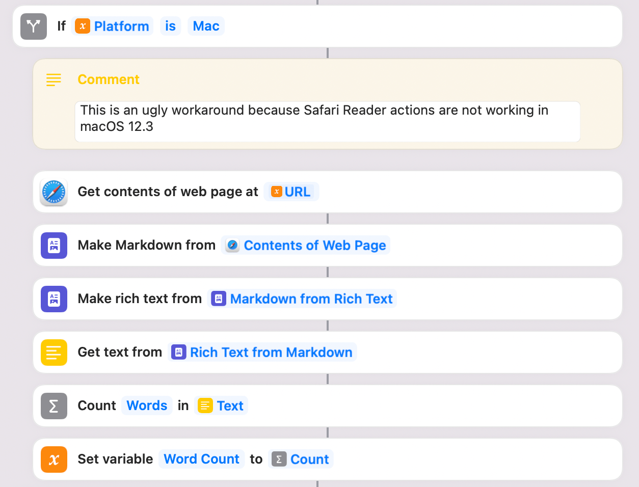
To get a word count from an article on the Mac, I had to fetch the webpage’s contents as HTML, convert it to Markdown, convert it back to rich text (to eliminate as much HTML garbage as possible), force it into plain text (to get rid of images), then count the number of words. Why is this the case? I don’t know. But I hope WWDC 2022 and future OSes will be an opportunity for Apple to focus on Shortcuts bug fixes, performance improvements, and, most of all, feature parity between platforms.
Anyway, back to my read-later system. The shortcut (which you can download at the end of this section) processes Safari webpages in a second and articles are saved in Obsidian right away. The shortcut launches the Obsidian app at the end to force-trigger a sync for the newly created note; if you don’t want to launch Obsidian (perhaps because you’re using iCloud Drive, which always syncs in the background), you can remove this step.
In Obsidian, just like I did for rich links and YouTube videos before, I created a single Read Later.md note that uses Minimal Theme’s Cards layout mode and a DataviewJS snippet to visualize all notes saved in the ‘Read Later’ folder as nice interactive cards.
Here’s what the YAML syntax at the top of this note looks like:
```
And here’s the DataviewJS snippet:
```dataviewjs const {update} = this.app.plugins.plugins["metaedit"].api const {createButton} = app.plugins.plugins["buttons"] dv.table(["Image", "Title", "Note", "Link", "Saved On", "Saved From", "Word Count", ""], dv.pages('"Read Later"') .where(p => p.status == 'unread') .sort(p => p.readable_timestamp, 'desc') .map(p=> ["", p.title, "📝 " + p.file.link, "**[" + "🔗 " + p.domain + "](" + p.link + ")**", p.readable_timestamp, "Saved from: " + p.platform_saved, "Words: " + p.word_count, createButton({app, el: this.container, args: {name: "✅ Mark as Read"}, clickOverride: {click: update, params: ['status', 'archived', p.file.path]}})]) ) ```
When viewed in preview mode, the final result – especially when viewed on an iPad in portrait mode – is very pretty to look at:
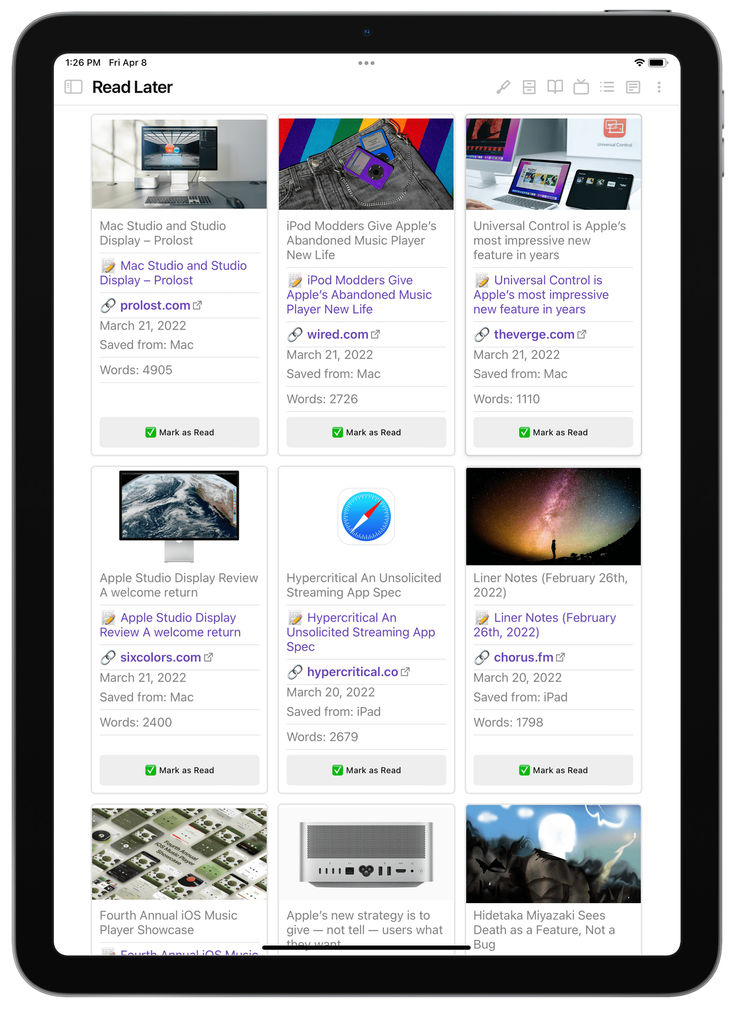
My read-later queue.
There are a couple of things worth noting here. The ‘Mark as Read’ button is interactive and you can click it to change an article’s status field from unread to archived; when you do that, the article will no longer appear in the Read Later grid, but the note will remain in Obsidian so you can open it later and add notes there if you want to. This is made possible by the Buttons plugin, which you’ll have to install from the Community Plugins section of Obsidian.
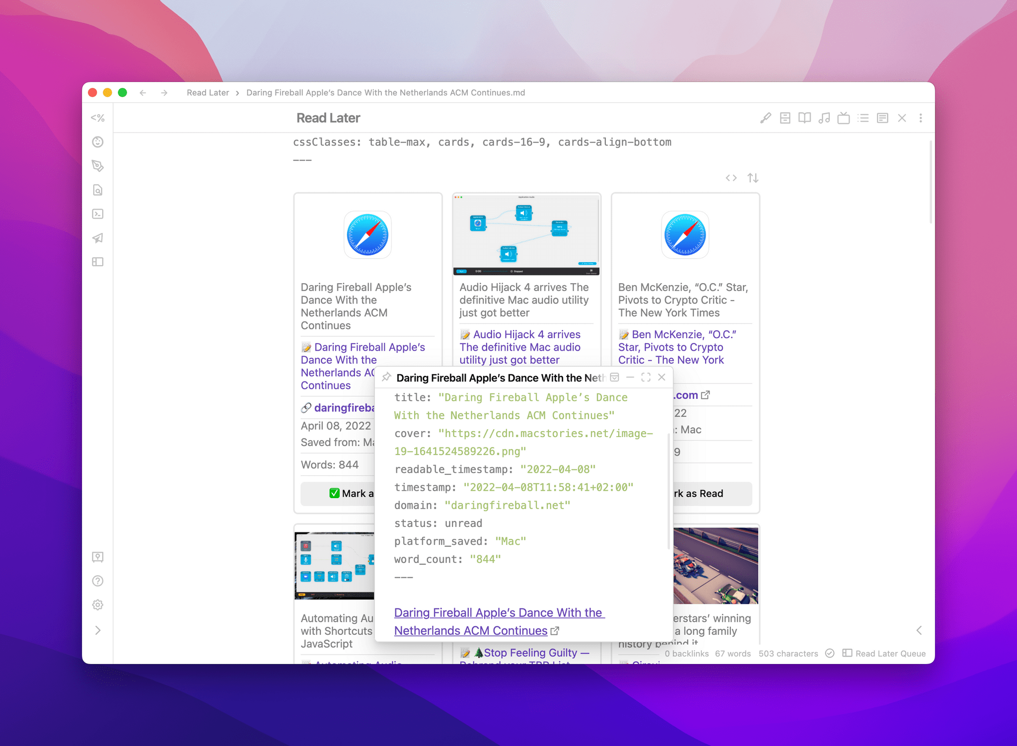
The ‘status’ tag controls whether an article is unread or archived.
Additionally, if you install the Sortable plugin, you’ll be able to sort articles in the read later grid by different properties in ascending or descending order. Articles are sorted by saved date (latest to oldest) by default, but you can also sort them by title, word count, platform, and more.
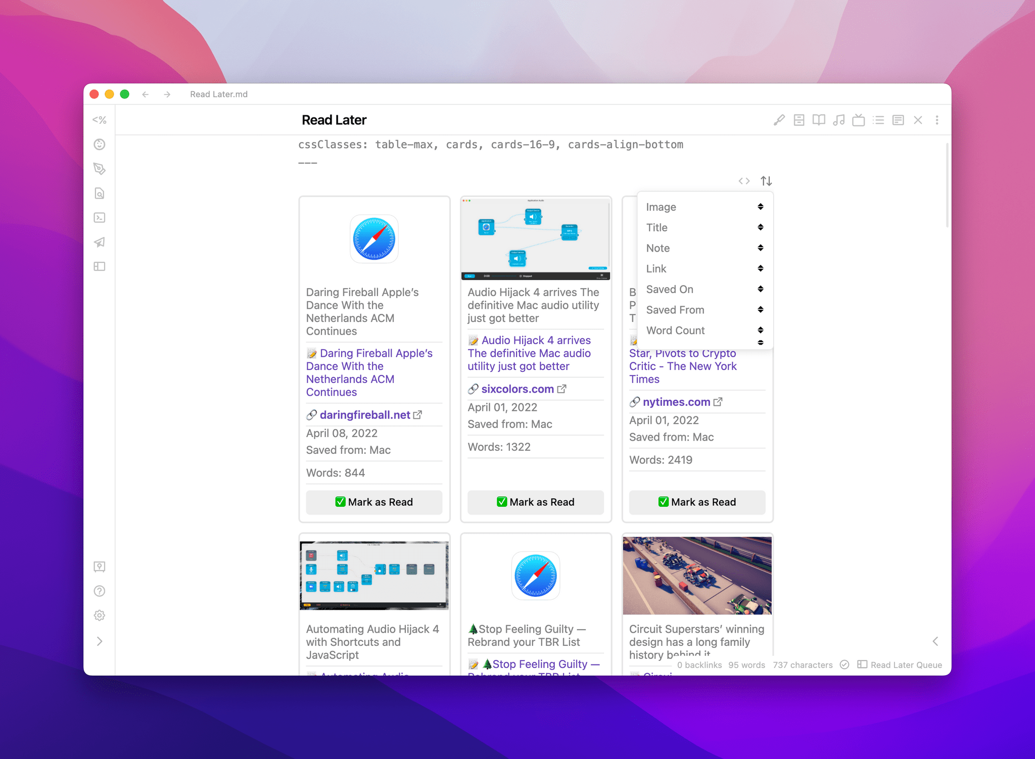
Sorting in the read-later queue.
I’ve been using this Dataview-based read-later grid view for the past couple of months, and I like how I can press a button in Obsidian for iPad (thanks to the Customizable Page Header plugin) to quickly return to this note when I’m in the mood for something to read. That said, I also came up with an additional shortcut that lets me pick articles from the Shortcuts widget on the Home Screen.
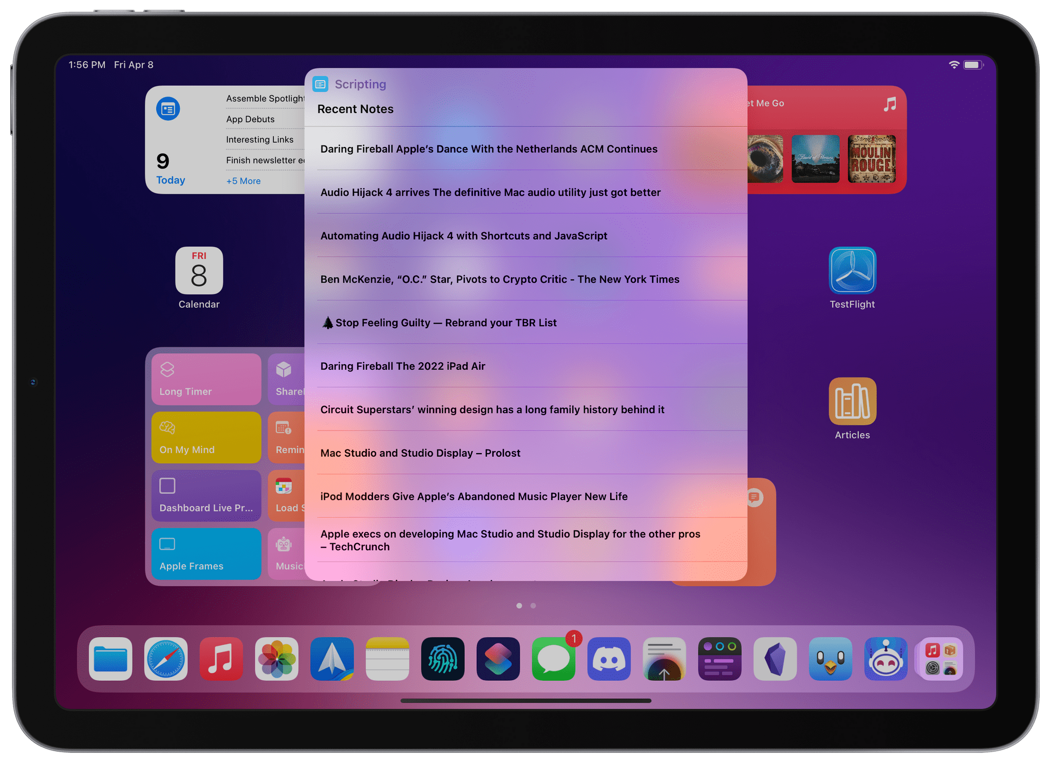
Getting unread articles from the Home Screen.
The shortcut is quite simple: it gets all notes from my Read Later folder, filters the ones that contain status: unread in their Markdown text, and presents me with a list of titles. When I pick a headline from the list, the shortcut uses RegEx to extract the story’s original link from the note and reopens it in Safari so I can start reading right away. Here’s what the shortcut looks like:
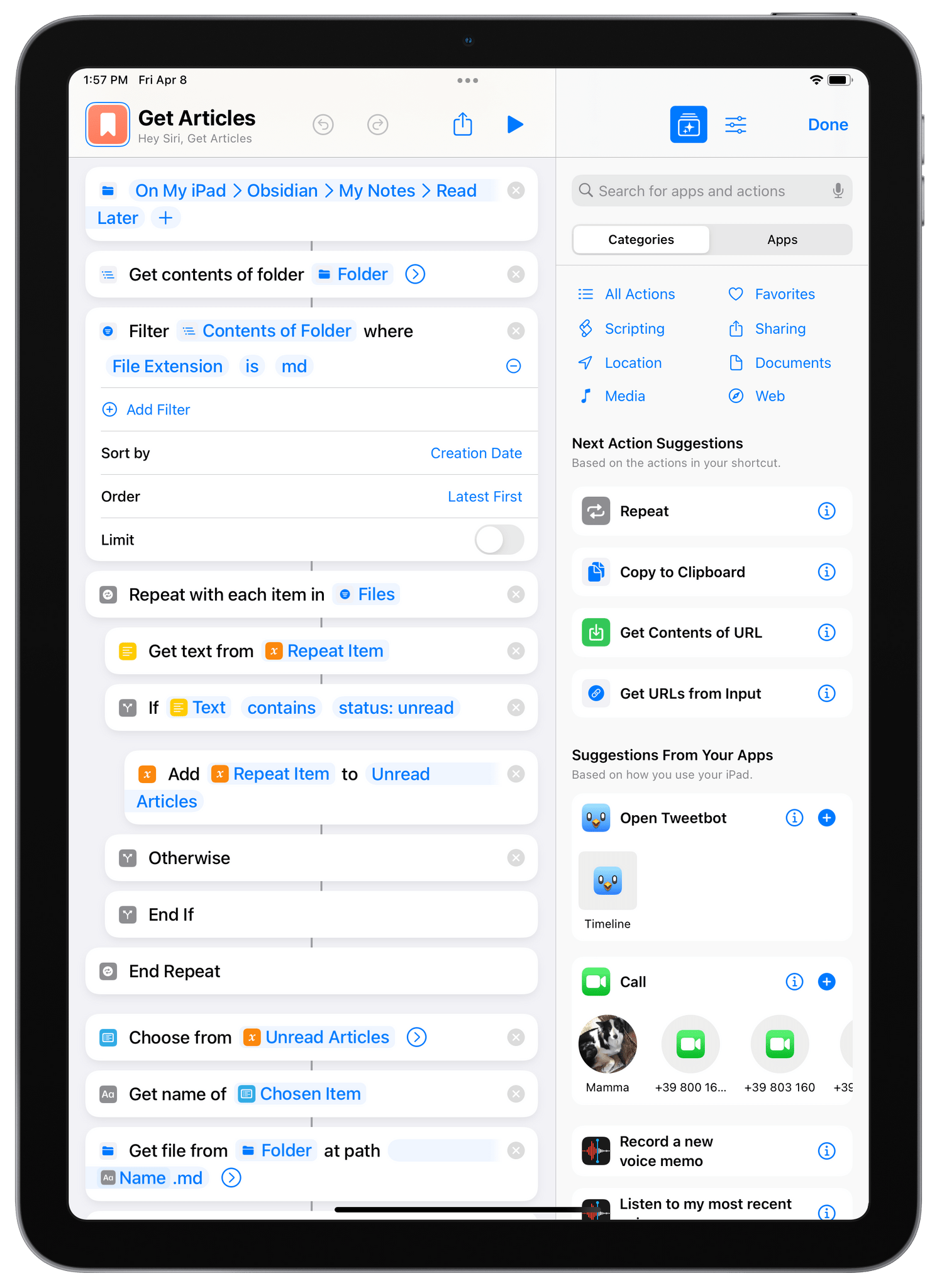
So this is how I’ve been tracking articles I want to read later in Obsidian. This approach may not have all the bells and whistles of modern startups like Readwise and Matter, but the entire “database” is just a collection of Markdown files that I fully control, can take notes on, and can visualize however I want with Dataview in Obsidian or quickly access from the Shortcuts widget on the Home Screen. To get started with this setup, you can download the two shortcuts below:
Once I had a system for articles, I figured I could adapt the same hybrid Obsidian-Shortcuts techniques for saving albums and singles from Apple Music in Obsidian too. Although I’m expecting I’ll switch to Marcos Tanaka’s upcoming MusicBox app as soon as it’s available (I seriously can’t wait for it), in the meantime I’ve been using my own system for keeping track of new music I want to listen later, and it works well enough for me.
Obsidian Listen Later is based on modified versions of the shortcuts and Dataview snippet I covered above. The only difference is that instead of sharing from Safari on your iPhone and iPad, you’ll have to run Obsidian Listen Later from the share sheet in the Music app. Alternatively, you can also run the shortcut manually from the Home Screen or on a Mac; in that case, you’ll be prompted to manually paste the URL of an Apple Music item you want to save.
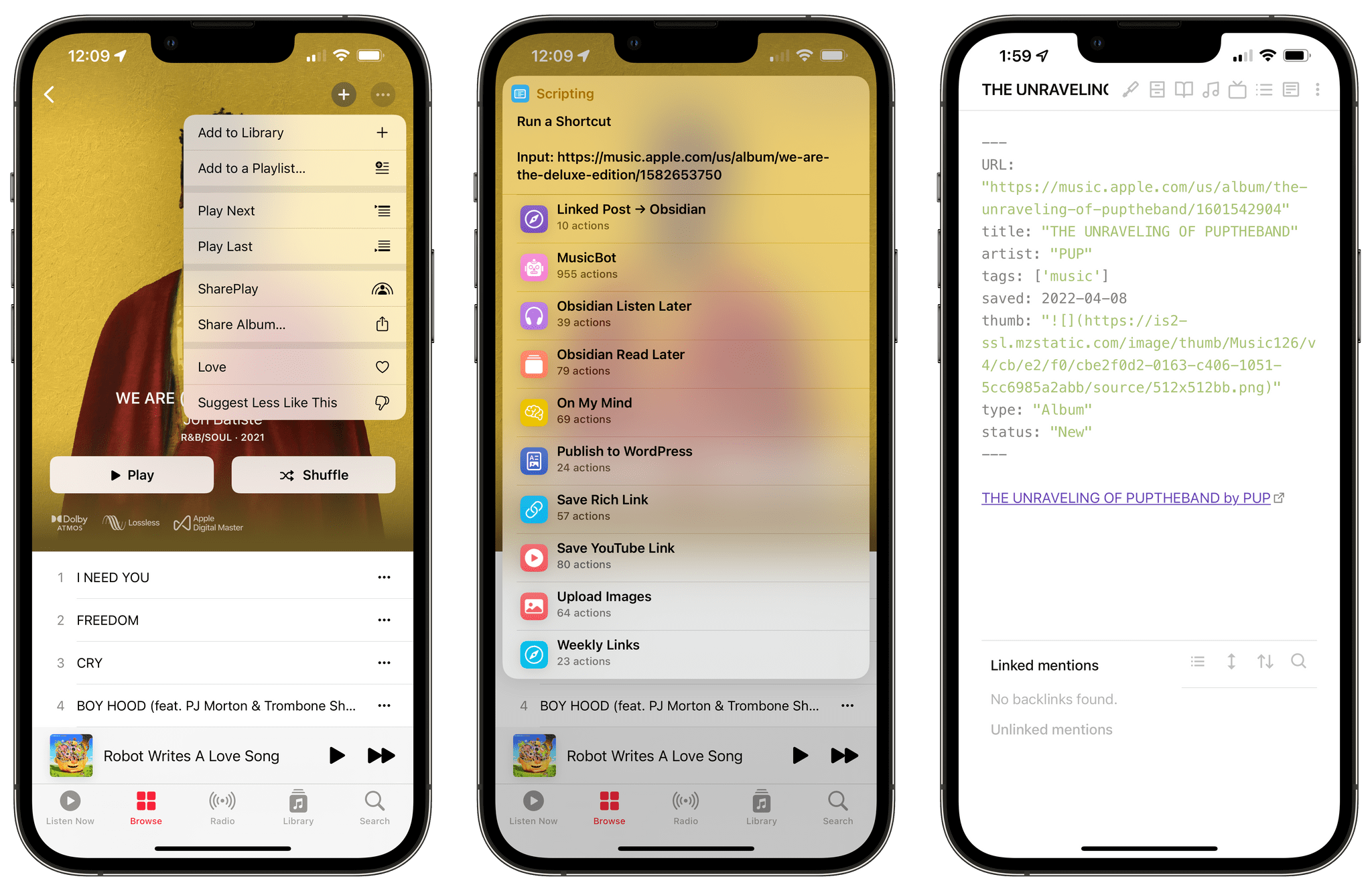
Running Obsidian Listen Later from the share sheet (left) and an example of a note created by the shortcut (right).
Obsidian Listen Later works by determining whether you’re saving an album or a single (a feature I adapted from MusicBot). Then, it uses Shortcuts’ native iTunes Store actions (are these ever going to be modernized for Apple Music?) to extract relevant metadata, including the album title and artwork URL. Then, just like Obsidian Read Later, a Markdown note is assembled with YAML frontmatter at the top, and the resulting file is saved in a folder of your choosing (mine is called ‘Listen Later’ in my Obsidian vault).
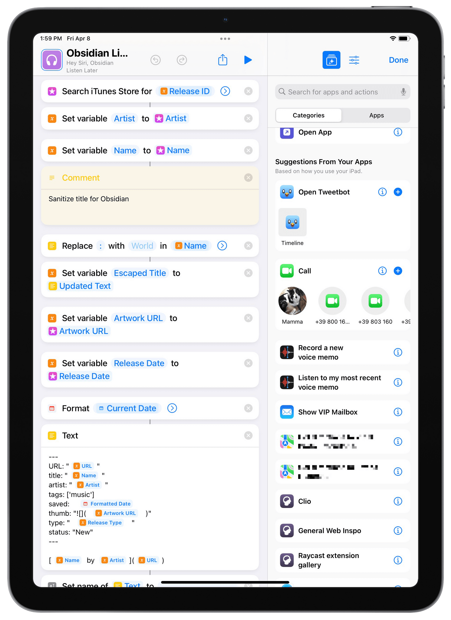
Getting metadata for Apple Music items.
In Obsidian, I created a Listen Later.md note and placed the following YAML frontmatter at the top of it:
```
Then, I dropped in the following DataviewJS snippet:
```dataviewjs const {update} = this.app.plugins.plugins["metaedit"].api const {createButton} = app.plugins.plugins["buttons"] dv.table(["Artwork", "Title", "Artist", "Link", "Saved On", "Type", ""], dv.pages('"Listen Later"') .where(p => p.status == 'New') .sort(p => p.saved, 'desc') .map(p=> [p.thumb, p.title, p.artist, "**[" + "🔗 Apple Music" + "](" + p.URL + ")**", p.saved, p.type, createButton({app, el: this.container, args: {name: "🎧 Mark as Listened"}, clickOverride: {click: update, params: ['status', 'Listened', p.file.path]}})]) ) ```
And here’s the result:
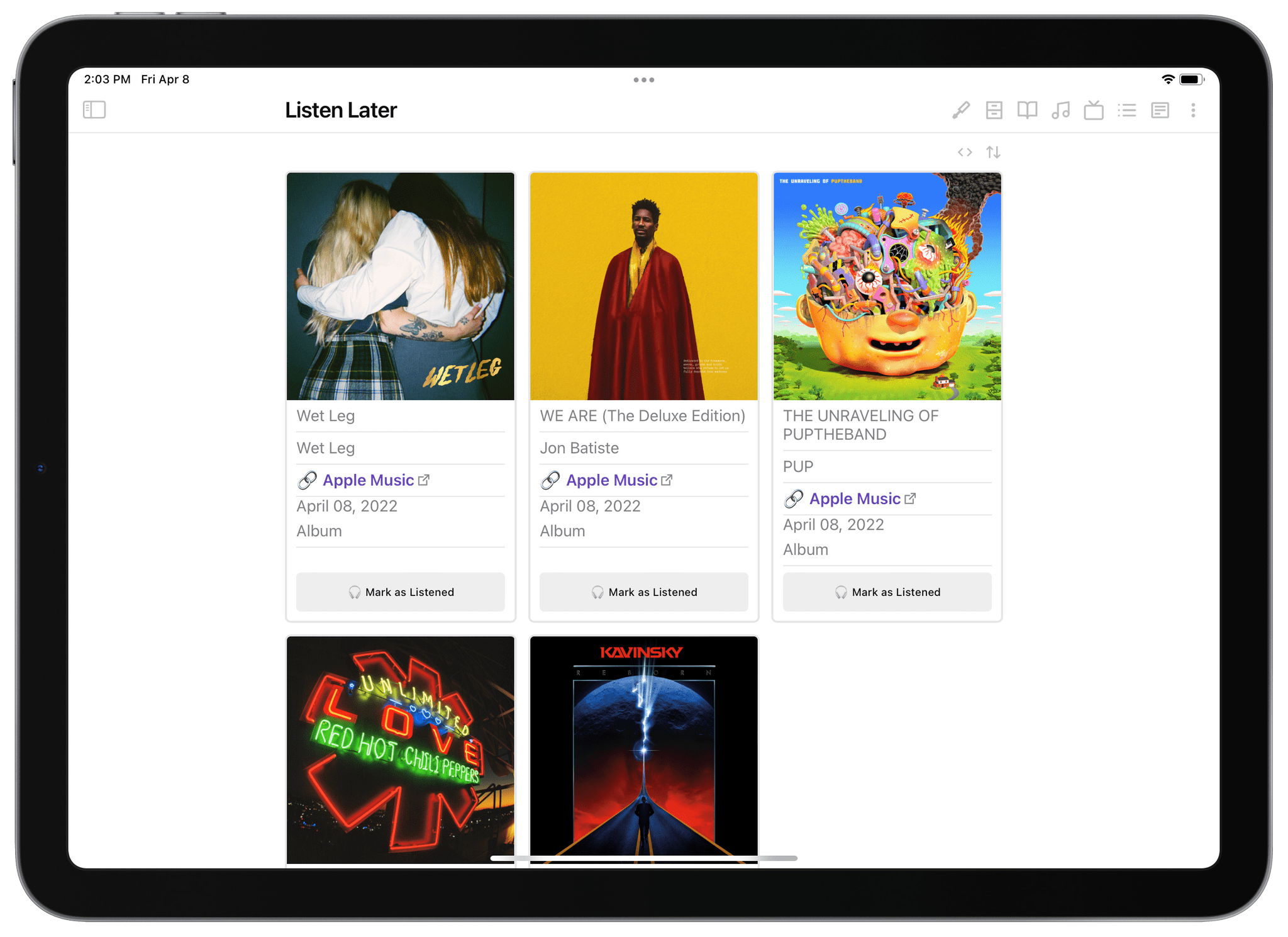
My saved albums in Obsidian.
Of course, in the part of the Dataview snippet where it says dv.pages('"Listen Later"'), you’ll have to replace ‘Listen Later’ with the name of your Obsidian folder where you’re saving music for later – same as above.
At any point, you can click on the ‘Apple Music’ link in the rich cards to reopen the selected item in Apple Music; you can sort the Dataview grid by all the criteria shown on the cards such as release type and creation date; and you can tap the ‘Mark as Listened’ button to mark an item as ‘Listened’ rather than ‘New’, thus making it disappear from the listen later queue.
Of course, just like I did for articles, I also created a ‘Get Albums’ shortcut to quickly retrieve notes for items marked as ‘New’ in Obsidian on the Home Screen. The shortcut presents me with a list of singles and albums that I can instantly reopen in the Music app, so I don’t have to open Obsidian and the Listen Later note if I don’t want to. That’s the beauty of having an open and customizable system based on a folder of Markdown files that I can choose to view and process however I see fit.
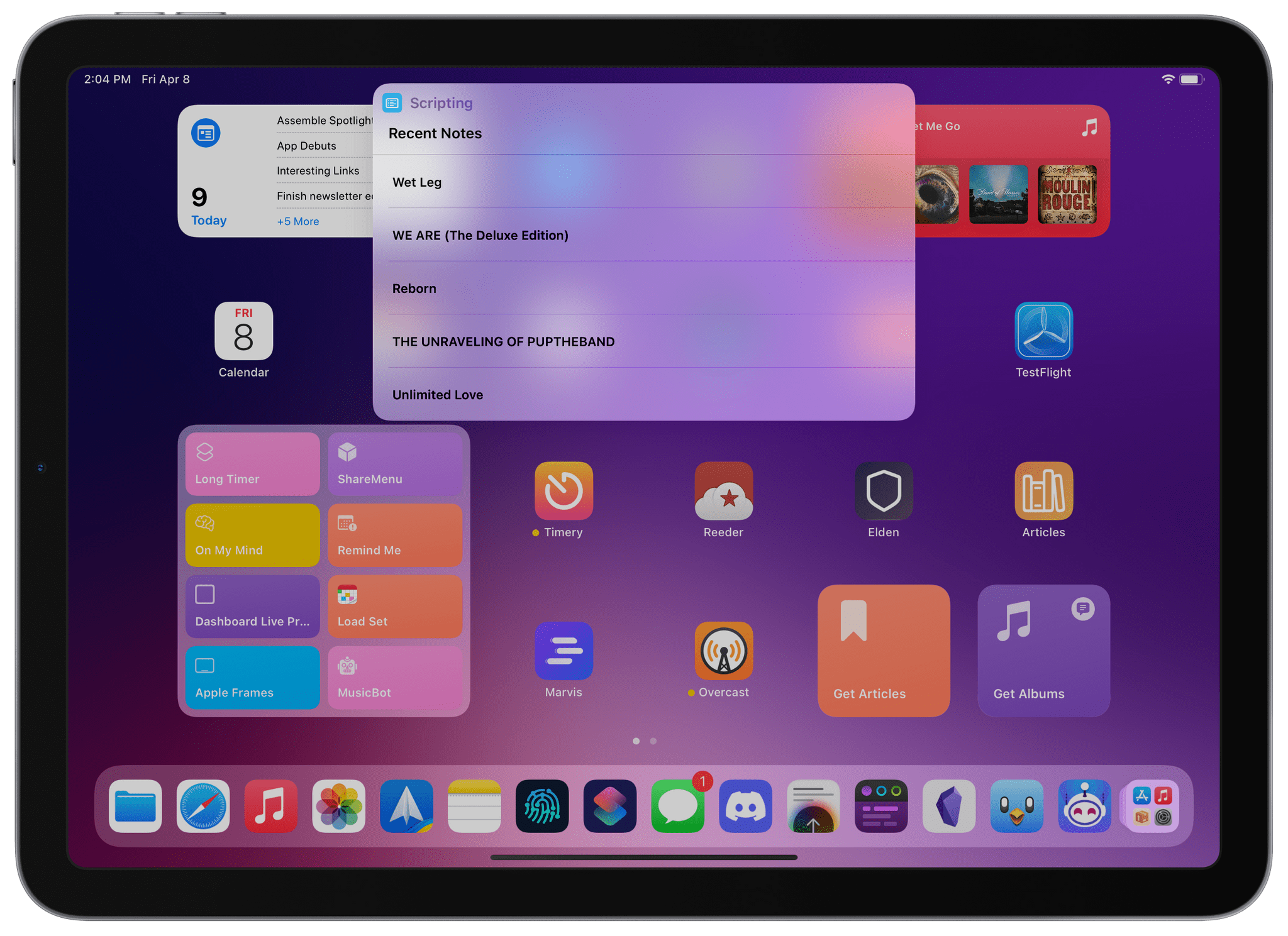
Accessing saved albums from the Home Screen.
If you want to get started saving albums and singles in Obsidian, you can copy the Dataview snippet I shared above and download the two shortcuts below:
And if you’re modifying this setup to track other things that aren’t articles or music, I’d love to know about it.
#capture #$# #reference