I’m guessing you may have heard that Safari for iOS and iPadOS 15 has gone through a…complicated development period this summer.
Well, I don’t want to talk about any of that. Criticisms of past beta versions no longer apply to the public release of iOS and iPadOS 15; all that matters is the Safari app shipping to iPhone and iPad users today.
And here’s the thing: the way I see it, this year’s Safari is an excellent upgrade over iOS 14, with desktop-class features that are finally making their way to mobile devices and a design direction that paves a new path for Apple to follow over the coming years. I have some reservations, particularly regarding the iPad version of Safari. But overall, I feel like the struggles with Safari’s design earlier this summer were necessary for Apple to end up in a much better place than iOS 14’s Safari.
The new Safari, especially on iPhone, may take a while to get used to, but I’m a convert, and I wouldn’t want to go back to Safari’s older look on iPhone now. Let’s take a look.
If you upgrade to iOS 15 today and haven’t seen screenshots of the new Safari for iPhone before, you’re in for quite the visual and functional shock the first time you open the app.
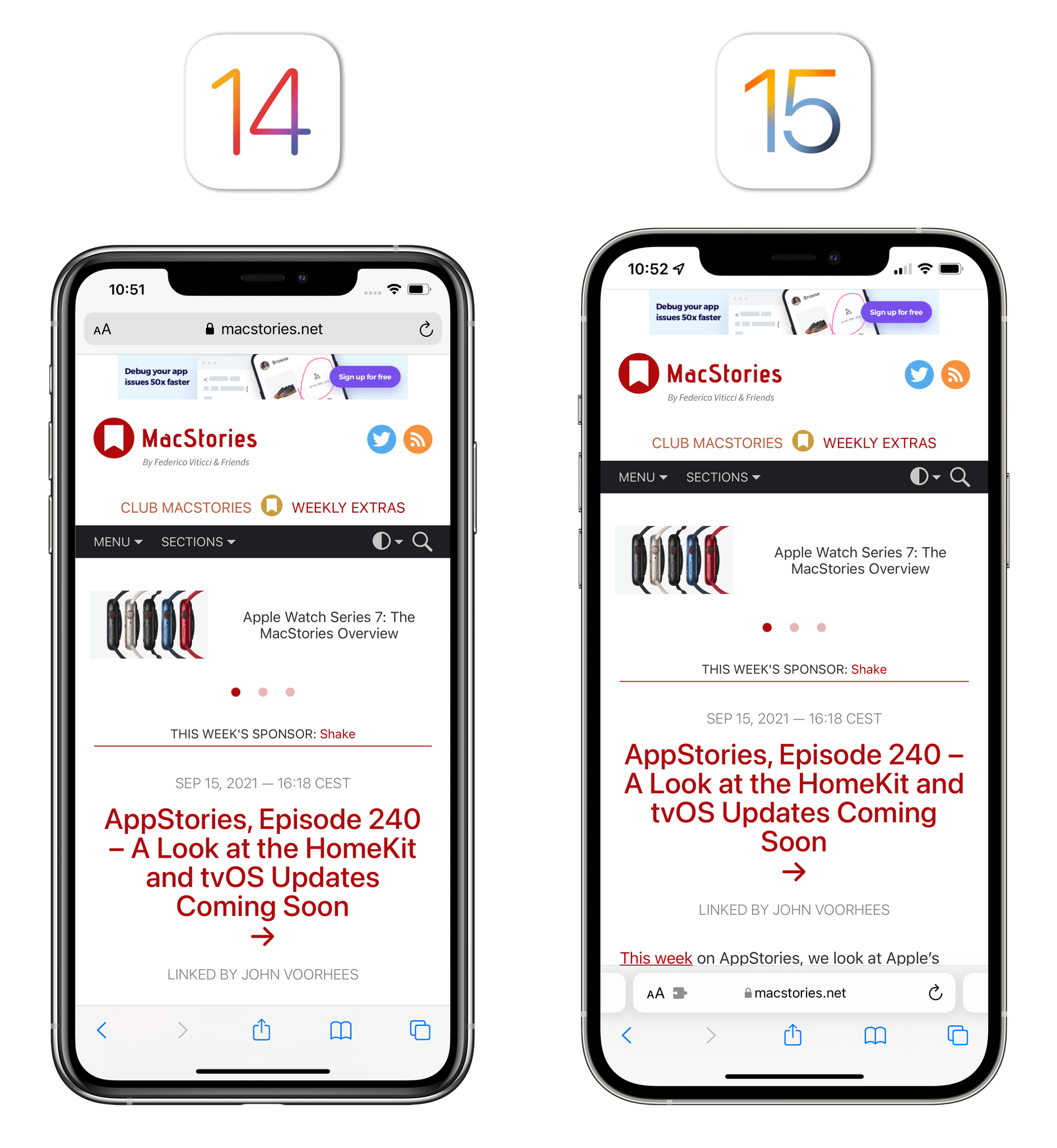
With iOS 15, Apple has moved the Safari address bar to the bottom of the screen: the address bar contains the same visual elements from before (the aA button, the domain name, and a reload button), but it is, by default, docked above the standard bottom toolbar. In the comparison screenshot below, you can see how it looks like the bottom toolbar in iOS 15’s Safari has expanded in height to make room for the address bar above it.
By default, the new Safari for iOS 15 uses a bottom tab bar.
This design is what Apple refers to as the new ‘tab bar’ in Safari for iPhone, which is different from the previous ‘single tab’ design where a single address bar was displayed at the top of the screen. As I’ll explain shortly, it’s a tab bar because, in reality, you swipe across multiple tabs with this new design.
The bottom-oriented approach taken with Safari for iOS 15 is a first for the platform, and it was motivated by Apple as a solution to make browsing the web more convenient on iPhone since key controls are within thumb’s reach now. Despite the many redesigns of Safari during the beta season, this hasn’t changed. Whether you’re using an iPhone 12 or a much larger 12 Pro Max, it’s undeniable that reaching for the address bar to navigate elsewhere or opening the ‘aA’ menu with your thumb is much, much easier than before.
Controls at the bottom are easier to reach on a large iPhone.
From a mere usability perspective, I feel like Apple succeeded in their mission here. What I think a lot of Apple commentators, myself included, have struggled with is reconciling this specific app design with the company’s broader goal of a unified design language and the HIG. There is no other app like Safari on iOS now. But we’ll get to that later.
In another first for the platform, you are not forced to use this new design. If you don’t like Safari’s new default look, you can revert to the old ‘single tab’ mode, which is a setting that sticks across app relaunches and device reboots. You can change Safari for iPhone’s design anytime in a couple different ways:
If you want, you can revert to the old Safari design with a setting (right).
Some people may balk at the idea of Apple offering users the option to customize the look of Safari by choosing from a thoughtfully-presented set of two designs. I say: Apple should do this more often.
In the age of customizable Home Screens with widgets and custom icons, hundreds of Watch bands, and computers that come in different colors, how is providing users with a limited number of options a bad thing? As long as Apple doesn’t overdo it (and, based on how these settings are laid out, they really aren’t), I believe customization is a healthy new direction for iOS, which is now a mature platform that is well into its second decade and used by hundreds of millions of people every day.
Personally, I love this new Apple that’s allowing users to customize Safari, change up their Home Screens, make smart lists in Reminders, or set a different Siri voice. Providing users with limited settings isn’t an act of “design cowardice” (some have used such an expression!): it’s the responsible thing to do now that iOS’ userbase has outgrown Apple’s monolithic design process. To sum up: you won’t hear a single complaint about “more customization” from me.
The thing to understand about the new bottom tab bar is that it fundamentally changes the browsing experience on iPhone in fairly substantial ways. For starters, you’re no longer focusing your attention on two separate areas of the screen (domain at the top, toolbar actions at the bottom) because everything has been unified at the bottom of the UI. Second, the tab bar doesn’t interfere with webpage content (unlike early betas) and auto-minimizes upon scrolling. Third, and perhaps most importantly, I find the new Safari vastly more comfortable to use one-handed on my iPhone 12 Pro Max. When I want to select the address bar, reload the page, or view additional browser actions, I don’t have to stretch my thumb all the way to the top of the screen; every action is conveniently clustered above the Home indicator, where I can easily tap without feeling like my phone is about to slide out of my hands.
The new tab bar is Safari’s equivalent of the Home indicator for multitasking.
It’s not just the physical comfort aspect of the bottom tab bar that makes it a winner in my opinion, though. Along with changing the placement of the address bar, as I noted above, Apple made it a tab bar that supports new interactions in iOS 15. The easiest way to think about it: the new tab bar is Safari’s equivalent of the Home indicator for multitasking. Just like you can swipe up on the iPhone’s Home indicator to open the app switcher, so you can swipe up on the address bar to open the new tab view (more on this in Tab View) with a grid of open tabs; and just like you can swipe horizontally on the Home indicator, you can now navigate between them by swiping across the current tab.
Gestures in the new Safari for iPhone. As you can see, you can also create a new tab from the tab bar: if you’re on the last tab, pull to the left until a ‘+’ button appears, then let go to instantly open a new tab.Replay
On principle, the new gestures create a conflict with the iPhone’s gestural multitasking system and could potentially confuse users. In practice, I think they’ve been implemented well and, after a few weeks of usage, I rarely trigger the app switcher by accident.
When you consider all these aspects together, the new bottom tab bar offers a compelling package for Safari users on iOS 15: it’s more comfortable to use, lets you quickly open the tab view, and because it’s not a single tab but a tab bar, you can switch between tabs quickly by swiping between them.
Bookmarks and Reading List are now displayed with a half-sheet too when using the bottom tab bar, matching the share sheet.
There is one downside about the new default Safari design on iPhone: it makes me wonder if this is an isolated case, or if we’re looking at a new potential design direction for Apple in iOS 16. This isn’t clear yet, and it somewhat muddles the design story of iOS 15. Did Safari receive special treatment in iOS 15 because Apple thinks web browsing is the only activity that could benefit from bottom-oriented navigation, or is this a public test until more apps undergo a similar redesign next year? Will more Apple apps become customizable with different layout options?
Apple listened to feedback and produced the best version of the browser to date.
I don’t know the answers to these questions, but because it’s my job to remember these things, I’ll point to history as an example: years before iPad multi-window became a system feature, Safari rolled its own custom split-screen solution to open multiple “windows” at once. I want to believe we’re looking at a similar public experimentation that, if successful, may become an official API in iOS 16 or 17.
In the meantime, I think Safari for iPhone’s combination of comfort and new gestures have made Apple’s efforts to get to this stage well worth the beta troubles. Apple listened to feedback, polished Safari’s design, and produced the best version of the browser to date that marks an excellent new beginning for one of the platform’s essentials apps. I’m keeping the new design enabled, and I’m not turning back now.
I wish I could also be this effusive about Safari for iPadOS 15, where the one good idea Apple had about iPad UI this year is unfortunately overshadowed by an incoherent, faux-minimalistic design that I consider a regression from iPadOS 14.
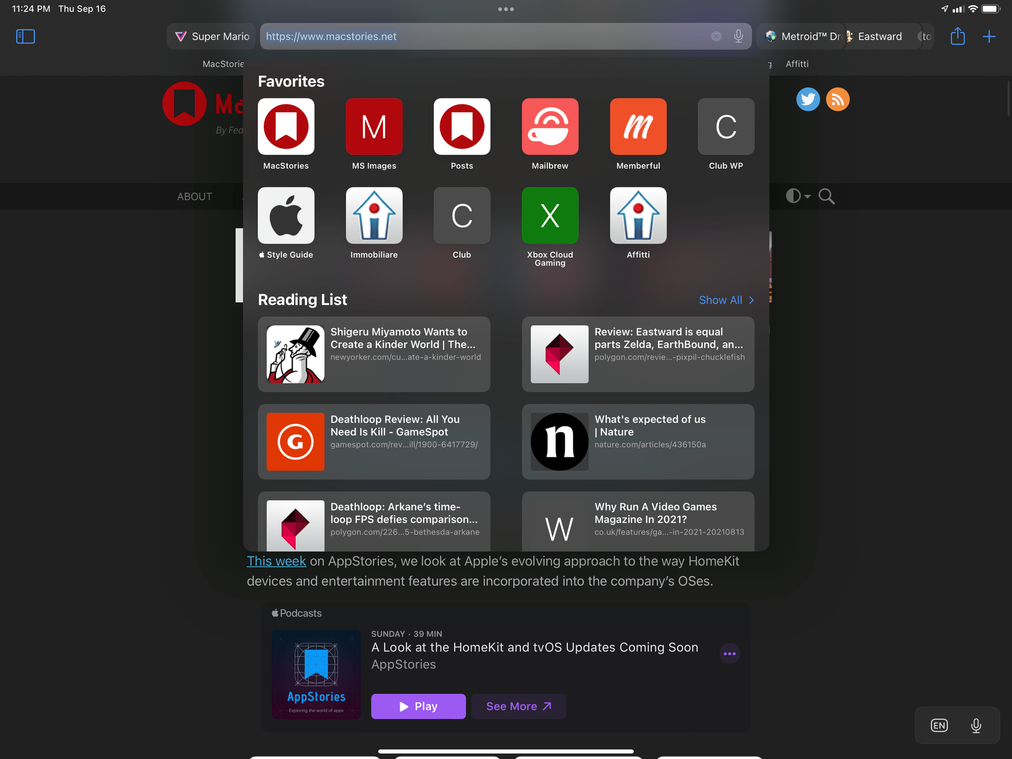
Let’s dispense with the good news first: Safari for iPad now comes with a native sidebar. In keeping with the trend of letting iPad apps take advantage of the iPad’s large canvas, the browser has adopted a sidebar that lets you easily navigate between tabs, tab groups, links shared with you (see Shared with You), plus the usual bookmarks, Reading List, and history. As in other iPad apps, the sidebar can be invoked/dismissed with a button or, alternatively, by using the ⌘⇧L keyboard shortcut.

The new sidebar in Safari for iPadOS 15.
Besides bringing Safari up to speed with the rest of the iPad app ecosystem, the addition of a sidebar has allowed Apple to provide dedicated space to features that were previously tucked away in submenus or hidden behind multiple layers of navigation. Switching between your regular tabs and private mode, for instance, now requires a single tap in the sidebar and the browser instantly cycles between different sets of open tabs on the right. Same with your bookmarks, history, and Reading List: in iPadOS 14, you had to tap the Bookmarks button in the top toolbar first, then select each item from a custom sidebar; now, you can open each item directly in a native sidebar. The end result is a much faster, intuitive iPad browser that feels like a miniaturized version of Safari for Mac rather than an enlarged version of Safari for iPhone.
The old custom sidebar in iPadOS 14.
The new sidebar for Reading List in iPadOS 15.
The sidebar was also necessary to bring new functionality into Safari: all the tab groups you create on iOS, iPadOS, or macOS are listed in the sidebar, and you can switch between the different sets of tabs contained within them with one click. As we’ll explore later in Tab Groups, you can also right-click a group in the sidebar to view a context menu with additional options.
Even though the sidebar is not customizable (I would have loved to rearrange the order of elements and pin some of my favorite websites there, too), I find it a solid addition to Safari and a great match for the browser.
Alas, I cannot say the same about either of the two new modes in Safari for iPad: compact and separate tab bar.
The compact tab bar mode is an attempt to shoehorn iOS 15’s tab bar mode into Safari for iPad, but it entirely misses the point of understanding what people seek from a desktop-class web browser. If you enable the compact tab bar mode (it’s disabled by default), the tab and address bars will merge into a single row of “tabs” you can horizontally scroll that is reminiscent of the iPhone’s new tab bar.
The iPad’s new compact tab bar mode.
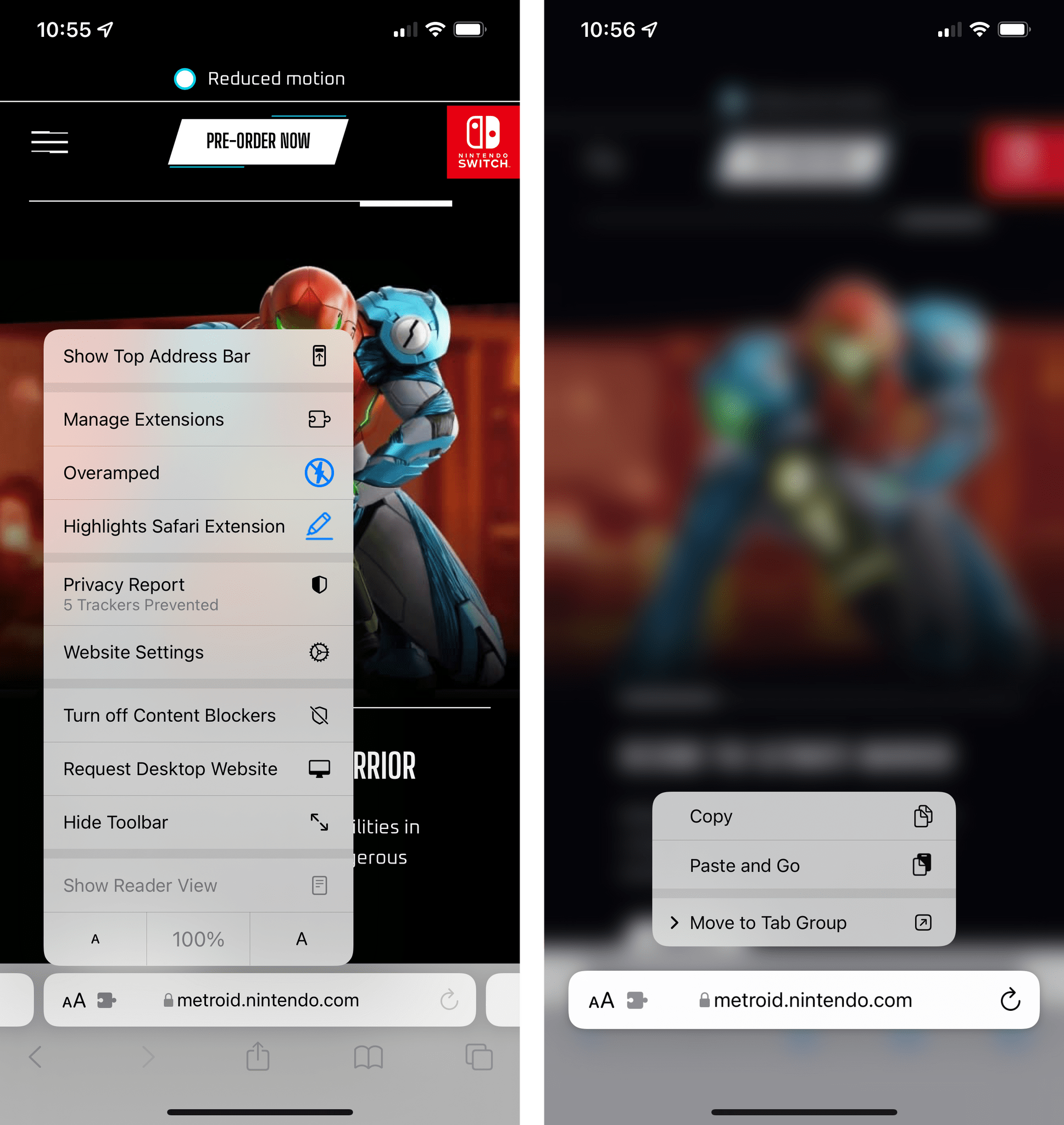
I write “tabs” deliberately. Because the separate address bar disappears and tabs have to serve double duty of address bar for the current page and UI elements to switch between open pages, tabs lose most of their utility and become overloaded with functionality. Even on a 12.9” iPad Pro in landscape, as soon as you open more than five tabs, other tabs considerably shrink in size because the current tab has to be larger to show you its active state and controls for reload, extensions, and a contextual menu for other options. The standalone aA button gets hidden, so these buttons overlaid on top of the active tab are very close to each other, making it challenging to click a specific one. Due to the compact nature of this mode, with enough open tabs, these controls almost completely hide the domain of the page you’re on:

Have fun clicking those buttons in the current “tab”.
If you run into a similar scenario, the only way to see the title of the current tab (which is normally displayed on a standalone tab) is to hover with the pointer over the active tab. To my knowledge, this is the first instance of an iPadOS interface element that can only be activated with the pointer; if you’re using the iPad in touch mode, the only way to quickly see the full title of the current page is to click the contextual menu to see it at the top of a custom share sheet that also contains other buttons on top of extensions:

In compact mode, you can view full webpage titles either by hovering with a pointer over a tab…
…or by opening the ‘More’ menu.
But the problems go on. When you start opening more tabs in compact mode, as I mentioned before, other tabs get smaller than they would otherwise be in separate tab bar mode. You have to scroll more to view your open tabs; sometimes, if you don’t pay enough attention and click another tab to open it, you may accidentally close it instead because the pointer automatically snaps to the ‘x’ button. Touch targets are smaller, so there’s a small difference between tapping the ‘x’ button and clicking just outside of it to switch to a different tab. This happened to me on several occasions over the past few weeks whenever I tried compact mode, forcing me to go find the tab I accidentally closed in the history view.
Using the new compact mode in Safari for iPad means you always have to be extra precise when clicking around tabs. Also: they move around a lot.Replay
Furthermore, the accordion-like animation used to scroll and animate tabs is spatially disorienting and oftentimes downright user-hostile. If you manage to find the tab you’re looking for and click it, it enlarges and pushes adjacent tabs further to the left or right. This animation is cute at first but quickly starts feeling like something is constantly moving at the top of the browser, distracting you. The worst offender, however, is the animation that happens when you select the current tab/address bar by clicking or pressing ⌘L: the entire tab expands into a full address bar, pushing all other tabs out of view. In this scenario, you no longer see your other tabs, and when you exit out of it, it’s harder to find your place again in the tab bar if you’re the kind of person who opens a lot of tabs on a regular basis. There’s no spatial sense to any of this; it feels like Safari is doing its own dance at the top of the screen, confusing you with its fancy animations to resize tabs while you just want to browse and keep track of your open tabs.
Where did my tabs go?
The problems with compact tab bar mode are endemic to the design itself, and they pose a threat to accessibility in the app. Try telling me, at a glance, which one is the active tab here:

Yeah, this design is not good at all.
Apple is using a subtle selection state to tell the active tab apart from others by changing its color in the top toolbar. I don’t think this is good enough. I’m not a visually impaired user, and I always struggle to quickly identify the current page by its selected state alone. I often understand which one it is because it’s the one with the buttons all close to each other. I can only imagine how users with varying degrees of visual impairment may deal with this design. For a company that prides itself upon the (genuinely amazing) work they do for the Accessibility community, this is not a good look.
Let’s not even begin to discuss how difficult this compact tab bar is to operate if you also show the sidebar in Safari:

Look at what happens to the tab and the buttons inside it. How did this even ship?
Or if you try to use it on an iPad mini:
On the 5th generation iPad mini, the situation gets even worse. Additionally, because the reload button in tabs is only shown on hover, unless you’re using a pointer with an iPad mini, you won’t have one in the tab.
In case I haven’t been clear enough above, I’ll be blunt: I don’t understand why the compact tab bar exists on iPad, and I think this design shouldn’t have shipped to customers.
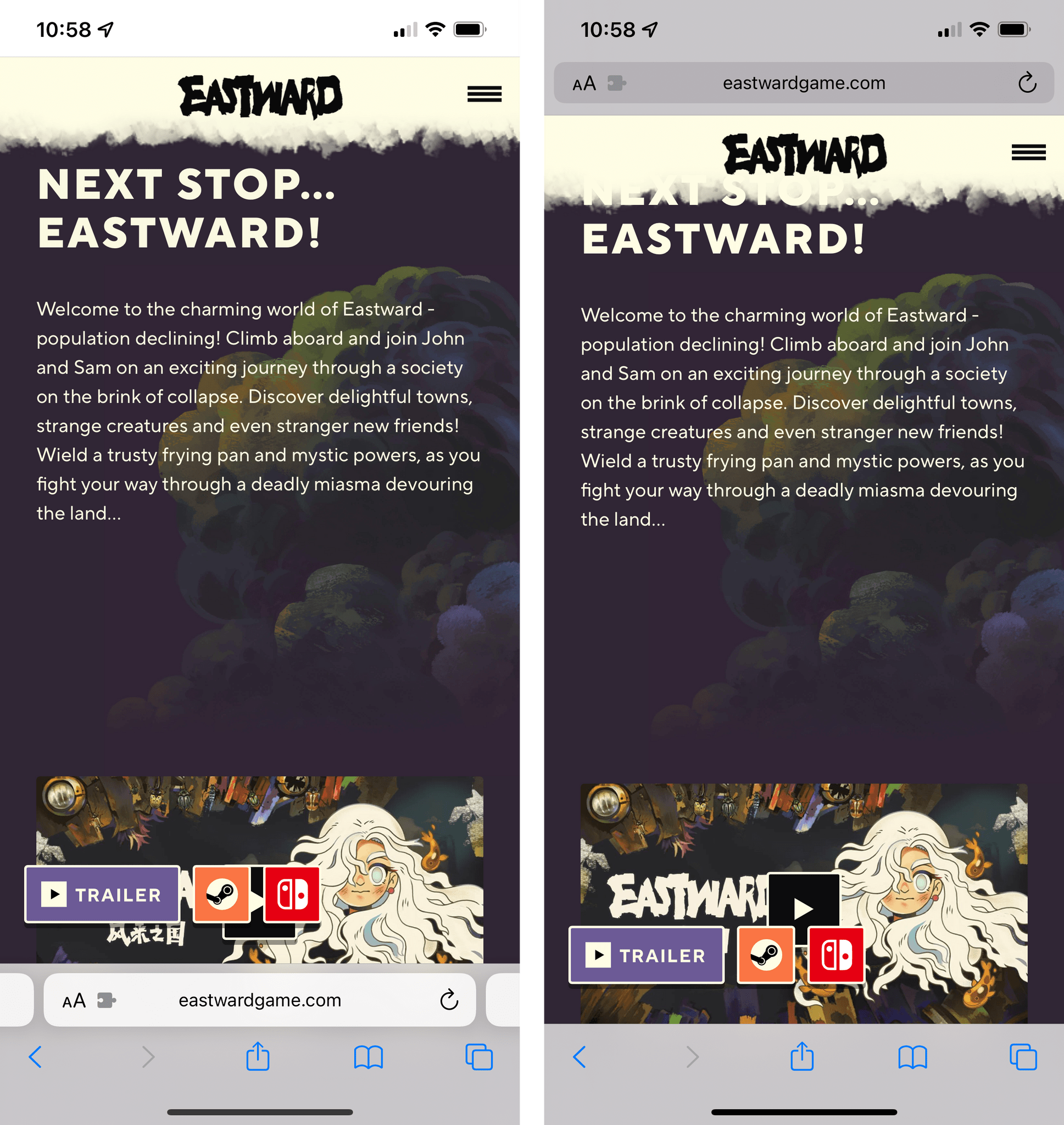
My understanding is that Apple thought the benefit of removing a separate address bar, therefore saving a few vertical pixels on the page, would have made all the compromises we’ve seen so far worth the trade-offs in usability. I think that’s a wrong and mismanaged decision driven by an unmotivated pursuit of an iPhone-like design that has no place on iPad. If slightly increasing vertical space on webpages is Apple’s only argument here in favor of the compact tab bar, you tell me if it’s worth the trouble by judging from the screenshots below. Here’s Safari in compact mode:
And here’s Safari with a separate tab bar instead:
Was it worth shipping this, frankly, unusable design for an extra line of text and a whole bag of design and interaction problems? The answer, in my opinion, is a resounding no. Compact tab bar mode pleases no one, and, fortunately, Apple reversed course over the summer and made it an optional setting. But going forward, I think it should be entirely scrapped since it does nothing to make Safari a better browser for iPad users.
Alas, Safari in iPadOS 15 doesn’t fare much better with its default separate tab bar mode either. Thankfully, it’s not as bad as compact mode, but it carries many of the same interface problems, which ultimately lie in the perplexing design direction Apple chose for tabs in its browser this year.

Separate tab bar mode in Safari for iPad.
In separate tab bar mode, the standalone address bar returns along with webpage titles always displayed in tabs and the aA menu to access website settings and other Safari features. That’s good, but all the other issues with tabs persist. Tabs keep their button-like appearance and are smaller than before. You have to be extra precise to open a tab instead of closing it when you have multiple tabs open; you see less of a tab’s title than before, and while the accordion-like animation goes away because you have a proper address bar, selection state for the current tab is still hard to parse at a glance. Even in this mode, you often end up with Safari looking like this:

All the small tabs.
Here’s a good test to tell this new design doesn’t cut it: compare the new Safari’s tab UI to Safari on iPadOS 14, and the old version looks like a breath of fresh usability air. It’s also a lot nicer.
Can you please come back?
I’m not typically one to reminisce about “the good old days” and wax poetic about old iOS and iPadOS versions, but, at this point, I think I know a poorly thought-out design when I see one, and these new tabs are it.
There’s another change in Safari for iPad I don’t understand: the Favorites bar has been moved under tabs. For years now, Safari and other browsers have adhered to a predictable, common-sense structure: there’s your address bar with the URL of the page you’re on at the top, followed by a row of favorites to navigate to a different, bookmarked URL, followed by a row of tabs, in which one represents the current page you’re viewing. Now, for reasons I don’t comprehend, tabs sit underneath the address bar, and your favorites are floating above the current page.
I understand that comparisons with “tabs” in physical notebooks can only go so far since we’re talking about a web browser, which isn’t a concept that exists in the real world. But, at least for me (and I think for lots of other people too), the ‘tab’ always acted as an indicator for the page you’re currently on or other pages you may want to open. There was a direct connection between the tab and the page it represented. Just like you pull a tab in a notebook to open the page connected to the tab, so you can click a tab and see the webpage directly below it. Now that visual connection is gone, and although it’s not a catastrophe, it feels like an unmotivated decision that will only confuse users’ muscle memory and habits. It feels like change for change’s sake, and it doesn’t bring anything useful or more reasonable to the table.
I feel like changes to the Safari UI on iPad are an unfortunate blemish on an updated browser that is otherwise packed with other useful features, which I’m going to cover in the next sections. I think Apple should entirely abandon the idea of a compact tab bar on iPad, scrap the new design for tabs, and reverse course on the placement of the Favorites bar. Essentially, I’d love to have the same design as Safari for iPadOS 14, but with the added functionalities I’m going to detail on the next page.
The new tab design of Safari for iPad isn’t superior to the old one in any way.
The new tab design of Safari for iPad isn’t superior to the old one in any way, and I hope Apple understands that making things look “simpler” and “more minimalistic” doesn’t equate with making them better. The changes in Safari for iPhone have a practical use you may choose to rely on or not; in Safari for iPad, it just feels like they rearranged the deck chairs for no good reason other than to say “it looks different now”.