
[TOC]

Listen to this article read by Siri below...
Were it just I who came to you with only my voice on this cold night, proclaiming the imminent release of a whole numerical version of a third-party mobile Twitter client in 2021, you really would have no choice but to send for the laws, for you’d be left no consideration other than my comprehensive descent into absolute insanity. 825 days ago, I told you lots about the history surrounding the development of Tweetbot 5, which I confidently described as “likely the last competitive third-party Twitter app for iOS.” After spending the past few months diving deep into iOS in preparation to review and reflect upon Apple’s current flagship handset, my eyes have been opened to the exponentially-increasing pace of the whole environment’s metamorphosis during the course of my lapsed attention. In the name of progress, I’ve done my best to make a point of looking back, too, yet something astonishingly personally relevant managed to slip past me until just last week: there is a sixth version of the Tweetbot app. At this moment, it is listed on the App Store as an “Early Release” version, though its predecessor can still be downloaded by those who’ve already purchased it in the past, like me. This is an unusual practice - usually, pre-release versions of iOS apps can only be distributed through Apple’s developer beta testing infrastructure, though Testflight. Notably, Tweetbot developer company Tapbots was apparently required to take down Tweetbot 5’s store listing 30 days before releasing Tweetbot 6.
https://soundcloud.com/compaqclub/macstories-on-tweetbot-6
I can’t remember exactly why - though I suspect I was just fucking around on my phone before bed, bleary-eyed - but the implications of this next numeral passed me by the first time I saw and downloaded Tweetbot 6, two weeks ago. Perhaps it’s because the app didn’t appear to have any new features - in fact, it’s technically got less than 5, though those that have been removed - user-specified URL shortening, image hosting, and video hosting services - haven’t worked in a good while anyway. As my old fav, The Verge noted in their coverage of 6, blame for these omissions rests solely on Twitter, Inc., itself, who’s continued to hold its API development inordinately close-to-chest. I didn’t bother to find out about this, though, because my first assumptions upon poking around the new app - especially after encountering its new subscription requirement in order to use any of its substantive features - was that its developers had ceased any actual time investment into the app long ago, and that 6 was a new version in number and rudimentary visual updates, only, shoved out in hopes of peaking old, loyal users like myself enough to get us to download it, at least. In the disappointment I’d already expected, I closed and immediately deleted the app.
I’ve paused everything else to write you on this, though, because the story is actually much bigger. Had I investigated any further that first time, I would have discovered an odd amount of buzz coming from even the most mainstream of tech media in a simple search. (Yes, I am ashamed about it.) You’re still reading, but perhaps - as I was, originally - you are doing so from an appropriately-jaded, well-read perspective on software, generally, in 2021. Perhaps you’re looking at the search results, yourself, and wondering if you’re dreaming. Dedicated coverage of a fucking third-party Twitter client iteration??? At this point in history? What in fuck? I’m fairly certainly neither of us are, though: fucking Tweetbot made headlines on Engadget, TechCrunch, 9to5Mac, MacStories, iMore, MacRumors, and others. No, it’s not 2010 again. In fact, The Verge, at least, has never given up on Tweetbot. If my long term memory had been functioning, I would have remembered noticing its spot in “12 great apps for your new iPhone in 2020:”
Twitter is a vaguely terrible way to spend your time these days, but if you (like me) can’t tear yourself away from the social media service / entryway into hell, you’ll want Tweetbot, which actually makes using Twitter far less painful. Tweetbot shows you the tweets of the people you follow, in the order that they tweeted them. There are no ads or promoted tweets, powerful mute filters to block out unwanted noise, and (thanks to Twitter’s unfriendly API changes) no notifications to constantly ping you to come back to the app.
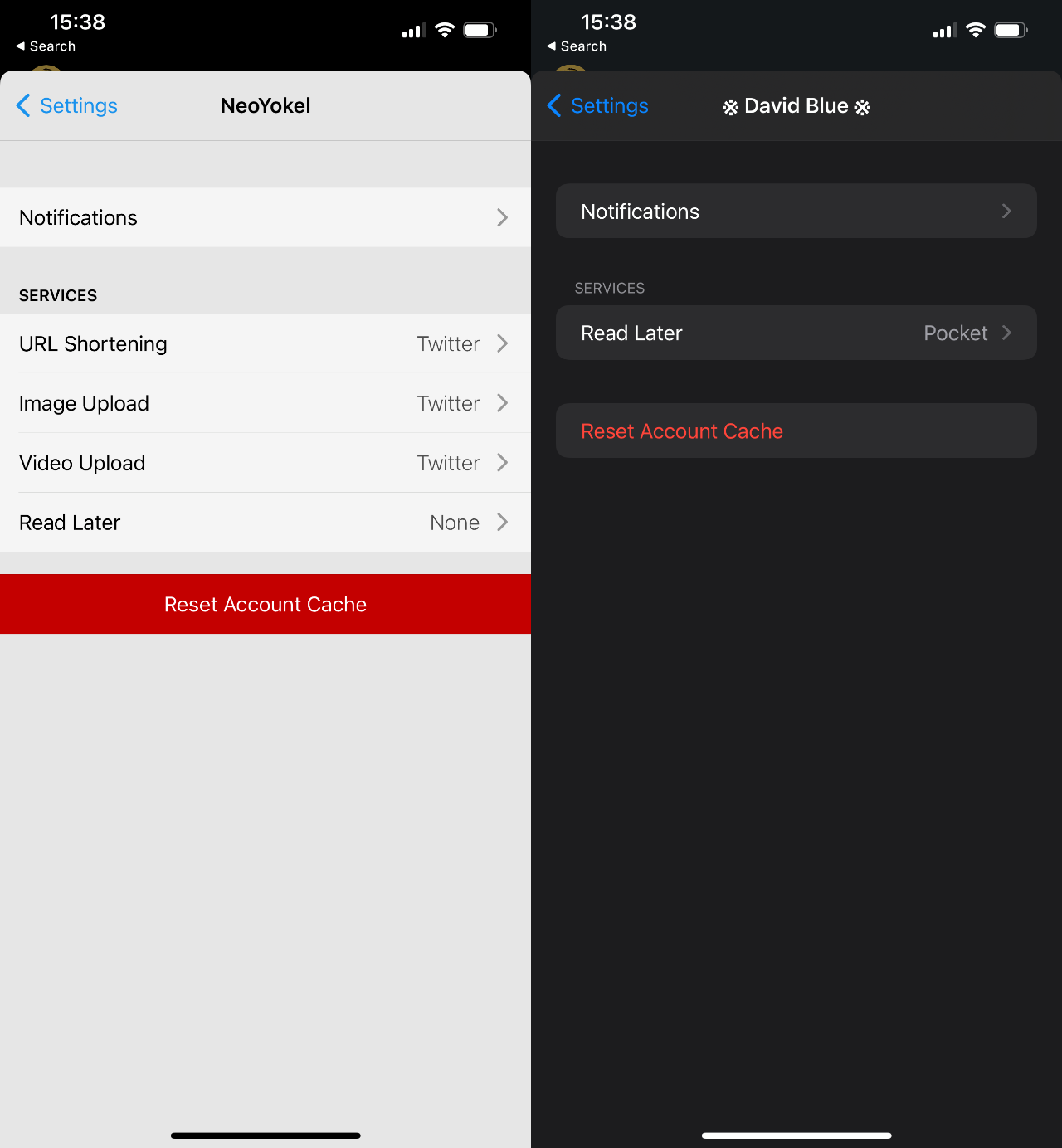
Here’s to Chaim for exposing me to a perspective I never would have otherwise considered: Tweetbot’s lack of push notifications as a positive. If you’re wondering, no, this new app does not yet include any additional notification integration, and it’s not clear whether or not it’s on Tapbots future roadmap for the app, or where. As for the reality of integrating Tweetbot 6 into your current Twitter use, I stand by my argument that deleting the native Twitter app isn’t really an option if you plan to ever view your notifications on your phone. The popular assumption (I assume) if you’re still reading is that you are a “poweruser,” meaning details about my own configuration are probably irrelevant. If by chance you’ve just downloaded Tweetbot for the first time, you should take the time to disable notifications for Tweetbot entirely, but leave them on for the native Twitter app, even if you decide to banish it to your App Library. Before I began any work on this review, I made sure to swap in Tweetbot 6 where the native app had been in my dock for several years, now. I originally pushed the native app all the way to page 6, but immediately found this extreme. Instead, I put it in the bottom-right corner in my second screen, as you can see in the screenshot below (which also serves as proof, if you needed it.)

I should also note how much my own engagement on Twitter has diminished in the past 3-5 years. Not to manifest tiny violins - in turn, my engagement on (and investment in) Mastodon has increased exponentially, and it’s of a much higher quality. I bring it up for context’s sake: I can afford to prioritize Tweetbot in my Twitter use because of how few daily notifications I get - a number which is unusual for someone who uses Twitter as much as I do. Inevitably, my own use is once again going to factor heavily in this work, as is the significance of my relationship with Twitter, generally, in my life. If you didn’t already know, I’ve met basically all of my friends since high school through Twitter. As of this moment, my private “Friends” Twitter List includes 149 accounts, and I’ve spent more than 10 years, now, reading almost every single one of their Tweets. I have been as critical of the service as anyone, but - whether or not either of us are willing to acknowledge it, wholly - I believe the intimacy of this arrangement to exceed that of any in-person relationship I have ever had. Reading the random thoughts of these people seconds or minutes after they’ve popped into their heads for all this time has been an experience unique to the format Twitter pioneered, if not to the service, itself. I have no choice but to acknowledge that I am deeply invested in not just Twitter, but Twitter’s less-than-visible Lists feature, emotionally and intellectually. When I hit my follow limit, several years ago, Lists also became my single means of acquiring new connections on the network. If it were to be removed, I would lose this ability, entirely, as well as any reasonable means of communicating with any of my friends.
https://www.youtube.com/watch?v=IO-ZSD-vymc
Perhaps you understand, now, why I have written and Tweeted so extensively about Lists. You should also understand just how miraculous the possibility of Tweetbot’s new future now seems, personally, unless you’re new to all of these ideas and don’t feel like reading that big olé Tweetbot 5 review of mine (which is fine.) Before I go into the history of Tweetbot, let me first share the single most telling feature in Tweetbot of Tapbots’ belief in using Lists and share some evidence of others’ present day belief in Tweetbot. Shamefully, I’ve spent several years - tens, if not hundreds of thousands of hours - using Lists in Tweetbot, oblivious to its upmost Lists integration: “Use Lists as Timeline.” Had I actually bothered to look at the support docs at any point, I would have discovered this long ago, which would have almost certainly made my given year. If you use Tweetbot and Lists, for the love of Gourd, please take a look. Here’s what those docs currently say, in full:
One long time Tweetbot feature is the ability to use any of your lists as your main timeline. To do this, all you have to do is hold down on the “Timeline” label in the navigation bar (in the timeline tab) and a menu populated with your lists will appear. Select one and that will become your current timeline. You can switch to another list or back to your main timeline any time by performing the same action.
Even after reading this multiple times, it still was not obvious to me what it was talking about, and I was unable to find precisely zero visuals on The World Wide Web of this action taking place, so I recorded and uploaded the video embedded above. Good God, how I wish I’d been a more detail-oriented young man! I’ll be privatizing my self-punishment from here on out, though, so bear with me.

The discourse surrounding Tapbots’ recent announcement has already reached a higher decibel count than I would have ever expected, so it’s obvious there are plenty of users who still love Tweetbot, and you already know from the beforelinked stories that The Verge has also stood firmly by it as the preferred Twitter experience. It takes a wee bit of digging, though, to discover the subtle bets on both Tweetbots and Lists from no less than Apple, Inc., itself. In the official Apple Shortcuts Gallery, a curated list entitled “Twitter Better” includes “Open Twitter Lists” at number 1. In 5th position is “Open in Tweetbot,” and “Open in Twitter App” (3rd,) is configured by default to first ask you to choose between Tweetbot and Twitter’s native app, despite its title.

As for App Store rankings, the fact that Tweetbot 5 was forcibly removed from public listings makes it impossible to meaningfully judge recent popularity of Tweetbot on iPhone/iPad. Its MacOS-based sibling, though (called Tweetbot 3,) was the second most popular paid app on the Mac App Store as of February 6th, 2020. That’s the day I borrowed my Mom’s MacBook Pro for a short while to check up on MacOS Big Sur, when I downloaded the current version (3.5.2, if you wanted to know) of Tapbots’ desktop Twitter client and messed around with it enough to tell you that it’s as wonderful as ever. (Had I not switched back to Windows as my primary desktop OS a decade ago, I would use it every single day.)

I suspect most active Twitter users in 2021 would be even more surprised to discover Tweetbot’s remaining, discreet hold on today’s Twitter experience than I was, assuming most of them joined more recently than myself and those I regularly interact with. For the sake of this Post, I reached out to Tapbots with an interview request about “Tweetbot’s roadmap, Apple’s requirement that [they] remove 5 from the App Store 30 days beforehand, and why [they’ve] decided to take this (risky, imo) bet on making our lives better,” though I don’t expect a reply, which is fine. They did respond to my support request regarding hardware keyboard shortcut support very quickly, saying they’ll look into it. (Without being verbose, I’ll just tell you that if a near future update to the app fixes the F and ⌘ + R shortcuts, I will shit out my whole ass.)

Before I dig into the controversy and hypotheticals surrounding what Tweetbot 6 might become, let’s take a moment to qualify it vs all of one’s options to interact with Twitter on iOS currently (as in, Feb 11, 2021 at 19:24.) It’s almost certainly premature to do so, but skeptical readers would note, I’m sure, that its listing on the App Store is “early release” in name only, that I have just spent money on this specific version, which should therefore render inert the normal exceptions a review would make for beta or pre-release software. If you’ve somehow come across this Post before reading anything else about Tweetbot 6 and simply want to know what is new for this version compared with 5.5.3 (its predecessor’s most recent release,) the frank answer as it stands is not much. Perhaps I’m doing something wrong, here, but the YouTube videos and tech media articles I could find dealing with the subject of additions, specifically, were all either misleading, entirely wrong, or both.
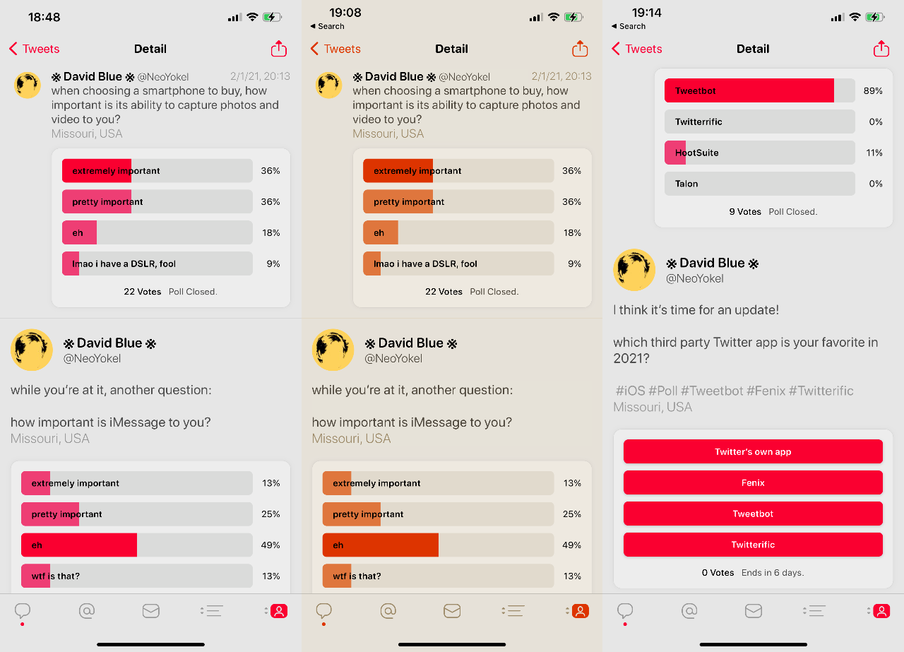
While 6 lists one more option (for a total of 9) under Themes in the Display section of the app’s Settings menu, none are substantive variations of the same themes you’re familiar with from 5. “Future Light” is just a more turquoise variant of the “Default” blue UI theme in 5. In fact, the singular change in the Display menu is the addition of “San Francisco Rounded” under the Fonts selection. Below, you can see side-by-side screenshots of the Tweet Detail view in Tweetbot 5 vs. Tweetbot 6, with the regular SFUI font on the left and rounded variant on the right (text size slider set to max on both apps.)

To be honest, I can’t really tell the difference between the typefaces in this view, but have used the new app enough to know I prefer the latter. More topically exemplified in that image is Tweetbot 6’s new support for social cards, which the Tapbots boys have executed in a startlingly beautiful way that puts Twitter to shame and makes one feel like you’ve taken them for granted these past few years. Also in that vein and more than worthy of the same accolades is Tweetbot 6’s support for Twitter polls. They’ve never looked so good.
Somewhat on-trend, the app also includes two new icons, but - if we’re being 100% frank - they’re a paltry, dated-looking afterthought and Tweetbot deserves (needs, even) better branding. If I were allowed a singular compulsion to impress upon its developers, I’d make them put out a public call for new art. I’m all but dying to see what the community would come up with.
So, if you were wondering what the fuck Tapbots have been doing these past 3+ years, you should now have the basal bullet points of your answer. The Greater Truth about this gosh darned Twitter app (and why its long-respected developers are now asking you for a whole dollar a month,) though, requires a broader look.
https://youtube.com/watch?v=DE1YHcoPxMk
For as long as I can remember, both the MacOS and iOS versions of Tweetbot have always possessed a more-or-less undefinable (perhaps Apple Development- specific) quality that’s noticeably set them apart from their direct competitors. I didn’t fully understand why they “feel” so much more “right” until I started making my way through this list of all the interviews/podcast appearances by Tapbots’ iOS code wizard, Paul Haddad, who comments in variations the same argument for a very deliberate developmental pace. The first time, with a MacWorld journalist on some steps outside WWDC 2013, I assumed he was just tossing some self-deprecation around to casualize the interview:
Frankly, we’re slow at doing stuff.
Yes, you are, Tapbot… From a returning user’s perspective, it’s hard to understand what in Gourd’s name they’ve been doing. I listened and read through every Tapbots interview I could find - all but one with Paul, who has through the years continued to come across as a sensitive, well-read, even wise professional developer with a healthy, professional outlook on the work of his little (relatively) weathered company and its place within the warp speed nightmare that is the mobile software industry. I suppose I was expecting to find an explanation for what I saw initially as a minimal regard for Tweetbot’s history, in contrast to 6’s announcement. I wouldn’t find it, though, because in truth, I was sure I already knew it: Twitter made it clear over a decade ago - just after they’d purchased Tweetie and slapped their own name on it - that they had no intention of competing in the client space, so third-party developers were no longer welcome.
Developers have told us that they’d like more guidance from us about the best opportunities to build on Twitter. More specifically, developers ask us if they should build client apps that mimic or reproduce the mainstream Twitter consumer client experience. The answer is no.
As we point out above, we need to move to a less fragmented world, where every user can experience Twitter in a consistent way.
I’ve spent enough time in The App Space (read: Phone Dude Hell) to expect a lot of melodrama, largely without judgement, considering how generally awful the big vendors have made the whole situation. The business legality of the story was spiked into the mainstream conversation last year by controversy encouraged by Basecamp following some pretty toxic, retaliatory correspondence from Apple regarding their plan to subsidize their new email service, HEY. Frankly, I’ve found such stories - about clashes between big software companies over mediocre, uninspiring, and sometimes just downright bad software - ridiculously exhausting and less and less interesting, lately, as I’ve realized that the most innovative, quality work I have experienced has basically all come from the tiniest teams. The most groundbreaking projects and products I’ve bothered to show and tell, here - Unichar, Zalgo Generator, Bear, Toot!, Mastonaut, Mast, etc. - were all built by individual developers except for Shiny Frog’s Bear. (Their team currently numbers 16, by my count.) Each one of those hyperlinks eventually leads to a form of my same rant: why the fuck won’t tech media talk about genuine innovation anymore.
As I read and listened through Tweetbot’s history for this work, it occurred to me that I might be neglecting to acknowledge an age old divide in development philosophy across platforms. In the singular instance both Tweetbot devs appeared together in a podcast interview - a Founder’s Talk episode from 10 whole years ago - Paul Haddad addressed the when is it gonna be done question in a comprehensive and particularly illuminating way:
I personally hate that question because, you know… it just will get done when it gets done… We’re definitely slow. We go over every screen, every detail over and over again until we get it right. That takes time, which is why we don’t talk about upcoming projects.
Every screen, every detail, over and over again. This sort of deliberateness (which I have personally been working on appreciating, as of late) is actually - as I have come to realize - Tweetbot’s defining feature, especially going forward. Out of all the third-party Twitter clients to come and go, Tweetbot has been overwhelmingly singled out as the favorite because of how aligned it is with the traditional priorities of the Apple space: thoughtful, deeply-considered robustness. Pardon the cliché, but it is the only one that has always felt native - as if it could have been published by Apple, itself.
The iOS Poweruser Community has been “allowed” to drift away from these principles since iOS 12, especially, and its Pandora’s box-like integration of Siri Shortcuts (Workflow, by another name.) You may or may not be aware of the jailbreaking community’s continued efforts - I was certainly surprised to discover that the r/Jailbreak subreddit has nearly 600,000 subscribers, which outnumbers all but the eldest subreddits in the Apple sphere, including r/iOS, r/iOSBeta, and r/Shortcuts (one of the primary hubs for the Siri Shortcut tinkering community) by a huge margin. Since iOS 14’s addition of sanctioned custom widgets, Twitter and Reddit have been host to a fairly-steady stream of personalized iOS “themes” representing varying degrees of tedium/obsession/madness. One “fringe”-ish avenue I’ve explored quite thoroughly is the adjacent community of public beta tests via Testflight, which allows willing App Scrubs like myself to download beta/pre-release versions of iOS apps. As of this moment, no less than 25 of the 227 apps installed on my iPhone 12 Pro Max are Testflight beta versions (both numbers far higher than normal because of my in-progress review.)

Essentially, it’s now easier than ever to run incredibly janky software on your iPhone or iPad, remaining well clear of a warranty violation, yet the apps that stick out most boldly in the mind (at least for myself) are unfailingly apart from any sort of experimentation. Bear, for instance - the writing app I evangelize to every iOS user and have continued to describe as “the most beautiful piece of software I have ever seen” - just allowed registered beta testers access to its in-progress “Editor 2.0” on iOS, which Shiny Frog describes as still in its “alpha” stage, yet even I have as yet been unable to trip it up whatsoever. This is the league Tweetbot pioneered, in many ways. For the record, both Tweetbot 6 and Tweetbot 5 have been demonstrably more reliable for me in the past few months than Twitter’s native app, which has been crashing multiple times per day on my devices for quite a while during regular use. I’m accustomed to crashes, so I can’t say with 100% confidence that Tweetbot has never crashed, but it certainly hasn’t since I first downloaded 6 and began this review, despite my deliberate attempts to probe its every possible function.
Not only is Tweetbot 6 reliable as hell - it’s also stupid frugal. Currently, its App Store installation weighs in at 10.9 MB, while Twitter’s app is more than ten times heavier, at 116 MB. I realize Sizes On Disk are further from your mind than they’ve ever been in this age of outright computing gluttony and you probably couldn’t care less about my personal encounter with bandwidth famine in late 2018. In fact, I find it particularly telling that Tapbots has continued to prioritize such efficiency in their development despite operating under less financial, technical, and social pressure than ever to do so.
Let’s say you’ve somehow made it this far without either satisfactorily resolving your confusion about Tapbots’ decision to implement subscriptions, why they’ve decided to continue investing their time in third-party Twitter clients, whatsoever, and/or some other App Quandary, and you’re still expecting David Blue of all people to articulate some pivotal element of this story that’ll put your intellect at ease. Perhaps you’re still looking for a comprehensive picture of what using Tweetbot as one’s main Twitter client looks like in 2021. Let’s change it up a bit, toss in some fucking bullet points, and list a few fundamental truths:
In the month since the Tweetbot 6 story first broke (a nice birthday present!,) no less than three newish Twitter features have made the news. Last week, it (apparently) committed to the worst possible user-side content monetization model concept out of the dozens that have dipped in and out of rumor for virtually the service’s entire history: “Super Follows” are slated to shade our collective experience with putrid freemium concerns. “Communities” sound in concept like a worthwhile and genuinely value-adding feature addition for actual Twitter users, but any substantial expectations of the company feel far too risky to invest in. All the while, Twitter Spaces - the audio-only Clubhouse-ish mutilation of Periscope’s corpse - has been silently bestowed upon a secret set of @s at an achingly slow pace. I don’t know about you, but I still haven’t even fully digested fucking Fleets, yet.
What does Tweetbot 6 really offer you, Twitter user, in 2021? Freedom from all of that bullshit.
It’s just occurred to me how much more anxious the movements of Twitter, Inc. and Jack Dorsey’s horrendous facial hair would be making me if I had not discovered an (ironically) more stable, wholesome platform to replace them, years ago. No, I will not discuss Mastodon beyond this remark, but readers invested enough to get to this point who haven’t heard of the federated, open source social network by that name would do well to consult this handy hyperlink. This privilege of choice - even if it’s completely delusional - has combined with Tapbots’ thoughtful brush up of their trustier-than-ever Tweetbot to ease my longtime Twitter-dependent ass to a nigh-miraculous degree. However, stepping back from it all, I realized Tweetbot’s new life bets even heavier on that single, defining feature which the company hardly mentions, and could conceivably restrict - maliciously or not - or remove entirely without real consequences to their business or public standing via tech media outcry. What if Twitter killed Lists? We’d all be fucked.
Upon this realization, I shot out of bed very late in a recent evening and went straight to fucking Trello, of all places, to sift through Twitter’s public development roadmap for any official word on their fate. I really did panic for a beat upon first reading the words “Replacement for Lists functionality” before realizing the actual intention of the card’s expression in the context’s syntax, which is probably about as positive as it could possibly be: a public suggestion that Lists will continue to be supported through 2.0, at least. The card sits in the “Nesting” column (which I assume to be the lowest priority group, chronologically,) right between identical cards for Bookmarks and Direct Messages.
https://imgur.com/gallery/A1zbhLq
Writing about Tweetbot 6 has been an illuminating personal experience, if you haven’t yet caught on. The timing of its release has proved awfully convenient, just predating the aforementioned catastrophe of disjointed features that has descended harder than ever before on Twitter’s own app, leaving it an absolute mess. When I initiated the symbolic swap maneuver documented at the very beginning of this review, I assumed I was going to find Tweetbot awkward to use as my primary in the present day, but have found the opposite to be true. The social network Tweetbot draws from is barely recognizable as the same property it drew upon originally, when its Lists-loving configuration was simply one of a dozen different interpretations of how one should interact with Twitter (by far the sharpest, I think we’d agree.) Tweetbots, in contrast, is virtually identical in principle, though the unwavering bearing of its development has resulted in the true definition of refinement. The result is the most beautiful way to use Twitter in 2021, no competition, and is also crucially the singular means of interacting with it on one’s “own terms” - as long as yours align with The Lists Method, that is - in an environment that feels predictable and fundamentally at your control.
As much as I have praised the Mastodon app Toot! as the most innovative social app available - and will continue to do so until I encounter something more original and ingenious - it’s perhaps the singular remaining cleverly playful Tweetbots feature which first opened my perspective to appreciate little Easter egg-like tricks. Indeed - even after all we’ve been through together these past ten years - you can still cycle through all of Tweetbot’s visual themes by two-finger swiping vertically in 6. Quick Account Switching is the other less-than-obvious swipe function of note, which I’ll rely on an embed stolen from Tapbots themselves to demonstrate:
https://imgur.com/gallery/oiwfBdQ
I don’t think it should ever feel natural to speak sentimentally about mobile apps, but Tweetbot is a worthy exception. If you glance over the respective comments sections of the articles and YouTube videos I’ve hyperlinked, you’ll pick up on this phenomena of legacy Twitter users chucking back some tragically nostalgic sentiments in response to the reminder surfaced by the Tweetbot 6 news of just how long we’ve been doing this. From my perspective, the other majority sentiment found there catalyzes the bizarre chronobending at play even further. I can’t believe how many folks continue to be flabbergasted by the idea of paying for software in 2021, but I’ve been literally begging Twitter to charge me a monthly fee in exchange for some greater curative capabilities for as long as I can remember. The whole of my gospel, again, is that Tweetbot 6 has personally made using Twitter a little bit better than bearable, so I have no other reasonable choice available: I’m paying the fuck up.
https://soundcloud.com/compaqclub/tweetbot1
#software

Listen to this article read (with some bugs) by Siri Voice 3 below...
As you may or may not be aware, I’ve spent all of my 2021 so far diving real deep into iOS, considering all that has changed since “an iPod, a phone, an internet communicator.” I’ve tuned in to the output of explicitly Apple-adjacent publications both old (MacRumors, Apple Insider, 9to5 Mac, etc,) and new (Apple Scoop, MacStories,) which have all metamorphosed in huge, mostly-redeemable ways just as their primary subject has. I have my own pubescent stories of Mac occultism, but I do not consider my relationship with the brand to be an essential part of my identity, as so many do and have. Apple, Inc’s story is spectacular and infinitely-relevant so long as they remain “the most valuable company in the history of the world,” as I so love to describe them. Like many of you, I’m sure, I am often compelled to bring up the humongous contrasts in the historical context of the company - to scream infinitely many variations of the observation that Apple was basically the fucking indie, premium-tier consumer tech manufacturer owned by the Creative Class for the first half+ of their existence, and have somehow maintained that Think Different™ brand narrative as they have definitively become the Big Blue of their time.
From my perspective, the responsibility for the wellbeing of this utterly-delusional, occasionally very dangerous sentiment actually lies fairly squarely on those of us who consider ourselves better than all of that because of our Debian workflows and their ancient command line utilities. (For the record, this is also 100% delusional as things stand in 2021.) One thing I think we can all acknowledge, though, is that Apple’s image has been inextricably bound with musicmaking, throughout, far more than any other even remotely comparable tech company. Naturally, the business still loves to bring this up all the time in big, glossy gestures. The topical example of note would be the only worthwhile content I’ve yet to encounter on Apple TV+: Billie Eilish: The World’s a Little Blurry, which documents the highlights of the young, beloved musician’s prodigious ascension. For what it’s worth, I appreciate some special insights I gained thanks to the film, which I do not actually consider at odds with the truth of its super on-brandness for Apple.
An interesting take I found from 2017 from a new favorite voice on the business end of tech reporting: “How Music Drowns Apple’s Innovation” by The Information’s Jessica Lessin portrays Apple’s relationship with music distribution and the music industry as a sort of compulsive distraction from its ambitions in serving video content, namely. Lessin points out the everpresent reminders of this obsession:
And so it is no wonder that Apple’s first forays into original video content fall under Apple Music. It’s worth noting that the first series the company announced—“Carpool Karaoke” is literally about singing; “Planet of the Apps” features rapper Will.i.am as a judge.
I think I can speak for the majority of my audience when I suggest that the targets of Lessin’s cynicism would be more than welcome, if they were The Whole Truth. Indeed, the most valuable company in all of history retaining an “emotional” attachment to the welfare of music creators might be described as charming or more. As is often the case on The Information, the comments from readers often offer noteworthy insight. In this case, Kevin Swint - who has apparently worked as an executive for both Apple and Samsung, according to his profile on The Information - responded with an important consideration: “…it's possible that Apple's behavior around music has more to do with the company's overall tendency to stick with its past successes a bit too long rather than music really being a core part of its DNA.”
In terms of business, that’s all I have to contribute, and I shall do my best not to evangelize Apple Music (or more likely, disparage Spotify as one of the most destructive cultural forces of our time,) here. However, I would like to respond to a particular Jimmy Iovine quote from the original Apple Music announcement amid the 2015 WWDC Keynote:
There needs to be a place where music can be treated less like digital bits and more like the art it is, with a sense of respect and discovery… and if that place could actually accommodate and support the artists who make the music, not just the top-tier artists, but the kids in their bedrooms too, provide them all with a home and a way to engage with their audiences, that would be pretty great.
Boy, this service Iovine describes sounds an awful lot like Bandcamp, no? The suggestion that Apple should have purchased Bandcamp is a very scary one, from my perspective, but I am reassured by the likelihood that the notion did indeed occur to someone at Apple, Inc. at some point in the past, and was quickly discarded, for whatever reason. I promise not to mention Bandcamp again in this Post, aside from its own two iOS apps: for listeners and for “Artists/Labels” as creator/curator tools.
I’m going to be focusing largely on the iPhone-bound experience, here, though I did borrow my mom’s MacBook Pro for a weekend to explore the state of music on MacOS and (accidentally) played around with Apple Music on The Television (a surprisingly beautiful experience.) On that note, I’ll hurry up and get specific…
Assuming you’re already an Apple Music user, it’s very possible that you’ve been deprived of the “true” experience on the service provided by the variety of actively-developed but woefully-undercovered app store entries that integrate directly with Apple Music. One of the most glaring discoveries I’ve made so far in my iOS deep dive, this year, has been the absolutely horrific state of Discovery on Apple’s App Store. If you’d thought to search the top charts under the store’s Music category, you wouldn’t find any of the gems I’m going to highlight, here. The credit for exposing me to their existence, in fact, lies with MacStories - a hard-hitting, well-established Apple-adjacent media company piloted by Federico Viticci. At this very moment, their app-centric podcast, App Stories, is in the midst of a special mini-series devoted to Music on iOS/Mac, from which this Post draws upon heavily. For better or worse, they represent the definitive authority on this subject (among many others, naturally,) though I wouldn’t necessarily recommend their various publications be added to the reading lists of any but those most invested in iOS.

There is something uniquely concrete about a purely-chronological feed which we’ve lost in the past 5-10 years in favor of algorithmic curation, generally. The next item in this particular feed, in fact, includes my attempt to explain why Twitter’s hard-chronological Lists feature has sheltered me from the anxiety of the service’s main timeline, now ordered by proprietary (and obscured) formulas. I’d been aware of that dynamic in my own Twitter consumption for years, though. I certainly did not anticipate the impact of the music release equivalent of a chronological timeline as provided by MusicHarbor - an app for iOS and MacOS that acts as a frontend for one’s music library across both Apple Music and Spotify.
It's hard to remember how we (Apple Music) got here without embarking upon some gargantuan A Complete Visual History of Apple Music-like document, but it must be said that Tim Cook's "next chapter in music" has become a sad afterthought. As far as I understand it, the "streaming war" between Apple and Spotify has long since gone definitively to the latter in statistical terms, which I'd suggest to be an overall positive outcome for Apple Music subscribers, generally. The self-perception within the heavy music consumer crowd of "niche," "underground," "obscure" cultural minority should - in theory - push those who believe themselves destined to be different away from Spotify into the handy care of Apple, the absolute champion of this particular self-deception. To be honest - though I write this for all listeners, sincerely - I have found myself in a sort of utopian echo chamber of my own design in music culture terms. My days of waiting through 4+ hours of local openers before rap shows are far behind me, and I consume and engage exclusively with music I find personally redeemable.
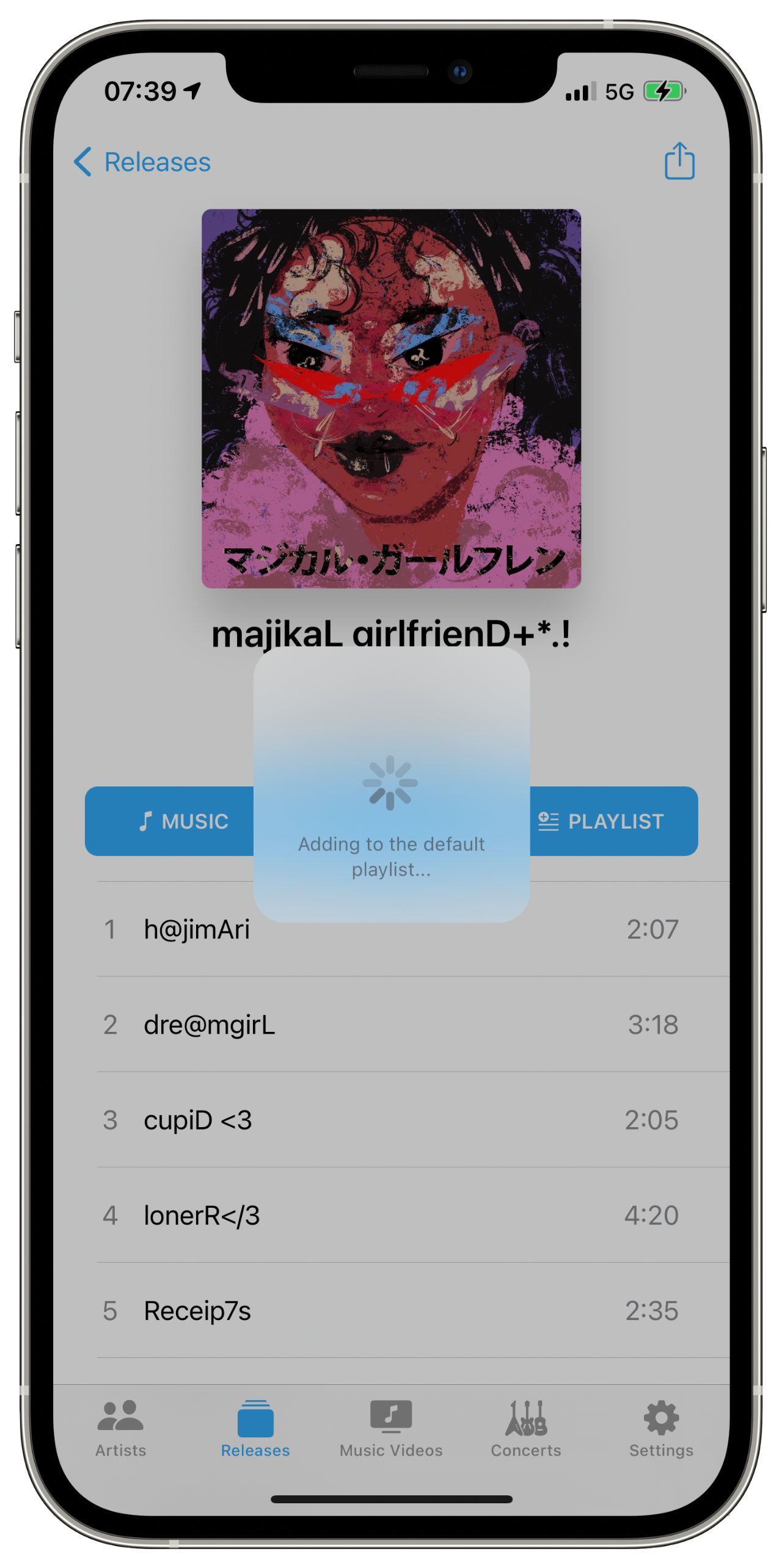
My Apple Music library has become quite fragmented after I lost my entire physical music collection along with the external drives containing my accumulated digital music library in 2017. Still, after more or less starting anew this past December and casually, deliberately adding digital files back into the accursed, ancient iTunes desktop application and restoring some (outdated) versions of my handful of shared curatorial playlists thanks to SongShift (which we'll glance on later,) MusicHarbor currently lists 1433 artists represented across my Apple Music and (very sparse) Spotify libraries. I know this because of a very simple Siri Shortcut I modified which returns a text list of all Artists in one's MusicHarbor library in Quick Look. (Here is my result as of this moment in GitHub Gist form.) According my App Store receipts, I first downloaded MusicHarbor on March 26 - 20 days ago - which is mentionable because of how much I've accomplished with very minimal time investment in terms of curating my own music library thanks to MusicHarbor. As you'll note in the 3rd of the 4 screenshots embedded above, I was able to delete System of a Down from my library - a single function which alone justifies the app's one-time $5.99 "Unlock Everything" fee, to my sensibility. I've also been able to begin following all the artists represented in a few of my favorite playlists with a handful of taps - a task which would literally require hours in the native Apple Music app of old (when one could actually follow artists, there.) On that note, it's time to cite the primary MacStories article you should read, entitled "How I Keep Track of New Music Releases," regarding Apple Music's performance as a release tracker:
The ‘New Releases’ section is tucked at the very end of the For You page and laid out as a horizontal carousel that requires a lot of swiping; you can view the ‘New Releases’ page as a grid, which has sections for different weeks, but, in my experience, it only aggregates highlights for new releases from some of my favorite artists. The ‘New Music Mix’ playlist is not terrible, but it often comes loaded with stale data – songs I’ve already listened to multiple times and which shouldn’t qualify as “new” weeks after their original release date. Furthermore, I’ve found notifications for new releases for artists in my library unreliable at best: I occasionally get notifications for new albums, but never for new singles or EPs.
Here, Federico Viticci is riffing off a newsletter issue written by music blogger Jason Tate, in which he describes the service's missing tracking functionality as "the single most frustrating part of Apple Music." Though these points in the conversation are both almost two years old, MusicHarbor remains the ultimate means of tracking new music releases chronologically on Apple's platforms. Though I am personally just three weeks in, the confidence this app has given me in the certainty of its chronological release feed is quite profound. Its integration with one's calendar to track upcoming releases is a bit much for my own needs, but I know personally enough invested curators for whom it'd be a godsend to mark it no small addition.

MusicHarbor’s only downside is entirely excusable/understandable, in context: it’s a bit clunky. For the sake of this work, I set up a shared Apple Music playlist so I could further demonstrate all the new music I discovered in MusicHarbor. Adding whole albums to this playlist with a single tap feels powerful because it is - I’ve no idea what sort of developer wizardry is involved in such an action, but the Wait Wheel doesn’t feel like too much to endure. Adding a release to one’s library - the other in-MusicHarbor accumulative function - is a bit quicker. It’s important to remember that this piece of software was/is created and maintained by a single human being, though I would expect nothing but improvement, going forward.
That’s all I have to report on MusicHarbor, for the moment, but I’ll add further MacStories praise from their 2019 MacStories Selects app rewards:
What makes MusicHarbor special – and, ultimately, the reason why we all use the app here at MacStories – is just how much developer Tanaka understands what someone who wants to know about new music releases is looking for.
July 2021 Update: The MacStories gentlemen have just published an interview episode of AppStories speaking at length with MusicHabor creator Marcos Tanaka.
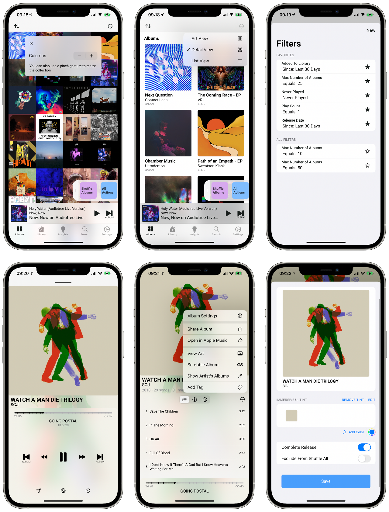
On the other end of the spectrum, exploring new digital manifestations of The Music Collection, is Albums, which actually functions as an entire replacement frontend player for Apple Music. Reviewed much more recently by MacStories, it really is best-described as “opinionated, favoring album playback over individual songs or playlists.” Considering that I installed the app just a week ago and have focused most of my attention on MusicHarbor in that time, I’ll leave most of the commentary to John Voorhees. All I can say, really, is that I see an extremely powerful application, here, for a fairly specific use case: someone who’s listening is largely occupied by albums they already “own” in Apple Music and treasure deeply. The ability to set an individual record’s “Immersive UI Tint” down to the hex (in “Album Settings”) is as in-depth a tool of adoration as I’ve ever seen in a digital music service. Combined with Albums’ presumptuous takeover of actual playback from the Apple Music app, I think I can rightfully say that it was built for the extremely serious music consumer.
My favorite part so far: the app knew well enough to offer me THE ZRO BUTTON. Telling, I think.

Since it’s already quite clear how much this Post draws from MacStories, I’ll let their review of Soor stand on its own (I couldn’t quite justify spending $6.99 just for review purposes.) In the episode embedded above, they also mention Denim - a playlist cover creator I am not personally all that impressed with. There’s also MusicHarbor’s sibling, MusicSmart, which manages the tricky but essential task of adding the metadata retrieval Apple Music should have included all along. The rest can be found in the episode’s show notes. I’m not done with them, but the rest are what I would differentiate as services…
One of the bewilderingly undercovered digital music sharing tools of our kind, Odesli has been my preferred method of sharing tracks/albums/EPs since I first discovered it in 2018. It is not specific to iOS but it is essential for competent music sharing, anywhere, these days, in its magical ability to correctly intersect any given piece of music’s links across all streaming services, known and unknown. To be honest, I thought everybody would be using it by now, but it’s continued to develop with minimal attention aside from Siri Shortcuts developers. Thanks to Odesli’s Public API, dozens of Music-centric Siri Shortcuts have emerged over the past few years, resulting in one of the most useful Siri Shortcuts integrations to be found for real, reasonable human beings. Here’s where Apple-adjacent media and I part ways…
While current common conversation might point you to Federico Viticci’s MusicBot hyper-Shortcut and/or @gianflo6’s 600 action-strong Song.Link Shortcut, I (perhaps expectedly) would point you to my own, 17-action Shortcut which spares you any selections and simply opens the Song.Link URL of the track currently playing in Apple Music (while also copying said URL to the clipboard.) It’s not that MusicBot isn’t massively impressive and still useful, but it represents a class of super/hyper-Shortcuts which (from my perspective) far-overreach beyond the intended use case for Siri Shortcuts and end up immediately bewildering/alienating potential new users. Truthfully - as Federico singularly acknowledges - they are full applications built atop a less-than-ideal platform designed for relatively simple, repeatable automations. I’ll spare you further opining on this idea until another, potential Post, and instead demonstrate my personal solution.
https://imgur.com/gallery/eblzlbD
In the clip above, you can see I was working on this very draft when LoneMoon’s “kawAii @F” started playing. Naturally, I was compelled to share it on Twitter, so - without leaving Drafts (my writing app) - I called the type-to-Siri prompt by holding the Sleep/Wake button on my iPhone 12 Pro Max and simply typed “sl” (I renamed my Shortcut for this use,) running the Shortcut, which opened the track’s Song.Link page in Safari - very much an optional step, mostly just to make sure the match is correct - and copied its URL to my clipboard, from which I could share it anywhere. Since the advent of widgets in iOS’ Today View, I’ve also kept a button for this Shortcut in one of four precious slots in a box at the very top. For those willing to play around a bit, it should be fairly straightforward to configure the end bits to your liking, but it should work out of the box for even those least interested in Siri Shortcuts/automation in general.

As I confessed before, it is only thanks to SongShift that I was able to recover anything of my original, prized, deeply-considered Apple Music playlists. The standalone MacStories article on this one is a bit dated, but I don’t see much change in function in that time. For most people, SongShift’s free service is simply the best way to transfer a playlist between music streaming services. If you find yourself genuinely sold by the features offered by SongShift Pro, I suspect you know more about playlist manipulation than I could ever learn you by diving in any deeper.

Yup… Believe it or not, Last.fm is still fucking scrobbling after 19 fucking years (almost to the day,) and its iOS app still fucking works. What’s most bizarre about this truth is that I did not encounter mention of Last.fm for years until I started noticing it as an integration option in the settings menus of these premium iOS apps. Is this some sort of conspiracy? I’m not sure, but I suppose I might as well insist you follow my ancient account, if you’re still using it.
alright folks fucking ADD ME ironically or not. this profile is older than all of the cells in my body. https://t.co/cQLeb0dGEK
— ※ David Blue ※ (@NeoYokel) April 16, 2021
I should also note that not only is the Last.fm iOS app still working, it’s working well, from all appearances, anyway. Though the service no longer includes hosting, itself, it’s apparently still a prime player in the world of playback tracking.
https://youtube.com/watch?v=pSDCbXGIovM
What if you actually want to “make” music with your iPhone? We’ve seen iPhone television ads for years featuring amalgamations of musician-looking types playing instruments with cables attached to their handsets, but is the iPhone now a reasonable platform for any sort of serious sound capture? The short answer is no. Who am I to proclaim such an absolute? None other than the motherfucker who’s been messing around with mobile DAWs for 10 whole years. I even “released” an “album” on Bandcamp made exclusively with Apple’s own GarageBand for iOS and inspired by the dangerous life of the contemporary raw milk smuggler. I wouldn’t call it “music,” per se, or an example of what a real electronic producer could pull off in the app, but it does represent its capabilities in the hands of the average user, using mostly default loops.
https://soundcloud.com/dieselgoth/wurlie-jam
While Apple does publish an Apple Book entitled “Everyone Can Create Music” about GarageBand on iOS, it is specifically directed at iPad-bound use. Any serious DAW user uses keyboard shortcuts, which I admit I only discovered recently in GarageBand for iOS. The official documentation is - once again - for iPad, specifically, but most of them still work on iPhone.
FL Studio Mobile - the original third-party iOS-bound DAW - is still going, apparently. While I did, indeed purchase the original version on my iPhone 4, I remember absolutely nothing about it, suggesting I was over my head, even then. There’s also Auxy, as covered recently in this App Store Story and Reason Compact. I’ve played around with these more recently - since they’re both available in their most primitive forms as a free download - with little to report.
Disappointingly, Apple’s own Music Memos - as demonstrated by Chris Welch from The Verge in the embed, above - is currently in the process of being officially sunsetted and is now no longer available for download on the App Store. As that article notes, users are instead directed toward GarageBand or ye olde native Voice Memos to record high quality audio. However, if you want to take advantage of the stereo audio recording capabilities included in iPhones after the 11 Pro, you must either use the native Camera app to capture video (and extract the audio later,) or Dolby On - Dolby’s own iOS app for recording which - if I’m completely honest - will do nothing but utterly frustrate anyone trying to capture the truest digital audio possible.
https://youtube.com/watch?v=GhAknEKy9Ig
As part of my iPhone 12 Pro Max Review, I’ve accumulated quite a few audio files in various formats testing its capture abilities and stashed them in this folder on The Psalms’ GitHub Repository. Probably the most relevant of these, though, is embedded just above. If you’ll forgive my pajamas, ridiculous piano faces, and general rustiness with the instrument, it demonstrates the “Audio Zoom” feature found in the iPhone 11 Pro and up, which I’ve found to be unfortunately underdocumented by Apple, itself. I added my own inquiry to this post on the official Developer forums asking about it, but don’t really expect anything back. According to “What is Audio Zoom for smartphones?” published on the site DxOMark:
The main technology behind audio zoom is called beamforming, or spatial filtering. It allows changing an audio recording’s directivity (that is, the sensitivity according to the direction of the sound source) and shape it in any way necessary. In this case, the optimal directivity is a hypercardioid pattern (see illustration below), which enhances sounds coming from the front direction — that is, from the direction in which your camera is pointed — while attenuating sounds from all other directions (your background noise).
My testing has suggested that the best means of recording unfiltered-as-possible stereo audio with an iPhone is to record video at 1x zoom with the native Camera app and extract the audio from the video file. In the Bandcamp track embedded below, I “mounted” my 12 Pro Max right above my old upright’s soundboard and extracted audio directly from the video file with Audacity. It was then amplified slightly, saved to a FLAC file and uploaded directly to Bandcamp. Of course, it’s worth qualifying that - while I have extensive experience with audio - I have neither professional training, nor any professional monitoring equipment.
https://davidblue.bandcamp.com/track/-
That said, the biggest objection I’ve heard from audiophiles regarding audio capture and manipulation on handsets, generally, has to do with their hardware’s extremely limited capabilities when compared to any sort of professional desktop soundcard. Given the greater argument I've come to regarding the state of consumer tech as best exemplified by smartphone design - that we've come to expect far too much of single devices, and the resulting jack-of-all-tradeness summing their real-life capabilities has become a severe detriment instead of a feature - I must echo, again, that adding "studio" audio capture, manipulation, and production capabilities to our goddamned cellular phones doesn't help anyone. To any user truly hoping to accomplish these things, I say just go home and boot up your damned desktop.

The final episode in AppStories' three-part miniseries on music was just published today, though I suspect - for my audience, anyway - that its coverage is mostly out-of-scope on this topic, largely for financial reasons. Apple's first event of the year is scheduled for tomorrow at noon, my time, and is entitled "Spring Loaded," which - combined with its 4/20 joke date - suggests to me that we'll finally see the release of the APPLE GUN™ alongside iWeed™, but little to nothing in the way of music.
In the midst of my brief research into The Greater History of Apple Music, I discovered the existence of iTunes Ping - which I somehow missed entirely, along with my Twitter friend Jon Male. I also discovered articles from the company's decision to kill its successor "Connect" from Apple Music, which was reportedly "rarely used." Notably, this removal also took away what little power Artists had over the narrative surrounding their music on the service. I can see the business justification for all of this (barely) except for removing the ability for users to follow artists.
The latest Apple Music feature - a "channel" for music videos - also makes zero sense to me, but the launch of Apple Music on the web absolutely does, especially for Windows and Linux users, who are now officially freed from iTunes (the software) and allowed to use a much more modern Apple Music experience. I prepended "officially," there, because third-party Apple Music web players have existed as long as the service has allowed the required integration. First, there was Naveed Golafshani's - which is no longer live - but Brychan Bennett-Odlum's Musish is still live and working, as you can see from the screenshot embedded above. Other than the ability to select between two stream bitrates, I can't seen any remaining advantages to using the latter over Apple's own web player, unless you harbor spite toward their handling of the whole thing, which would be entirely understandable, from my perspective.
https://twitter.com/NeoYokel/status/1359364473253937153
As someone who grew up in the mp3 era with a first-generation iPod Shuffle and iTunes, living and dying between iTunes Store gift cards, Apple Music still seems like one hell of a magical deal. In effect, it allows access to all of iTunes for a flat monthly fee. Or at least it would had I never become acquainted with professional independent musicians who've published, there, and have to contend with tedious realities like the process by which one can add those beautiful lyrics to Apple Music tracks, and who's only real means of control/engagement on the service has been removed with virtually zero prospects of a replacement. If, indeed, Jessica Lessin was correct about Apple's obsession with music, it has resulted in very little for any class of music makers, and left even its listeners to seek out and find third-party solutions like MusicHarbor to perform even the most basic personalization one expects from a modern music streaming service without even bothering to amend their App Store's discovery process to illuminate them, or even write a fucking App Story. Despite this, one-to-three-person app teams continue to work on new solutions, to these and other problems...
#music #software

One of the handful of Siri's most useful features has been the "Hey Siri! Where are you?" command, to which Siri will respond "I'm here" or "here I am!" Were it possible to view how many times one has triggered a particular Siri command on iOS, my personal reliance on it would almost certainly be embarrassing. Often, my handset isn't even obscured from view - it's just faster to have Siri speak up than it is to scan the room. Occasionally, however, my device has managed to become embedded beneath and/or within some genuinely-perplexing series of couch cushions/blankets/briefcase pockets/etc. which require a more constant homing sort of audio reproduction. Asking friends/family to call one's phone is the general goto, yes, but honestly the actual length of time cellular telephones will ring before sending a caller to voicemail in 2021 is ridiculously short, especially when rummaging through Gourd-knows-what. For that matter, most of my peers keep their phones on silent mode, 24/7. What then?
https://www.youtube.com/watch?v=3evgnSlnkjk
Since the very first time I set eyes upon Siri Shortcuts in iOS 12 Beta, I have wanted to create one to address this issue in a creative, entertaining, and (hopefully) genuinely-useful way. On that day almost three years ago, I even knew it would be called Marco!, believe it or not. In the past few months, I've returned to the project on and off and ended up with several different versions of varying complexity. One day, I'd like to figure out how to integrate the full extent of my ideas for Marco! into a Shortcut which can be reliably triggered when one's device is locked, but for this first release version, I have included only what I and a few other (much appreciated) volunteers were able to trigger in every situation we could conceive of.
Marco! Version 1.0 can be downloaded on RoutineHub (which I would highly recommend,) or directly via this iCloud share link. I know it's a bit excessive, but I even created a GitHub Repository just for this Shortcut, seeing as it is undoubtedly the most original I will ever contribute, and the singular one with potential for continued development.
Download Marco! as is and (as long as you don't rename it) use "Hey Siri!... Marco!" This should immediately run the Shortcut, which includes my voice saying "Polo! Bitch!" followed by five repeats of the flashlight/noise cycle as described in detail below.

As documented by the Jellycuts file above, Version 1.0 of Marco!'s actions are as follows:
The most clever bit about this particular Shortcut is its use of Base64 text to include audio playback. I just fixed a bug on my own Base64 audio encoder Shortcut if you'd like to try it out. Since this version includes my own voice (subject to taste, I realize,) as well as some minor profanity, I do intend to publish a clean variation at some point in the future. If this is an obstacle for you, and/or if you'd like a custom version made with audio of your own choosing, please do send me an email! I would be more than happy to make one for you.
#software

I have written more than my fair share of words about software, as I have loved, despised, and been utterly perplexed by it. This year, my return to the iOS community has perhaps inevitably turned apps into an addiction of sorts. This particular platform is so utterly chock full/stocked up of creativity at a scale immeasurably greater and more accessible than the whole of those throughout computing history, combined. For someone like myself, it is all too easy to allow oneself to wander down a virtually endless path of intriguing, very self-indulgent play, especially now that third-party sites like Departures.to have managed to add discoverability to TestFlight beta distributions, allowing those non-millionaires among us opportunities to use test releases of applications we would’ve otherwise had to pay for. This has been exclusively to my benefit - I can only imagine what 15 year-old me would have done with such power.

In my recent endeavor to focus on making my work more useful to others, I've reflected on something I've heard from nigh every developer of the apps I've reviewed: Ah yes, your blog looks really cool but FOR THE LOVE OF GOD, PLEASE REVIEW MY FUCKING APP on the FUCKING STORE. Read: your commentary is appreciated, but your five stars would almost certainly more economically beneficial.
As you can see from the image embedded above, I have personally fallen very behind in doing my part for those apps I've celebrated, here. A vague intention to get around to it eventually clearly is not working, so I've decided to give myself a deadline: August 15th, 2021 - precisely one month from today. By this date, I will have sifted through my commentary on apps in this setting and adapted the most useful of it (per app, obviously) into a manner appropriate to appear on an App Store Page, and I would like to formally-ish invite other tech writers/app reviewers to join me.
https://twitter.com/NeoYokel/status/1402057069927309318
I'm terrible at community organization, which certainly does not exclude events, so I very much welcome any feedback you might have, as well as any collaborative contributions you'd be interested in making. As I see it, I have a few essential considerations to offer.
First, the page in the screen capture above - which can be found in the App Store App ⇨ Account (your profile picture in the top-right corner) ⇨ Account Settings (the tapable element at the very top with your profile picture and information) ⇨ Ratings and Reviews - is broken as hell, along with the rest of the Account Settings menu, notably. This is important because I insist we all complain about it on all available channels, considering it's been broken for several months, at least.
Second, you should almost certainly use this "new" dev-facing tool when searching the App Store, considering that it actually works in a trustable way, unlike the user-facing tool in the app.
https://twitter.com/NeoYokel/status/1415732070626758663
Since the standard online palette of event organization software are all so easy to use, these days, I've established event pages for this event on multiple platforms, linked in the list below, which I will update as per any suggestions/requests for equivalent pages on other services. Of course, it's certainly not a requirement that you join/engage with any of them.
One could could certainly just add the date to their own calendar (conveniently with this .ics file,) remain entirely silent about the thing on social, and still be participating. Those interested in further engagement, however, can Chat Me Up on Extratone's Discord, the Teams event chat, Telegram, etc. I also plan to reshare most of this post as a thread on Twitter.
As we face the horrendous, utterly inexcusable state of Discovery on the App Store/Apple's general fuckery regarding the independent developers mostly responsible for making its platforms a worthwhile space, I hope I've created something of value in whipping up this "event." If you have thoughts on how I might do so more effectively, once again, please do reach out.
#software #meta

Apple's second virtual World Wide Developer Conference came and went as I wrote this guide - you can metaphorically picture me looking up from my machine having overheard the news of the 2021 Apple Design Award Winners announcement. Perusing through them, I saw two I would have voted for, myself: CARROT Weather - the beautifully vulgar, grumpy bitch frontend for your preferred weather information service, and Craft - perhaps the most innovative take on word processing of the past two or three years - listed under "Finalists." (Read: losers.) The most positive personal discovery of (all?) WWDCs: an app called Be My Eyes, which "connects blind and low-vision people with sighted volunteers and company representatives for visual assistance through a live video call," along with an exceptionally crafted, cross-device accessible-as-fuck TTS solution called Voice Dream Reader. However, a double take in games from Genshin Impact and the fucking League of Legends game certainly sours the mouth and suggests yet further just how much Apple, Inc. has sold out.
The continued prioritization of Growth for Growth's sake over any and all other considerations (namely, users,) is not unexpected from even the most valuable company in the history of the world, I suppose, but there is an actor at this point in the story who is catastrophically and demonstrably failing to fulfill their role: all I really know is that technology media has fallen into a trough of total uselessness when it comes to qualitative, authoritative analysis of consumer-targeted software. The necessity of this guide - and the bizarrely silent ignorance of even the "fringes" on its subject - is unimaginably severe. Before me has been (for years, now,) the "answer" to a Jolly Big Load of what tech and marketing types lament in more and more existential language, yet hardly any of the humans with the most to lose from their negligence - regular, casual social media users - have been delivered to these experiences. The story is not being articulated. The journalism is not being done.
I know you almost certainly did not arrive here to hear one motherfucker's complaints about WWDC, but - as with everything Apple, Inc. does - every morsel of curatorial expression/discrimination/favoritism from The Great Money God within this platform must be scrutinized and criticized. Quite frankly, I found myself completely at a loss as to how not to dwell on the Discovery Disparity, here.
Despite how deeply I've gone into iOS this year, I do not believe myself to be a qualified judge of software design, but I no longer believe Apple to be, either. Regardless of the revenue-related controversies of late, Apple have simply become terrible stewards of the App Store in every imaginable sense. Scams and blatant intellectual property theft abound, while the majority of the most innovative entries I've ever seen remain entirely obfuscated and uncelebrated by all of Apple. Inc.'s mechanisms. If you required an explanation for the amount of time I've invested into App Guides - a space to which I never would have imagined intentionally bringing The Psalms - I hope you can understand.
I must confess: I have been meaning to write this app guide since even before I interviewed Mastodon creator Eugen Rochko on the morning of his Big Press Day, just over 4 years ago. I’ve exhaustively explored different means of convincing my own longtime Twitter friends to move, over that time, with very little success. Eugen, himself, published an official blog post at the beginning of February detailing his plans to open up onboarding by way of “an official Mastodon app that is free to download and that is specialized in helping new users get started on the platform.” As a Patreon supporter of The Mastodon Project (full disclosure,) I've been testing this app (see preview shots at the very end,) and am quite smitten with it. That said, I thought it might be worth going over the third-party options iOS users currently have available to them, largely because the offerings are each innovative and mature applications in their own right. (Also, it’s become quite apparent that the normal tech media sources you’d go to for such a guide aren’t going to give Mastodon the attention it deserves.)

I originally intended to be as clinical as possible in this Post, having realized its potential as the singular comparison of its kind to appear in search results for new and potential users of Mastodon. From my perspective, Mastodon has long since surpassed regard as a novel social media experiment who's function is to prompt academic conversations about decentralization, open source, ad tech, and federated social's solutions to all of the Big Web's Big Boy (proprietary) Problems (though I have been compelled to invest significantly in that very conversation.) In the less intellectual hours of my day-to-day life (read: most of the time,) Mastodon is nothing more or less than my favorite place on the internet. It is a relentless delight which I only lament because I want to share so much of it with my friends, but have continued to fail in my efforts to articulate that Mastodon is not a compromise; it is a better social space.
If you didn't know, this seems to have become my general shit, for lack of a better term: the ethical considerations of open source/"alternative" software are very important, yes! ... but they are far from the whole, and they are not a requisite for new users. The second of this World Wide Web Blog's fundamental considerations, in fact:
The Open Source/Open Web community continues to struggle with their brand image (if you will) in both old and new ways that needlessly alienate (and sometimes obfuscate) some of their most important contributions from the average user. Technology media has failed in their responsibility to address this issue.
The blog on which you're reading this, in fact, is federated on ActivityPub. If you so chose, you could be reading it in any client capable of displaying large bodies of text. The crucial point, though, is that you didn't need to know that - you could very well go on reading it on the web in total ignorance/apathy regarding Federation.
Oh boy, here we go... No. I did not want to say anything ideological - I wanted this Post to function as little more than a pretty screenshot showcase and simple associative list responding to all of the Reddit posts I've seen to the tune of "is there an iPhone app?" As I explored them, however, I was reminded of the sheer creativity the "alternative" software community is capable of. Even the roughest of these considered apps seem unable to be faceless - sorting through the obscene amount of (unlabeled) screenshots accumulated over the past weeks of testing in my Recents folder has been so much easier than I thought it would be because of their relentless originality. If you've actually used any iOS applications and/or browsed the singular App Store from which they can be acquired in the past 3-4 years, you're undoubtedly skeptical: what we might have called "feature overlap" at one time has become all but the platform's core ethos. If you're the sort who enjoys screwing around with apps, generally, as I have for the whole of iPhone history, you have grown accustomed to disappointment.
https://twitter.com/NeoYokel/status/1402057069927309318
Regardless of who is to blame, we can all agree that the App Store is currently oversaturated nigh beyond usability with mediocre entries built from the beginning with zero apparent ambition toward original function. This, alone, wouldn't be so problematic if Discovery were not so completely and totally Fucked (except when dev-facing,) but I needn't comment further on that subject at the moment - I'm just trying emphasize how absolutely unheard of it is for a single protocol/service's third-party client representation on iOS to be so thoroughly special. It was astonishing to find all but one or two of these apps in a functional state, actually. In all my equivalent experiences downloading the entirety of a given service's API-supported palette (e.g. IRC apps, topically,) an all-too-significant purpose of whatever ends up getting published is simply documenting the 20% of available titles that actually work at the given moment. (I'd have mentioned the "best [service/task] iPhone apps for [year]" listicles found in online publications like Digital Trends were it not for the percentage of them in which it's clear the author did not actually download some/most of the apps listed‽‽‽) Perhaps due to iOS 14.5's implementation of ATT, all of the Mastodon apps I could find and test (not counting non-English language-supporting apps, in fairness' interest) are currently functioning.
So, if there's virtually zero chance a new Mastodon user might download one of the apps we're about to consider and find it broken, what practical function remains for this guide? Hopefully, to establish a SEO catch-all for such users from a non-automated source less associated with the project than the official apps list. Those for whom Mastodon is still an unfamiliar subject should find the collected imagery intriguing, hopefully.
https://www.youtube.com/watch?v=g2MSr_7J1GY

My first step in writing this guide was to post a thread on r/Mastodon soliciting thoughts on third-party Mastodon apps from other users, who expressed a lot of love for Toot! and Metatext:
Toot is just a joy to use. It has a little too much sometimes (it actually contains little mini games...which really aren't needed), but the experience of using it has some really clever UI twists. -u/mikepictor
Pragmatic Code's Linky was also mentioned by multiple respondents. It's not a client, but a bridging tool for smoother URL sharing that integrates with iOS' share sheet. I did not have time to try it, myself, but from all accounts, it is an obligatory mention. So too is the GitHub Repository/List I created in order to "formally" offer a list with much greater brevity and zero editorialization.
First, let’s begin with The Big 6 - those apps The Mastodon Project, itself, has seen fit to list on joinmastodon.org.
https://youtube.com/watch?v=LdBFMibyh3Y
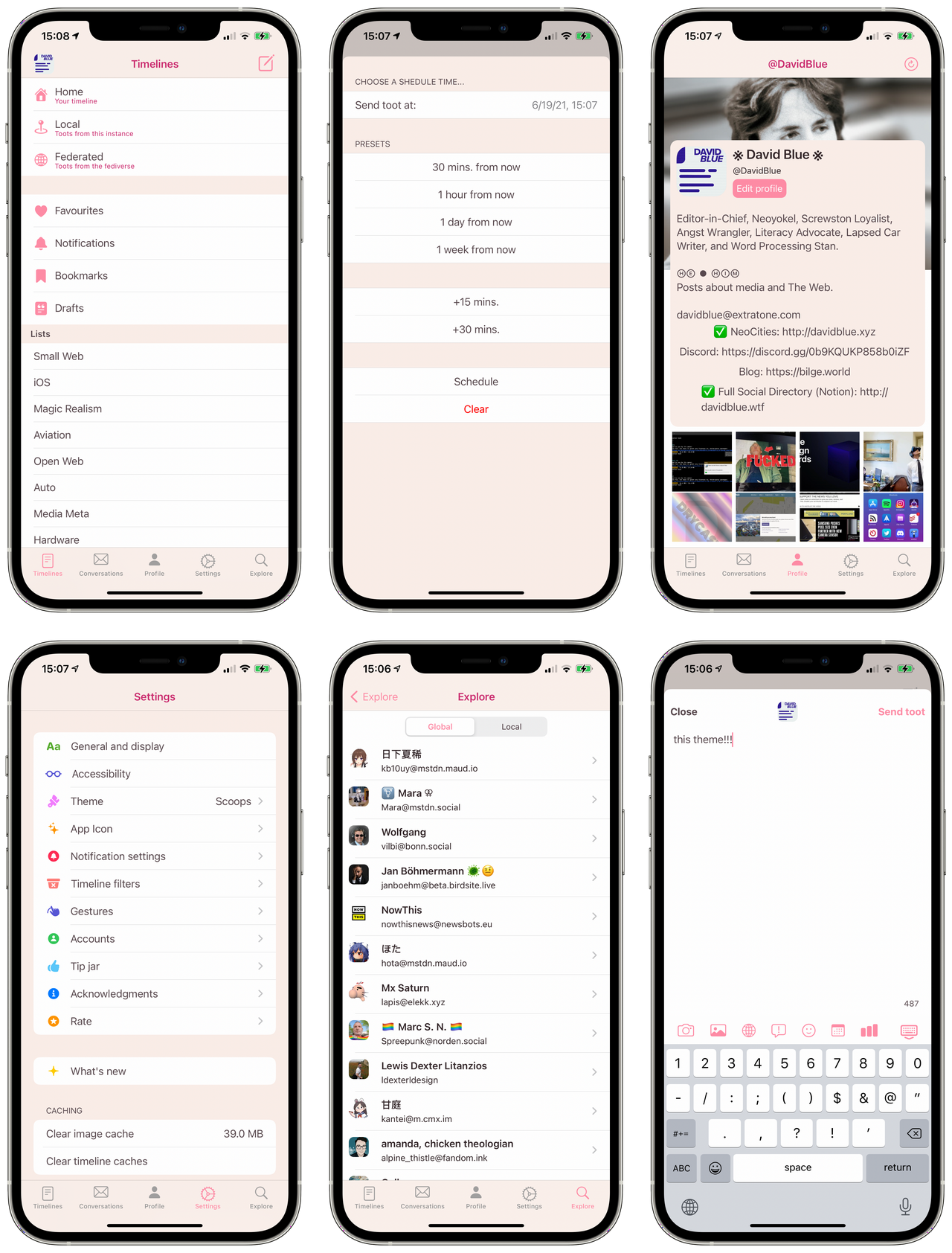
Dag Ågren‘s Toot! is not only my personal app of choice - I would (and have) go so far as to say it’s the single most innovative mobile social app I’ve ever encountered, largely because of its jacknife-esque instance selection. It’s held a place in my phone’s dock since the day I first downloaded it, for this and many other reasons. While one might find bugs/loose ends (understandably) exploring the functions of other indie social clients, within Toot!, they will only find little delights, like its wholly unique Share Sheet interface.

Toot! is extremely beautiful (despite its unfortunate name,) and I am quite superficial in my taste. It’s Obsidian theme (which may or may not be related to the topical notetaking system of the same name) is especially gorgeous.
In my cacophonous attempt to compare the notifications of all available Mastodon apps simultaneously, it's worth noting that Toot!'s always came first. Its charming custom audio alerts also make them my favorite by far.
They're not just cute: in reflection informed by a newly-considered function of these apps - serving as representing the network as a whole - it occurred to me that Toot! audio alerts playing from my iPhone have prompted more first-time conversations about Mastodon in the wild than I can count. (Seriously: they should be considered an onboarding mechanism.)

In my experience, it’s also the most robust of the lot - as in, it is very much the exception rather than the norm to encounter any sort of error or other obstruction in normal, day-to-day use. My own real reservation applies to the entire selection discussed today: I wish Toot! supported Bluetooth keyboard shortcuts.

I originally had high hopes for Shihab Mehboob‘s Mast - which used to look very different from the way it does, today. That’s almost certainly to do with its ownership changing hands at some point (no, I do not have any further details on that story, unfortunately.) That’s not to say the current app isn’t a worthwhile offering, it’s just far less visually ambitious than the original I remember. However, it’s also significantly more reliable.
https://twitter.com/JPEGuin/status/1354854403124178947


The Original… Genesis… If Amaroq was not the first Mastodon app on the App Store, it’s certainly the oldest to survive. Its GitHub Repository’s first commit dates back to April 17th, 2017. While you’re there, you might note that it’s the only one of these entries coded entirely in Objective-C - the near-40-year-old language originally underpinning iOS before Swift’s birth in 2014. Amaroq was the first Mastodon app I used and remains the strongest free option for iOS users. It’s been nearly a year since its last update, so its missing a few narrower functions like Bookmarking and Polls, but the core features it does include are rock solid. The only wild card: what the fuck is Awoo Mode???

For better or worse, @rinsuki’s iMast will require either a basic grasp of the Japanese language, or the patience to translate its menus and work backwards. (OCR came to mind, but I’m not quite dedicated enough to try it for this guide.) Assuming Google’s translation of its GitHub Pages site is correct, iMast is also Open Source “under the Apache License 2.” Unlike Amaroq, it appears to have been built in Swift from the ground up. Unfortunately, that's about all I can comment on, though I would very much love to hear from any iMast users/Japanese speakers and will update this Post accordingly.
A function I can provide: documenting iMast’s Bluetooth keyboard shortcuts.
| Action | Key |
|---|---|
| Open Compose Window | ⌘ + N |
| Send Toot | ⌘ + Return |
| Home Timeline | ⌘ + 1 |
| Notifications | ⌘ + 2 |
| Local Timeline | ⌘ + 3 |
| Others (Menu) | ⌘ + 9 |
iMast is also the singular Mastodon app with a Siri Shortcuts action!
Daniel Nitsikopoulos' Mercury represents yet another entirely original direction in Social clients. It's fresh and "opinionated" in its explicit lack of support for instances that "promote abuse and harassment." From all appearances, this appears to be the singular source of negative reviews on its iOS App Store page. It's also the other option to offer widgets integration (in a single form, currently,) and custom audio notifications, though I couldn't capture a sample. Its Trello Roadmap and Feedback Repo are public but mostly inactive. As you can see in the grid embedded above, I absolutely adore its Scoops theme and find my $0.99 Tip 100% worth its custom icons.

Unfortunately, the state of Mercury's App Store reviews prompt yet another essential economic/editorial consideration. The one in the very center of the image embedded, above - from "FeralDandelion" - is the singular one I will allow myself to address. It is true that Mercury straight up refuses to authenticate or federate with a substantial amount of specific Mastodon servers, but it is exhaustively explicit about this from very get-go. Its single-page Help document includes a detailed, up-to-date table of every single blocked instance and the specific justification for each respective instance's presence on it:
Mercury takes a zero tolerance stance on abuse and harassment and as such does not support many instances that promote abuse and harassment.
Let me be clear: the practical manifestation of this position is exclusively positive. The Mastodon project has long outgrown the sort of fixation on ideology for ideology's sake that even Lucky Linus himself has no patience for. Instead, thank Gourd Mercury's developers took the time to better your social experience! In response to statements like the pullquote above, I expect only thumbs in the air from this point, forward.

Metatext is perhaps the buzziest of all these apps - well-praised in every space I could find conversation on the subject. It's developed under Justin Mazzocchi's software studio, Metabolist and is as Open Source as it gets! (As per my hardware keyboard shortcuts crusade, I added my own issue requesting support.) u/GummyKibble noted that "it looks like a native app on both iOS and iPadOS." This term - native - seems inextricably linked with Metatext. I vaguely understand what it means, and I do agree, but it's worth noting that I speak with some privilege, having compared all of these apps on the top performing handset Apple currently has to offer. In many ways, it is the most frugal of the new offerings, especially, yet it strikes a keen balance between function and delight. I think "native" can be translated as generally of a stout, sturdy disposition, thanks to the care put into honing said balance.
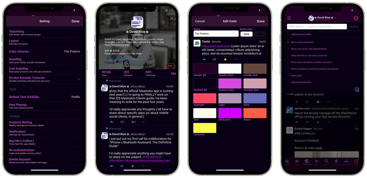
I'm not entirely positive which Mastodon app was actually the first on my iPhone, back in 2017, but I know for sure it was either Amaroq or the dearest, infinitely-colorful Tootle. Its App Store Page Version History suggests it has not been updated in 14 months, yet the app - which was apparently "Designed for iPad" - appears to be working just fine. There are some overlapping UI elements, but they're barely noticeable. Were it not for the new dev-facing store search tool mentioned above, I would have assumed this app long gone, to be honest, but using it again has somehow managed to genuinely twinge my nostalgia nerve.
In my search for any extra-App Store representation other than Tootle's Mastodon Account (which last posted the day after my birthday, last year,) I discovered Tootle... for Linux. Since I am a dedicated and thorough person, these days, I spent several hours messing around with Linux Virtual Machining until Lubuntu finally functioned just so I could show you what it looks like. Below is a screen capture of Tootle bordered by the most Macish LXQ desktop bars included in Lubuntu and even wearing the new official Apple System Font, SF Pro. Still, I think you'll agree... Tootle for Linux is not related to Tootle.

Personally, I find this a profound shame - I think more apps should be as colorful - and as color configurable - as this little, mysterious Mastodon app. I created the theme you see represented in the frames embedded above using The Psalms colors, naturally, and the whole process took less than five minutes. Play around with it as I remember doing, all those years ago, and you'd be surprised how hard it is to create an unusable color theme. What I find most shame in, though, is that Tootle appears to be completely invisible in regular app store searches, now. (And by "most shame," you know I really mean entirely fucking unacceptable.)
https://www.youtube.com/watch?v=WBZtmOqyk8c
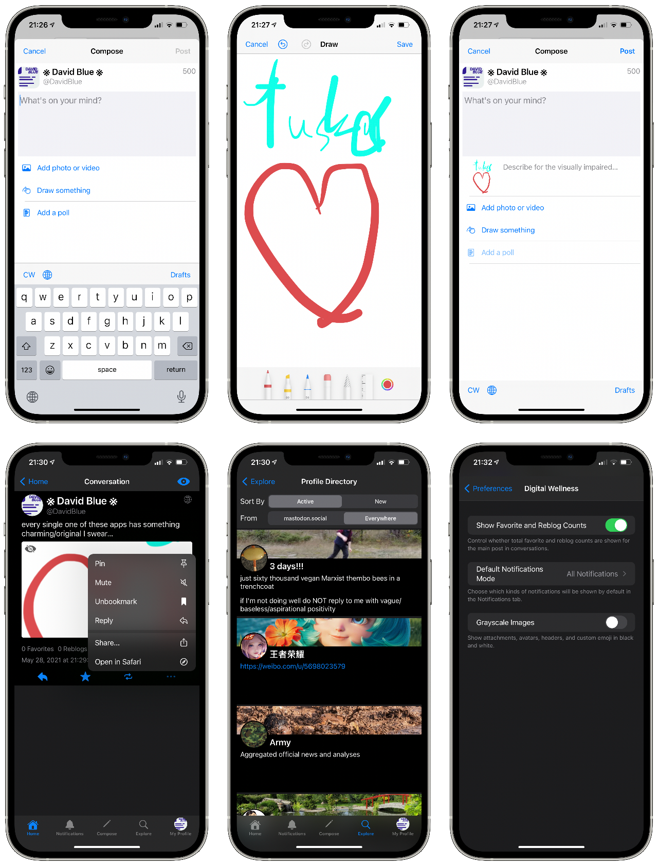
I found my way to the only currently in-development entry on this list thanks to my Mastodon friend wakest. iOS developer Shadowfacts (who also maintains shadowfacts.net) is working on their considerate, distinct app, Tusker in this self-hosted Repository. In (1)(https://mastodon.social/web/timelines/tag/tusker) on Mastodon, you'll find a few poignant praises from Pixelfed founder and principal developer Dan Sup, which - from my perspective - are especially high, indeed.

Tusker's color customization options are technically... well.. not infinite, like other apps here, but the end result of their (obviously, very considered) selection will be a net win for 100% of users over that alternative, I believe. It is definitely of a similar philosophy to Metatext, but unquestionably more ambitious. Out of the lot, testing Tusker was the singular instance in which I found myself considering a "replacement" for Toot! You, yourself can use Tusker right this very minute via Apple's beta distribution system, Testflight, via this invite link.

Installing Roma for the first time led to a puzzling quest with a particularly pleasant end. I noticed fairly quickly that the iOS app was a re-branded release of what used to be Mast. My first instinct upon this discovery was to DM Mast's original developer, Shihab Meboob, on Twitter, but frankly, I've already bothered him enough there over the years, so it's understandable that I didn't hear back. When I downloaded the desktop app I found on Roma's web page and noticed its similarity to Whalebird, I decided to use the site's contact form to inquire about what exactly was going on as gingerly as I could. Happily, I received a reply just minutes later from Leo Radvinsky, head of Leo.com, "a Florida-based boutique venture capital fund that invests in technology companies:"
Hi David,
In both cases we funded the original developers of both Mast and Whalebird to create a branded whitelabel app specially made for Pleroma. The idea was to make Roma a cross platform brand/app. It didn't really work out so now we're working on a new app from scratch called Fedi for iOS and Android and releasing that as open source.
https://play.google.com/store/apps/details?id=com.fediverse.app&hl=en_US&gl=US
https://apps.apple.com/in/app/fedi-for-pleroma-and-mastodon/id1478806281
I think Roma has been removed from the app stores as it's no longer supported.
Let me know if you have any other questions
Though my hopes for the original Mast to live on in Roma form were more or less dashed by this message, the suggestion that someone is investing actual capital into federated social is certainly worth celebrating. If Roma is still available on the App Store as you're reading this, I insist you download it immediately. It represents an incredible and original attention to detail which should not simply be forgotten.

Naturally, the app inheriting the work/resources established by Mast and Roma - known by Fedi - should be next up for discussion. Hopefully, my relative lack of experience with Pleroma - another ActivityPub-based, federated social network - won't let you down, here. After a brief shock from the uniqueness of Fedi's UI passes, one immediately notices how beautifully it is animated, wholly disregarding my recently-acquired preference for as little animation as possible. Perhaps more than any other app discussed here, Fedi feels uncannily bespoke in a way which iOS apps almost never do. It is undoubtedly the result of a very specific vision - to disregard the whole modern template for social apps and completely reimagine the archetype. Personally, I'm not sure if it would be easy to get used to, but my tastes/habits in this regard are very much the result of the past decade of proprietary social apps' blandness. Going forward with substantial financial backing and the talents of whoever it was that got it this far, no doubt we should all have very high hopes for Fedi.

DUDU (or "嘟嘟," which translates to "Toot," appropriately,) definitely wins for Cutest Iconography. It's a non-English-native application with exceptional English support, which I personally appreciate very much. Compared the entries immediately above, DUDU represents a much more modest interpretation of what a Mastodon client can offer. It’s robust, free of over-animation, and - most distinctly - very wide, which might have something to do with the "designed for iPad" subtitle on its App Store Page.

Yet another "Designed for iPad" entry, Naoki Kuwata's Tootoise is defined by its custom incoming post rate accommodations and its gorgeous Solarized theme. Its "Max number of new arrival posts" setting ranges from 0-400, allowing one to freeze their timeline entirely from any accidental (or habitual) Pulls to Refresh (set at 0,) load 400 Toots from such a gesture, or anything in between (at 40-Toot increments, anyway.) The advantages of this specification become immediately apparent when one actually begins to explore it, especially for those who have come to Mastodon after feeling overwhelmed by Big Social.
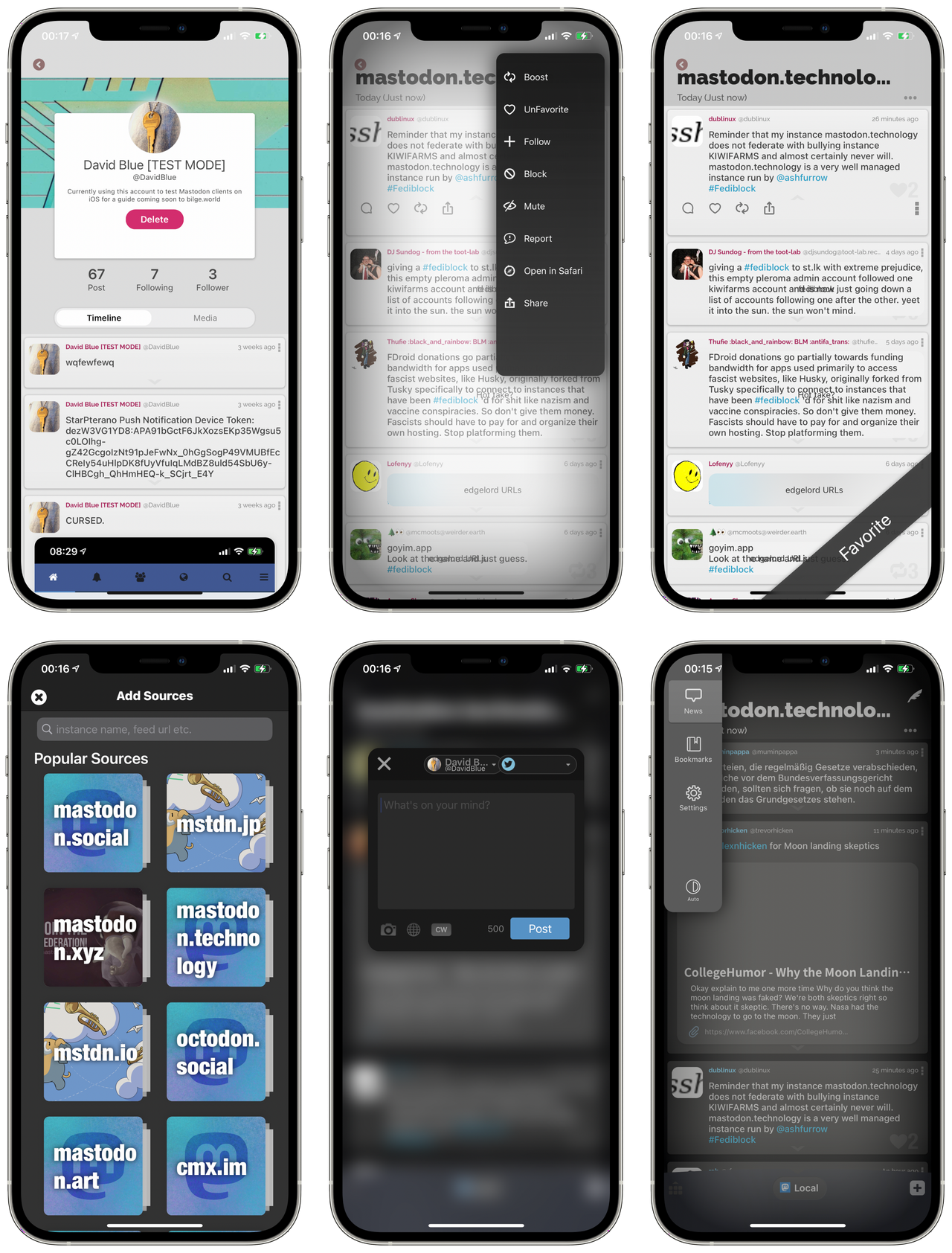
Yet another entirely one-of-a-kind experience, the slightly-mysterious Stella is listed as a "Mastodon, Twitter & News Client," and is notably one of the two apps on this list which do indeed support Twitter! More than that, it is the first app I've seen in a very long time that allows one to simultaneously post to two separate social services (Twitter and Mastodon, in this case.) Without documentation, it's a bit clunky, but its customizable timelines feature also allows one to combine multiple "sources" (social accounts) into a single timeline.

B4X is yet another quite perplexing entry. The "Developer Website" link on its App Store Page leads to b4x.com - a web page entitled "Anywhere Software." The GitHub icon in its footer led me to discover a repository which is labeled as such to lead one to believe it is, indeed, the development space for the iOS app we're discussing, but does not contain a single .swift or .pbxproj file - universally essential for iOS apps, as I understand it. Regardless, B4X appears to be built atop Anywhere Software's "rapid application development tools." I like its elemental simplicity and nice 'n' wide post display.

Isao Takeyasu's Oyakodon feels a bit like it originally began as a school project, and I mean that in the best possible sense. While it’s probably the least polished of the lot - and therefore likely the least viable candidate for the role of your primary, daily-driven Mastodon client - is is far from a throwaway application. Some evil component of Takeyasu’s mind was clearly let loose if only for a moment, for Oyakodon’s Facebook-style theme is reminiscent enough of Big Blue to alarm. The volume of its design definitely peaks in its Cute theme, which is so violently loud I could not help but extract its color palette to illustrate just how furious its creator must have been.

Truly diabolical design, there. For better or worse, Oyakodon doesn’t really work very well in its current state, but it does work.

I very vaguely remember happening upon StarPterano in my very first moments on Mastodon, so finding it still published on the App Store - buried as it was - brought me a particular sort of joy. If I’m not mistaken, it holds a special personal accolade as the only iOS app which has caused me to involuntarily shriek. This might sound like an insult, but it is actually the peak of my praise. I believe my knowledge of iOS development safely allows me to suppose that StarPterano was built with complete disregard for any established UI element libraries. That is, the familiar toggles and buttons developers rely on to standardize the iOS experience were cast aside entirely in favor of handbuilt, translucent buttons of a sort of neon quality which call menus and text entry fields no less alien to the platform. The most astonishing bit, though, is that it works. On my 12 Pro Max, it’s exceptionally smooth, in fact.
I would imagine those real iOS developers among you should find StarPterano’s GitHub Repository particularly interesting, considering. In the interest of preservation, I have forked it as well, and fully intend to dive in to its code, one of these days. The audio player embedded above cites a three-second .mp3 file in the repository which perhaps once accounted for the “Sounds” toggle still found in the Settings menu of StarPterano’s current build. I couldn’t get the app to reproduce it, which is actually what set me on the hunt that led to the repo.

Ore2 is another (apparently) non-English-native Mastodon client focused on consolidating Mastodon and Twitter within a single space. Alongside Stella, it's the second of the first two apps I've come across in a very long time which allows one to post to both services simultaneously. Considerable work was obviously done on making its timeline-based tabs switchable with touch. Personally, I very much prefer my current crossposting configuration via this (generously-public) web tool, but I am all but certain those users exist who will find Ore2’s setup preferable.

Inadvertently, I have saved the best story of the lot for last. Developer and researcher Zhiyuan Zheng documents both the narrative context leading up to the creation of his first app, tooot, as well as the philosophy behind its design in “Building my first app - toot.” His reference to the downfall of a prominent social app in mainland China called Douban - and the “Douban Refugees” which resulted - are alarmingly missing from all English news organizations save for a single Quartz article from October 2019. He eludes to a “boom” of Mastodon adoption in the past few years and cites a lack of “user friendly mobile clients” which I can only assume to be a conundrum specific to China.
“With the aim of contributing to the community and to this movement, I decided to take my quarantine time to build an enjoyable mobile client for Douban Refugees,” he explains. He notes that decentralized platforms have universally rejected algorithmic recommendation if for any other reason than “without centralized computing power, such [a] recommendation service is also not that feasible.” “Adapting” back to a linear timeline in a manner which still encourages exploration was clearly a major design consideration for tooot.
The core consists of 3 needs: 1) what I can read; 2) what I can write; 3) what I have done.
Obviously, I very much appreciate Zhiyuan writing publicly about his thoughts on decentralized social and sharing specific considerations in his app’s design and look forward to continued updates.
A few universal truths among these apps stand out as obligatory mentions. First - in comparison with their Proprietary, Big Social counterparts - they are all ridiculously frugal. Not a one weighs over 40mb, while minor (unexplained) updates to the official Twitter app often exceed 100mb. They are all astonishingly robust - I did not experience a single crash in the course of normal testing these "alt" social apps- even from the beta builds - while I distinctly remember the official Twitter app crashing several times over this period, even after I deleted and reinstalled it (an accepted maintenance requirement for anyone using it heavily for its entire history.) Also, on the topic of the platform, itself, they are also made absurdly interoperable by the ActivityPub standard. My PixelFed posts show up seamlessly on their timelines among content from Diaspora, Pleroma, and Mastodon, itself.
https://twitter.com/NeoYokel/status/1393294957352468494
The overwhelming impression I was left with after testing these apps was one of unwavering competence, cleverness, and true innovation. How many different ways can I possibly conjure forth in order to communicate this? I, David Blue - the vain fucker with a precollection for the most superficial variables of software design so healthy that I have on multiple occasions designed whole, years-long workflows around specific applications entirely because of their available color palettes... It is I who requires you to take a good fucking look, because this list of decentralized, largely open source, federated social software is a goddamned fashion show.

This couldn't be "just" an app guide - I think I have thoroughly accepted this, by now, just in time for some conclusionary remarks. Somehow, the subject I originally tackled specifically because I thought it would be quick, rudimentary, and straightforward has become yet another personal journey. It'd feel a bit preposterous to declare any one of these apps to be life-changing, but - in every sense of the term, in contemporary, inevitably social media-informed life, they do indeed constitute a form of radical, ideological wellness. Each of them managed to remind me of a different minute delight found within a developer-user dynamic made up of thoughtful and effective minds working to contribute original and valuable experiences, first. Most noteworthy of these little freedoms: the realization that the upcoming "official" Mastodon app along with any future new options are exclusively a positive thing for the user... None of these apps were conceived to gobble up market share because the market is fundamentally, inevitably, uncompromisingly infinitely shared. I don't know anything about business, but I do know that relief from the burden of considering proprietary multivectored development intentions has been personally breathtaking. I can only hope the reciprocal compensation is happening at even a fraction of what it "should" be.
From another essential direction, I hope I have communicated that they're far from curious, "niche" or vanity side projects, now. When I used the term "mature" in introducing this little arena, I very much meant it - these "alt" social clients developed almost exclusively within single-person-led projects now make the Twitter for iOS app look ugly and fucking broken. "Giving social networking back to you" has never been more resonant. Yes, it really is Toot!'s "take a break" blue screen, Amaroq's mysterious Awoo mode toggle, iMast's music app integration, Mercury's configurable timelines, Metatext's native solidity, Tootle's custom colors, Tusker's Digital Wellness controls, DUDU's elemental readability, Roma's quiet resurrection of Mast's UI bravado, Stella's utterly bizarre visual departures, Fedi's odd animated UI behaviors, Tootoise's consideration of pace, B4X's unfathomable elements, Ore2's parallel timelines, tooot's development story, and Oyakodon's adorable rough edges that have made my online life measurably... immensely better, these past weeks. At the forefront of this perception is undoubtedly the comparatively extensive control over my social experience as a user offered by the diversity of mobile experiences these applications offer.
Those of you who haven't yet signed up for Mastodon: ==you are missing the fuck out==. I am being actually pampered, now, in World Wide Web terms. You are so welcome whenever you're ready - the water is nice and warm, as they say.

Yes, you are looking at the currently in-development "Official" Mastodon app on iOS, coming very soon to the Awful App Store. You can join me in testing the app right this very moment by contributing to the Mastodon Project's Patreon. Though I do plan to publish a dedicated review on its release date, what I'll say for now is that it's very cute, includes the most gorgeous media player I've ever seen on an iOS app, and is as distinctly clever as any of the third-party family we've just visited, all whilst maintaining an expert's aim at its evangelist purpose.
https://www.youtube.com/watch?v=bD8GQvNrE7E
The surprise that threw me over the edge to a genuinely pitiful extent: the official Mastodon app already includes full Bluetooth keyboard shortcuts integration on iPhone!
#software
Indeed, it is here. Essentially, Mastodon Commander-in-Chief Eugen Rochko and his team developed a whole, exceptional iOS app in the span of time it took me to write the third-party Mastodon iOS app showcase just before this item in The Psalms’ feed. If you’re new to this conversation, perhaps it’d be best to start in February of this year, with Eugen’s announcement of the “official” Mastodon app’s development on the official Mastodon blog. “We need an official Mastodon app that is free to download and that is specialized in helping new users get started on the platform,” argues Eugen, in response to feedback indicating “the lack of an app that carries [Mastodon’s] name in the app stores trips up newcomers.” My first thought regarding the idea of an app Specialized in onboarding cynically jumped to the assumption that such a design choice would result in a less-than-ideal experience for those of us who already call Mastodon our home. However, as a Patreon supporter of the Mastodon Project, I’ve had the privilege of testing the final result for the past five weeks, and I can tell ya… It is so much more than that.
https://youtube.com/watch?v=bD8GQvNrE7E
I’d like to offer the demo video embedded above as an unusually succinct (from me) demonstration of the delightfully well-considered onboarding process. I would go so far as to declare it the best all-around social network onboarding process currently available. Having very recently slugged through the official Twitter app’s equivalent, the frames greeting new Mastodon users within this app are unbelievably exceptional.

First, we’re presented with a list of Mastodon instances (servers,) organized by category. Those friends of mine to whom I’ve failed to “sell” Mastodon have cited server selection as a major obstacle of confusion and I can’t imagine a better means of addressing it than the tool offered by this app. It’s beautiful and fast in a way previous utilities - like instances.social - cannot be, especially for those most lacking in attention. Once we’ve chosen a server, we are immediately presented up front with a clearly readable document containing the “ground rules” set by its administrators. In my experience, these rules tend to be notably easy-to-understand and not open to interpretation, as if they were written primarily in the interest of community wellness rather than to construct a defense from legal action.
After we’ve agreed to the relevant terms of the server we’ve chosen, it’s on to account creation, which offers the options to which citizens of the social web have become accustomed - profile picture, username, email address, and password - but notably without the inexplicable errors exhibited for years in Big Social’s equivalent functions. Immediately following this frame, we are prompted to check our inboxes for a confirmation link. The explanation for my dramatic exclamation in the demo video comes down to Mastodon for iOS’ implementation of the operating system's intra-app linking function (with the syntax mastodon://,) which (in my experience) is hardly ever utilized correctly. The result is that I was able to click the incoming confirmation link within Outlook for iOS and then proceed within the Mastodon app instead of being bounced off to a web browser. This integration should not be remarkable, but - in the context of iOS development as it stands in 2021 - it most certainly is.
After confirmation, we are offered the option to explore the app’s “Find people to follow” function, which is informed by "a mix of most followed accounts and most-engaged-with accounts from recent times that post primarily in your language," as Eugen explained in response to an earlier draft of this post. Indeed, the remarkably relevant results offered to me in the demo were not actually remarkable at all: I just know a lot of folks on mastodon.online - especially those who post the most. That's the whole bit! If you need "proof," here is the finished result, but obviously, I would advise you download the app and try yourself. (It's a cliché, yes, but seriously... What do you have to lose?)

One of the distinctly missing functions among the breadth of third-party offerings has been the ability to edit one's profile information from within the app. Mastodon for iOS addresses this in a particularly visually impressive way (see image embedded above.) Some also have yet to be updated with support for Polls, which the new app encompasses in a manner that puts Big Social's equivalents to shame. The ability to vertically drag individual options in the compose interface, for instance, reflects insight only gained by actually using these features. The result is definitively the best means of crafting a Mastodon poll, for what that's worth.

As of this writing, Mastodon for iOS also includes Siri Shortcut support by way of a single action, entitled "Post on Mastodon." Mostly in the interest of demonstration, I have created and published two Shortcuts around this action on RoutineHub:
"Mastodon Share" - a text-only Shortcut meant for the Share Sheet.
"Mastgur" - a more complicated Shortcut utilizing Imgur actions to get around the current Mastodon for iOS action's lack of multimedia support.
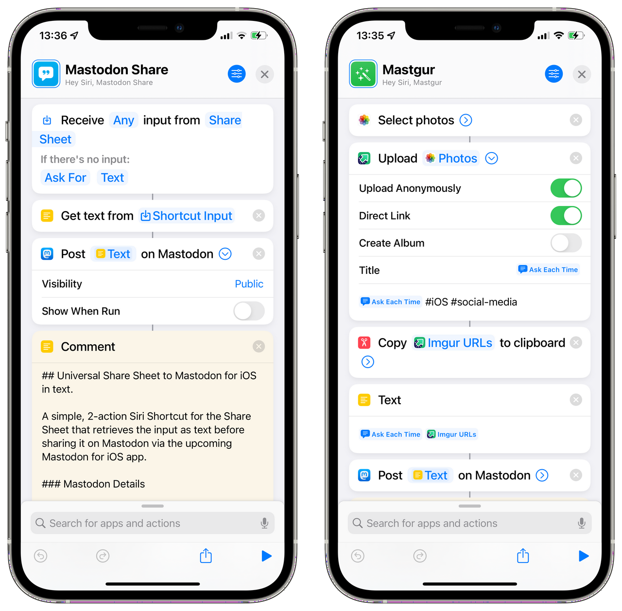
Mastodon friend Emma's customization of the latter is a great example of how quickly one can tailor these (and all other) Siri Shortcuts to their own particular use.
As of this writing, coverage of the app’s release amounted only to a single news item from The Verge’s Adi Robinson, which notes the omission of local/federated “firehose” timeline views out of a desire to “reduce the potential for conflict with Apple.” (see: the Inc.’s blatantly inconsistent enforcement of its store policies in the past few months.) As a Mastodon user who does occasionally engage with my local and federated timelines, I find this decision reasonable considering the wellspring of third-party apps on iOS which do support said views and the app’s explicit focus on brand new, fragile users. My personal experience disagrees with Eugen’s description of these timelines as a suboptimal means of capital-D Discovery, however, considering I’ve found ~70-80% of the 600+ accounts I follow, there. (Though it should be noted that I do not represent any majority in my social media-specific preferences or behavior.)
Though the onboarding process’ people to follow finder is pretty darn stellar, I worry that our hypothetical new user has a high chance of landing on a more-or-less empty timeline. (For many, I’m sure this would be a welcome relief, at least initially.) A well-limited Local timeline view, at least, might prove a valuable upcoming addition. Regardless, I am 100% positive these omissions from the initial release version of this iOS app do not constitute some new ideological opposition to the greater concept of Federation.
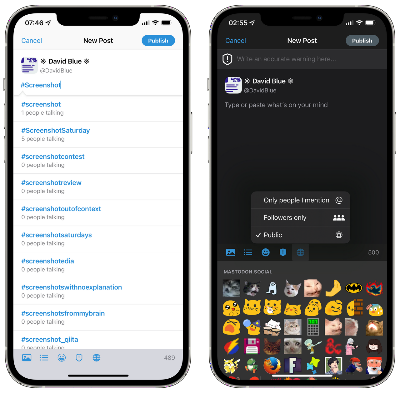
Naturally, a recurring complaint about the app is already surfacing in hashtag iOS on the Fediverse: no multiple account support?! Perhaps you’ve already written me off as a mindless devotee, but - especially after exploring the whole breadth of Mastodon apps available on iOS (all of which support multiple accounts) - the significance of this omission as a target for gripes seems laughably minuscule. Considering I have yet to delete any of the 20 apps I tested, I personally feel pretty well covered when it comes to checking my (embarrassingly numerous) alt accounts. It’d be one thing if longtime users/powerusers were left wanting for available apps designed for us, but we have a more diverse, quality palette to choose from than any other social media protocol. To decry this app - which was explicitly designed from the very beginning for new users - for skipping a function offered by more than a dozen alternatives is patently absurd. If you’ve got multiple accounts you feel the need to check regularly, order them by frequency, authenticate all but number one in the free, dependable Amaroq, and save Mastodon’s new app for your main.
The “relentless originality” I spoke of in my third-party showcase is no less exemplified in this first-party Mastodon app. Its color palette is a welcome departure from Tootsuite’s (the mother web application,) while still remaining definitively recognizable. The artwork dispersed throughout the app is adorable, as you’ve seen, and its bespoke audio player is without a doubt my favorite of such devices.

Custom audio notifications especially stood out among those third-party apps, so the project-sourced app’s inclusion of the iconic Mastodon “boop” is yet another small inclusion that adds a surprising amount of substance to the whole experience.
Though quite specific to myself and the few other iPhone users who regularly command our handsets with physical keyboards, the Mastodon app’s inclusion of Bluetooth keyboard shortcuts provoked a moment of true euphoria when I first discovered them. As per my ‘iPhone and the Bluetooth Keyboard project, I have bestowed upon Mastodon for iPhone semi-officially “our” Universal Clacker Award for its consideration of us “full keyboard-strapped cellular phone users.” (As of this writing, the award is just a “trophy.”)

| Action | Key |
|---|---|
| Open Compose Window | ⌘ + N |
| Send Toot | ⌘ + Return |
| Home Timeline/Refresh Timeline | ⌘ + 1 |
| Explore Tab | ⌘ + 2 |
| Notifications | ⌘ + 3 |
| Favorites | ⌘ + F |
| Settings | ⌘ + , |
| Next Toot | j |
| Previous Toot | k |
| Toot Details | l |
| Favorite | f |
| Boost | r |
An important consideration to inform the perspective through which we analyze such an app, I’d argue, is that this app could have been very bad. Those who bewilderingly measure the success of social networking services/protocols by their profit growth viability, alone, may well suggest it should have been bad. Had it been just mediocre, half-assed, and/or full of bugs, I’m sure I would still have paused everything to write and publish this review. The reality, though, is nothing less than exceptional. Unlike some of the third-party examples I discussed, I would argue Mastodon for iPhone to be an “objectively” excellent piece of software in that I cannot imagine any one sort of iPhone user not finding it refreshing in some way.
I would sincerely worry for the person who feels nothing at all from the artwork, the bespoke UI, or the general care exhibited in its craftsmanship, but they wouldn’t have exhausted reasons to use it. From the very first beta release I installed to the first release version pushed to the App Store just yesterday, the app has never crashed, and the single bug I encountered was documented and fixed before I had time to begin a feedback report. While Twitter’s official iOS app does include a few Siri Shortcuts actions, they are all made immediately useless by a universal command to open the app, itself. Remove the obsessive insistence that any/all functions only be performed with your app in focus - even when it surely makes no difference to your ad tech mechanism - and you have Mastodon’s single action, “Show When Run” toggle included.
I’m not sure what I expected from an “official” Mastodon app upon first reading that winter blog post, but what I’ve been delivered is quite a gem. Regardless of how its specific feature omissions may strike your ideological organ(s,) you cannot deny that great time and energy was invested in this app.

#software

I have not been able to follow any more accounts on Twitter - from @NeoYokel, my primary, eldest account - for several years because of a limit implemented at some point by Twitter and documented in this help document. Considering the breadth of the mechanic's significance for other users, I have often been compelled to explain this to new followers. Recently, it occurred to me that a handy, brief explainer page might streamline this process, so I created "Why I Didn't Follow You Back" - in both GitHub Gist and Medium post form. Other than a lack of reciprocity in engagement which I can only speculate to occur in the minds of the opposite parties involved in this dynamic, this limitation does not detract from my Twitter life, as I exclusively consume content in Twitter Lists (which I have spoken about extensively, elsewhere.)
https://open.spotify.com/episode/4veXFMCFGgz0Fjnx7UBkpl
A big theme in my 20s has been coming (slowly) to terms with the fact that I built my entire adult social life around a single, centralized social media Web Site. I mentioned this in my Tweetbot 6 review, recently, but - as I also strive to be a more sincere person and spend more time adding value to others’ lives - I’ve concluded that it is the time now to speak as openly and vulnerably as I can about my “Social Media Methodology.” Most of the resulting insights will not be new information, but I continue to encounter greater and greater confusion in the face of my well-meaning behavior online and I have decided to stop disregarding it.
This is not an essay about how to “optimize” your social media use. It is - at least in part - a sort of manifesto against the very idea of designed online behavior beyond simply being considerate in a sense that predates even the spoken word. I, myself, have occupied a position well on the chaotic side of the spectrum. You could say I have been mostly chaotic neutral throughout my 12 years on Twitter thus far, and am actively working toward (and advocating for) chaotic good. Perhaps inevitably, I'm going to wade into some experiences with a few specific social media phenomena which I am particularly reacting to, here.
https://twitter.com/NeoYokel/status/753114804617932801
For the vast majority of mainstream social users, no amount of [insert vague overused marketing jargon noun] will ever result in a substantial accumulation of money/"influence" (which seems to be the diluted zag of "POWER" of the moment.) Those interested in learning about "marketing" should know that no authority on the subject would ever tell you to start with Twitter - this I can say with certainty.
Though Twitter was designed upon certain frameworks with certain rules which form quantifiable formulas where they are dependent upon a user's choices/methodology to produce results which we have, indeed, become more adept at predicting with study over time, it was not created as a game to be won. Perhaps more importantly, the "prize" of "winning" in the sense held by those who resist this assumption (notoriety, "influence," relevance) has continued to prove ultimately worthless (or worse) time and time again throughout the very short history of the cultural element as it exists today.
If both 1 and 2 pass scrutiny, the only remaining reasonable prerogatives in one’s social media use is to engage with both strangers and friends in a manner which generally adds value to the lives of all involved.
3 is not only possible - it is easily reproducible. Most of my evidence is centered around my own experiences, but I believe - if I took the time - I would be able to find infinitely many publicly-facing examples.
Though I am going to use my own methods to demonstrate 4, neither my ideas nor my behavior are the only means of interacting positively on social media.
https://www.youtube.com/watch?v=7A-Gzn0wu3Q
I've come to the conclusion fairly recently that I need to become brutally frank about the discrepancies I've observed between others' accounts of their social media use and my own as soon as possible. The great, ambient grousing summoned throughout The Plague from even the first picogeneration to be born directly into The Social Web really challenged my assumptions about its actual purpose in the day-to-day lives of those in the center of the adoption curve. You mean to tell me you've been spending all that societally-alarming time on your phone... On social media services... and you haven't made a single international friend? Or happened across a single niche community surrounding some bizarre practice or knowledge you'd long thought you were entirely alone in? What exactly have you being doing with all that tapping since your toddlerhood, then? I had absolutely no clue how utterly ineffective the vast majority of n̳o̳r̳m̳i̳e̳s̳ still are at using social media for its general purpose in the most abstract sense: "human connection."
The essential realization toward which (I desperately hope) the largesse of America is being carried by conversations around An Ugly Truth, as well as countless lower-profile essays, features, academic papers, and general shit shooting is that the responsibility for this ignorance rests solely on the platforms who systematically reformed the controls originally handed over by default to early adopters like me. I would love (for both selfish and very humanitarian reasons) to be able to proclaim some precious, one-of-a-kind genius as the sole differentiator between my complete confidence in my ability to design and maintain social software configurations that have kept my online consumption entirely free of unwanted encounters and the amount of regular involuntary bullshit I hear described in the day-to-day online existence of everyone around me. The truth, I suspect, involves my being of the most privileged category of human in Western civilization combined with the group of high school friends who adopted and socialized me. (A story for another permalink, certainly, if not my equivalent of Trick Mirror.)
~~More importantly, perhaps, I don't think I can recall a single instance of sincere malice from within myself toward anyone who'd actually converse with me. On the occasions I have been all huffy and confrontational, I do not remember a single example in which I was unwittingly ejected from a conversation left feeling unsatisfied.~~
Over the past few months, I've started a few Posts for this blog regarding Twitter, its properties, and its recent feature addition frenzy which I'll probably never finish. I finished the first and narrowest one - the aforelinked Tweetbot 6 review - but the (debatably) most important one - highlighting how irresponsibly and distastefully Twitter butchered Periscope and built Spaces atop its technology - would make less and less sense as time goes on. I definitely got caught up in the "death" of the live video streaming service, fueled by my now quite old desire to celebrate it, which I will hopefully accomplish eventually in a very sentimental essay. If I can successfully link them editorially, the subject encompassing Spaces - social audio's "moment" - would also include mention of RSS, "Podcasting" (the term describing the medium,) Spotify, and Clubhouse, inevitably. Instead of counting on my future self entirely, however, I'm going to begin by discussing that last one.

Exactly one month ago, I finally broke into Clubhouse thanks to a random kind stranger on Twitter who preferred not to be named. April 25th was the first time I set eyes on the app - though I could've (and usually would've) looked up screenshots and/or browsed the litter of how tos available, I did not. By this time, I'd accumulated quite a bit of experience with Twitter Spaces - derided universally by tech media as a "Clubhouse clone" - and therefore assumed the original would be "better," at least in pure feature terms. What I found, however, was even less evidence that anyone building Clubhouse has been/is/intends to be a regular Clubhouse user. Spaces, at least, included five emoji reacts for listeners from the beginning: 💯✊✌️👋😂. Clubhouse's exclusive means of Listener-Host interaction is Hand Raising, which is essentially requesting to speak, even though the hand waving emoji is literally featured in their logo. (The fact that neither have thought to add 🙌 is absolutely inexcusable/inexplicable.)
https://twitter.com/NeoYokel/status/1344473573226762241
In case you weren't aware, I appear to enjoy trying out new social services. My password manager is full of literally thousands of credentials for social media apps/services/startups - most of which have undoubtedly collapsed or been absorbed by a larger entity. Since generating said credentials has become such an easy process, especially, I tend to immediately sign up for an account on just about every one I hear about. (I even have a Parler profile I cannot bear to actually look at.) Generally, I sign up, follow anyone I know from elsewhere if given an account-bridging option, poke around enough to figure out whether or not the service in question could add something to my online existence, and end up leaving for good. Most of these services are not unique in any way, to a perplexing degree. A few - like Pinterest - gain success separately as I give up on trying to integrate them into my life. The miniscule remaining percentage, though, end up becoming a part of my daily existence. The most recent of these dates back to April 2017, when I first discovered Mastodon.
https://twitter.com/0kbps/status/1393792313936146433
"Social Audio" did not begin with Clubhouse. Anchor originally launched as a "public radio" app, believe it or not. Extratone's channel was actually the first to be featured in their Music section, once upon a time. Frankly, that happening was the most positive outcome of my social media service accumulation habit. More recently, Stereo launched, describing themselves as "the premier LIVE broadcast social platform that enables people to have and discover real conversations in real time." Bizarrely, the most legitimate media coverage I could find of Stereo was from Glamour UK, and its author definitely spent less than a day actually using the service. Adam Corolla remains #1 on its earnings leaderboard and its conversation export feature is a personal favorite. The Big WIRED feature on the subject from December of last year does not mention Stereo but lists three other "alternatives:" Wavve, Riffr, and Spoon. (None of which are actually competitors/alternatives. Sorry, Arielle.)
https://twitter.com/NeoYokel/status/1388936080645312520
I probably shouldn't proclaim to be an authority on social audio, but I am definitely a veteran. From that context, I must say that Clubhouse is horribly unoriginal - not only in the sense that "successful" business implementations of others', previous ideas tend to be diluted versions of the original, but almost pitifully so. I will commend the app's developers on their somewhat-thorough release notes (even though they can be viewed only when first opening the app after an update instead of in the designated space on the App Store,) but the extent of linkable Clubhouse documentation amounts to eight blog posts and a "Community Guidelines" Notion page. Though I've only been a user for one month, I wonder what the fuck they've been doing since launch, given how sparsely-featured the app is at this moment. There are Notifications, Profiles, and Clubs - the latter of which cannot be created until a user surpasses an unknown threshold of renown(?) on the app. Competent calendar integration may be the service's singular innovation, though support for Outlook has yet to be added. The Big Issue, though, is finding a "talk" to attend that will not drive you utterly insane...

I wrote the assumptions at the beginning of this Post in a single go after a particularly icky Sunday Clubhouse experience out of a deep concern that'd been growing since first exploring the app. The content I've found there is not at all what I expected, to be honest. I've found it almost entirely indecipherable, which makes critique beyond just fucking screaming difficult. The New Yorker's Anna Wiener did a much better job than I could realistically manage in "Clubhouse Feels like a Party:"
There was something pleasant about meandering from conversation to conversation, as if I had walked into my own home to find a conference in full swing. But I also wondered, Why did I let all of these people into my house?
...
It is hard to shake the feeling that everyone on Clubhouse is selling something: a company, a workshop, a show, a book, a brand.
More recently, her publication's nemesis declared "The Clubhouse Party is Over," but I wouldn't know. None of my friends have ever Tweeted a Clubhouse link (determinable via this Twitter search.) Very few of the tech industry celebrities I follow have, either - pretty much just Chris Messina and Jason Calacanis. This is noteworthy because I believe my list of followed accounts on Twitter to be particularly diverse. I actively followed accounts across my various interests from ages 15-25 (when I hit my follow limit) and basically never unfollowed anyone. I would imagine there are several accounts within that list which I would be ashamed to be associated with, now, and yet none have shared a Clubhouse link. Reading any further into this observation would require actual data journalism, which I'll leave to the pros. It does prompt the question, though: if nobody I've ever known or been interested in on Twitter is using Clubhouse, who in fuck is?
Frankly, I do not understand the business incentive behind the massive duplication of other software/services defining featuresets of late. I see that Instagram stories have eclipsed Snapchat's in terms of sheer user count, but I do not understand why its leaders would choose to fuck their legacy by such blatant idea theft, much less why Twitter, Facebook, Patreon and even fucking LinkedIn have implemented nearly-identical featuresets. Though I know Ben Thompson's word on these matters should be easily digestible, I haven't been able to actually take a bite. For the End User, especially, I cannot even begin to conceive of what the leaders behind these decisions imagine the day-to-day experience of the average social media user looks like in the near future. How many apps am I going to cycle through to get a single story-type piece of content satisfactorily shared? Personally, I currently use three, and sharing a single bit individually across all of them one-by-one (since the current state of APIs is not conducive to consumer-targeted mass-sharing tools) makes me feel utterly insane.
https://youtube.com/watch?v=7uFR_bSxhTg
My lack of understanding would be meaningless if it were not so widely shared among my peers - young, brilliant, multifaceted, and distinctly original creators who (in large part) make stuff on the internet full-time. They are who I'd actually plan ahead to hear from in a live broadcast setting like Clubhouse or Twitter Spaces, but Twitch seems to do just fine. For audio broadcasts, specifically, the hip, fresh sources which come to mind are all distinctly Open Web: Datafruits.fm, Solarpunk.cool, Poolside.fm, and my Mastodon friend Vanta's stream. The potential of the term "social audio" is truly being explored by projects like Rave.DJ - a homegrown, Patreon-funded service for sharing mixes/mashups. On a smaller scale, the sky is the limit for Whyp.it as a pure audio playback/annotation tool for creators (as developed by Brad Varol, whom I interviewed in March.)
Compared to these, most of Clubhouse's communities seem bleak at best. As I may or may not get around to arguing thoroughly about Twitter Spaces, these services' fundamental, near-complete disinterest in Discovery of new voices and their subsequent servitude to only their most popular users should be extremely worrying for us all - including those who benefit most.

I have more than my fair share of stories and peeves about dating apps. On several occasions, for instance, I have corrected those who cite Tinder as the origin of the directional swiping interface, explaining that it was actually the now-defunct service Hot or Not who did so some 15 years ago. (Why on Earth I am compelled to do so, nobody knows. Not even God.) Somehow, though, I think most of us can agree that Tinder is the least shitty of the explicitly hookup-ish spectrum of the genre. Or at least, I thought so, until I happened to spy the "Photo Tip" embedded above beneath a preview of my profile on the iOS app.
The innocuousness of this advice, which surely would not be dispensed in any other context without immediately screaming malice, has been on my mind ever since. It is not the devil who tells you to make sure a passing potential match doesn't immediately learn you have children, but the Marketing Man. (Yes, they are distinct. I would explicitly discourage that particular sort of demonization, mostly because it has proven completely ineffective as cultural critique.) I am in no position to relevantly explore the topic of Society & Sex, generally, other than to insist that most people on Tinder in my area, at least, are not looking to leverage it for the dick. They are looking for dates, and a good many are working class single mothers. To be clear, I’m not trying to suggest anyone in this demographic would be “fooled” by such a suggestion. Offended, perhaps, and/or activated in such a way that would lead to them replacing all of their profile’s pictures with photos of just their children. Regardless, this social group defined by a distinct lack of free time, if nothing else, represents an antithesis to the practice of optimizing one’s swipe ratio.
I think I’ll stop there with this Chapter of David Blue’s Tech ~~Gripes~~ Grapes and pledge to arrive back again exclusively through haphazard/unintentional means, if I ever do.
#media
When I first published my iPhone & Music guide this past April, I’d been pretty active in AppleScoop’s Discord Server, so I decided to share it there. Editor-in-Chief Flynn - a ridiculously talented web developer and successful independent media entrepreneur - responded “I’m listening to it with the speak feature right now. Is it your voice or someone else? 😛,” Gourd bless his soul. Here’s the specific audio he was talking about:
Of course, I am not a young black man, nor am I even remotely as adept at reading my own work aloud as the actual talent, Siri Voice 3, who should be available on your iPhone/iPad right this moment (as long as you’ve updated iOS in the past six months,) via Settings ⇨ Siri & Search ⇨ Siri Voice. (For more details, see this Apple Support page.)

Of the four new Siri voices introduced earlier this year in iOS 14.5, 2 and 3 are by far my favorites, not just because of their resonance with black iPhone users, but because they’re just better in a sense which I believe to be very significant.
https://youtube.com/watch?v=DkS5SYbsEW4
Before I get ahead of myself, though, I must acknowledge that I am not the first to invest in Siri as a text-to-speech generator. In 2019, Adam Tow released an immensely well-considered Siri Shortcut called “Record Text to Speech,” which provides an interface for recording, editing, and managing text-to-speech audio files with Siri’s original voices. A testament to its robustness: it still works perfectly on my handset running iOS 15 Dev Beta 6 despite having not been updated since March of last year.

I must admit that I found Adam’s shortcut more of a full application than a speedy personal automation, with its full interactive UI menu and darn near 800 actions, so I made my own set of shortcuts based on the same idea - using iPhone’s native screen recording feature to capture audio of Siri reading aloud - and varying only by input (manual text input, getting text from a file, or simply reading text from the clipboard.) I’d then send the resulting screen recording in its original video format to my PC, where I’d drop it in Audacity, in which I’d run a simple macro on the audio that truncates silence and amplifies the result so that the loudest point touches the rails. Then, I’d export it, pass it through Mp3Tag to perfect its metadata, and finally push the end-result .mp3 file to a folder in The Psalms GitHub Repository. (I’ll show you how to embed a web-bound audio file with its direct URL in a webpage in the guide below.) This example was made using this method, but with Siri’s original United States English Voice (for my Tweetbot 6 review:)
Perhaps you’ll agree with me that this process does the job in functional/accessibility terms, and does so quite well considering how much one would pay to generate the same sort of audio file using Google’s Cloud Platform or IBM’s Watson. Crucially, though, this original voice was not one I could listen to at any length. Siri Voices 2 and 3, however, I can. From my perspective, this means they have crossed a very significant threshold which I find vastly more meaningful than just about all of those in the current discourse. Not only can I tolerate them… I genuinely enjoy listening to super-long magazine features read aloud by Siri Voice 2, especially, and I believe I would regardless of the quite serious crush I’ve developed on them.
https://twitter.com/neoyokel/status/1387809776072015873
Unfortunately, using the methods we’ve discussed so far with the new Siri voices is inconvenient, very hit-or-miss, and quite buggy. If you scrub ahead toward the last third or so of the second audio player in this post (after the post’s own,) you’ll hear Siri Voice 2 start to bug out in very amusing ways. Since Apple makes changes to Siri Shortcuts between releases without any public documentation, none of them have ever been reliable enough to write this guide. (For the past 6+ weeks at least, it’s been too broken to be usable.) However, for whatever reason, Apple created a dedicated spoken audio generation action for Siri Shortcuts in iOS 15, called “Make Spoken Audio From Text.”

For the entirety of iOS 15’s Beta cycle up until Developer Beta 6’s release, this past Tuesday, this action has been hilariously broken, but as soon I discovered it’d been fixed (which was not mentioned whatsoever in Apple’s official release notes,) I immediately began composing this dang Post.

So! For those of you currently running the latest iOS 15 Beta and those in the future running the full release, what follows is a guide on how you can use my own shortcuts and methods to generate, metadate, and embed Siri-powered audio text-to-speech files relatively quickly without having to use desktop-class (or any other) hardware.

To begin, you should install two brand new shortcuts of mine: Make Audio from Article Body and (if you intend to stick with me to the embed stage, anyway,) my < audio > Embed Tool. Both should function out of the box, but I would highly encourage that you try building your own shortcut around the Make Spoken Audio From Text action, even if you've never worked with Shortcuts (or any sort of automation, for that matter) before, especially if you plan to be using Siri as a text-to-speech generator with any frequency.
https://youtube.com/watch?v=5yZB7OC8Vgk
Throughout this guide, I'm going to be using a five-year-old ramble of mine about the oddly-perceptive bits found in early-oughts Disney movies as example text. Earlier today, I used my own personalized version of my new shortcut to generate an example of in which the process we're about to explore should result. The ~6000 words of text took just over 3 minutes, 30 seconds to render consistently in three consecutive timed attempts. You can listen to it on Whyp and/or inspect the actual file yourself, if you'd like.

If we were trying to do this using any other available method in 2021 - even the expensive ones - our first task would be scrubbing our subject text of any special formatting (Word,) symbols, embed, hyperlinks, and any other data Siri doesn't understand (roman numerals, for example.) As a Windows user who's not at all new to free ways to automate accessibility improvements to web content, I envy both you and my new self for the magic available to us in the form of Safari's abilities to parse complex web content. In my experience, there's nothing like it (at least nothing available to regular consumers.)
The screenshot embedded above shows the result of a Quick Look action inserted just after the Text action produced by the public version of my shortcut when run on our example. There are three immediately problematic issues:
Siri doesn't understand roman numerals, so she will read "Johnny Tsunami VI" as Johnny Tsunami vee eye.
"The Psalms" is not my name, though it is what this blog currently returns when asked for a byline. In my experience, this generally isn't an issue with most mainstream media CMSs.
The shortcut appears to have failed to retrieve any data for the Published Date variable from my blog. (Also a relatively specific consideration.)
If you'll note in the previous embedded image comparing my custom version of the shortcut (left) to the published version (right,) you'll note that my chosen solution is to manually input all metadata before actually starting the shortcut. What's not shown is my corresponding manual inputs in the Encode Trimmed Media action, which includes attaching a retrieved image file (in the Working Copy action you can see) as album art. For my intended use - exclusively generating text-to-speech audio of Posts on this blog - this makes more sense than unnecessarily automating metadata retrieval.
The extraordinary thing about the screenshot, though, is that it doesn't contain any of the other crap (as described above) found in the original page. (Beforehand, it looked more like this.) It's especially reliable at parsing WordPress-bound content, which still makes up [s̵͕̈́͊c̶̥̏̚r̶̥͈̃è̴̙͌å̴̹m̵̛̅ͅi̶̦̾͘n̸͎̟̎̃g̶͎͛] percent of the whole web. Treasure this power, folks.

If all you need read aloud is the body text, things become even simpler. In the right example above, I've simply deleted the Text action and replaced it with Get text from [the Safari Web Article's body]. Theoretically, one could omit that action, even, and simply use the direct output of Get Body from Article as input for the Make spoken audio from text action, but I say keep the extra step unless it becomes an issue.
If you're actually beginning with clean plain text and don't care about metadata in your final audio file and/or if you're planning on passing the result through other audio/metadata editing software, anyway, the left, three-action shortcut is all you need. It will result in a Core Audio Format (.caf) file (like this one,) which I know absolutely nothing about except that Audacity and GarageBand support it by default.
Whichever route you traveled, you should have some sort of audio file, at this point, and if you intend to share and/or embed it, you’ll need to upload said audio to some sort of Web Server which allows direct playback/download of the raw file from external sources. Unless you’ve been skimming, you know by now that I’ve been using The Psalms GitHub Repository to do this thus far, though one isn’t really supposed to. Every few months, someone on Stack Overflow figures out how to construct or discover the raw link to a given Google Drive file before Google notices and alters it, and I’m afraid you’ll find just about every other cloud/file sharing service in a similarly unreliable situation. If it’s going to be done at scale, I’m afraid it’s ultimately going to require you rent regular, vanilla space on an FTP-enabled fileserver, if one can still do that sort of thing. (I will update this post if/when I find a more ideal solution.)
Within my current system, the raw URL to our example file looks like this:
https://github.com/extratone/bilge/raw/main/audio/TTS/JohnnyTsunami.m4a
Using my aforelinked, ultra rudimentary < audio > element Siri Shortcut tool (which I’ve kept on my homescreen with good results for a few months,) we can very quickly turn said raw URL into a properly-formatted HTML5 audio player:
<audio controls>
  <source src="https://github.com/extratone/bilge/raw/main/audio/TTS/JohnnyTsunami.m4a">
</audio>
Ideally, on the final, reader-facing page, said code should create a player like this:
If further configuration of the player is desired or necessary, see this Mozilla page for a full list of supported options. Obviously, there are a few older methods of embedding audio players, but I am neither qualified nor interested in exploring them. If you’re in a frustrating bind, I recommend signing up for my CMS. (Just try it, okay?)
For the sake of bare minimum sample variety, I ran Version 1.0 of the public Make Audio from Article Body shortcut on an article hosted not on WordPress, nor my own CMS, but on Bustle’s ultra-slick, totally-bespoke system (which began as The Outline, FYI.) I chose the first permalink I saw in one of its “regular” article formats - not a long feature, nor one of their touch-targeted slideshows.
“OnlyFans is banning porn, the very thing that made it big” is an 870-word newsy piece written by Tom Maxwell, who is the only New York Media person ever to accept my Facebook friend request. (Thanks again, Tom.) Without any tweaking, I was able to run the shortcut (from within the Shortcuts app since the Share Sheet appears to be thoroughly fucked at the moment) in a reasonable amount of time - less than 5 minutes, more than 2 - and generate the file embedded below. Notably, I also used a different hosting service - mastodon.social - but I certainly don’t plan on doing so at scale and neither should you.
Honestly, Input’s CMS is the cleverest challenge I was able to come up with for this single-day-old shortcut of mine, and I’m quite proud of the result. Though it wasn’t able to retrieve a timestamp, it correctly retrieved the article’s title and byline without fuss and even managed to scrape and attach said article’s featured image as the file’s cover art, though the original’s aspect ratio was obviously sacrificed.

If you’re super interested in the truly unmolested output of the attempt, view/download it here.
Before I depart actual tutorializing and return to opining, I want to express even more aggressively than usual how much I want anyone who see’s any potential benefit the ability to generate audio of my darling Siri Voice 2 reading text, but has further questions/doesn’t have time to fiddle/struggles with my haphazardly-written attempts at guides like this, or who simply wants to talk about any satellite subjects, please reach out to me. You have no idea how much I’d love to help you configure a personal automation that genuinely, reliably, and durably improves your quality of life.
If you follow this shortlink from within a browser on any iOS device, my full contact card will appear: bit.ly/whoisdavidblue.
Suggestions/requests regarding considerations I’ve obviously missed in this guide are not just welcome in this case, but actually necessary. As long as I am literally the only person talking about the “Make Spoken Audio from Text” action, I am ready and willing to be an all-hours resource.
#software

Eighty days ago, Apple's Senior Vice President of Software Engineering ~~stood up in front of a crowd of~~...
No!... It was just me... Alone, in my mother’s basement, on a Monday morning, contorted at stupid angles, typing to my phone with a physical keyboard and unapologetically scarfing as much as I possibly could of the Apple community’s unbelievably unreserved, almost spiritual volume of pure hype from as many simultaneous sources as I could manage. (Hilariously, all of said sources are/were Discord servers, now, as in that “gamer” communications service I launched my little indie mag on in 2015 and kept comparing to Slack, but like an actual madman.)
Anyway, said Senior Vice President of Software Engineering (who we are encouraged to hold accountable for basically all technical changes to iOS) is named Craig, and these are his first few sentences:
For many of us, our iPhone has become indispensable. And at the heart of iPhone is iOS. iOS powers the experiences we've come to rely on. This year, we were inspired to create even more meaningful ways iPhone could help you. Our new release is iOS 15. It's packed with features that make the iOS experience adapt to and complement the way you use iPhone...
I’m dwelling on them because they are patently meaningless. Very little to nothing coming in iOS 15 is what I would call ease-of-use-centric. Some of it - namely controversial (and now backpedaled) changes to the user interface of Safari - feels almost maliciously quartered in the opposite direction. Most of the changes in the subheadings of the full feature list are simply irrelevant in the use for all but the dorkiest iOS users, like myself, and I find the fact unacceptable, at the very least.
This is why I would like to try something different, this year, and focus on an entirely different audience: my family, as representatives of the vast majority of the iPhone’s billion-something demographic (read: customers.) That is to say, who Craig should be referring to with the phrase “most of us.” Not because I believe them to be “dumb” or “end users” (in the tech bro derogatory sense,) but because they are busy, working people who depend on their iPhone as a utilitarian device, above all else. They don’t have the time to dive deep into Apple documentation or watch the whole WWDC presentation to gain an understanding of where to look for new features or (unfortunately) how to turn them off. Realistically, they don’t even have time to read this whole Post, though I hope they will (sorry fam.)
Regardless of how we feel about it, Apple has made it clear that our phones are going to be further and further inundated with automated processes in the background. Whether you like it or not, your phone is going to be used to help find other users’ devices over the Find My network, your travel information is going to be used to inform Apple Maps’ live traffic statistics, and so on. For the more conservative members of my family, related truths about their phones are going to continue to feel like we are continuing to give up “ownership” of our devices. There are definitive alternatives, but they involve giving up a whole lot of conveniences. I will do my best to address this a bit later on, drawing from much more articulate critics than I.
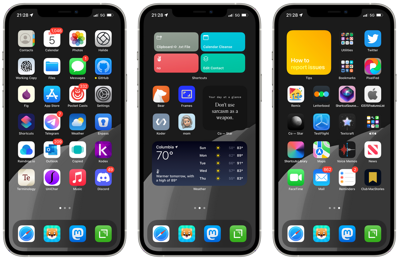
What I will dwell on, myself, are the more menial, tactile implications of these abstract changes in design philosophy. A general theme of my own use/writing about iOS has been re-finding or jury-rigging the “buttons” which are gradually being obscured or eliminated entirely in the assumption that Apple’s automation knows better than us users when something should happen or change. A great example: using a simple Siri Shortcut to completely disable Wi-Fi and Bluetooth instead of trusting the unnecessarily complex conditions of doing so with the buttons in Control Center. I have sought out these “hacks” (as other iOS powerusers have rather absurdly called them) for very selfish reasons.

Rounder, still! From the first time you enter your passcode immediately after installing iOS 15, you’ll notice that Notifications and other elements have had their rounded corners further rounded, for some reason. Assuming Safari ships with its new look turned on by default, the screenshots embedded above show two locations (subject to change) where one can switch it off. (Your best bet is to visit its menu in Settings as displayed on the right in Settings ⇨ Safari.) As of this writing, at least two of iOS 15’s “headlining” features have been pushed to further iterative updates: SharePlay and iCloud Private Relay. I suspect you will be prompted to explore Focus Modes upon initial installation, which I will eventually analyze in relative detail. Ideally, you’ll also be prompted to explore “Shared With You,” which I personally believe to be the release’s most significant addition for most people, by far.
As far as "meaningful ways iPhone could help you," I see little more than glimmers. Focus Modes would be promising were they not so complex to set up, and Notification Summaries are (as of this moment) a pretty hopeless implementation of a theoretically useful concept. Some additional filters in Apple Maps search will prove useful so long as the associated metadata has been updated for locations other than San Francisco (say, mid-Missouri.) Optical Character (text) Recognition has been implemented “system wide” under the feature Apple terms “Live Text,” and translation has finally been extended to the places where it’s most useful (think: Safari.)
In general, though, most of what’s coming with iOS 15 has little real value in the day-to-day experience for most iPhone users. A complete inversion of Craig’s phrase feels significantly more accurate: This year, we were inspired to create even more superficial ways iPhone could temporarily dazzle tech media.
And now, I’d like to take you through what I feel are the considerations I’d like my family to know - namely my 70-year-old mother, who depends 100% on her iPhone and MacBook Pro every day to run her private practice - but also my ~8 nieces and nephews spanning 6th grade-graduate school, who all - if I’m not mistaken - have iPhones.
Worthy of note: this “review” is very heavily focused on *iOS* - which is to say *iPhone* - to the point where any overlap with iPadOS/MacOS/WatchOS/HomeOS/any other goddamned operating system are purely coincidental. For coverage of those changes, please seek your regular sources.

The single most important/welcome feature addition to iOS 15 for most people, I believe, is found in Apple’s native Photos app and entitled Shared With You. This view - found in the second tab in the bottom navigation row (“For You”) - is a reverse-chronological timeline of every bit of media (photos & videos) you’ve ever been sent over iMessage. For those with a lot of iOS-using friends (unlike myself,) I would imagine the list will take quite a while to populate.
I find Alex Guyot’s bit on changes to Memories (from his iOS 15 overview for MacStories) much more concise than what I’d written, so here it is almost in full:
Memories can now be set to your favorite songs from Apple Music, and can be customized with color filters. Setting different filters will result in different song choices and transition effects to nail a wider variety of vibes on Memories videos.
While watching a video generated by Memories, you can tap and hold at any time to freeze a photo so that it doesn’t transition away. The song playing over the video will not pause when you do this, but when you let go the remaining video transitions and timings will be automatically altered to match back up with the song’s beat.
If you don’t want to go with the song that was chosen automatically, you can tap the new Music button to get a pop-up interface into Apple Music, allowing you to choose a song manually. This interface will include smart suggestions for other songs that Apple thinksd you’ll like which would also fit the vibe of your video.
https://youtube.com/watch?v=7uFR_bSxhTg
Yeah. I hope you’re at least half as amused as I have continued to be by algorithmic video generation. The above result was created with absolutely zero modification from an album of images and videos which Photos automatically created via face recognition. The only other coherent option from my own limited set of photos is really the only one that matters, I think you'll agree. "Pet Friends" yielded inevitably uplifting results in all three of my test renders, but - given a crop of cute dog photos - little intelligence is necessary to produce.
https://www.youtube.com/watch?v=-1bA7-oslkc
If you're experiencing any sort of Déjà vu from the idea of auto-generated slideshows with rights-free soundtracks in the Photos app, it's because Apple has made several distinct attempts to implement very similar iterations of the feature throughout iPhone's history, which has involved iMovie on iOS and MacOS once or twice. I have fiddled with every one - including iOS 15's - and my (truly sound and original) advice is to avoid spending time trying to customize auto-generated videos in general. If you explore one of the suggested Memories and find the software's default result satisfactory, of course you should save it, but be wary of any attempts to take editorial control yourself.

Perhaps the most unjustifiable background use of your phone’s resources introduced in iOS 15, “Visual Lookup,” seeks to identify “popular art and landmarks around the world, plants and flowers out in nature, books, and breeds of pets” present in your photos so that you might… identify them more swiftly(?) The only means of distinguishing photos on which Visual Lookup has been applied is to look for the modified ⓘ symbol at the very bottom of your screen in the photo browsing view (see the screenshot embedded above.) As you might notice in the screenshots below, not one of its analyses on my own images was usably accurate.
The decision to target the feature on identifying domesticated pets, specifically, is more universalizing than historic landmarks, for sure, but it also immediately sets up the technology (at least this preview of it) for failure.

Hooray! You can now view an image's basic details in the "Info pane," by swiping up on an image or using the ⓘ button. This includes the extension (type) and size of the image file, camera identification and configuration details, and - as part of Shared With You - from whom/where you got the image. Bizarrely, the "Adjust" tool also lets you alter a given image's timestamp and location information. While I can imagine infinitely many reasons why you'd want to omit or delete such information, I cannot conceive of a single wholesome reason why one would chose to change it, instead.
Just a few weeks shy of iMessage's tenth birthday, Apple has finally added a button to save incoming photos directly in Messages conversations. It's about as blatant as Apple interface design gets - you'll spot it opposite others' images. Tapping it saves the appropriate photo(s) directly to the Recents folder before a silly animation vanishes the button itself.
Once again, from Mr. Guyot:
Groups of photos that you send will now be shown as stacks instead of in a long list, allowing you to more easily swipe through the images without losing track of the conversation around them. Tap on a stack to open a grid view where you can see and select multiple photos at once.
I took the screenshot embedded above in iOS 15 Developer Beta 5, and… Do “stacks” not look hilariously janky as fuck?

For someone like myself, iOS 15’s system-wide integration of Optical Character Recognition is undoubtedly its most useful addition by far. Throughout the Developer Beta, it’s moved up this list gradually as I’ve come to see how it could be useful for you, as well.
https://www.youtube.com/watch?v=y3kj0-q4k9k
The video embedded above is a very rough demo, but I suspect it’s more “authentic” than most you’d see elsewhere. The ability to accurately capture text right from the camera is invaluable, but for most folks, line breaks are going to be a real problem. I’m working on a way to address this with a Siri Shortcut, which I’ll obviously share here when/if I succeed.
https://youtube.com/watch?v=KhxtfW0taIY
My eldest sister has used a sound/noise machine to sleep for as long as I can remember, so I was especially excited to show her iOS 15’s native “Background Sounds” feature, but she was distinctly unimpressed, noting that her iPhone-based sound generation needs were well met by third-party apps she’d already discovered.[1] I didn’t have time to try out her recommendations, but I’m going to assume they aren’t able to operate “behind” additional audio playback like the “new” native feature is.

My personal (hopefully insightful) anecdote: Background Sounds appear to be impervious from the audio interruption issues iOS has struggled with since its origin, which makes them a partial remedy to the discomfort of sudden, unexpected silence when using headphones with active noise cancellation. As configured in the screenshot embedded above (the menu found in Settings ⇨ Accessibility ⇨ Audio/Visual ⇨ Background Sounds) - with “Use When Media Is Playing” toggled OFF- your selected Background Sound should fade in when normal playback from another app is interrupted.[2]
Just to be clear, I strongly believe that normal users should basically ignore all mention of Apple’s “Spatial Audio” (read: don’t worry about it) for a few reasons, most of which aren’t all that interesting. Since one of my very first written works on tech was/is directly related to the subject, though, indulge me for just a moment for an attempted explanation. Firstly, I must note that only two audio channels (the stereo experiences in various forms you’ve certainly had in your life, regardless of who you are) are necessary for audio to become “spatial.” If you’re curious about this, my favorite all-time web experience from The Pudding is an absolutely impeccable next destination. Secondly, the actual technology behind Apple’s title was not developed by Apple, but by Dolby. It’s not that Apple doesn’t acknowledge this thoroughly in their explainer docs, nor is Dolby by any means a wee organization in need of my amplification, but this is one of those Apple habits that’s become a particular peev. If you’re interested, here is the actual spec sheet for Dolby Atmos in PDF.

If you happen to have either AirPods Pro or AirPods Max devices, an iPhone 7 or later, and an Apple Music subscription, you might want to disregard my cynicism at least long enough to try "dynamic head tracking."
The Verge’s Chaim Gartenburg did an excellent - if a bit precocious - job of explaining what he describes as iOS 15’s “headline feature,” called SharePlay:
It’s a new software feature on top of FaceTime that allows you to watch and listen to movies, TV shows, music, podcasts, and more with friends and family while video chatting.
In my opinion, SharePlay represents one of those great, well-thought solutions to some notably youth-specific challenges which nobody (even the youth) will see as more worthwhile than their own. By that I mean, one ear bud per person… now, an ancient tradition. I’ve deprioritized it, in contrast to Chaim, because I’d bet it’s also one of those things one can only learn themselves.

Yes, notifications have gotten even rounder still for some reason in iOS 15. Contact photos and “larger app icons” also “make them easier to identify,” according to Apple. (This is the one point in my whole writing life where the phrase well I’ll be the judge of that! is 100% valid and applicable.) There’s also a new feature called Notification Summary which is an absolutely useless and unnecessary complication, at least at the moment. Honestly, the one bit of solid advice from The Social Dilemma was… Just turn all Notifications off, or at least as many as possible. Notifications Summary feels like a near direct response to that one goddamned film, and its new Focus Modes do even more so.
https://youtube.com/watch?v=YZCx-9wF3ow
The most glaringly standout parallel between Microsoft’s Windows 11 release (which I have also been beta testing much less dutifully for most of this year) and Apple’s stated goals in iOS 15’s design centers around the design supposition that maximum malleability of the “spaces” in which one dwells on their operating system - namely, the “desktop(s)” and/or “home screen(s)” - lends toward a more healthy digital occupancy of them, especially in terms of attention. Unfortunately, both of them chose respective solutions which - from my view, anyway - add complexity more than anything.
The Verge’s guide frames Focus as a customization feature to be used in tandem with custom app icons to fiddle your way into your own bespoke iPhone experience. I could be wrong, but I suspect very few among my family will find the time investment required worth the end result, but we’ll see.

I chose to embed Matt Birchler’s guide to Focus above because it’s by far the most succinct and helpful video I’ve yet seen on iOS 15, generally, and demonstrates how a working person might actually use Focus. My one addendum to this (and any other Focus) guide: proceed without the automated bits by avoiding anything under the TURN ON AUTOMATICALLY subsection of the menu. For whatever reason, location-based automation triggers on iPhone, especially, have literally never functioned usefully (or reliably) in my experience.
https://www.youtube.com/watch?v=40y7iLdfOnM
(I am going to do a bit of editorializing on this subject, specifically.) If the video embedded above is confusing, know that it's a very insular joke - over six years ago, in my video review of the Nissan Juke NISMO, I praised its integrated navigation screen specifically for its frugality.
I'm not old. I don't need a gigantic nav screen. I don't need to see a 3D rendition of the whole Earth and my position relative to it.
...and yet, a playful, exploratory experience is what Apple has in mind for Maps, apparently. Here's their description of the new "Interactive globe" feature:
Discover the natural beauty of Earth with a rich and interactive 3D globe, including significantly enhanced details for mountain ranges, deserts, forests, oceans, and more.
In the footnotes, it’s explained that the feature will only be available on "iPhone with A12 Bionic or later," meaning the iPhone X range, basically, which makes sense considering the extent of animation and touch manipulation technology present in this view. It’s an entertaining plaything, but not much more, which is strange and frustrating. If I could gather the usage statistics across all my family’s iPhones, how much time would you suppose they’ve spent in Apple Maps to date screwing around as opposed to searching and navigating?
https://twitter.com/NeoYokel/status/1437519482428272641
Put another way - Apple’s developmental direction for Apple Maps as a service seems distinctly toward a travel/entertainment application (notably, like Google Earth,) instead of a utilitarian navigation app (like Google Maps, Waze, or MapQuest.) It’s not just the Interactive globe. One of the most exciting features in last year’s release (iOS 14) was the ability for Maps users to create custom Guides. I created my own containing a few local spots I believe to be especially relevant for first-time travelers/new residents of my area. Clearly, I misinterpreted the intended function of Guides entirely - continuing without a means of discovering user-generated guides, whatsoever, iOS 15 cements (in my view) that they’ll instead continue to be left to travel magazines, none of which I recognize save for Atlas Obscura, who’s “Hidden Wonders of Chicago” guide appears to be the single worthwhile representation of the Midwest on the service.

One welcome exception to this absence of investment in user-generated content is the new, unified “user account” view, which aggregates one’s curation (both private and public) along with travel preferences and a list of one’s contributions to Apple Maps - another new feature for the app.

Above is a screenshot of my first test contribution to Apple Maps (my mom’s private practice,) which also serves as an example of Maps’ new “place cards.” As of this writing, all of my test contributions are still held "Pending Review," yet navigating to the share link with a desktop browser indicates they've already been made public.

As of this writing, it’s unclear how much of the Maps features I’ve used will be carried over to CarPlay upon iOS 15.0.0’s official release, but I know for certain that CarPlay is a weekly (if not daily) used feature by virtually all of my family members. With the additional variable of differences in support between given automobile marques/models - including which support Car Key - it’s difficult to say definitively what will have changed about your personal CarPlay use. What experience I do have using CarPlay has been exclusively with my mom’s 2019 Volkswagen Jetta and documented visually in this photo gallery as well as on my alt Instagram’s “iOS & iPhone” IGTV Series.

To once again cite from the official full features list:
An all-new driving map helps you see traffic, incidents, and other details that affect your drive at a glance. See incredible road details like turn lanes, bike, bus, and taxi lanes, medians, crosswalks, and much more. When approaching a complex interchange, Maps switches to a 3D road-level perspective to help you find your way."
"It's faster and easier to report an issue in Maps" is a standout, literal statement. Once you've navigated to the menu in the screenshot below (via the chatbox with exclamation point icon,) touching any of the three options will immediately report its respective information without confirmation.

The default Driving Focus can be configured to activate automatically as soon as CarPlay connects which would be the single exception from my earlier advice against automating Focus modes at all were it not for the mode's lockout from the Lock Screen (as shown in the first of the three screenshots embedded below.)

Once you've locked your device with the Driving Focus on, you must clear an extra step to unlock it by selecting "I'm Not Driving," which then turns the Focus off. In my (unsolicited) opinion, this renders the Focus unusable at best and arguably downright dangerous. "Hey Siri!" is an option most folks I know leave off and I can't imagine a single reason to add such an obstruction.

I can offer a solution, however, in the form of my custom Car Focus, which only allows calls and texts from my mom, open a single, otherwise-hidden custom (work-in-progress) Home Screen with exclusively driving/nav/travel-relevant apps, and even activates automatically via a very simple automation in the Shortcuts app. Technically, the only feature it's missing from the default Driving Focus are automatic text replies, which (as of beta) weren't working anyway.
https://www.youtube.com/watch?v=-hNCsS4I0uk
For those new to Siri Shortcuts completely, I recorded a rough video guide on how to set up both the Focus and its automation.

“A to-do list is, ultimately, nothing more or less than an attempt to persuade yourself” concludes a feature by Clive Thompson in the most recent issue of WIRED. In the face of a literally indigestible volume of available (and award-winning!) Task Management applications found on iOS - Microsoft To Do, Microsoft Lists, Todoist, Things 3, Fantastical, GoodTask, OmniFocus 3, and on… - Apple’s Reminders app has always had perhaps the most insurmountable task of all its native applications in remaining competitive. Up until I wrote this review, my personal list in the app was nothing but a wasteland of forgotten, out-of-context items from up to 7 years ago (!) which I’d obviously set with Siri without bothering to correct its voice recognition.
Before you proceed to experiment with Reminders, I’d recommend using my Reminders Backup Siri Shortcut to create a .zip file of all existing items in your Reminders app, even if there are just a few. I insist upon this largely because it’s so fast and so frugal. (Here’s how to allow the addition of Siri Shortcuts from third-party sources.)
For a particularly positive - but very trustworthy - perspective on the additions to Reminders coming in iOS 15, John Voorhees’ overview for MacStories is succinct and informative.
https://imgur.com/gallery/u8HxROl
An opportunity for an anecdotal, but genuinely exciting! demonstration is allowed us in Reminders: Drag & Drop is, indeed, finally here.

Before you read on… If you’re just wondering how to make Safari go back to the way it was before, refer back to the first subhead on this page (“The Gist.”)
The one commonality in the experience of every single person finishing up their iOS 15 review/overview/guide: we’ve all saved Safari for the very last minute. I am 99% certain the saga surrounding changes to Apple’s native web browser - along with my personal, reactionary gripes spewed along the past two months of iOS 15’s Developer Beta cycle - were the overwhelmingly affirming factors that led to me pursuing this very review. I have rewritten this portion over and over again, but now that you know how to disable the new look, I’m going to as briefly as possible summarize the changes that are actually relevant to you.

https://twitter.com/NeoYokel/status/1438980179712479241
If, like me, you’ve always found Bookmark/Favorites management in Safari utterly impossible, you’ll rejoice at the implications of Drag & Drop as demonstrated in the Twitter video embedded above.

Finally, the great, terrible Apple God has granted its bizarre animated minimes a torso! I have always found memoji alarming, mostly, but now that I’ve paid them mind, I would like to express my sympathy for those of you who enjoy using them. I’m sorry to report that you will still need to go to Messages and open the compose window in a conversation in order to select the emoji iMessage app. Though iOS 15 adds full bodies to memoji (and clothes to cover them, as required since Adam & Eve,) as well as “accessible accessories,”[4] there’s not as yet any way to actually see a memoji in full-body view other than the editing interface (as far as I could tell.) You can also choose to separately color your memoji’s eyes.

Yes, you can technically Facetime with non-Apple devices thanks to iOS 15's changes. In fact, you'll be able to "Facetime" any device with a web browser! However, in doing so you will be forgoing every single one of Facetime's advantages: call quality, "privacy," ecosystem integration, etc. Without these, it would be silly to use Facetime over literally any other video calling service. What an immense waste of time, eh?
https://twitter.com/NeoYokel/status/1430679850399014912
For the sake of thoroughness, though, I should note that I appear to be alone in this view of the new Facetime changes. MacStories founder and Ultimate iPad Sage Federico Viticci’s report on the subject was one of mostly satisfaction.
I will note, too, that my test of the new “Mic Modes” function yielded impressive results (along with a few other experiences I’ve had so far,) especially in the “Voice Isolation” mode’s performance, but - as I lamented on Twitter - its association with FaceTime makes it unavailable where one actually could make use of it on iOS.
I know it probably doesn’t mean much to you, but in my lifetime of beta testing iPhone updates, I have never experienced such a disastrous cycle as 15’s. MacWorld’s outline of the expected features not coming in today’s release from the 7th of this month has no less than eight headings: SharePlay, Legacy Contacts, App Privacy Report, 3D CarPlay navigation, Universal Control, IDs in Wallet, Custom iCloud email domains, and CSAM scanning features.
https://twitter.com/NeoYokel/status/1438960700286717955
For us powerusers, Siri Shortcuts are absolutely fucked and Apple Dork Twitter is livid about it. Personally, I find these to be the least problematic of the unfixed bugs, and I can only hope it means that Apple has prioritized fixes for the features most relevant in your life. I will be updating this Post as actively as I can in the coming weeks and always appreciate any questions or thoughts you might have about how I could make it more useful.
[1] If you’re reading this and happen to be looking for app recommendations, let me know and I’ll ask her. [2] This wasn’t working reliably in the last Developer Beta, but I’ll do my best to check back for the normal release. [3] This is one of those things I can’t say more about until I actually hear from other folks… I’ll check back in a month or so. [4] The full quote: “Three new accessibility options let you represent yourself with cochlear implants, oxygen tubes, or a soft helmet.”
#software

By the end of next year, I no doubt will be a card-carrying festival bro. If you need explanation for why I’ve been listening to Resident Advisor’s main podcast feed with relative frequency, that’s it.
I’d been catching up this afternoon when I came across the big round number 800 and found it immediately so compelling that I actually sought out the associated interview, which I needed only skim for less than half a second a before spotting the words “Techno Is Black.” (Stylistically, I believe the Advisor is in error here. TECHNO IS BLACK doesn’t seem to be in question.)
https://soundcloud.com/resident-advisor/ra800-uniiqu3
Within the same second, I’m sure, I saw the words “Spotify playlist” in the vicinity of this profound, but unacceptably undercovered truth, and concluded that I was obligated to take action.
Using a free web tool to associate some metadata across databases is not activism, mind you, but here’s what I can do: I will be diligently minding the origin playlist (on Spotify) for changes and assuring that they are reflected accurately in the target playlist (on Apple Music.) I will not be removing any music. I can do this, at the very least.
I have also created handy shortlinks for both the original and the parallel playlist hosted on my Apple Music profile.
ORIGIN: https://open.spotify.com/playlist/6GXo3G4M0wrOVI7yTkYviz
UNIIQU3'S FAVORITE BLACK TECHNO ARTISTS.. GET INTO IT . NEW MUSIC ADDED MONTHLY. FOLLOW THESE CREATIVES IF YOU ENJOY THE UNTZ UNTZ - @UNIIQU3MUSIC
I also made a shortlink to the original despite its unfortunate choice of platform:
⇨⇨https://bit.ly/technoisblack⇦⇦
➹➹➹➹➹➹➹➹
TARGET - https://music.apple.com/us/playlist/techno-is-black/pl.u-oZylyLpFpbBNgA
⇨⇨https://bit.ly/technoisblackam⇦⇦
#music
Incredibly, the second most powerful social media company in the world has finally managed to implement a paid subscription model, as I’ve been begging them to do for at least 5 years, now. For three U.S. Dollars a month, “Twitter Blue” is now available for all United States users. Aside from a relentless, rude, two and a half hour-long rant at two new friends on End User, I should confess that I haven’t spoken adequately to peers at length about their Twitter use - understandably, busy independent artists don’t seem to find themsevles with the spare time to hypothesize methodically about what they might want from the service, going forward. From the mass of commentary on Twitter Blue I was able to gather, a resounding sentiment refrains: these features should be available to everyone.
https://open.spotify.com/episode/3VSCTrzf9QN2MjyFMQ930d
Frankly, after all these years, there’s not all that much to actually say about the product, itself. Thanks to Spaces, I happened to catch a chance to ask my favorite sage of late - Jason Scott, original creator of textfiles.com - for his thoughts.
“Well, I bought it.” “Yeah, same.”

Then, we talked for 45 minutes about self-actualization. As I’ve recently honed my understanding of the significance behind my own personal extraordinary dependence/investment in this one service, I have also - in parallel, ya might say - refined wholly a set of expectations which I do not ever again expect to be usurped in any way by Twitter, Incorporated’s decisions. Believe it not, these thoughts of mine really do have real potential to add value to your life, especially if you’re still reading. The next time you find yourself wondering what Twitter might do next, try to internalize the utter inanity of that whole pursuit. Not one second can be concretely spent in that endeavor because the organization is defined singularly by its outrageous negligence. They are not villains or demons like Big Blue - they are through and through a village of idiots, and no manner of user action can possibly budge them.
Of course, this new development of mine hasn’t actually managed to delivery any peace upon my person. In fact, because it is impossible to be constructively critical in such a situation, I am one of few I know who must continue to be critical, anyway, because my livelihood does not depend on the newsworthiness of my subject matter. I guess I should just be thankful my “must” represents so little time-sensitive consequence, if any, given how long it takes me to finish anything, these days. On that note, please look elsewhere for the bulletpoints… Come back for at least a second, though, because this Post does eventually circle around to a handful of poignant, original comments on the Whats.
The peeves aren’t new, but I’ve found my own redundancy within The Psalms to be less and less… redundant, if that makes sense. This company’s software is bad and its continued prioritization of the two native mobile applications (neither of which it actually built) over any other clients for all user considerations is a spectacular tedium to follow. Its world record breaking inability to understand anything about how its whole shit fits into the lives of any of its users continues to astound. My peak irritation about the whole situation, lately, is that you fuckers continue to discuss alterations to social software, generally, as if they are inevitable with a sense of complicity I will not allow. I’m not going to argue that you’re obligated to speak up and out in a labor sense, but beseeching that you expect more from these organizations as a customer, a citizen, and a human being.
For your sake, I've spent the time to break Twitter Blue's offering down specifically, feature by feature, only because I have yet to see it done methodically in detail from the tech media sources you'd normally depend on.

If I’m honest, the majority of the discourse I’ve picked up surrounding Twitter threads in the past few years has been negative. Vaguely, “getting lost” is something I recall being expressed. Twitter Blue’s Thread Reader offers a “reader view”-like experience in three different font sizes - none of which looked particularly optimal, to my eye. If there’s anything to say about it, really, it’s suggest this adjustment be made more variable, natively, though further adjustment is allowed at the moment by using ⌘ + =, -, and 0 for those iPhone keyboarders among you.

Also, the appearance of non text-only posts (especially Voice Tweets, which I, alone, continue to use) in this view feels like a bit of an afterthought.

Intentionally or not, the configuration of Twitter for iOS’ navigation tabs enabled by Twitter Blue membership is a revelation - or it would be, were it the only viable Twitter client on the platform. It’s perhaps the most celebratable feature included in Twitter Blue, if only because it suggests the Twitter team is finally paying attention to Tweetbot. (In case you weren’t aware, I spent a significant amount of time and words writing about just how valuable Tweetbot is, earlier this year.) Unfortunately for Twitter, Tweetbot’s had an incredible year. The biggest possible miss, here, was adamantly missed: one cannot customize away the “Home” timeline from the first nav bar position, which brings up another huge issue with expecting a monthly fee for an experience within Twitter’s iOS app: persistence.
https://twitter.com/neoyokel/status/1467393675579871234
In the clip of the Twitter feedback Space embedded above, my second point of note was that the app had not “randomly logged me out” in the seven days I’d then been subscribed to Twitter Blue. To be clear, this was referring to the experience of opening the Twitter for iOS app to the welcome screen instead of where one left off, which has indeed happened in the interim. The worst bit: after logging back in again, all one’s app preferences are reset to their respective defaults. Without a means of exporting or “backing up” one’s settings - like say, Better Tweetdeck has - this means that one has to methodically explore every single Settings menu and re-select core essentials like posting the highest quality possible images, for instance, all with the knowledge that such a reset could happen again at any time. Suffice it to say, this is not the sort of quality one expects from a premium iOS app in 2021.
https://twitter.com/neoyokel/status/1463658007791812608
As you’ll see in the screenshot embedded above, Custom Navigation offers one a choice of up to 6 tabs from a total of 10, which include some Bluetooth keyboard shortcut considerations I suspect you’ll not find detailed from any other source.
To start, ⌘ + F will now reliably open the Explore tab and (most of the time) deliver one’s cursor directly to its search field. However, this only functions when Explore has been selected as one of the bottom nav tabs, which really misses out on an opportunity for the shortcut to be uniquely useful, in my view. Otherwise, ⌘ + 1-6 will open the bottom tabs you’ve chosen in order, which means - brace yourselves - that Twitter Blue’s Custom Navigation technically includes configurable keyboard shortcuts.
https://twitter.com/neoyokel/status/1467681892468154370
Also notable: when viewing the obligatory Home tab, one can navigate between their Lists with just the (unmodified) left and right arrow keys! ⌘ + , is now a dependable way of opening the app’s Settings menu, ⌘ + \` pulls up the account switcher,⌘ + =,-,0manipulates text size, app-wide.⌘ + Vwill open Tweets from links in one’s clipboard from anywhere in the app - not a new trick, I don’t think, but a clever one. As of this writing, [the public-facing document of Twitter for iOS’ Bluetooth keyboard shortcuts](https://help.twitter.com/en/using-twitter/twitter-ios-app) is quite inaccurate. For example, it lists⌘ + Mas the command to switch between light and dark mode in the app, which is actually accomplished with⌘ + ⇧ + D`.

Perhaps unlike you, I have never had a problem understanding why “editable” Tweets will never exist, largely thanks to my conversation with Eugen Rochko about implementing editable posts on Mastodon:
That won't happen. There's actually a good reason why they don't do that. It's simply because you could make a toot about one thing, have people favorite it and share it, link it from other places, and then suddenly, it says 'Heil Hitler,' or something.
This, actually, is not the reason I found it easy to understand, though I hope it makes a bit of a sense. It was when Eugen mentioned (unquoted) Twitter's original design around SMS1 that I first vaguely understood the depth of this limitation in the core architecture of the service. As far as I understand it, the method in which a Tweet’s basic data is stored does not allow for revision. It can be deleted or obfuscated, but never substituted for or replaced.
As I noted all those years ago. Delete & Re-Draft - the answer Mastodon integrated natively and third-party social clients have featured for years - makes a lot more sense than straight up "editable Tweets" or the chosen answer at the top of Twitter Blue's feature list, "Undo Tweet."
Here's the full text from its subpage in Twitter's documentation:
Undo Tweet gives you the option to retract a Tweet after you send it, but before it’s visible to others on Twitter. It’s not an edit button, but a chance to preview and revise your Tweet before it’s posted for the world to see. Once the Undo period is over, the Tweet is viewable to your followers and you can either leave it or delete it, like you normally would on Twitter.
- Tapping Undo sends you back to the Tweet composer where you can make changes before posting the Tweet, or deciding not to post at all. You can also select Send now to skip the Undo Tweet option and post your tweet immediately.
- You can turn Undo Tweet settings on for all or some of the different types of Tweets including Original Tweets, Quote Tweets, threads, and replies.
- When active, Undo Tweet displays a countdown of the time left until your default 30-second Tweet Undo period expires, and your Tweet appears on Twitter. Shorten or lengthen the expiration window to 5, 10, 20 or 60 seconds under the Twitter Blue feature settings menu.
- If you turn off Undo Tweet, you won’t see the Undo Tweet prompt.
- Read more about how to adjust the settings of your Undo Tweet feature.
By default, Undo Tweet is turned on for every single post of any kind at 20 seconds' notice. This was my very first change to the default settings (other than the highlight color and app icon): I turned it off for Original Tweets, Replies, and Threads. This makes it tolerable, but still useless, and honestly, I can think of only one instance in which I used it for its intended purpose.

The only straight up “we’ll let you take up a bit more bandwidth since you’re paying us” feature addition included with Twitter Blue is its elongation of the time limit for posted videos from two to ten minutes. One of very few observations about Twitter Blue I could find from “regular” Twitter Users comes from r/Twitter (which is uh…. a mess:)
the only reason i got it is because it allows 10 minutes of videos you can post and since I make content I no longer have to be restrained to the 2:20 video time on the "regular" Twitter. -u/jdb825
I personally feel this post wholeheartedly - especially since I’ve basically committed to single-take video content, personally, yet have been regularly sharing screencaps on my account. An anecdote I have not seen mentioned: for videos uploaded directly to Twitter’s “Media Studio” (a feature to which I have access because of my peak Periscope fame, years ago,) the two-minute limit still applies. Yet another beautifully absurd product oversight.
From the screenshot embedded above, it’s quite obvious that I no longer use Twitter’s Direct Messages, but there was a time, many years ago, when I would have personally appreciated “Pinned Conversations” very much.

As much as I want to unabashedly celebrate the investment Twitter, Inc. is inexplicably now demonstrating in Lists - a feature I’ve tirelessly advocated for out of perceived obscurity - with Twitter Blue, there’s at least one example which they’ve managed to fuck up such investment. The official list of publishers participating in Twitter Blue’s “Ad-Free Articles” rehash of Scroll is exclusively documented in the from of @TwitterBlue’s singular Twitter List, which makes it conveniently quite difficult to share. Aside from that anecdote, I have another which is both mostly personal and yet inexcludable.
The day Twitter acquired Scroll, I had the bizarre, completely unexpected opportunity to ask Tony Haile - Scroll’s founder, who also played a substantial role in creating the Ad-Tech Hell it was founded to counter in creating Chartbeat, some years ago - a question. I’d been listening to a Twitter Space hosted by Chris Messina and Brian McCullough for TechMeme featuring Haile while I’d been showering. Somehow, the two ran out of questions to ask Tony, so they turned to the audience. I requested to speak and Chris - who’d done so a few times before - let me in almost immediately.
Nude and still very wet, standing in my bathroom, I suddenly found myself on a call, essentially, with certainly the most interesting media industry figure of the moment. Chris, who knew me well enough already as a regular in his Spaces to know my speech often includes long pauses, said something like “quickly.” I began by bringing back a topic from an hour before, at least, and noted that Twitter’s “Tips” feature was no more than a list of hyperlinks as it stood (it basically still is,) before (more or less verbatim:)
“I just got out of the shower but uh… I forgot about Tony Haile. (yes, he was listening directly to the Space and I did say that) …but I would ask him to narrate how exactly he got from Chartbeat to Scroll to Twitter.” Yes, I spoke of him in the third person even though I could all but hear him breathing. I then retired from my speaking role, but - from what I could tell, passively listening as I finished getting ready for some time-sensitive engagement - my question basically sustained the rest of the interview.
This experience, alone, wouldn’t necessarily be worth mentioning, but after discovering The Kansas City Star - one of the oldest, most established local mastheads to my home state (Missouri,) to which I maintain a subscription - among the aforelinked List list of participating publishers in Twitter Blue’s Ad-Free Articles program, I reached out to the one Star reporter I know, asking simply if she’d heard anything whatsoever about the program from editors or just ambiently in the newsroom. She had not.
For an explanation, I dug just a bit further and found out the Stars’ corporate owner, McClatchy, had in fact “tested” a “partnership” with Scroll before, and appeared to have opted its whole handful of local American news institutions - including the Star - in again, en masse, to its new, Twitter-owned form.
Before I go on, I should note that one can indeed utilize Ad-Free articles’ benefit within your preferred web browser, but the process is very specific. On iOS, you’ll need to open an Ad-Free Article in the Twitter app first (marked with blue text) and then tap the Safari icon in the bottom right to open your default browser. You’ll know you’ve authenticated correctly when you see one of these two motherfuckers2 (depending on your system’s current light/dark theme setting) in the bottom right of your browser window:

For thoroughness’ sake, here’s what the official help document has to say:
As long as you stay logged in to Twitter, and use the same browser each time, you should get ad-free reading when you subsequently visit that same Twitter Blue site.
Have a peak at The Kansas City Star’s Wikipedia page and you’ll note that it’s over 150 years old, once claimed Ernest Hemingway on its masthead, has been awarded eight Pulitzer Prizes, and that it depends on a combination of advertising dollars and possibly in duress subscription revenue to stay afloat. This in mind, note the screenshot I’ve embedded below, comparing how a Twitter Blue-participating Star article appears within a desktop browser - without Twitter Blue vs Twitter Blue.

Captures of each respective webpage demonstrate that Twitter Blue exempts a reader from about half of the content weight of the non-Blue-authenticated render3. Old school banner ads account for a portion of the missing content, but at least three elements for converting visiting readers to paying subscribers make up for most of it, I’d wager. None of what’s gone is content anyone on Earth wants to see, mind you, but frankly, it’s disrespectful of the paper’s classically villainous, recently bankrupt corporate overloard to opt it in with a program fundamentally designed to intentionally forgo advertising engagement.

Tony Haile, if you’re reading this, you can exhale now. Yes, the theory behind Scroll, and now “Ad-Free Articles” in Twitter Blue, suggests that the fifteen cents I’ve earned the Star so far (the graphic above can be found in the “See Your Impact” selection within one’s Twitter Settings) will be paid directly to… Whom, exactly?
The answer offered by Twitter, Inc. to the question of “How does my ad-free reading support journalism?” (asked of themselves:)
Each month, we pay publishers within the Twitter Blue Publishers Network based on the content you and other Twitter Blue subscribers read ad-free through Twitter Blue. Our model is designed to help publishers continue to fund the journalism you love to read.
Publishers. I suspect that means cash-desperate McClatchy and not The Kansas City Star. All to be done at the moment, at least, is to ask ourselves how much of that cash will ever be seen by the paper.

Bookmarks and Bookmark Folders represent yet further evidence that someone at Twitter, Inc. actually uses Twitter (or perhaps has a friend or family member.) Technically, they also represent one of few core functions exclusive to Twitter’s own clients. (Consider: Tweetbot even supports polls, now.) However, like the Thread Reader and “Custom Themes,” Bookmark Folders, too, feel like an afterthought shoved in the bundle an hour before a deadline. Specifically, their color-coded icons look like placeholders for custom images… which aren’t supported, and they represent 0 additional function as curatorial/archival tools (no exporting/aggregating/or sorting, even) beyond simply nesting bookmarks into… folders.
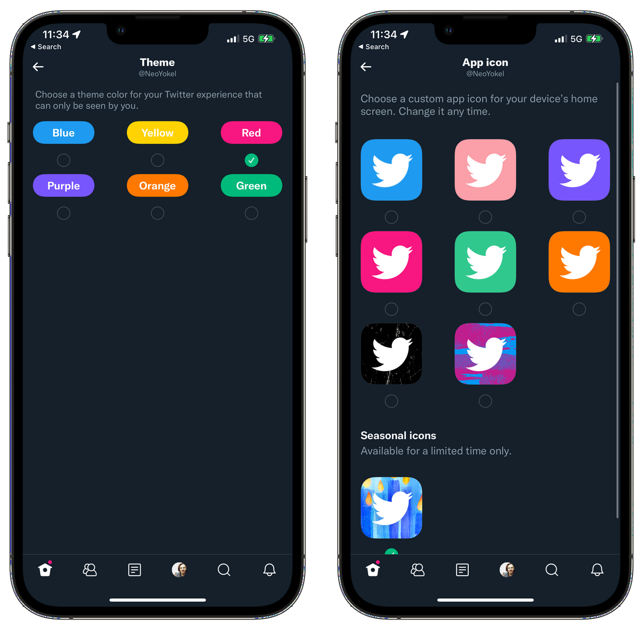
Even greater heights of half-assery have been achieved by what Twitter describes as “exclusive app icons and colorful themes.” Here, I must finally give in and compare Twitter Blue with Tweetbot directly.
https://twitter.com/neoyokel/status/1467422017527951366
Absolutely zero effort has been expended thus far in recharacterizing what Web Twitter still calls “Colors” as “Themes,” and the only exclusivity in the icon options is that some are seasonal, or otherwise time-limited, for what possible purpose I cannot conceive. This from a company of more than 5000 full-time employees.
In contrast, from a full-time team of two - both of whom suffered through bad COVID infections, this year - Tweetbot now includes an even further broadened spectrum of app-wide themes and 19 app icons in total, including, yes, at least two very cute, limited-time seasonal options.
https://open.spotify.com/episode/0ImyC2Twm5qyx9lxmcKmkP
The episode of End User embedded above is one of the only podcast episodes I’ve ever made which I actually find too painful to listen back to4, but I still think it’s valuable. There’s a specific bit of the conversation between @alisonbuki and I in which the term “Poweruser” is actually thrown around regarding my own use of Twitter Lists, Tweetbot, and a few other Hax to consume content deliberately. I think I failed somewhere in my portrayal of this curation and miscommunicated the nature of what I was trying to get at by “making use of the tools available to you.” Regarding the actual manhours involved in the configuration I was trying to evangelize, I think I’ve spent more time trying to describe the effort than I have actually configuring my own content intake.
Long before I was follow-limited in 2017, I lived entirely in my Twitter Listshttps://twitter.com/NeoYokel/lists), the largest of which I built up “organically” over time, by adding appropriate accounts one by one as I came across them. Thanks to Tweetbot, my equivalent of the native apps’s Home timeline is a private List of 200 accounts whose users represent the actual entirety of my adult social life, past to present. Then, there’s The New, which - I must admit - has grown beyond its original scope and sortof become my follow list, with enough exceptions that I consider it worthwhile to keep public. Then, there’s the newest - my Meta-Media List - and the very oldest: my dear, weathered Rolodex of Automotive Twitter. I keep Tweetbot in my dock and the native app on my device just for notifications, Spaces, and now Communities. That’s it! Yet, using this configuration, I never see content that seriously disturbs, shames, triggers, or otherwise upsets me beyond reason or expectation5, but am regularly exposed to a relatively diverse palette of perspectives, and just generally find my consumption/engagement time on the service meaningfully spent.
The particular amalgamation of truly half-assed user experience features offered in Twitter Blue lend toward a narrative about this company which we collectively have continued to fall for literally dozens of times - often in immediate succession - throughout the fewer years of its history: that it finally has a morsel of what might just become a cohesive vision. Clearly, I am as susceptible to this as anyone considering how quickly I jumped to celebrating the fact that finally, Twitter had seen the humongous value to be imparted to its userbase by simply adding basic configurables like custom navigation and especially refining the essential curatorial tool that is Lists.
Were I still a person who wastes my energy speculating on the real happenings within Twitter, Inc, though, an entirely different, much more realistic sounding theory arises after the analysis we’ve trudged through together in this post: every single item on Twitter Blue’s feature list represents the absolute bare minimum resource investment possible. If I had any money, I’d go on to bet that Shihab Mehboob could have built from scratch every single developmental “addition” to the iOS app Twitter Blue includes in a matter of hours, though from experience, I seriously doubt he’d ever allow such lackluster work to reach even beta tester’s fingers. As far as Ad-Free Articles go, Twitter hasn’t even bothered to swap out all the Scroll branding. The fact that I had to surface the concept of Delete and Re-Draft to Twitter Employee brains for what all appearances indicate was the first time in that “FeedbackFriday” Twitter Space represents a truly sickening lack of effort. No, the story that aligns much more succinctly in the grander context is that Twitter Blue just happened to be the first disjointed, scatterbrained subscription service pitch to finally fall out the rectum of this miraculously bunk organization, but all you motherfuckers can talk about is Japple Notes Dorsey walking out, and what it could mean.
Since I have now actually been personally and explicitly invited to share feedback regarding Twitter Blue, I suppose I’ll make some effort to send them this hyperlink. In that vein, I think I’ll end with some advice addressed directly to Twitter, Incorporated:
Hey Twitter! If you ever find yourself genuinely interested in selling a subscription product long term, as a mutual value exchange with your users, make all of Twitter Blue’s features available to all users, and ditch Scroll entirely. Instead of placing the bet on local newspapers like The Kansas City Star, it should be on you to take the financial risk yourself, and offer, simply, a completely ad-free Twitter experience. That might just be worth $2.99 a month.
[1] Despite the fact that Tweeting via SMS has since been disabled. [2] I was just… rude. Very rude. “Necessary” is not a term I’d apply to this rudeness, but… Just give me this once, please. [3] In the process of trying to capture a good image of this thing, I noticed that all the assets are still being loaded from static.scroll.com. Nice. [4] See for yourself via this thread on my Telegram channel. [5] An obligatory note that I am of the most privileged sort of human there ever has been, or that one can be.
#software #media
tusker ↩